常用模块导入
import numpy as np
import matplotlib
import matplotlib.mlab as mlab
import matplotlib.pyplot as plt
import matplotlib.font_manager as fm
from mpl_toolkits.mplot3d import Axes3D
解决显示异常问题
中文乱码
myfont = fm.FontProperties(fname="字体文件路径")负号显示为方块
matplotlib.rcParams['axes.unicode_minus']=False折线图
生成数据
x = np.linspace(-np.pi, np.pi, 256, endpoint=True)  # 从-π到π 等间隔取256个点
y_cos, y_sin = np.cos(x), np.sin(x)  # 对应x的cos与sin值
初始化画布
plt.figure(figsize=(8, 6), dpi=80)  # figsize定义画布大小,dpi定义画布分辨率
plt.title("简单折线图", fontproperties=myfont)  # 设定标题,中文需要指定字体
plt.grid(True)  # 是否显示网格
设置坐标轴
# 设置X轴
plt.xlabel("X轴", fontproperties=myfont)  # 轴标签
plt.xlim(-4.0, 4.0)  # 轴范围
plt.xticks(np.linspace(-4, 4, 9, endpoint=True))  # 轴刻度

# 设置Y轴
plt.ylabel("Y轴", fontproperties=myfont)
plt.ylim(-1.0, 1.0)
plt.yticks(np.linspace(-1, 1, 9, endpoint=True))
绘制数据
线类型有几种:"g+-", "r*-", "b.-", "yo-",第一个字代表颜色,第二个字符代表节点样式,第三个字符代表连线样式
plt.plot(x, y_cos, "b--", linewidth=2.0, label="cos示例") # 前两个参数是坐标值,第三个参数为线类型,linewidth为线宽,label为图例文字
plt.plot(x, y_sin, "g-", linewidth=2.0, label="sin示例")
设置图例
plt.legend(loc="upper left", prop=myfont, shadow=True) # loc可以是upper、lower和left, right, center的组合图形显示
plt.show()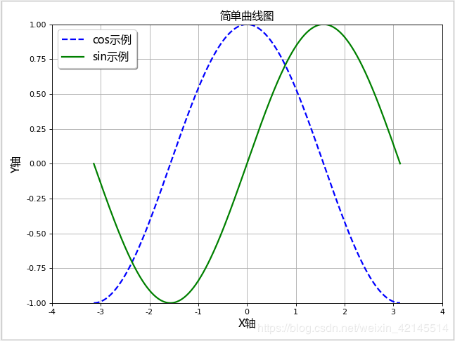
面积图
plt.fill_between(x, -1, y_sin, where=True, color="blue", alpha=0.25)
plt.show()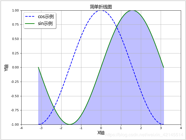
三维折线图
# 生成测试数据
x = np.linspace(0, 1, 1000)
y = np.linspace(0, 1, 1000)
z = np.sin(x * 2 * np.pi) / (y + 0.1)

# 生成画布(两种形式)
fig = plt.figure()
ax = fig.gca(projection="3d", title="plot title")
# ax = fig.add_subplot(111, projection="3d", title="plot title")

# 画三维折线图
ax.plot(x, y, z, color="red", linestyle="-")

# 设置坐标轴图标
ax.set_xlabel("X Label")
ax.set_ylabel("Y Label")
ax.set_zlabel("Z Label")

# 图形显示
plt.show()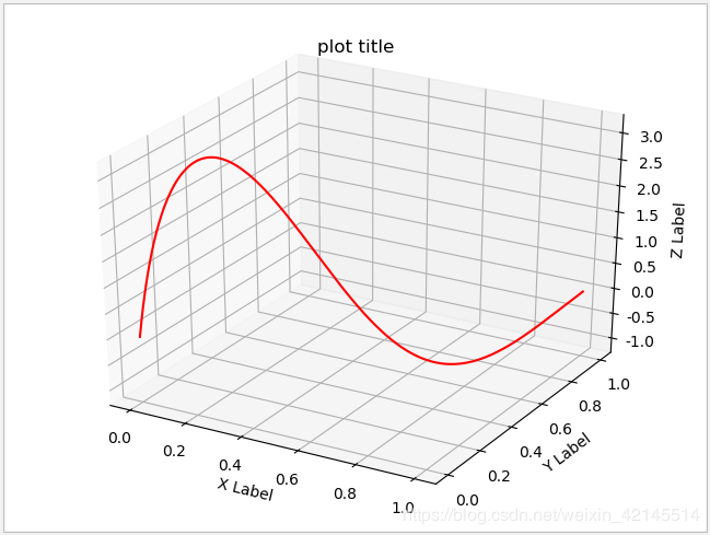
柱状图
生成数据
# 生成测试数据
means_men = np.array((20, 35, 30, 35, 27))
means_women = np.array((25, 32, 34, 20, 25))
初始化画布
plt.figure(figsize=(8, 6), dpi=80)  # figsize定义画布大小,dpi定义画布分辨率
plt.title("简单柱状图", fontproperties=myfont)  # 设定标题,中文需要指定字体
plt.grid(True)  # 是否显示网格
设置坐标轴
index = np.arange(len(means_men)) [0,1,2,3,4]
bar_height = 0.35  # 柱宽度
plt.xlim(0, 45)  # 轴范围
plt.xlabel("Scores")  # 轴标签
plt.ylabel("Group")
plt.yticks(index + (bar_height / 2), ("A", "B", "C", "D", "E")) # 轴刻度
绘制数据
# 绘制横向柱状图
plt.barh(index, means_men, height=bar_height, alpha=0.2, color="b", label="Men")
plt.barh(index + bar_height, means_women, height=bar_height, alpha=0.8, color="r", label="Women")
设置图例
plt.legend(loc="upper right", shadow=True)显示数据值
for i, v in zip(index, means_men):
    plt.text(v + 0.3, i, v, ha="left", va="center")
for i, v in zip(index, means_women):
    plt.text(v + 0.3, i + bar_height, v, ha="left", va="center")
图形显示
plt.show()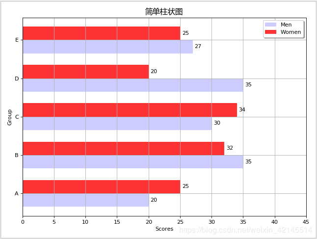
竖向柱形图
设置坐标轴,x与y对调
index = np.arange(len(means_men)) [0,1,2,3,4]
bar_height = 0.35  # 柱宽度
plt.ylim(0, 45)
plt.ylabel("Scores")
plt.xlabel("Group")
plt.xticks(index + (bar_height / 2), ("A", "B", "C", "D", "E"))
绘制数据
# 绘制竖向柱状图
plt.bar(index-bar_height/2, means_men, width=bar_height, alpha=0.4, color="b", label="Men")
plt.bar(index+bar_height/2, means_women, width=bar_height, alpha=0.4, color="r", label="Women")
图形显示
plt.show()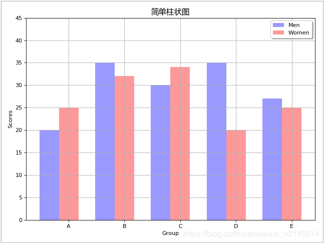
堆叠柱状图
# 生成测试数据
data = np.array([
    [1, 4, 2, 5, 2],
    [2, 1, 1, 3, 6],
    [5, 3, 6, 4, 1]
])

# 设置标题
plt.title("层次柱状图", fontproperties=myfont)

# 设置相关参数
index = np.arange(len(data[0]))
color_index = ["r", "g", "b"]

# 声明底部位置
bottom = np.array([0, 0, 0, 0, 0])

# 依次画图,并更新底部位置
for i in range(len(data)):
    plt.bar(index, data[i], width=0.5, color=color_index[i], bottom=bottom, alpha=0.7, label="标签 %d" % i)
    bottom += data[i]

# 设置图例位置
plt.legend(loc="upper left", prop=myfont, shadow=True)

# 图形显示
plt.show()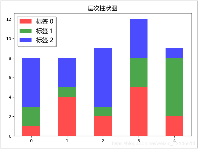
直方图
# 生成测试数据
mu, sigma = 100, 15
x = mu + sigma * np.random.randn(10000)

# 设置标题
plt.title("直方图", fontproperties=myfont)

# 画直方图, 并返回相关结果
n, bins, patches = plt.hist(x, bins=50, density=1, cumulative=False, color="green", alpha=0.6, label="直方图")

# # 根据直方图返回的结果, 画折线图
y = mlab.normpdf(bins, mu, sigma)
plt.plot(bins, y, "r--", label="线条")

# 设置图例位置
plt.legend(loc="upper left", prop=myfont, shadow=True)

# 图形显示
plt.show()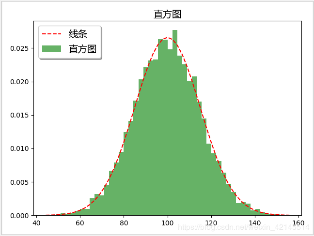
三维柱形图
# 生成测试数据(位置数据)
xpos = [1, 2, 3, 4, 5, 6, 7, 8, 9, 10]
ypos = [2, 3, 4, 5, 1, 6, 2, 1, 7, 2]
zpos = [0, 0, 0, 0, 0, 0, 0, 0, 0, 0]

# 生成测试数据(柱形参数)
dx = [1, 1, 1, 1, 1, 1, 1, 1, 1, 1]
dy = [1, 1, 1, 1, 1, 1, 1, 1, 1, 1]
dz = [1, 2, 3, 4, 5, 6, 7, 8, 9, 10]

# 生成画布(两种形式)
fig = plt.figure()
ax = fig.gca(projection="3d", title="plot title")

# 设置坐标轴图标
ax.set_xlabel("X Label")
ax.set_ylabel("Y Label")
ax.set_zlabel("Z Label")

# 画三维柱状图
ax.bar3d(xpos, ypos, zpos, dx, dy, dz, alpha=0.5)

# 图形显示
plt.show()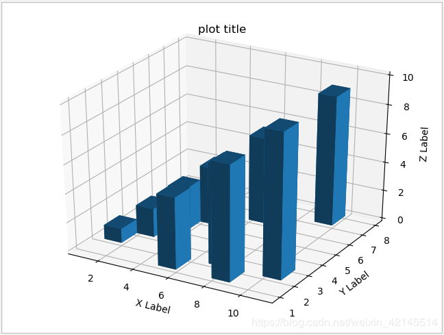
饼状图
生成数据
# 生成测试数据
sizes = [15, 30, 45, 10]  # 数值
labels = ["Frogs", "中文", "Dogs", "Logs"]  # 标签
colors = ["yellowgreen", "gold", "lightskyblue", "lightcoral"]  # 颜色
初始化画布
plt.figure(figsize=(8, 6), dpi=80)  # figsize定义画布大小,dpi定义画布分辨率
plt.title("简单饼状图", fontproperties=myfont)  # 设定标题,中文需要指定字体
设置扇区偏离值
explode = [0, 0.05, 0, 0]绘制数据
patches, l_text, p_text = plt.pie(sizes, explode=explode, labels=labels, colors=colors, autopct="%1.1f%%", shadow=True, startangle=90)  # autopct设置显示百分比的格式,startangle设置图像转动方向
for text in l_text:
    text.set_fontproperties(myfont)  # 设置字体,避免中文乱码
图形显示
plt.show()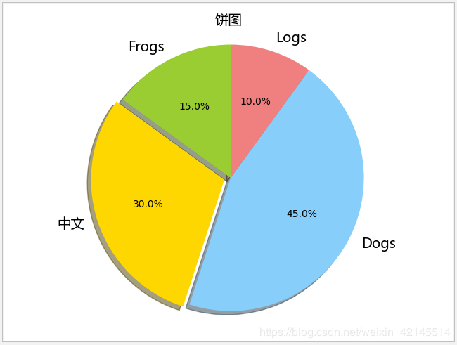
散点图
生成数据
N = 1000
x = np.random.randn(N)
y = x + np.random.randn(N)*0.5
初始化画布
plt.figure(figsize=(8, 6), dpi=80)  # figsize定义画布大小,dpi定义画布分辨率
plt.title("简单散点图", fontproperties=myfont)  # 设定标题,中文需要指定字体
绘制数据
plt.scatter(x, y, s=5, c="red", marker="o") # s表示点的大小,c表示点的颜色,marker表示点的形状图形显示
plt.show()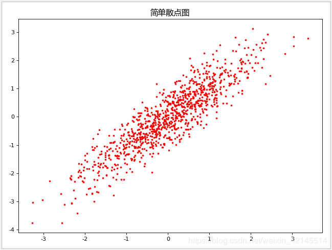
三维散点图
# 生成测试数据
x = np.random.random(100)
y = np.random.random(100)
z = np.random.random(100)
color = np.random.random(100)
scale = np.random.random(100) * 100

# 生成画布(两种形式)
fig = plt.figure()
fig.suptitle("三维散点图", fontproperties=myfont)
ax = fig.add_subplot(111, projection="3d")

# 设置坐标轴图标
ax.set_xlabel("X Label")
ax.set_ylabel("Y Label")
ax.set_zlabel("Z Label")

# 设置坐标轴范围
ax.set_xlim(0, 1)
ax.set_ylim(0, 1)
ax.set_zlim(0, 1)

# 画三维散点图
ax.scatter(x, y, z, s=scale, c=color, marker=".")

# 图形显示
plt.show()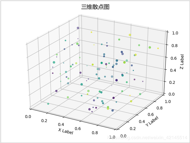
雷达图
生成数据
labels = np.array(["A组", "B组", "C组", "D组", "E组", "F组"])
data = np.array([68, 83, 90, 77, 89, 73])
theta = np.linspace(0, 2 * np.pi, len(data), endpoint=False)  # 每个维度的角度值
初始化画布
plt.subplot(111, polar=True)  # 3个数字,前两位表示把画布分为几行几列,后一位表示花在哪个位置上
plt.title("雷达图", fontproperties=myfont)
设置坐标轴
plt.ylim(0, 100) # 轴范围绘制数据
plt.thetagrids(theta * (180 / np.pi), labels=labels, fontproperties=myfont)图形显示
plt.show()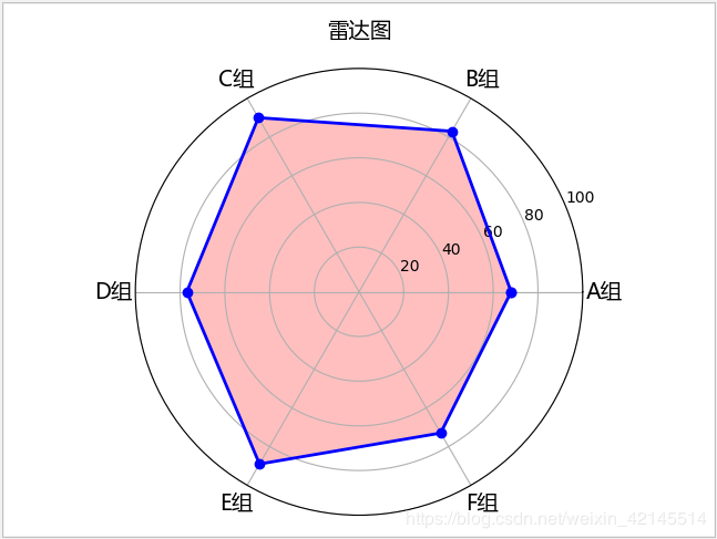
想进一步了解编程开发相关知识,与我一同成长进步,请关注我的公众号“松果仓库”,共同分享宅&程序员的各类资源,谢谢!!!