scatter()–散点图
视频链接暂无
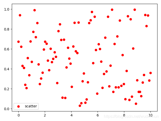
函数格式:
plt.scatter(x,y,c="b",label="图例名")
参数说明:
- x:x轴上的数值
- y:y轴上的数值
- c:散点图中标记的颜色
- 颜色使用缩写:b/g/r/c/m/y/k/w
- 对应的颜色是:blue/green/red/cyan/magenta/yellow/black/white
- label:图例文本
代码:
import matplotlib.pyplot as plt
import numpy as np

# 准备数据
# x与y中的100都是指的数据的个数,需要一致
x = np.linspace(0,10,100)
y = np.random.rand(100)

# 画图
plt.scatter(x,y,label="scatter",c='r',lw=1)

# 结束
plt.legend()
plt.show()