可视化对于大家来说确实是有关的,因为确实是直观的,每一组大数据如果可以用可视化进行展示的话可以让大家豁然开朗。但在另外一些场景中,辅之以少量的文字提示(textual cue)和标签是必不可少的。虽然最基本的注释(annotation)类型可能只是坐标轴标题与图标题,但注释可远远不止这些。让我们可视化一些数据,看看如何通过添加注释来更恰当地表达信息。
Python之Matplotlib数据可视化(五):文字与注释
首先导入画图需要用到的一些函数:
import matplotlib.pyplot as plt
import matplotlib as mpl
plt.style.use('seaborn-whitegrid')
import numpy as np
import pandas as pd
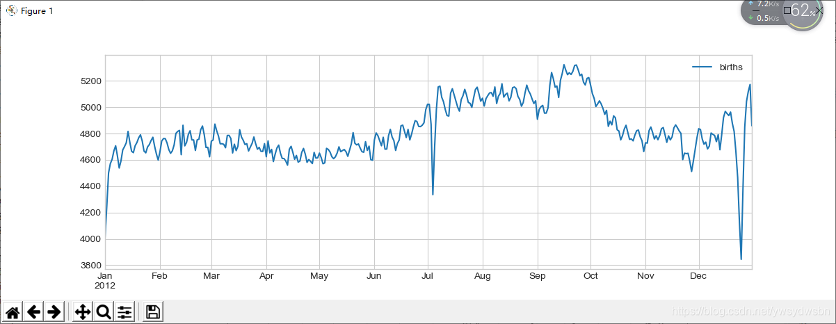
1 案例:节假日对美国出生率的影响
数据可以在 https://github.com/jakevdp/data-CDCbirths 下载,数据类型如下:
用清洗方法处理数据,然后画出结果。
日均出生人数统计图
births = pd.read_csv('births.csv')
quartiles = np.percentile(births['births'], [25, 50, 75])
mu, sig = quartiles[1], 0.74 * (quartiles[2] - quartiles[0])
births = births.query('(births > @mu - 5 * @sig) & (births < @mu + 5 * @sig)')
births['day'] = births['day'].astype(int)
births.index = pd.to_datetime(10000 * births.year + 100 * births.month + births.day, format='%Y%m%d')
births_by_date = births.pivot_table('births', [births.index.month, births.index.day])
births_by_date.index = [pd.datetime(2012, month, day) for (month, day) in births_by_date.index]
fig, ax = plt.subplots(figsize=(12, 4))
births_by_date.plot(ax=ax);
import matplotlib.pyplot as plt
import matplotlib as mpl
plt.style.use('seaborn-whitegrid')
import numpy as np
import pandas as pd
births = pd.read_csv('C:\\Users\\Y\\Desktop\\data-CDCbirths-master\\births.csv')
quartiles = np.percentile(births['births'], [25, 50, 75])
mu, sig = quartiles[1], 0.74 * (quartiles[2] - quartiles[0])
births = births.query('(births > @mu - 5 * @sig) & (births < @mu + 5 * @sig)')
births['day'] = births['day'].astype(int)
births.index = pd.to_datetime(10000 * births.year + 100 * births.month + births.day, format='%Y%m%d')
births_by_date = births.pivot_table('births', [births.index.month, births.index.day])
births_by_date.index = [pd.datetime(2012, month, day) for (month, day) in births_by_date.index]
fig, ax = plt.subplots(figsize=(12, 4))
births_by_date.plot(ax=ax);
plt.show()
为日均出生人数统计图添加注释
在用这样的图表达观点时,如果可以在图中增加一些注释,就更能吸引读者的注意了。可以通过 plt.text / ax.text 命令手动添加注释,它们可以在具体的 x / y 坐标点上放上文字
fig, ax = plt.subplots(figsize=(12, 4))
births_by_date.plot(ax=ax)
# 在图上增加文字标签
style = dict(size=10, color='gray')
ax.text('2012-1-1', 3950, "New Year's Day", **style)
ax.text('2012-7-4', 4250, "Independence Day", ha='center', **style)
ax.text('2012-9-4', 4850, "Labor Day", ha='center', **style)
ax.text('2012-10-31', 4600, "Halloween", ha='right', **style)
ax.text('2012-11-25', 4450, "Thanksgiving", ha='center', **style)
ax.text('2012-12-25', 3850, "Christmas ", ha='right', **style)
# 设置坐标轴标题
ax.set(title='USA births by day of year (1969-1988)',
ylabel='average daily births')
# 设置x轴刻度值,让月份居中显示
ax.xaxis.set_major_locator(mpl.dates.MonthLocator())
ax.xaxis.set_minor_locator(mpl.dates.MonthLocator(bymonthday=15))
ax.xaxis.set_major_formatter(plt.NullFormatter())
ax.xaxis.set_minor_formatter(mpl.dates.DateFormatter('%h'));
import matplotlib.pyplot as plt
import matplotlib as mpl
plt.style.use('seaborn-whitegrid')
import numpy as np
import pandas as pd
births = pd.read_csv('C:\\Users\\Y\\Desktop\\data-CDCbirths-master\\births.csv')
quartiles = np.percentile(births['births'], [25, 50, 75])
mu, sig = quartiles[1], 0.74 * (quartiles[2] - quartiles[0])
births = births.query('(births > @mu - 5 * @sig) & (births < @mu + 5 * @sig)')
births['day'] = births['day'].astype(int)
births.index = pd.to_datetime(10000 * births.year + 100 * births.month + births.day, format='%Y%m%d')
births_by_date = births.pivot_table('births', [births.index.month, births.index.day])
births_by_date.index = [pd.datetime(2012, month, day) for (month, day) in births_by_date.index]
fig, ax = plt.subplots(figsize=(12, 4))
births_by_date.plot(ax=ax)
# 在图上增加文字标签
style = dict(size=10, color='gray')
ax.text('2012-1-1', 3950, "New Year's Day", **style)
ax.text('2012-7-4', 4250, "Independence Day", ha='center', **style)
ax.text('2012-9-4', 4850, "Labor Day", ha='center', **style)
ax.text('2012-10-31', 4600, "Halloween", ha='right', **style)
ax.text('2012-11-25', 4450, "Thanksgiving", ha='center', **style)
ax.text('2012-12-25', 3850, "Christmas ", ha='right', **style)
# 设置坐标轴标题
ax.set(title='USA births by day of year (1969-1988)',
ylabel='average daily births')
# 设置x轴刻度值,让月份居中显示
ax.xaxis.set_major_locator(mpl.dates.MonthLocator())
ax.xaxis.set_minor_locator(mpl.dates.MonthLocator(bymonthday=15))
ax.xaxis.set_major_formatter(plt.NullFormatter())
ax.xaxis.set_minor_formatter(mpl.dates.DateFormatter('%h'));
plt.show()
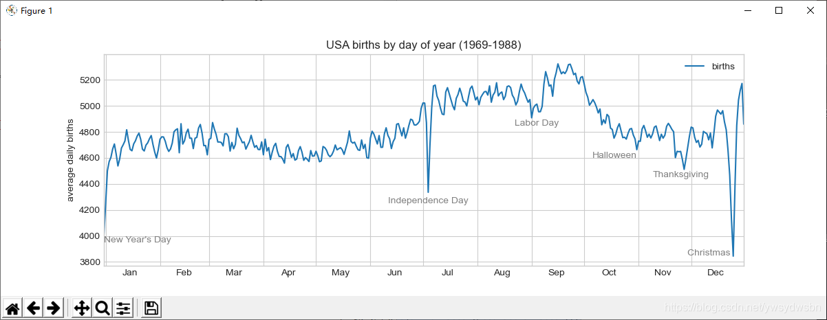
ax.text 方法需要一个 x 轴坐标、一个 y 轴坐标、一个字符串和一些可选参数,比如文字的颜色、字号、风格、对齐方式以及其他文字属性。这里用了 ha='right' 与 ha='center' ,ha 是水平对齐方式(horizonal alignment)的缩写。关于配置参数的更多信息,请参考plt.text() 与 mpl.text.Text() 的程序文档。
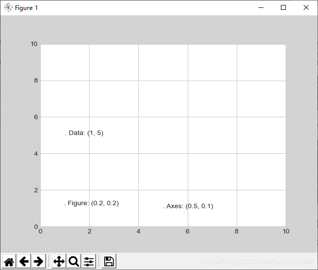
2 坐标变换与文字位置
前面的示例将文字放在了目标数据的位置上。但有时候可能需要将文字放在与数据无关的位置上,比如坐标轴或者图形中。在 Matplotlib 中,我们通过调整坐标变换(transform)来实现。
任何图形显示框架都需要一些变换坐标系的机制。例如,当一个位于 (x, y) = (1, 1) 位置的点需要以某种方式显示在图上特定的位置时,就需要用屏幕的像素来表示。用数学方法处理这种坐标系变换很简单,Matplotlib 有一组非常棒的工具可以实现类似功能(这些工具位于 matplotlib.transforms 子模块中)。
虽然一般用户并不需要关心这些变换的细节,但是了解这些知识对在图上放置文字大有帮助。一共有三种解决这类问题的预定义变换方式。
ax.transData	以数据为基准的坐标变换。
ax.transAxes	以坐标轴为基准的坐标变换(以坐标轴维度为单位)。
fig.transFigure	以图形为基准的坐标变换(以图形维度为单位)。
默认情况下,上面的文字在各自的坐标系中都是左对齐的。这三个字符串开头的 . 字符基本就是对应的坐标位置。
transData 坐标用 x 轴与 y 轴的标签作为数据坐标。
transAxes 坐标以坐标轴(图中白色矩形)左下角的位置为原点,按坐标轴尺寸的比例呈现坐标。
transFigure 坐标与之类似,不过是以图形(图中灰色矩形)左下角的位置为原点,按图形尺寸的比例呈现坐标。
对比 Matplotlib 的三种坐标系(1)
下面举一个例子,用三种变换方式将文字画在不同的位置:
fig, ax = plt.subplots(facecolor='lightgray')
ax.axis([0, 10, 0, 10])
# 虽然transform=ax.transData是默认值,但还是设置一下
ax.text(1, 5, ". Data: (1, 5)", transform=ax.transData)
ax.text(0.5, 0.1, ". Axes: (0.5, 0.1)", transform=ax.transAxes)
ax.text(0.2, 0.2, ". Figure: (0.2, 0.2)", transform=fig.transFigure);
import matplotlib.pyplot as plt
import matplotlib as mpl
plt.style.use('seaborn-whitegrid')
import numpy as np
import pandas as pd
births = pd.read_csv('C:\\Users\\Y\\Desktop\\data-CDCbirths-master\\births.csv')
quartiles = np.percentile(births['births'], [25, 50, 75])
mu, sig = quartiles[1], 0.74 * (quartiles[2] - quartiles[0])
births = births.query('(births > @mu - 5 * @sig) & (births < @mu + 5 * @sig)')
births['day'] = births['day'].astype(int)
births.index = pd.to_datetime(10000 * births.year + 100 * births.month + births.day, format='%Y%m%d')
births_by_date = births.pivot_table('births', [births.index.month, births.index.day])
births_by_date.index = [pd.datetime(2012, month, day) for (month, day) in births_by_date.index]
fig, ax = plt.subplots(facecolor='lightgray')
ax.axis([0, 10, 0, 10])
# 虽然transform=ax.transData是默认值,但还是设置一下
ax.text(1, 5, ". Data: (1, 5)", transform=ax.transData)
ax.text(0.5, 0.1, ". Axes: (0.5, 0.1)", transform=ax.transAxes)
ax.text(0.2, 0.2, ". Figure: (0.2, 0.2)", transform=fig.transFigure);
plt.show()
对比 Matplotlib 的三种坐标系(2)
需要注意的是,假如你改变了坐标轴上下限,那么只有 transData 坐标会受影响,其他坐标系都不变
ax.set_xlim(0, 2)
ax.set_ylim(-6, 6)
fig
import matplotlib.pyplot as plt
import matplotlib as mpl
plt.style.use('seaborn-whitegrid')
import numpy as np
import pandas as pd
births = pd.read_csv('C:\\Users\\Y\\Desktop\\data-CDCbirths-master\\births.csv')
quartiles = np.percentile(births['births'], [25, 50, 75])
mu, sig = quartiles[1], 0.74 * (quartiles[2] - quartiles[0])
births = births.query('(births > @mu - 5 * @sig) & (births < @mu + 5 * @sig)')
births['day'] = births['day'].astype(int)
births.index = pd.to_datetime(10000 * births.year + 100 * births.month + births.day, format='%Y%m%d')
births_by_date = births.pivot_table('births', [births.index.month, births.index.day])
births_by_date.index = [pd.datetime(2012, month, day) for (month, day) in births_by_date.index]
fig, ax = plt.subplots(facecolor='lightgray')
ax.axis([0, 10, 0, 10])
# 虽然transform=ax.transData是默认值,但还是设置一下
ax.text(1, 5, ". Data: (1, 5)", transform=ax.transData)
ax.text(0.5, 0.1, ". Axes: (0.5, 0.1)", transform=ax.transAxes)
ax.text(0.2, 0.2, ". Figure: (0.2, 0.2)", transform=fig.transFigure);
ax.set_xlim(0, 2)
ax.set_ylim(-6, 6)
fig
plt.show()
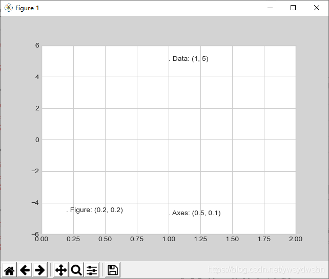
如果你改变了坐标轴上下限,那么就可以更清晰地看到刚刚所说的变化。
3 箭头与注释
除了刻度线和文字,简单的箭头也是一种有用的注释标签。
在 Matplotlib 里面画箭头通常比你想象的要困难。虽然有一个 plt.arrow() 函数可以实现这个功能,但是我不推荐使用它,因为它创建出的箭头是 SVG 向量图对象,会随着图形分辨率的变化而改变,最终的结果可能完全不是用户想要的。我要推荐的是 plt.annotate()函数。这个函数既可以创建文字,也可以创建箭头,而且它创建的箭头能够进行非常灵活的配置。
图形注释
下面用 annotate 的一些配置选项来演示
fig, ax = plt.subplots()
x = np.linspace(0, 20, 1000)
ax.plot(x, np.cos(x))
ax.axis('equal')
ax.annotate('local maximum', xy=(6.28, 1), xytext=(10, 4),arrowprops=dict(facecolor='black', shrink=0.05))
ax.annotate('local minimum', xy=(5 * np.pi, -1), xytext=(2, -6),arrowprops=dict(arrowstyle="->",
connectionstyle="angle3,angleA=0,angleB=-90"));
import matplotlib.pyplot as plt
import matplotlib as mpl
plt.style.use('seaborn-whitegrid')
import numpy as np
import pandas as pd
births = pd.read_csv('C:\\Users\\Y\\Desktop\\data-CDCbirths-master\\births.csv')
quartiles = np.percentile(births['births'], [25, 50, 75])
mu, sig = quartiles[1], 0.74 * (quartiles[2] - quartiles[0])
births = births.query('(births > @mu - 5 * @sig) & (births < @mu + 5 * @sig)')
births['day'] = births['day'].astype(int)
births.index = pd.to_datetime(10000 * births.year + 100 * births.month + births.day, format='%Y%m%d')
births_by_date = births.pivot_table('births', [births.index.month, births.index.day])
births_by_date.index = [pd.datetime(2012, month, day) for (month, day) in births_by_date.index]

fig, ax = plt.subplots()
x = np.linspace(0, 20, 1000)
ax.plot(x, np.cos(x))
ax.axis('equal')
ax.annotate('local maximum', xy=(6.28, 1), xytext=(10, 4),arrowprops=dict(facecolor='black', shrink=0.05))
ax.annotate('local minimum', xy=(5 * np.pi, -1), xytext=(2, -6),arrowprops=dict(arrowstyle="->",connectionstyle="angle3,angleA=0,angleB=-90"));

plt.show()
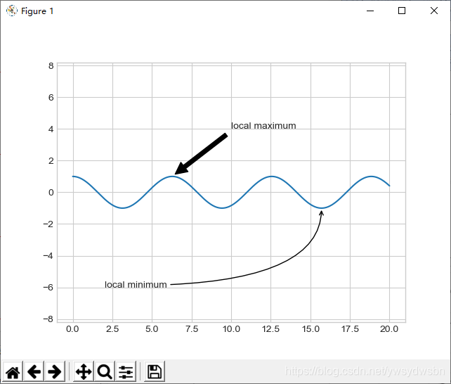
箭头的风格是通过 arrowprops 字典控制的,里面有许多可用的选项。由于这些选项在Matplotlib 的官方文档中都有非常详细的介绍,我就不再赘述,仅做一点儿功能演示。
带注释的日均出生人数
让我们用前面的美国出生人数图来演示一些箭头注释
fig, ax = plt.subplots(figsize=(12, 4))
births_by_date.plot(ax=ax)
# 在图上增加箭头标签
ax.annotate("New Year's Day", xy=('2012-1-1', 4100), xycoords='data',xytext=(50, -30), textcoords='offset points',arrowprops=dict(arrowstyle="->",connectionstyle="arc3,rad=-0.2"))
ax.annotate("Independence Day", xy=('2012-7-4', 4250),xycoords='data',bbox=dict(boxstyle="round", fc="none", ec="gray"),xytext=(10, -40), textcoords='offset points', ha='center', arrowprops=dict(arrowstyle="->"))
ax.annotate('Labor Day', xy=('2012-9-4', 4850), xycoords='data', ha='center', xytext=(0, -20), textcoords='offset points')
ax.annotate('', xy=('2012-9-1', 4850), xytext=('2012-9-7', 4850), xycoords='data', textcoords='data', arrowprops={'arrowstyle': '|-|,widthA=0.2,widthB=0.2', })
ax.annotate('Halloween', xy=('2012-10-31', 4600), xycoords='data', xytext=(-80, -40), textcoords='offset points', arrowprops=dict(arrowstyle="fancy", fc="0.6", ec="none", connectionstyle="angle3,angleA=0,angleB=-90"))
ax.annotate('Thanksgiving', xy=('2012-11-25', 4500), xycoords='data', xytext=(-120, -60), textcoords='offset points', bbox=dict(boxstyle="round4,pad=.5", fc="0.9"), arrowprops=dict(arrowstyle="->", connectionstyle="angle,angleA=0,angleB=80,rad=20"))
ax.annotate('Christmas', xy=('2012-12-25', 3850), xycoords='data', xytext=(-30, 0), textcoords='offset points', size=13, ha='right', va="center", bbox=dict(boxstyle="round", alpha=0.1), arrowprops=dict(arrowstyle="wedge,tail_width=0.5", alpha=0.1));
# 设置坐标轴标题
ax.set(title='USA births by day of year (1969-1988)', ylabel='average daily births')
# 设置x轴刻度值,让月份居中显示
ax.xaxis.set_major_locator(mpl.dates.MonthLocator())
ax.xaxis.set_minor_locator(mpl.dates.MonthLocator(bymonthday=15))
ax.xaxis.set_major_formatter(plt.NullFormatter())
ax.xaxis.set_minor_formatter(mpl.dates.DateFormatter('%h'));
ax.set_ylim(3600, 5400);
import matplotlib.pyplot as plt
import matplotlib as mpl
plt.style.use('seaborn-whitegrid')
import numpy as np
import pandas as pd
births = pd.read_csv('C:\\Users\\Y\\Desktop\\data-CDCbirths-master\\births.csv')
quartiles = np.percentile(births['births'], [25, 50, 75])
mu, sig = quartiles[1], 0.74 * (quartiles[2] - quartiles[0])
births = births.query('(births > @mu - 5 * @sig) & (births < @mu + 5 * @sig)')
births['day'] = births['day'].astype(int)
births.index = pd.to_datetime(10000 * births.year + 100 * births.month + births.day, format='%Y%m%d')
births_by_date = births.pivot_table('births', [births.index.month, births.index.day])
births_by_date.index = [pd.datetime(2012, month, day) for (month, day) in births_by_date.index]

fig, ax = plt.subplots(figsize=(12, 4))
births_by_date.plot(ax=ax)
# 在图上增加箭头标签
ax.annotate("New Year's Day", xy=('2012-1-1', 4100), xycoords='data',
			xytext=(50, -30), textcoords='offset points',
			arrowprops=dict(arrowstyle="->",
			connectionstyle="arc3,rad=-0.2"))
ax.annotate("Independence Day", xy=('2012-7-4', 4250), 	xycoords='data',
			bbox=dict(boxstyle="round", fc="none", ec="gray"),
			xytext=(10, -40), textcoords='offset points', ha='center',
			arrowprops=dict(arrowstyle="->"))
ax.annotate('Labor Day', xy=('2012-9-4', 4850), xycoords='data', 		ha='center',
			xytext=(0, -20), textcoords='offset points')
			ax.annotate('', xy=('2012-9-1', 4850), xytext=('2012-9-7', 4850),
			xycoords='data', textcoords='data',
			arrowprops={'arrowstyle': '|-|,widthA=0.2,widthB=0.2', })
ax.annotate('Halloween', xy=('2012-10-31', 4600), xycoords='data',
			xytext=(-80, -40), textcoords='offset points',
			arrowprops=dict(arrowstyle="fancy",
			fc="0.6", ec="none",
			connectionstyle="angle3,angleA=0,angleB=-90"))
ax.annotate('Thanksgiving', xy=('2012-11-25', 4500), xycoords='data',
			xytext=(-120, -60), textcoords='offset points',
			bbox=dict(boxstyle="round4,pad=.5", fc="0.9"),
			arrowprops=dict(arrowstyle="->",
			connectionstyle="angle,angleA=0,angleB=80,rad=20"))
ax.annotate('Christmas', xy=('2012-12-25', 3850), xycoords='data',xytext=(-30, 0), textcoords='offset points',size=13, 		ha='right', va="center",bbox=dict(boxstyle="round", 		alpha=0.1),arrowprops=dict(arrowstyle="wedge,tail_width=0.5", 	alpha=0.1));
# 设置坐标轴标题
ax.set(title='USA births by day of year (1969-1988)',ylabel='average daily births')
# 设置x轴刻度值,让月份居中显示
ax.xaxis.set_major_locator(mpl.dates.MonthLocator())
ax.xaxis.set_minor_locator(mpl.dates.MonthLocator(bymonthday=15))
ax.xaxis.set_major_formatter(plt.NullFormatter())
ax.xaxis.set_minor_formatter(mpl.dates.DateFormatter('%h'));
ax.set_ylim(3600, 5400);

plt.show()
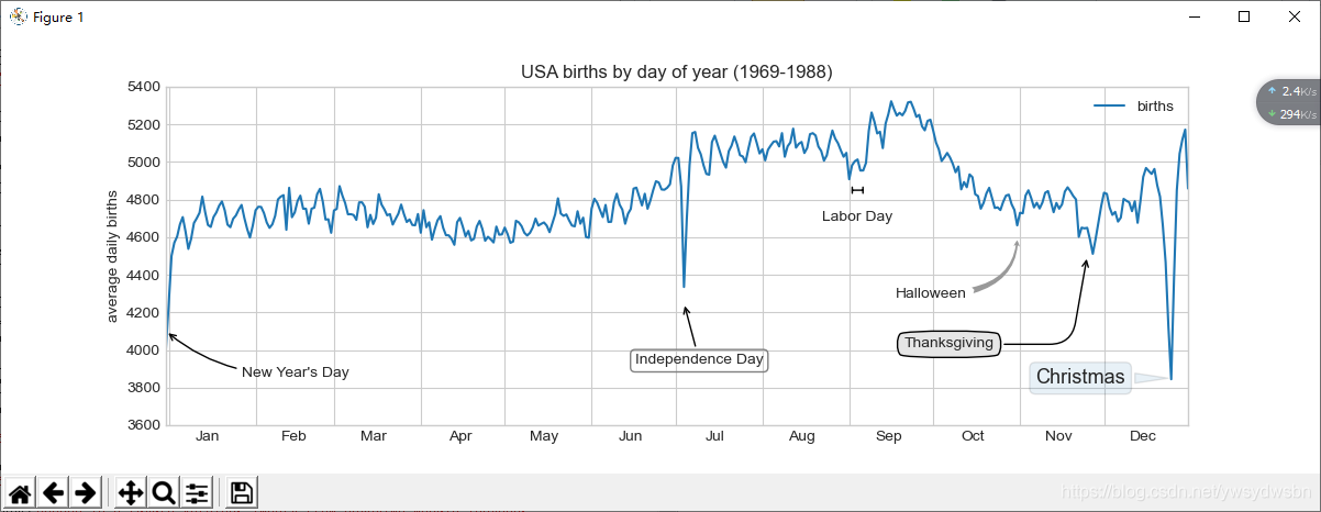
你可能已经注意到了,箭头和文本框的配置功能非常细致,这样你就可以创建自己想要的箭头风格了。不过,功能太过细致往往也就意味着操作起来比较复杂,如果真要做一个产品级的图形,可能得耗费大量的时间。最后我想说一句,前面适用的混合风格并不是数据可视化的最佳实践,仅仅是为演示一些功能而已。
备注
各位老铁觉得可以的话来个“点赞”、“关注”、“评论”
各位老铁觉得可以的话来个“点赞”、“关注”、“评论”
各位老铁觉得可以的话来个“点赞”、“关注”、“评论”
