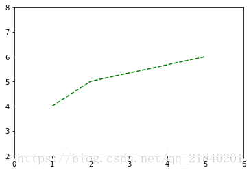
import matplotlib.pyplot as plt
plt.plot([1,2,5],[4,5,6],color='g',linestyle='dashed')
plt.axis([0,6,2,8])   ### axis([xmin, xmax, ymin, ymax])指定x,y的坐标范围
plt.show()
一、直线图--plot
### plot直线图
import matplotlib.pyplot as plt
x = [1,2,3]
y = [5,7,4]
x2 = [1,2,3]
y2 = [10,14,12]
plt.plot(x,y,label='first line')
plt.plot(x2,y2,label='second line')
plt.xlabel('index')
plt.ylabel('values')
plt.title('plot graph')
plt.legend(loc=1)
       ###    ‘best’           0
       ###     'upper right'     1
       ###     'upper left'      2
       ###     'lower left'      3
       ###     'lower right'     4
       ###     'right'           5
       ###     'center left'     6
       ###     'center right'    7
       ###     'lower center'    8
       ###     'upper center'    9
       ###     'center'          10
plt.show()
二、条形图--bar
### bar条形图
import matplotlib.pyplot as plt
plt.bar([1,3,5,7,9],[5,2,7,8,2], label="Example one",color='r')
plt.bar([2,4,6,8,10],[8,6,2,5,6], label="Example two", color='g')
plt.xlabel('bar number')
plt.ylabel('bar height')
plt.title('bar graph')
plt.legend()
plt.show()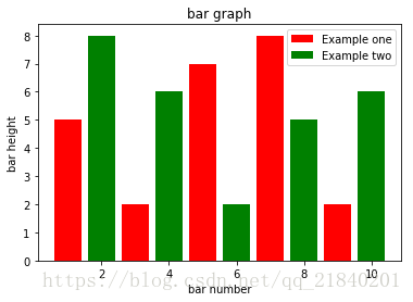
三、直方图--hist
### hist直方图
import matplotlib.pyplot as plt

population_ages = [1,6,7,11,12,13,16,17,18,19,20]
bins = [0,5,10,15,20]
plt.hist(population_ages, bins,label='hist graph',histtype='bar', rwidth=0.4)
plt.xlabel('x')
plt.ylabel('y')
plt.title('hist graph')
plt.legend()
plt.show()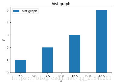
四、散点图--scatter
### scatter 散点图
import matplotlib.pyplot as plt
x = [1,3,4,7,8,9,10,4,8,10,11,6]
y = [5,2,4,2,1,4,5,2,8,9,10,6]
plt.scatter(x,y, label='scatter graph',color='b', s=25, marker="+")
plt.xlabel('x')
plt.ylabel('y')
plt.title('scatter graph')
plt.legend(loc=1)
plt.show()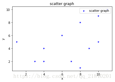
五、堆叠图--stack
### stack 堆叠图
import matplotlib.pyplot as plt

days = [1,2,3,4,5]

sleeping = [7,8,6,11,7]
eating =   [2,3,4,3,2]
working =  [7,8,7,2,2]
playing =  [8,5,7,8,13]
plt.stackplot(days, sleeping,eating,working,playing,colors=['b','r','g','k'])
plt.plot([],[],color='b', label='Sleeping', linewidth=5)
plt.plot([],[],color='r', label='Eating', linewidth=5)
plt.plot([],[],color='g', label='Working', linewidth=5)
plt.plot([],[],color='k', label='Playing', linewidth=5)
plt.xlabel('days')
plt.ylabel('sleeping...')
plt.title('stack graph')
plt.legend()
plt.show()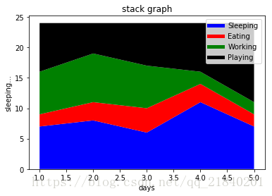
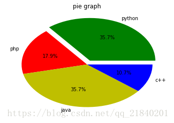
六、饼状图--pie
import matplotlib.pyplot as plt

slices = [100,50,100,30]
activities = ['python','php','java','c++']
cols = ['g','r','y','b']
plt.pie(slices,labels=activities,colors=cols,autopct='%1.1f%%',explode=(0.1,0,0,0))
###计算出百分比,可以单独拉出某一个切片(python)
plt.title('pie graph')
plt.show()