目录
1、qplot作图
geom指定图形形状,=point散点图,=bar柱状图,=histogram直方图,=density密度曲线,=boxplot箱线图
-
散点图
library(ggplot2)
head(mtcars,10)## mpg cyl disp hp drat wt qsec vs am gear carb
## Mazda RX4 21.0 6 160.0 110 3.90 2.620 16.46 0 1 4 4
## Mazda RX4 Wag 21.0 6 160.0 110 3.90 2.875 17.02 0 1 4 4
## Datsun 710 22.8 4 108.0 93 3.85 2.320 18.61 1 1 4 1
## Hornet 4 Drive 21.4 6 258.0 110 3.08 3.215 19.44 1 0 3 1
## Hornet Sportabout 18.7 8 360.0 175 3.15 3.440 17.02 0 0 3 2
## Valiant 18.1 6 225.0 105 2.76 3.460 20.22 1 0 3 1
## Duster 360 14.3 8 360.0 245 3.21 3.570 15.84 0 0 3 4
## Merc 240D 24.4 4 146.7 62 3.69 3.190 20.00 1 0 4 2
## Merc 230 22.8 4 140.8 95 3.92 3.150 22.90 1 0 4 2
## Merc 280 19.2 6 167.6 123 3.92 3.440 18.30 1 0 4 4#散点图
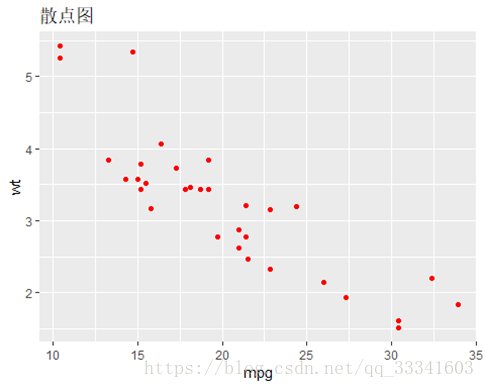
qplot(mpg,wt,main="散点图",data=mtcars,colour=I("red"))#所有数据点为红色
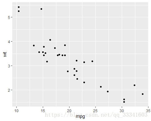
#以下命令也可以画散点图
qplot(mpg,wt,geom = 'point',data=mtcars)
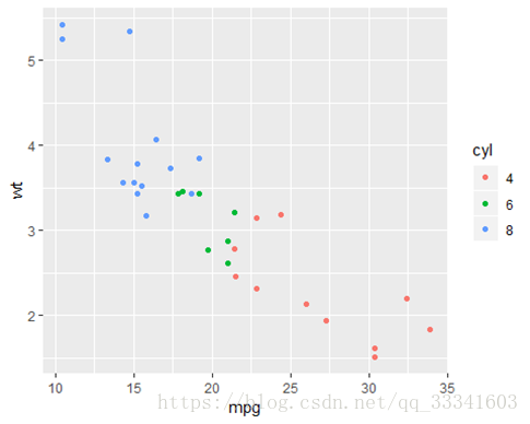
#分类散点图
mtcars$cyl<-factor(mtcars$cyl)
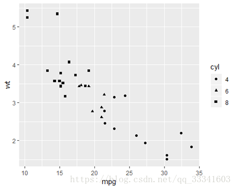
qplot(mpg,wt,colour=cyl,data=mtcars)#cyl是因子,离散的属性变量,按颜色区分各组数据点
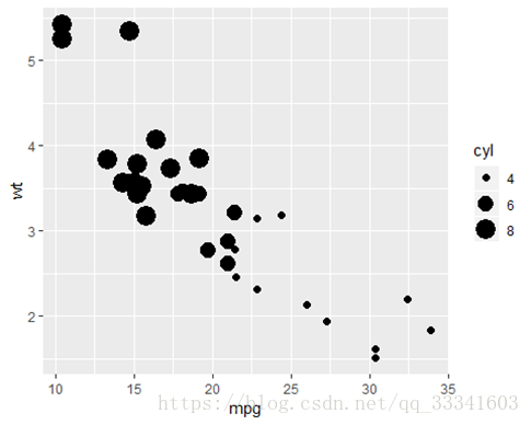
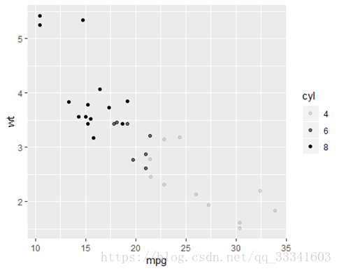
qplot(mpg,wt,size=cyl,data=mtcars)#按大小区分各组数据点
qplot(mpg,wt,shape=cyl,data=mtcars)#按形状区分
qplot(mpg,wt,alpha=cyl,data=mtcars)#按透明度区分
-
直方图
qplot(qsec,geom = "histogram",data = mtcars,bin=1)#bin调整矩形宽度

-
密度曲线图
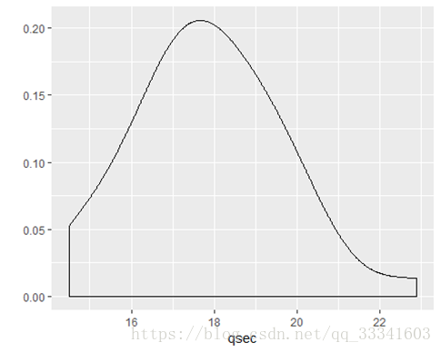
qplot(qsec,geom = "density",adjust=1.5,data = mtcars)#adjust越大,曲线越平滑
-
柱状图
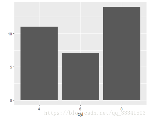
qplot(cyl,geom = "bar",data=mtcars)
qplot(cyl,geom = "bar",data=mtcars,weight=mpg)#weight显示mpg变量中各cyl值的求和

柱状图与直方图区别:柱状图是描述属性变量的概率分布;而直方图是连续变量的概率分布
-
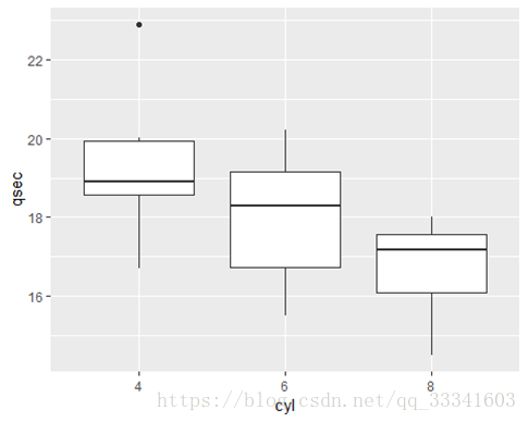
箱线图
–检测数据中的偏差值。必须指定X轴的变量
qplot(x='qsec',qsec,geom = "boxplot",data = mtcars)#单变量
qplot(x=cyl,qsec,geom = "boxplot",data = mtcars)#双变量,有分组

-
折线图
--时间序列图(要将X轴设置为时间)
head(economics,10)
## # A tibble: 10 x 6
## date pce pop psavert uempmed unemploy
## <date> <dbl> <int> <dbl> <dbl> <int>
## 1 1967-07-01 507. 198712 12.5 4.5 2944
## 2 1967-08-01 510. 198911 12.5 4.7 2945
## 3 1967-09-01 516. 199113 11.7 4.6 2958
## 4 1967-10-01 513. 199311 12.5 4.9 3143
## 5 1967-11-01 518. 199498 12.5 4.7 3066
## 6 1967-12-01 526. 199657 12.1 4.8 3018
## 7 1968-01-01 532. 199808 11.7 5.1 2878
## 8 1968-02-01 534. 199920 12.2 4.5 3001
## 9 1968-03-01 545. 200056 11.6 4.1 2877
## 10 1968-04-01 545. 200208 12.2 4.6 2709qplot(date,uempmed,geom = 'line',data = economics)

-
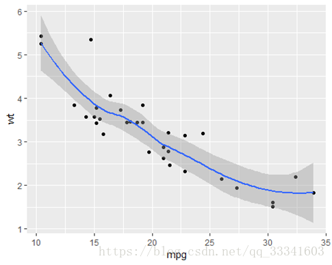
多个图形组合
–在geom中添加相应图形即可
qplot(mpg,wt,geom = c('point','smooth'),data=mtcars)#smooth平滑曲线
-
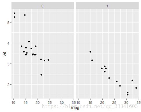
分面功能
–facets按照指定的变量分面
qplot(mpg,wt,facets = vs~am,data=mtcars)
qplot(mpg,wt,facets = vs~.,data=mtcars)
qplot(mpg,wt,facets = .~am,data=mtcars)


2、ggplot作图
–在一张白纸上逐渐添加图层
head(diamonds)
## # A tibble: 6 x 10
## carat cut color clarity depth table price x y z
## <dbl> <ord> <ord> <ord> <dbl> <dbl> <int> <dbl> <dbl> <dbl>
## 1 0.23 Ideal E SI2 61.5 55 326 3.95 3.98 2.43
## 2 0.21 Premium E SI1 59.8 61 326 3.89 3.84 2.31
## 3 0.23 Good E VS1 56.9 65 327 4.05 4.07 2.31
## 4 0.290 Premium I VS2 62.4 58 334 4.2 4.23 2.63
## 5 0.31 Good J SI2 63.3 58 335 4.34 4.35 2.75
## 6 0.24 Very Good J VVS2 62.8 57 336 3.94 3.96 2.48diamonds.sample<-diamonds[sample(nrow(diamonds),100),]#从数据集diamonds中抽取100个样本
-
多个图形组合在
一 第一个创建白板,然后加上散点图,最后加上趋势线
ggplot(diamonds.sample,aes(carat,price)) + geom_point()+stat_smooth()

-
条形图添加颜色–标尺设定离散颜色
ggplot(diamonds.sample,aes(cut,fill=cut)) + geom_bar()+scale_fill_hue()

-
条形图添加颜色–标尺设定渐变颜色
ggplot(diamonds.sample,aes(cut,fill=cut)) + geom_bar()+scale_fill_brewer()

-
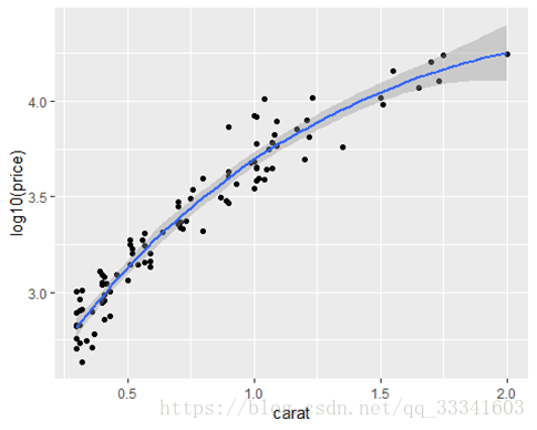
对图形进行尺度变换
ggplot(diamonds.sample,aes(carat,log10(price))) + geom_point()+stat_smooth()#对Y值进行对数变换,但坐标轴是经过变换的值
ggplot(diamonds.sample,aes(carat,price)) + geom_point()+stat_smooth()+scale_y_log10()#对Y值进行对数变换,但坐标轴仍显示原变量的值

-
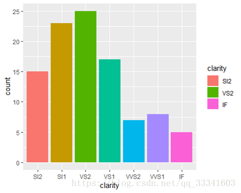
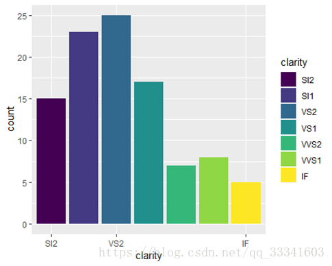
X轴、图例标签
ggplot(diamonds.sample,aes(clarity,fill=clarity))+geom_bar()+scale_fill_hue(breaks=c('SI2','VS2','IF'))#scale_fill_hue(breaks=c('SI2','VS2','IF')设置在图例中显示的标签
ggplot(diamonds.sample,aes(clarity,fill=clarity))+geom_bar()+scale_x_discrete(breaks=c('SI2','VS2','IF'))#scale_x_discrete(breaks=c('SI2','VS2','IF')设置在X轴上显示的标签
-
分面facet_grid()
ggplot(diamonds.sample,aes(depth,price)) + geom_point()+facet_grid(cut~color,margin=T)#margin=T添加边栏总数目

-
保存图
p<-ggplot(diamonds.sample,aes(depth,price))+geom_point()+facet_grid(cut~color,margin=T)
ggsave('C:\\Users\\lilil\\Desktop\\p.pdf',width=4,height=4)