qplot
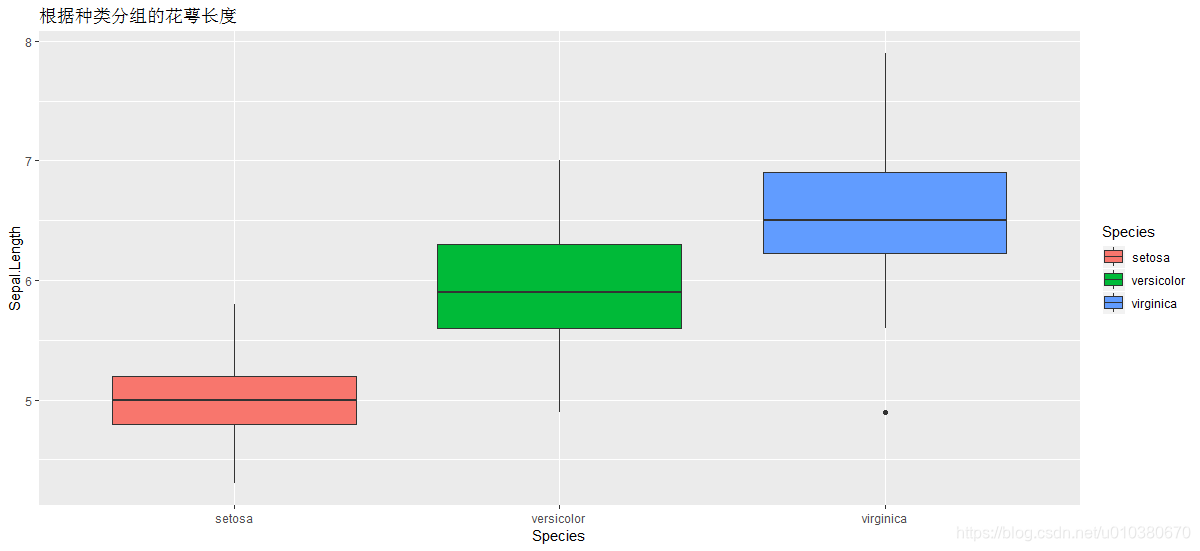
qplot(Species,Sepal.Length,data = iris,geom = "boxplot",fill=Species,
      main = "根据种类分组的花萼长度")
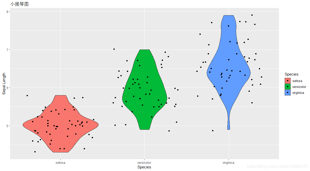
小提琴图
qplot(Species,Sepal.Length,data=iris,geom=c("violin","jitter"),fill=Species,main = "小提琴图")
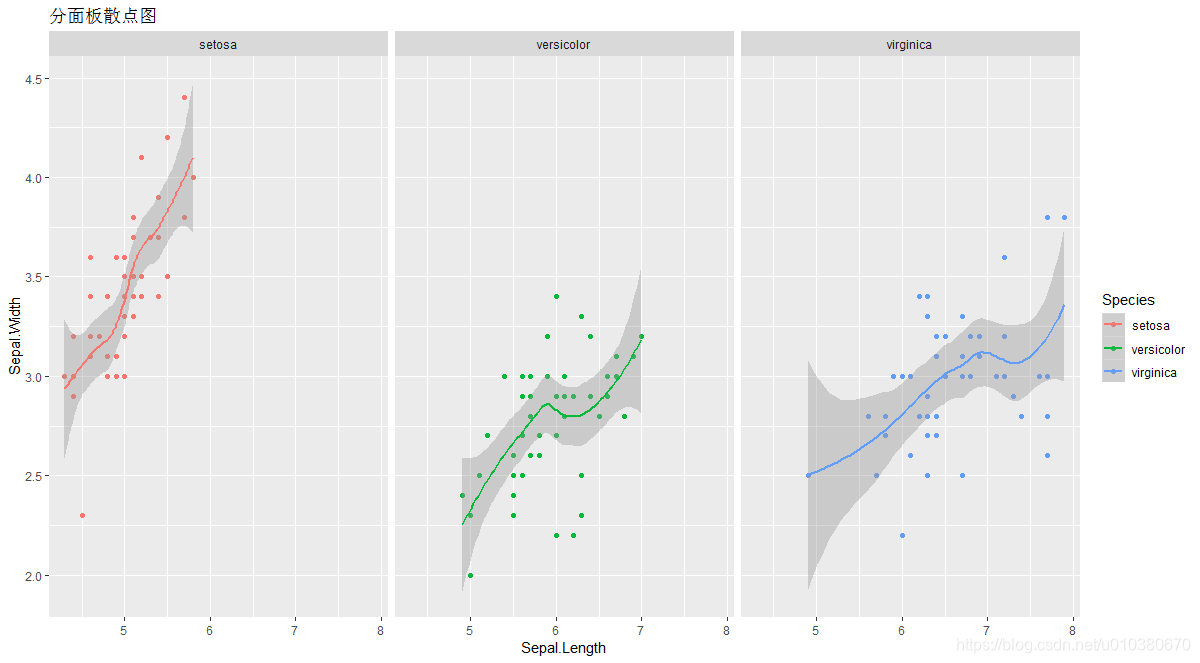
分面板散点图
qplot(Sepal.Length,Sepal.Width,data = iris,geom = c("point","smooth"),
      facets = ~Species,col=Species,main = "分面板散点图")
ggplot
初始化一个ggplot对象
layer
创建一个新图层
layer(geom = NULL, stat = NULL, data = NULL, mapping = NULL,
position = NULL, params = list(), inherit.aes = TRUE,
check.aes = TRUE, check.param = TRUE, show.legend = NA)
aes
描述数据中的变量如何映射到geom的视觉属性
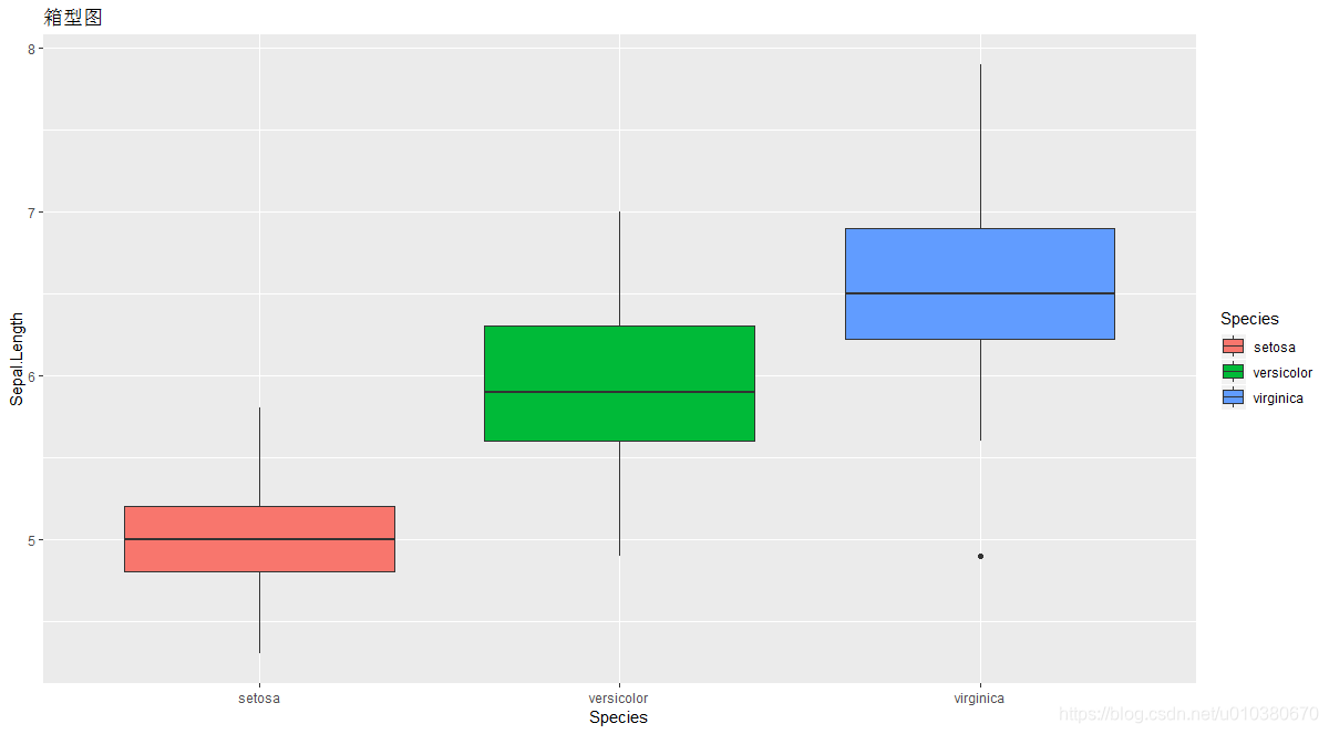
ggplot(iris,aes(x=Species,y=Sepal.Length,fill=Species))+geom_boxplot()+labs(title = "箱型图")
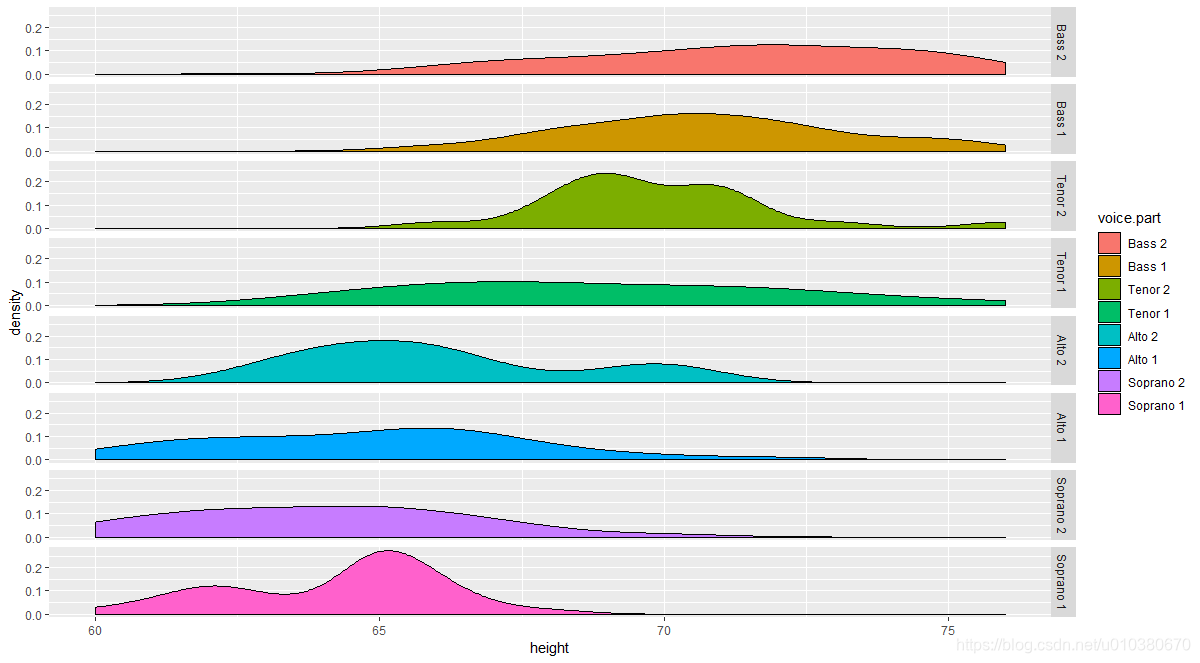
ggplot(singer,aes(x=height,fill=voice.part))+geom_density()+facet_grid(voice.part~.)
ggplot(singer,aes(x=height,fill=voice.part))+geom_density()+facet_wrap(voice.part~.,ncol=4)
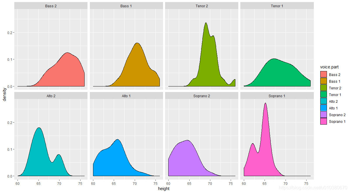
ggplot(singer,aes(x=height,fill=voice.part))+geom_density()+facet_wrap(voice.part~.,ncol=4)+theme(legend.position = "none")

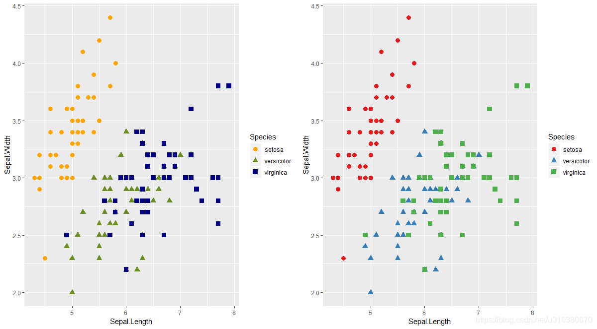
scale_color_manual scale_color_brewer改变图形颜色
g1 <- ggplot(iris,aes(x=Sepal.Length,y=Sepal.Width,colour=Species,
                      shape=Species))+scale_color_manual(values = c("orange","olivedrab","navy"))+
                      geom_point(size=3)
g2 <- ggplot(iris,aes(x=Sepal.Length,y=Sepal.Width,colour=Species,
                      shape=Species))+scale_color_brewer(palette="Set1")+
  geom_point(size=3)
grid.arrange(g1,g2,ncol=2)
ggsave()
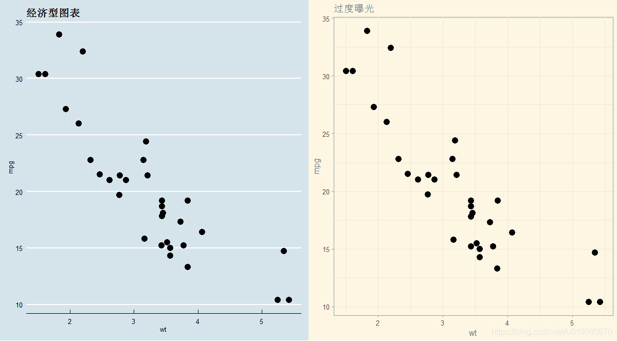
library(ggthemes)
p1 <- ggplot(mtcars,aes(x=wt,y=mpg))+geom_point(size=4)
p2 <- p1+ggtitle("经济型图表")+theme_economist()+scale_colour_economist()
p3 <- p1+ggtitle("过度曝光")+theme_solarized()+scale_colour_solarized("blue")
grid.arrange(p2,p3,ncol=2)
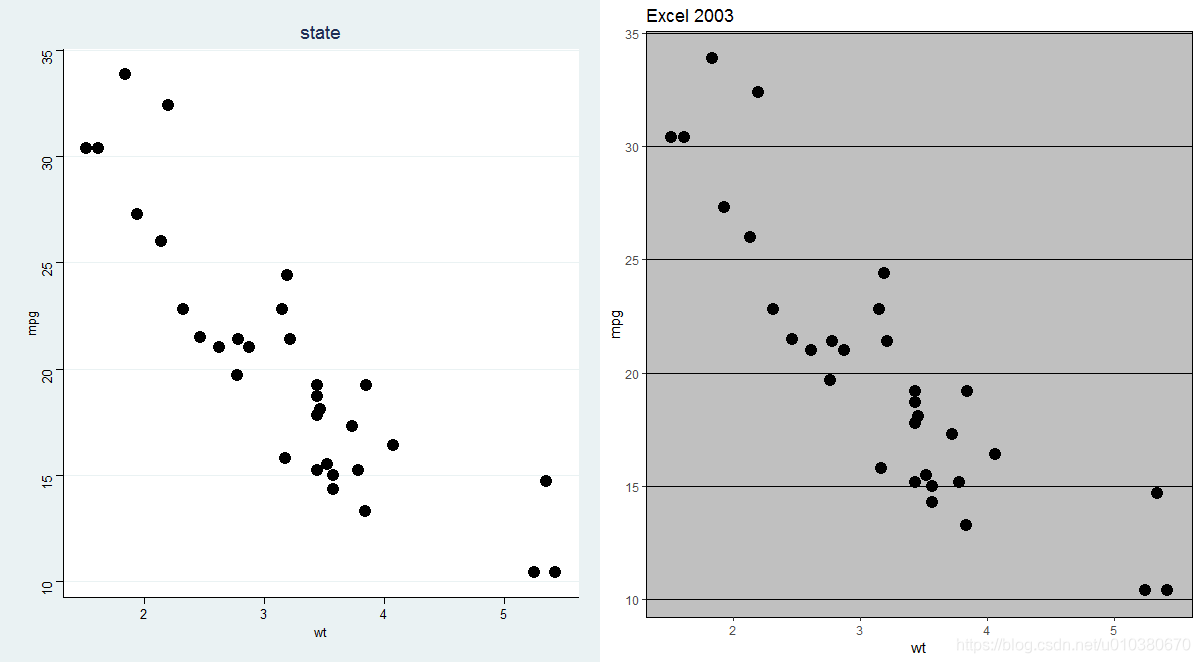
p4 <- p1+ggtitle("state")+theme_stata()+scale_colour_stata()
p5 <- p1+ggtitle("Excel 2003")+theme_excel()+scale_colour_excel_new()
grid.arrange(p4,p5,ncol=2)