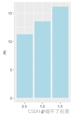
1、简单条形图
数据背景:测定3种浓度下某物质的含量。这里浓度仍然可以看做factor型的数据,数据类型和折线图的数据一样。
基础语法:
library(ggplot2)
df = data.frame(
c = c(0.5,1,1.5),
m = c(11.2,13.5,16.1)
)b = ggplot(df, aes(x=c, y=m))
b + geom_bar(fill = "lightblue", stat = "identity")
添加数值:
使用geom_text()添加文字,主要目的计算y值。
b + geom_bar(fill = "lightblue", stat = "identity")+
geom_text(aes(y = m - 0.2*m, label = m), vjust = 1.6,
color = "black", size = 3.5)
添加误差棒:
同样要先处理数据,计算sd和mean。
library("dplyr")
df = data.frame(
c = c(0.5,0.5,0.5,1,1,1,1.5,1.5,1.5),
m = c(11.2,11,12,13,12.1,13.5,15.2,15,16.1)
)
df$c = factor(df$c)
df2 <- df %>%
group_by(c) %>%
summarise(
sd = sd(m),
m = mean(m)
)
df2
b = ggplot(df2, aes(x=c, y=m))
b = b + geom_bar(fill = "lightblue", color = "black",stat = "identity")
b + geom_errorbar(aes(x = c, y = m,
ymin = m-sd, ymax = m+sd,
width = 0.2
))


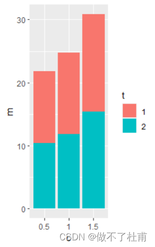
2、多组数据条形图
这里的数据相当于有2种物质在3种浓度下的含量。
基本语法:
型1:
df = data.frame(
t = c(1,1,1,1,1,1,1,1,1,
2,2,2,2,2,2,2,2,2),
c = c(0.5,0.5,0.5,1,1,1,1.5,1.5,1.5,
0.5,0.5,0.5,1,1,1,1.5,1.5,1.5),
m = c(11.2,11,12,13,12.1,13.5,15.2,15,16.1,
10.2,10,11,12,12.1,11.5,14.2,16,16.1)
)
df$c = factor(df$c)
df$t = factor(df$t)df2 <- df %>%
group_by(c,t) %>%
summarise(
sd = sd(m),
m = mean(m)
)b = ggplot(df2, aes(x=c, y=m))
b = b + geom_bar(aes(fill = t), position = "dodge",stat = "identity")
b
添加误差线:
b + geom_errorbar(aes(color = t,ymin = m-sd, ymax = m+sd),
position ="dodge"
)


型2:
b1 = ggplot(df2, aes(x=c, y=m))
b1 = b1+ geom_bar(aes(fill = t),stat = "identity")
b1