多画布
#add_subplot(first,second,index) first means number of Row,second means number of Column.

import matplotlib.pyplot as plt
fig = plt.figure()
ax1 = fig.add_subplot(3,2,1)
ax2 = fig.add_subplot(3,2,2)
ax2 = fig.add_subplot(3,2,6)
plt.show()
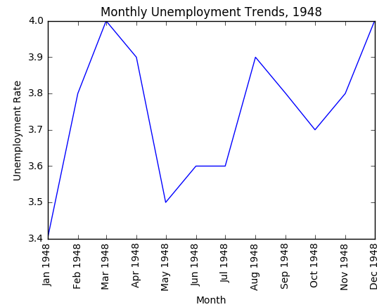
折线图
#xlabel(): accepts a string value, which gets set as the x-axis label.
#ylabel(): accepts a string value, which is set as the y-axis label.
#title(): accepts a string value, which is set as the plot title.

plt.plot(first_twelve['DATE'], first_twelve['VALUE'])
plt.xticks(rotation=90)
plt.xlabel('Month')
plt.ylabel('Unemployment Rate')
plt.title('Monthly Unemployment Trends, 1948')
plt.show()
多条线
unrate['MONTH'] = unrate['DATE'].dt.month
unrate['MONTH'] = unrate['DATE'].dt.month
fig = plt.figure(figsize=(6,3))

plt.plot(unrate[0:12]['MONTH'], unrate[0:12]['VALUE'], c='red')
plt.plot(unrate[12:24]['MONTH'], unrate[12:24]['VALUE'], c='blue')

plt.show()

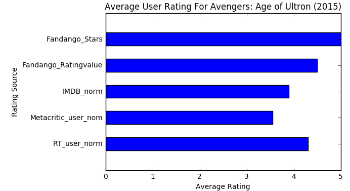
柱状图
import matplotlib.pyplot as plt
from numpy import arange
num_cols = ['RT_user_norm', 'Metacritic_user_nom', 'IMDB_norm', 'Fandango_Ratingvalue', 'Fandango_Stars']

bar_widths = norm_reviews.ix[0, num_cols].values
bar_positions = arange(5) + 0.75
tick_positions = range(1,6)
fig, ax = plt.subplots()
ax.barh(bar_positions, bar_widths, 0.5)

ax.set_yticks(tick_positions)
ax.set_yticklabels(num_cols)
ax.set_ylabel('Rating Source')
ax.set_xlabel('Average Rating')
ax.set_title('Average User Rating For Avengers: Age of Ultron (2015)')
plt.show()
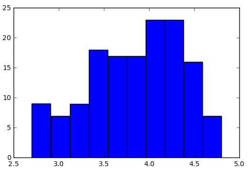
直方图
fig, ax = plt.subplots()
ax.hist(norm_reviews['Fandango_Ratingvalue'])
#ax.hist(norm_reviews['Fandango_Ratingvalue'],bins=20)
#ax.hist(norm_reviews['Fandango_Ratingvalue'], range=(4, 5),bins=20)
plt.show()
柱状图VS直方图
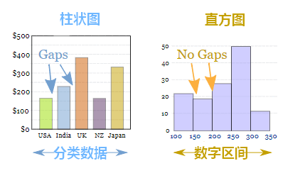
区别:
1.直方图展示数据的分布,柱状图比较数据的大小。
2.直方图X轴为定量数据,柱状图X轴为分类数据。
3.直方图柱子无间隔,柱状图柱子有间隔
散点图
#Switching Axes
fig = plt.figure(figsize=(5,10))
ax1 = fig.add_subplot(2,1,1)
ax2 = fig.add_subplot(2,1,2)
ax1.scatter(norm_reviews['Fandango_Ratingvalue'], norm_reviews['RT_user_norm'])
ax1.set_xlabel('Fandango')
ax1.set_ylabel('Rotten Tomatoes')
ax2.scatter(norm_reviews['RT_user_norm'], norm_reviews['Fandango_Ratingvalue'])
ax2.set_xlabel('Rotten Tomatoes')
ax2.set_ylabel('Fandango')
plt.show()

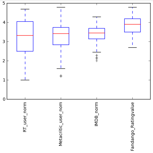
箱线图
num_cols = ['RT_user_norm', 'Metacritic_user_nom', 'IMDB_norm', 'Fandango_Ratingvalue']
fig, ax = plt.subplots()
ax.boxplot(norm_reviews[num_cols].values)
ax.set_xticklabels(num_cols, rotation=90)
ax.set_ylim(0,5)
plt.show()
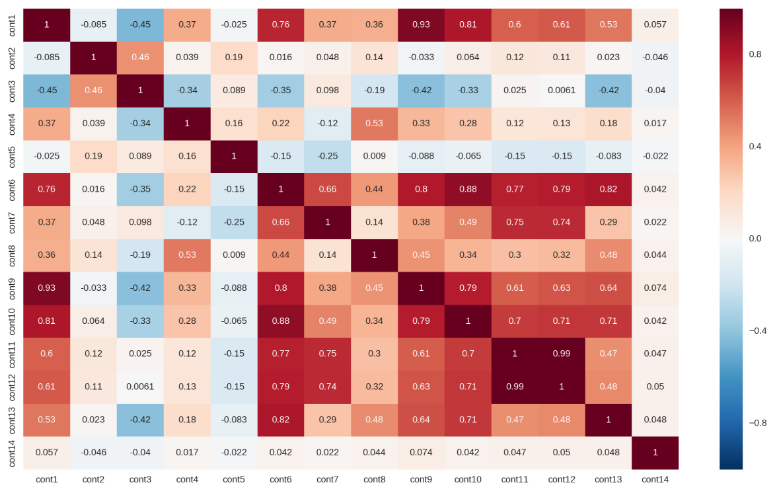
特征之间的相关性
plt.subplots(figsize=(16,9))
correlation_mat = train[cont_features].corr()
sns.heatmap(correlation_mat, annot=True)