python—matplotlib可视化基础图形
导入需要的基础模块并设置数据集
import numpy as np
import pandas as pd
import matplotlib.pyplot as plt    #导入画图模块
import matplotlib

#魔法函数,内嵌绘图,不必使用plt.show()来显示图形
%matplotlib inline

np.random.seed(100)    #设置随机数种子,便于每次生成的随机数都一致
df = pd.DataFrame(np.random.randint(-10,10,(10,3)),
                 index = pd.date_range("1/1/2000",periods = 10),columns = list("ABC"))
df = df.cumsum()    #数据进行累加
df.head()       #显示前五个数据
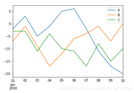
折线图——查看数据的变化趋势
df.plot() #默认情况下的参数kind = "line",x轴是索引行,y轴是columns列
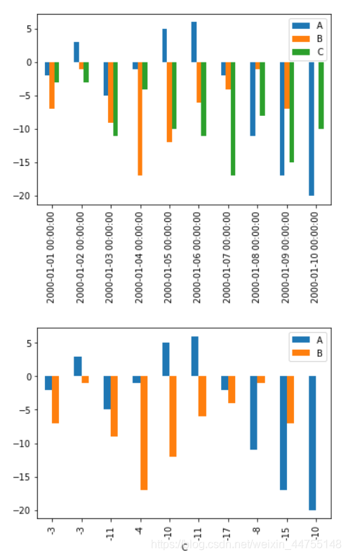
柱状图——对于离散型数据,我们可以看到不同类别之间的分布情况
df.plot(kind = 'bar')
df.plot(kind = 'bar',x = 'C',y = ['A','B'])      #修改x,y轴的数据
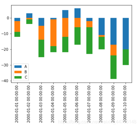
堆积柱状图——不仅能比较各类别总体区别,还能同时还能看出每个类别中子成分的占比情况
df.plot(kind = 'bar',stacked = True)
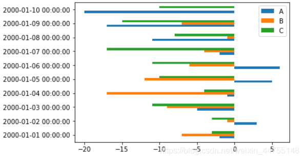
条形图——水平条形图在类别名称很长的时候非常方便
df.plot(kind = 'barh')
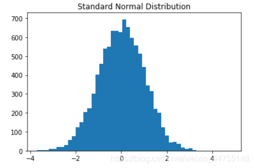
直方图——查看数据集的分布情况
a = np.random.randn(10000)
plt.hist(a,bins = 50)    #bins 箱子个数
plt.title("Standard Normal Distribution")
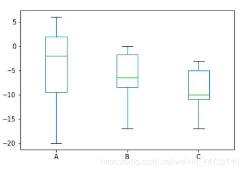
箱线图——用来展示数据的描述统计信息(即四分位数)
上下两端的横线:代表最大和最小值,如有冒出去的点,理解为异常值就好
箱子的上下限:分别是数据的上四分位数和下四分位数,意味着箱子包含了50%的数据,箱子的高低反应了数据的波动程度
箱子中间的横线表示中位数,代表数据的平均水平
df.plot(kind = 'box')
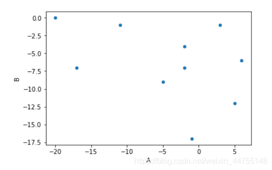
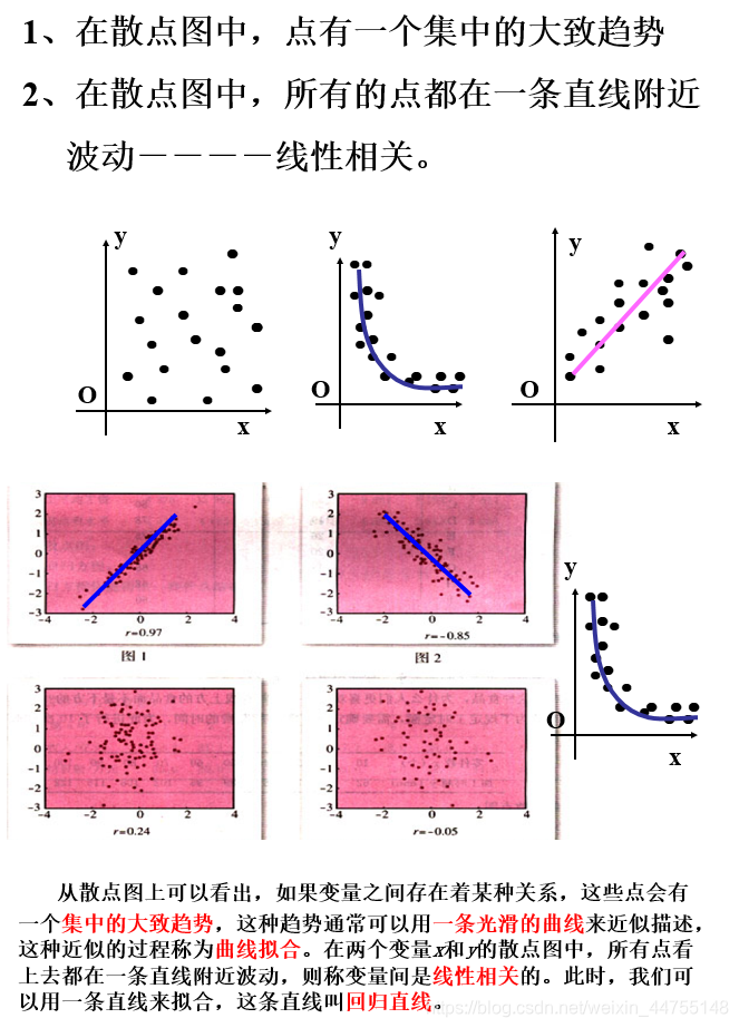
散点图——描述数据之间的相关性
df.plot(kind = 'scatter',x = 'A', y = 'B')
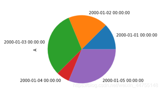
饼图——用面积表示一组数据的占比
a = df['A'][:5]      #  df.A[:5]这种取数也OK
a.abs().plot(kind = 'pie',figsize= (4,4))
备注:资源来源于微信公众号“数据蛙DataFrog”,推荐关注!