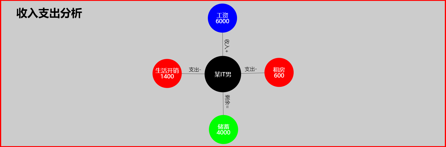
图表效果如下:
具体代码如下:
-
-
<html>
-
<head>
-
<meta charset="UTF-8">
-
<title>关系图案例 </title>
-
<!-- 引入 ECharts 文件 -->
-
<script src="js/echarts4.0.js" type="text/javascript" charset="utf-8"> </script>
-
</head>
-
<body>
-
<!-- 为 ECharts 准备一个具备大小(宽高)的 容器 -->
-
<div id="chart1" style="width: 80%;height: 400px;top: 50px;left: 10%;border: 3px solid #FF0000;"> </div>
-
</body>
-
</html>
-
<script type="text/javascript">
-
// 基于准备好的容器(这里的容器是id为chart1的div),初始化echarts实例
-
var chart1 = echarts.init( document.getElementById( "chart1"));
-
-
var option = {
-
backgroundColor: '#ccc', // 背景颜色
-
title: { // 图表标题
-
text: "收入支出分析", // 标题文本
-
left : '3%', // 标题距离左侧边距
-
top : '3%', // 标题距顶部边距
-
textStyle : { // 标题样式
-
color : '#000', // 标题字体颜色
-
fontSize : '30', // 标题字体大小
-
}
-
},
-
tooltip: { // 提示框的配置
-
formatter: function(param) {
-
if (param.dataType === 'edge') {
-
//return param.data.category + ': ' + param.data.target;
-
return param.data.target;
-
}
-
//return param.data.category + ': ' + param.data.name;
-
return param.data.name;
-
}
-
},
-
-
series: [{
-
type: "graph", // 系列类型:关系图
-
top: '10%', // 图表距离容器顶部的距离
-
roam: true, // 是否开启鼠标缩放和平移漫游。默认不开启。如果只想要开启缩放或者平移,可以设置成 'scale' 或者 'move'。设置成 true 为都开启
-
focusNodeAdjacency: true, // 是否在鼠标移到节点上的时候突出显示节点以及节点的边和邻接节点。[ default: false ]
-
force: { // 力引导布局相关的配置项,力引导布局是模拟弹簧电荷模型在每两个节点之间添加一个斥力,每条边的两个节点之间添加一个引力,每次迭代节点会在各个斥力和引力的作用下移动位置,多次迭代后节点会静止在一个受力平衡的位置,达到整个模型的能量最小化。
-
// 力引导布局的结果有良好的对称性和局部聚合性,也比较美观。
-
repulsion: 1000, // [ default: 50 ]节点之间的斥力因子(关系对象之间的距离)。支持设置成数组表达斥力的范围,此时不同大小的值会线性映射到不同的斥力。值越大则斥力越大
-
edgeLength: [ 150, 100] // [ default: 30 ]边的两个节点之间的距离(关系对象连接线两端对象的距离,会根据关系对象值得大小来判断距离的大小),
-
// 这个距离也会受 repulsion。支持设置成数组表达边长的范围,此时不同大小的值会线性映射到不同的长度。值越小则长度越长。如下示例:
-
// 值最大的边长度会趋向于 10,值最小的边长度会趋向于 50 edgeLength: [10, 50]
-
},
-
layout: "force", // 图的布局。[ default: 'none' ]
-
// 'none' 不采用任何布局,使用节点中提供的 x, y 作为节点的位置。
-
// 'circular' 采用环形布局;'force' 采用力引导布局.
-
// 标记的图形
-
//symbol: "path://M19.300,3.300 L253.300,3.300 C262.136,3.300 269.300,10.463 269.300,19.300 L269.300,21.300 C269.300,30.137 262.136,37.300 253.300,37.300 L19.300,37.300 C10.463,37.300 3.300,30.137 3.300,21.300 L3.300,19.300 C3.300,10.463 10.463,3.300 19.300,3.300 Z",
-
symbol: 'circle',
-
lineStyle: { // 关系边的公用线条样式。其中 lineStyle.color 支持设置为'source'或者'target'特殊值,此时边会自动取源节点或目标节点的颜色作为自己的颜色。
-
normal: {
-
color: '#000', // 线的颜色[ default: '#aaa' ]
-
width: 1, // 线宽[ default: 1 ]
-
type: 'solid', // 线的类型[ default: solid ] 'dashed' 'dotted'
-
opacity: 0.5, // 图形透明度。支持从 0 到 1 的数字,为 0 时不绘制该图形。[ default: 0.5 ]
-
curveness: 0 // 边的曲度,支持从 0 到 1 的值,值越大曲度越大。[ default: 0 ]
-
}
-
},
-
label: { // 关系对象上的标签
-
normal: {
-
show: true, // 是否显示标签
-
position: "inside", // 标签位置:'top''left''right''bottom''inside''insideLeft''insideRight''insideTop''insideBottom''insideTopLeft''insideBottomLeft''insideTopRight''insideBottomRight'
-
textStyle: { // 文本样式
-
fontSize: 16
-
}
-
}
-
},
-
edgeLabel: { // 连接两个关系对象的线上的标签
-
normal: {
-
show: true,
-
textStyle: {
-
fontSize: 14
-
},
-
formatter: function(param) { // 标签内容
-
return param.data.category;
-
}
-
}
-
},
-
data: [{
-
name: "某IT男",
-
draggable: true, // 节点是否可拖拽,只在使用力引导布局的时候有用。
-
symbolSize: [ 100, 100], // 关系图节点标记的大小,可以设置成诸如 10 这样单一的数字,也可以用数组分开表示宽和高,例如 [20, 10] 表示标记宽为20,高为10。
-
itemStyle: {
-
color: '#000' // 关系图节点标记的颜色
-
},
-
category: "收入支出分析" // 数据项所在类目的 index。
-
}, {
-
name: "工资\n6000",
-
draggable: true,
-
symbolSize: [ 80, 80],
-
itemStyle: {
-
color: '#0000ff'
-
},
-
category: "收入+"
-
}, {
-
name: "租房\n600",
-
draggable: true,
-
symbolSize: [ 80, 80],
-
itemStyle: {
-
color: '#ff0000'
-
},
-
category: "支出-"
-
}, {
-
name: "生活开销\n1400",
-
draggable: true,
-
symbolSize: [ 80, 80],
-
itemStyle: {
-
color: '#ff0000'
-
},
-
category: "支出-"
-
}, {
-
name: "储蓄\n4000",
-
draggable: true,
-
symbolSize: [ 80, 80],
-
itemStyle: {
-
color: '#00ff00'
-
},
-
category: "剩余="
-
}],
-
categories: [{ // 节点分类的类目,可选。如果节点有分类的话可以通过 data[i].category 指定每个节点的类目,类目的样式会被应用到节点样式上。图例也可以基于categories名字展现和筛选。
-
name: "收入支出分析" // 类目名称,用于和 legend 对应以及格式化 tooltip 的内容。
-
}, {
-
name: "收入+"
-
}, {
-
name: "支出-"
-
}, {
-
name: "支出-"
-
}, {
-
name: "剩余="
-
}],
-
links: [{ // 节点间的关系数据
-
target: "工资\n6000",
-
source: "某IT男",
-
category: "收入+" // 关系对象连接线上的标签内容
-
}, {
-
target: "租房\n600",
-
source: "某IT男",
-
category: "支出-"
-
}, {
-
target: "生活开销\n1400",
-
source: "某IT男",
-
category: "支出-"
-
}, {
-
target: "储蓄\n4000",
-
source: "某IT男",
-
category: "剩余="
-
}]
-
}],
-
-
animationEasingUpdate: "quinticInOut", // 数据更新动画的缓动效果。[ default: cubicOut ] "quinticInOut"
-
animationDurationUpdate: 100 // 数据更新动画的时长。[ default: 300 ]
-
};
-
-
// 使用刚指定的配置项和数据显示图表
-
chart1.setOption(option)
-
</script>
想要使用该图表,只需要 复制以上代码 ,再下载 echarts.js 在页面文件中引入即可.
注:想要让图表由金字塔转变为漏斗图,只需建将代码中图表配置项中的 sort : 'ascending' 改为 sort : 'descending' 即可。
echarts.js 下载链接: http://echarts.baidu.com/download.html