使用geom_bar()函数绘制条形图,条形图的高度通常表示两种情况之一:每组中的数据的个数,或数据框中列的值,高度表示的含义是由geom_bar()函数的参数stat决定的,stat在geom_bar()函数中有两个有效值:count和identity。默认情况下,stat="count",这意味着每个条的高度等于每组中的数据的个数,并且,它与映射到y的图形属性不相容,所以,当设置stat="count"时,不能设置映射函数aes()中的y参数。如果设置stat="identity",这意味着条形的高度表示数据数据的值,而数据的值是由aes()函数的y参数决定的,就是说,把值映射到y,所以,当设置stat="identity"时,必须设置映射函数中的y参数,把它映射到数值变量。
geom_bar()函数的定义是:
geom_bar(mapping = NULL, data = NULL, stat = "count", width=0.9, position="stack")
参数注释:
- stat:设置统计方法,有效值是count(默认值) 和 identity,其中,count表示条形的高度是变量的数量,identity表示条形的高度是变量的值;
- position:位置调整,有效值是stack、dodge和fill,默认值是stack(堆叠),是指两个条形图堆叠摆放,dodge是指两个条形图并行摆放,fill是指按照比例来堆叠条形图,每个条形图的高度都相等,但是高度表示的数量是不尽相同的。
- width:条形图的宽度,是个比值,默认值是0.9
- color:条形图的线条颜色
- fill:条形图的填充色
关于stat参数,有三个有效值,分别是count、identity和bin:
- count是对离散的数据进行计数,计数的结果用一个特殊的变量..count.. 来表示,
- bin是对连续变量进行统计转换,转换的结果使用变量..density..来表示
- 而identity是直接引用数据集中变量的值
position参数也可以由两个函数来控制,参数vjust和widht是相对值:
position_stack(vjust = 1, reverse = FALSE)
position_dodge(width = NULL)
position_fill(vjust = 1, reverse = FALSE)
本文使用vcd包中的Arthritis数据集来演示如何创建条形图。

head(Arthritis)
  ID Treatment  Sex Age Improved
1 57   Treated Male  27     Some
2 46   Treated Male  29     None
3 77   Treated Male  30     None
4 17   Treated Male  32   Marked
5 36   Treated Male  46   Marked
6 23   Treated Male  58   Marked
其中变量Improved和Sex是因子类型,ID和Age是数值类型。
一,绘制基本的条形图
使用geom_bar()函数绘制条形图,
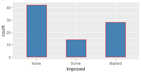
ggplot(data=ToothGrowth, mapping=aes(x=dose))+
  geom_bar(stat="count")
当然,我们也可以先对数据进行处理,得到按照Improved进行分类的频数分布表,然后使用geom_bar()绘制条形图:
mytable <- with(Arthritis,table(Improved))
df <- as.data.frame(mytable)

ggplot(data=df, mapping=aes(x=Improved,y=Freq))+
  geom_bar(stat="identity")
绘制的条形图是相同的,如下图所示:

二,修改条形图的图形属性
条形图的图形属性包括条形图的宽度,条形图的颜色,条形图的标签,分组和修改图例的位置等。
1,修改条形图的宽度和颜色
把条形图的相对宽度设置为0.5,线条颜色设置为red,填充色设置为steelblue
ggplot(data=Arthritis, mapping=aes(x=Improved))+
  geom_bar(stat="count",width=0.5, color='red',fill='steelblue')
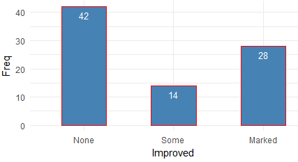
2,设置条形图的文本
使用geom_text()为条形图添加文本,显示条形图的高度,并调整文本的位置和大小。
当stat="count"时,设置文本的标签需要使用一个特殊的变量 aes(label=..count..), 表示的是变量值的数量。
ggplot(data=Arthritis, mapping=aes(x=Improved))+
  geom_bar(stat="count",width=0.5, color='red',fill='steelblue')+
  geom_text(stat='count',aes(label=..count..), vjust=1.6, color="white", size=3.5)+
  theme_minimal()
当stat="identity"时,设置文本的标签需要设置y轴的值,aes(lable=Freq),表示的变量的值。
mytable <- with(Arthritis,table(Improved))
df <- as.data.frame(mytable)

ggplot(data=df, mapping=aes(x=Improved,y=Freq))+
  geom_bar(stat="identity",width=0.5, color='red',fill='steelblue')+
  geom_text(aes(label=Freq), vjust=1.6, color="white", size=3.5)+
  theme_minimal()
添加文本数据之后,显示的条形图是:
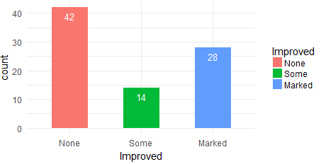
3,按照分组修改条形图的图形属性
把条形图按照Improved变量进行分组,设置每个分组的填充色,这通过aes(fill=Improved)来实现,每个分组的填充色依次是scale_color_manual()定义的颜色:
ggplot(data=Arthritis, mapping=aes(x=Improved,fill=Improved))+
  geom_bar(stat="count",width=0.5)+
  scale_color_manual(values=c("#999999", "#E69F00", "#56B4E9"))+
  geom_text(stat='count',aes(label=..count..), vjust=1.6, color="white", size=3.5)+
  theme_minimal()
4,修改图例的位置
修改图例的位置,通过theme(legend.position=) 来实现,默认的位置是right,有效值是right、top、bottom、left和none,其中none是指移除图例。
p <- ggplot(data=Arthritis, mapping=aes(x=Improved,fill=Improved))+
  geom_bar(stat="count",width=0.5)+
  scale_color_manual(values=c("#999999", "#E69F00", "#56B4E9"))+
  geom_text(stat='count',aes(label=..count..), vjust=1.6, color="white", size=3.5)+
  theme_minimal()

p + theme(legend.position="top")
p + theme(legend.position="bottom")
# Remove legend
p + theme(legend.position="none")
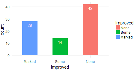
5,修改条形图的顺序
通过scale_x_discrete()函数修改标度的顺序:
p <- ggplot(data=Arthritis, mapping=aes(x=Improved,fill=Improved))+
  geom_bar(stat="count",width=0.5)+
  scale_color_manual(values=c("#999999", "#E69F00", "#56B4E9"))+
  geom_text(stat='count',aes(label=..count..), vjust=1.6, color="white", size=3.5)+
  theme_minimal()

p + scale_x_discrete(limits=c("Marked","Some", "None"))
三,包含分组的条形图
分组的条形图如何摆放,是由geom_bar()函数的position参数确定的,默认值是stack,表示堆叠摆放、dodge表示并行摆放、fill表示按照比例来堆叠条形图。
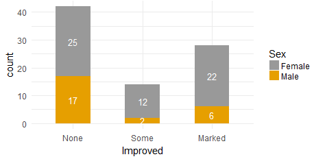
1,堆叠摆放
设置geom_bar()的position参数为"stack",在向条形图添加文本时,使用position=position_stack(0.5),调整文本的相对位置。
ggplot(data=Arthritis, mapping=aes(x=Improved,fill=Sex))+
  geom_bar(stat="count",width=0.5,position='stack')+
  scale_fill_manual(values=c('#999999','#E69F00'))+
  geom_text(stat='count',aes(label=..count..), color="white", size=3.5,position=position_stack(0.5))+
  theme_minimal()
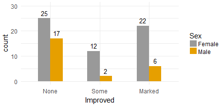
2,并行摆放
调整y轴的最大值,使用position=position_dodge(0.5),vjust=-0.5 来调整文本的位置
y_max <- max(aggregate(ID~Improved+Sex,data=Arthritis,length)$ID)

ggplot(data=Arthritis, mapping=aes(x=Improved,fill=Sex))+
  geom_bar(stat="count",width=0.5,position='dodge')+
  scale_fill_manual(values=c('#999999','#E69F00'))+
  ylim(0,y_max+5)+
  geom_text(stat='count',aes(label=..count..), color="black", size=3.5,position=position_dodge(0.5),vjust=-0.5)+
  theme_minimal()
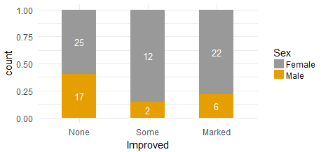
3,按照比例堆叠条形图
需要设置geom_bar(position="fill"),并使用geom_text(position=position_fill(0.5))来调整文本的位置,如果geom_text(aes(lable=..count..)),那么表示文本显示的值是变量的数量:
ggplot(data=Arthritis, mapping=aes(x=Improved,fill=Sex))+
  geom_bar(stat="count",width=0.5,position='fill')+
  scale_fill_manual(values=c('#999999','#E69F00'))+
  geom_text(stat='count',aes(label=..count..), color="white", size=3.5,position=position_fill(0.5))+
  theme_minimal()
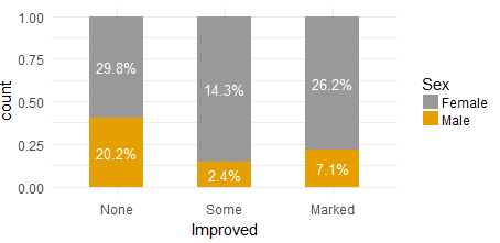
该模式最大的特点是可以把文本显示为百分比:
ggplot(data=Arthritis, mapping=aes(x=Improved,fill=Sex))+
  geom_bar(stat="count",width=0.5,position='fill')+
  scale_fill_manual(values=c('#999999','#E69F00'))+
  geom_text(stat='count',aes(label=scales::percent(..count../sum(..count..)))
              , color="white", size=3.5,position=position_fill(0.5))+
  theme_minimal()
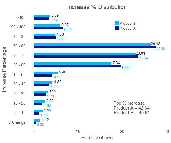
四,增加注释和旋转坐标轴
在绘制条形图时,需要动态设置注释(annotate)的位置x和y,x和y的值是由条形图的高度决定的,
annotate(geom="text", x = NULL, y = NULL)
在绘制条形图时,可以动态设置x和y的大小:
library("ggplot2")
library("dplyr")
library("scales")

#win.graph(width=6, height=5,pointsize=8)

#data
df <- data.frame(
  rate_cut=rep(c("0 Change", "0 - 10", "10 - 20", "20 - 30", "30 - 40","40 - 50", "50 - 60", "60 - 70","70 - 80", "80 - 90", "90 - 100", ">100"),2)
  ,freq=c(1,3,5,7,9,11,51,61,71,13,17,9,
          5,7,9,11,15,19,61,81,93,17,21,13)
  ,product=c(rep('ProductA',12),rep('ProductB',12))
)

#set order
labels_order <- c("0 Change", "0 - 10", "10 - 20", "20 - 30", "30 - 40","40 - 50", "50 - 60", "60 - 70","70 - 80", "80 - 90", "90 - 100", ">100")

#set plot text
plot_legend <- c("Product A", "Product B")
plot_title <- paste0("Increase % Distribution")
annotate_title <-"Top % Increase"
annotate_prefix_1 <-"Product A = "
annotate_prefix_2 <-"Product B = "

df_sum <- df %>%
  group_by(product) %>%
  summarize(sumFreq=sum(freq))%>%
  ungroup()%>%
  select(product,sumFreq)

df <- merge(df,df_sum,by.x = 'product',by.y='product')
df <- within(df,{rate <- round(freq/sumFreq,digits=4)*100})
df <- subset(df,select=c(product,rate_cut,rate))

#set order
df$rate_cut <- factor(df$rate_cut,levels=labels_order,ordered = TRUE)
df <- df[order(df$product,df$rate_cut),]

#set position
annotate.y <- ceiling(max(round(df$rate,digits = 0))/4*2.5)
text.offset <- max(round(df$rate,digits = 0))/25

annotation <- df %>%
  mutate(indicator = ifelse(substr(rate_cut,1,2) %in% c("70","80","90",'>1'),'top','increase' )) %>%
  filter(indicator=='top') %>%
  dplyr::group_by(product) %>%
  dplyr::summarise(total = sum(rate)) %>%
  select(product, total)

mytheme <- theme_classic() +
  theme(
    panel.background = element_blank(),
    strip.background = element_blank(),
    panel.grid = element_blank(),
    axis.line = element_line(color = "gray95"),
    axis.ticks = element_blank(),
    text = element_text(family = "sans"),
    axis.title = element_text(color = "gray30", size = 12),
    axis.text = element_text(size = 10, color = "gray30"),
    plot.title = element_text(size = 14, hjust = .5, color = "gray30"),
    strip.text = element_text(color = "gray30", size = 12),
    axis.line.y = element_line(size=1,linetype = 'dotted'),
    axis.line.x = element_blank(),
    axis.text.x = element_text(vjust = 0),
    plot.margin = unit(c(0.5,0.5,0.5,0.5), "cm"),
    legend.position = c(0.7, 0.9),
    legend.text = element_text(color = "gray30")
  )

##ggplot
ggplot(df,aes(x=rate_cut, y=rate)) +
  geom_bar(stat = "identity", aes(fill = product), position = "dodge", width = 0.5) +
  guides(fill = guide_legend(reverse = TRUE)) +
  scale_fill_manual(values = c("#00188F","#00BCF2")
                    ,breaks = c("ProductA","ProductB")
                    ,labels = plot_legend
                    ,name = "") +
  geom_text(data = df
            , aes(label = comma(rate), y = rate +text.offset, color = product)
            ,position = position_dodge(width =1)
            , size = 3) +
  scale_color_manual(values = c("#00BCF2", "#00188F"), guide = FALSE) +
  annotate("text", x = 3, y = annotate.y, hjust = 0, color = "gray30", label = annotate_title) +
  annotate("text", x = 2.5, y = annotate.y, hjust = 0, color = "gray30", label = paste0(annotate_prefix_1, annotation$total[1])) +
  annotate("text", x = 2, y = annotate.y, hjust = 0, color = "gray30", label = paste0(annotate_prefix_2, annotation$total[2])) +
  labs(x="Increase Percentage",y="Percent of freq",title=plot_title) +
  mytheme +
  coord_flip()
参考文档:
ggplot2 barplots : Quick start guide - R software and data visualization
Labelling Barplot with ggplotAssist(I)
作者:悦光阴