以下为6种常见的科研用图类型的绘制语法:
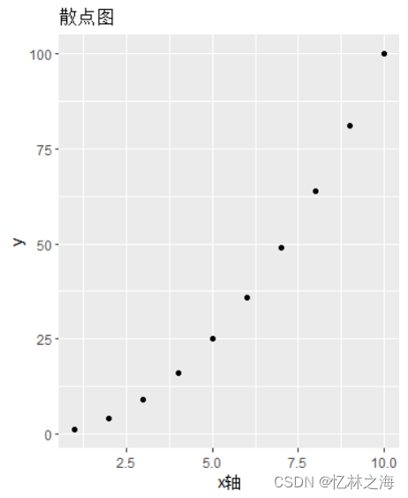
一、散点图
ggplot作图的最基础语法表达。
library(ggplot2)
x = seq.int(1,10,1)
y = seq.int(1,10,1)^2#散点图
ggplot() + geom_point(aes(x,y)) +
labs(
title = "散点图",
x = "x轴"
)
二、折线图
画板+线图+点图
animals = c("line", "elephant", "monkey")
numb = c(25,16,3)
ggplot() + geom_bar(aes(x=animals,y=numb),stat = "identity")
+
labs(
title = "条形图"
)

三、条形图
其中stat = "identity" 表示做的为密度(频度)图,说人话就是Y轴为真实的值。
animals = c("lion", "elephant", "monkey")
numb = c(25,16,3)
ggplot() + geom_bar(aes(x=animals,y=numb), stat = "identity") +
labs(
title = "条形图"
)

四、饼图
在条形图的基础上加上新函数 coord_polar("y", start=0) 相当于将圆Y轴转换为圆的一周,后面的文章会详解该部分。
require(scales)
df = data.frame(animals = c("lion", "monkey","elephant"),
numb = c(25,25,50))ggplot(df, aes(x="", y = numb, fill=animals)) +
geom_bar(width = 1, stat = "identity") +
coord_polar("y", start=0) +
theme(
axis.title.x = element_blank(),
axis.title.y = element_blank()
) +
geom_text(
aes(
y = numb/3 + c(0, cumsum(numb)[-length(numb)]),
label = percent(numb/sum(numb))),
size=5
)

五、直方图
bins表示柱子的个数,另外还有binwidth控制柱子宽度;
corlor 是边框的颜色, 内部颜色参数为fill;
df = data.frame(num = c(1,1,3,5,9,2,5,5,6,8,7,9,7,5,4,8,5,4,7,8,9,5,4,1,2,0))
ggplot(df,aes(num)) + geom_histogram(bins = 8,color = "white")

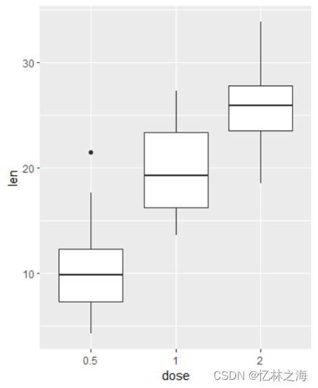
六、箱型图
data("ToothGrowth")引用了一个数据库;
data("ToothGrowth")
ToothGrowth$dose <- as.factor(ToothGrowth$dose)
head(ToothGrowth)
ggplot(ToothGrowth, aes(x = dose, y = len)) +geom_boxplot()
总结:
本文主要介绍了常见的6种科研用图的基本语法,接下来的文章将具体讲解每一种图的细节...