首先通过调整边框,我们可以发现一些端倪
<!DOCTYPE html>
<html>
	<head>
		<meta charset="utf-8">
		<title></title>
	</head>
	<style>
		.box{
			width: 150px;
			height:150px;
			border: 50px solid black;
		}
	</style>
	<body>
		<div class="box"></div>
	</body>
</html>
接着我们通过调整各个边框(例如border-top)的属性后发现 这些分割点棱角分明
<!DOCTYPE html>
<html>
	<head>
		<meta charset="utf-8">
		<title></title>
	</head>
	<style>
		.box {
			width: 150px;
			height: 150px;
			border-top: 50px solid cyan;
			border-right: 50px solid red;
			border-bottom: 50px solid green;
			border-left: 50px solid gray;
		}
	</style>
	<body>
		<div class="box"></div>
	</body>
</html>
在把宽高都设为0后,发现这个图形逐渐清晰起来
<!DOCTYPE html>
<html>
	<head>
		<meta charset="utf-8">
		<title></title>
	</head>
	<style>
		.box {
			width: 0px;
			height: 0px;
			border-top: 50px solid cyan;
			border-right: 50px solid red;
			border-bottom: 50px solid green;
			border-left: 50px solid gray;
		}
	</style>
	<body>
		<div class="box"></div>
	</body>
</html>
把任意两个三角形颜色设为一样,剩下的透明后就能获得三角形了
<!DOCTYPE html>
<html>
	<head>
		<meta charset="utf-8">
		<title></title>
	</head>
	<style>
		.box {
			width: 0px;
			height: 0px;
			border-top: 50px solid red;
			border-right: 50px solid red;
			border-bottom: 50px solid transparent;
			border-left: 50px solid transparent;
		}
	</style>
	<body>
		<div class="box"></div>
	</body>
</html> 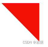
同理,通过改变边框的border-radius属性还能让其变成圆形,环等。