效果图:
图一: 图二:
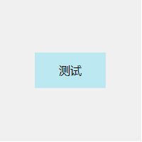

A、行内元素:line-height,如下:
<div class="child">测试</div>
.child{width:100px;height:50px;background: #BCE8F1;line-height:50px;text-align: center;}
B、块级元素:
1)使用绝对定位和负外边距对块级元素进行垂直居中:
<div class="parent">
    <div class="child">测试</div>
</div>
.parent{width:200px;height:200px;background: #f0f0f0;position: relative;}
.child{position: absolute;top:50%;left:50%;margin:-25px 0 0 -50px; width:100px; height:50px; background: #BCE8F1; line-height:50px; text-align: center;}
这个方法兼容性不错,但是有一个小缺点:必须提前知道被居中块级元素的尺寸,否则无法准确实现垂直居中。
2)另外一种使用绝对定位和负外边距进行垂直居中的方式
<div class="parent">
    <div class="child">测试</div>
</div>
.parent{width:200px;height:200px;background: #f0f0f0;position: relative;}
.child{position: absolute;top:50%;left:50%;width:50%;height:25%;margin:-12.5% 0 0 -25%; background: #BCE8F1;line-height:50px;text-align: center;}
这种方式的原理实质上和前一种相同。补充的一点是:margin的取值也可以是百分比,这时这个值规定了该元素基于父元素尺寸的百分比,可以根据实际的使用场景来决定是用具体的数值还是用百分比
3)使用绝对定位和transform
<div class="parent">
    <div class="child">测试</div>
</div>
.parent{width:200px;height:200px;background: #f0f0f0;position: relative;}
.child{position: absolute;top:50%;left:50%;transform: translate(-50%,-50%); width:100px;height:50px; background: #BCE8F1;line-height:50px;text-align: center;}
这种方法有一个非常明显的好处就是不必提前知道被居中元素的尺寸了,因为transform中translate偏移的百分比就是相对于元素自身的尺寸而言的。
4)绝对定位结合margin: auto
<div class="parent">
    <div class="child">测试</div>
</div>
.parent{width:200px;height:200px;background: #f0f0f0;position: relative;}
.child{position: absolute;top:0;bottom:0;left:0;right:0;width:50%;height:25%;margin:auto; background: #BCE8F1;line-height:50px;text-align: center;}
这种实现方式的两个核心是:把要垂直居中的元素相对于父元素绝对定位,top和bottom设为相等的值,left和right设为相等的值,我这里设成了0,当然你也可以设为10px或者-10px无论什么,只要两者相等就行,这一步做完之后再将要居中元素的margin设为auto,这样便可以实现垂直居中了。
被居中元素的宽高也可以不设置,但不设置的话就必须是图片这种自身就包含尺寸的元素,否则无法实现,如下:
<div class="parent">
    <img src="images/selected.png" class="child"/>
</div>

<style>
    .parent{width:200px;height:200px;background: #f0f0f0;position: relative;}
   .child{position: absolute;top:0;bottom:0;left:0;right:0;margin:auto; }
</style>
效果图:见图二;
5)使用 line-height 和 vertical-align 对图片进行垂直居中,效果图:见图二
<div class="parent">
    <img src="images/selected.png" class="child"/>
</div>

<style>
    .parent{width:200px;height:200px;line-height:200px;text-align: center; background: #f0f0f0;}
    .child{vertical-align: middle;}
</style>
6)使用padding实现子元素的垂直居中
<div class="parent">
    <div class="child">测试</div>
</div>
<style>
    .parent{width:200px;padding:75px 0; background: #f0f0f0;}
    .child{width:100px;height:50px;margin:0 auto; background: #BCE8F1;line-height:50px;text-align: center;}
</style>
这种实现方式非常简单,就是给父元素设置相等的上下内边距,则子元素自然是垂直居中的,当然这时候父元素是不能设置高度的,要让它自动被填充起来,除非设置了一个正好等于上内边距+子元素高度+下内边距的值,否则无法精确的垂直居中。
这种方式看似没有什么技术含量,但其实在某些场景下也是非常好用的。
7) 使用 display 和 vertical-align 对容器里的文字进行垂直居中
<div class="parent">
    <div class="child">测试</div>
</div>
<style>
    .parent{width:200px;height:200px;display: table; background: #f0f0f0;}
    .child{display:table-cell;vertical-align: middle;}
</style>
8)使用flex布局,效果图:见图一
<div class="parent">
    <div class="child">测试</div>
</div>
<style>
    .parent{display: flex;justify-content: center;align-items: center; width:200px;height:200px;background: #f0f0f0;}
    .child{width:100px;height:50px; background: #BCE8F1;line-height:50px;text-align: center;}
</style>
同样适用于行内元素;但。。。存在一定的兼容性