seaborn从入门到精通03-绘图功能实现05-构建结构化的网格绘图
总结
本文主要是seaborn从入门到精通系列第3篇,本文介绍了seaborn的绘图功能实现,本文是FacetGrid和PairGrid部分,同时介绍了较好的参考文档置于博客前面,读者可以重点查看参考链接。本系列的目的是可以完整的完成seaborn从入门到精通。重点参考连接

参考
seaborn官方
seaborn官方介绍
seaborn可视化入门
【宝藏级】全网最全的Seaborn详细教程-数据分析必备手册(2万字总结)
Seaborn常见绘图总结
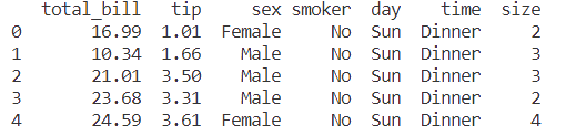
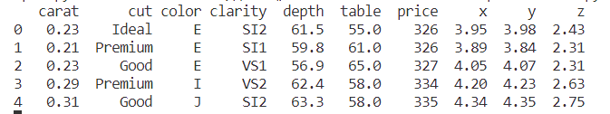
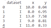
导入库与查看tips和diamonds 数据
import numpy as np
import pandas as pd
import matplotlib.pyplot as plt
import matplotlib as  mpl
import seaborn as sns
sns.set_theme(style="darkgrid")

mpl.rcParams['font.sans-serif']=['SimHei']
mpl.rcParams['axes.unicode_minus']=False

tips = sns.load_dataset("tips",cache=True,data_home=r"./seaborn-data")
tips.head()
diamonds = sns.load_dataset("diamonds",cache=True,data_home=r"./seaborn-data")
print(diamonds.head())
anscombe = sns.load_dataset("anscombe",cache=True,data_home=r"./seaborn-data")
print(anscombe.head())
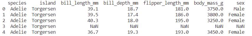
penguins = sns.load_dataset("penguins",cache=True,data_home=r"./seaborn-data")
print(penguins.head())
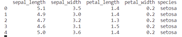
iris = sns.load_dataset("iris",cache=True,data_home=r"./seaborn-data")
print(iris.head())
构建网格多子图-Building structured multi-plot grids
When exploring multi-dimensional data, a useful approach is to draw multiple instances of the same plot on different subsets of your dataset. This technique is sometimes called either “lattice” or “trellis” plotting, and it is related to the idea of “small multiples”. It allows a viewer to quickly extract a large amount of information about a complex dataset. Matplotlib offers good support for making figures with multiple axes; seaborn builds on top of this to directly link the structure of the plot to the structure of your dataset.
在研究多维数据时,一种有用的方法是在数据集的不同子集上绘制同一图表的多个实例。这种技术有时被称为“格子”或“格子”绘图,它与“小倍数”的思想有关。它允许查看者快速提取关于复杂数据集的大量信息。Matplotlib为制作多轴图形提供了良好的支持;Seaborn在此基础上构建,直接将图的结构链接到数据集的结构。
The figure-level functions are built on top of the objects discussed in this chapter of the tutorial. In most cases, you will want to work with those functions. They take care of some important bookkeeping that synchronizes the multiple plots in each grid. This chapter explains how the underlying objects work, which may be useful for advanced applications.
图形级函数构建在本章教程中讨论的对象之上。在大多数情况下,您将希望使用这些函数。它们负责一些重要的簿记,使每个网格中的多个图同步。本章解释了底层对象是如何工作的,这可能对高级应用程序很有用。
案例1-多个小子图-FacetGrid
The FacetGrid class is useful when you want to visualize the distribution of a variable or the relationship between multiple variables separately within subsets of your dataset. A FacetGrid can be drawn with up to three dimensions: row, col, and hue. The first two have obvious correspondence with the resulting array of axes; think of the hue variable as a third dimension along a depth axis, where different levels are plotted with different colors.
当您希望在数据集的子集中分别可视化变量的分布或多个变量之间的关系时,FacetGrid类非常有用。FacetGrid最多可以用三个维度绘制:row, col, and hue。前两个与得到的轴数组有明显的对应关系;可以将色调变量看作是沿着深度轴的第三维度,其中不同的层次用不同的颜色绘制。
Each of relplot(), displot(), catplot(), and lmplot() use this object internally, and they return the object when they are finished so that it can be used for further tweaking.
relplot()、displot()、catplot()和lmplot()中的每一个都在内部使用该对象,并在完成时返回该对象,以便用于进一步调整。
g = sns.FacetGrid(tips, col="time")
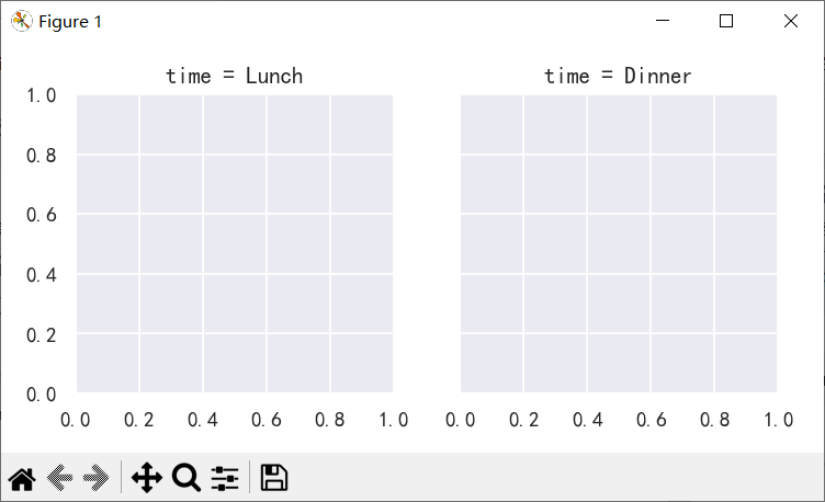
按照col和row进行网格布局:
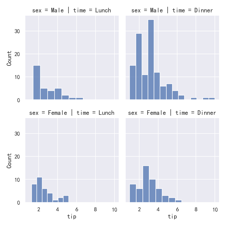
g=sns.FacetGrid(tips, col="time", row="sex")
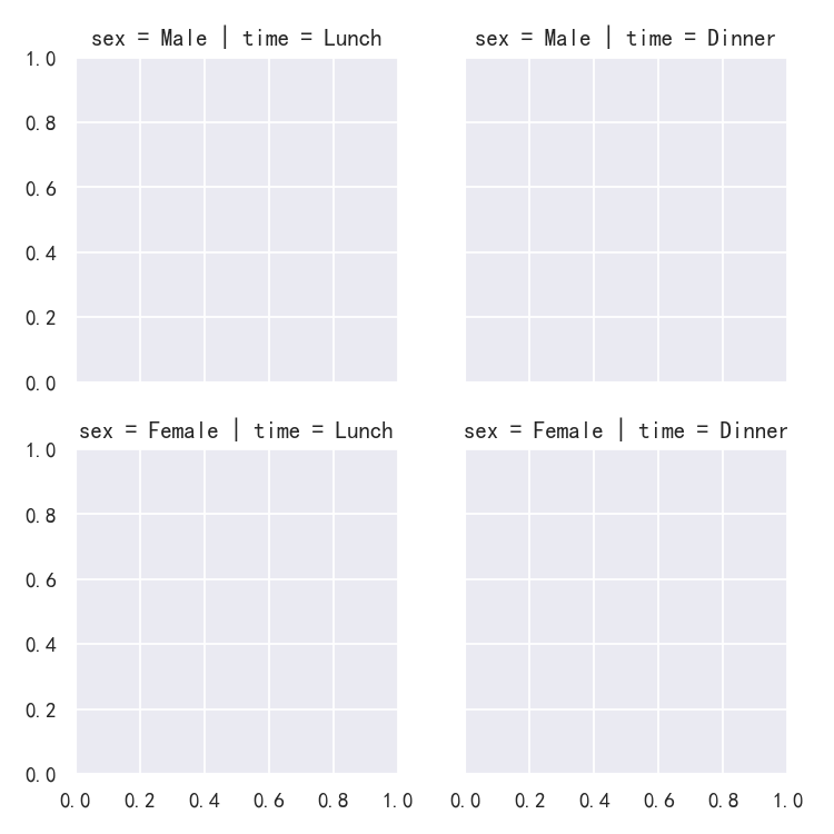
Initializing the grid like this sets up the matplotlib figure and axes, but doesn’t draw anything on them.
像这样初始化网格会设置matplotlib图和轴,但不会在上面绘制任何东西。
The main approach for visualizing data on this grid is with the FacetGrid.map() method. Provide it with a plotting function and the name(s) of variable(s) in the dataframe to plot. Let’s look at the distribution of tips in each of these subsets, using a histogram:
在这个网格上可视化数据的主要方法是使用FacetGrid.map()方法。为它提供一个绘图函数和数据框架中要绘图的变量名。让我们用直方图来看看小费在每个子集中的分布情况:
g=sns.FacetGrid(tips, col="time", row="sex")
g.map(sns.histplot, "tip")
This function will draw the figure and annotate the axes, hopefully producing a finished plot in one step. To make a relational plot, just pass multiple variable names. You can also provide keyword arguments, which will be passed to the plotting function:
这个函数将绘制图形并注释坐标轴,希望在一个步骤中生成一个完整的图形。要制作关系图,只需传递多个变量名。你也可以提供关键字参数,这些参数将被传递给绘图函数:
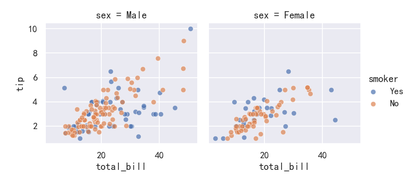
g = sns.FacetGrid(tips, col="sex", hue="smoker")
g.map(sns.scatterplot, "total_bill", "tip", alpha=.7)
g.add_legend()
案例2-绘制成对数据关系Plotting pairwise data relationships
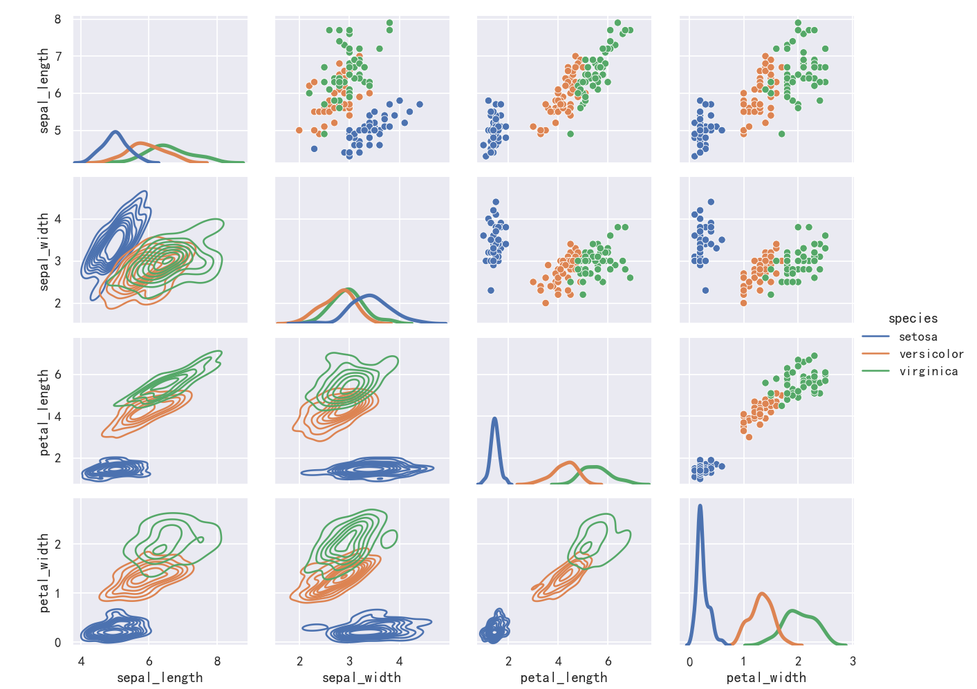
It’s important to understand the differences between a FacetGrid and a PairGrid. In the former, each facet shows the same relationship conditioned on different levels of other variables. In the latter, each plot shows a different relationship (although the upper and lower triangles will have mirrored plots). Using PairGrid can give you a very quick, very high-level summary of interesting relationships in your dataset.
理解FacetGrid和PairGrid之间的区别是很重要的。在前者中,每个方面都表现出相同的关系,条件是其他变量的不同水平。在后者中,每个图都显示了不同的关系(尽管上三角形和下三角形将有镜像图)。使用PairGrid可以非常快速、非常高级地总结数据集中有趣的关系。
g = sns.PairGrid(iris,y_vars=["sepal_length","sepal_width","petal_length","petal_width"],
                  x_vars=["sepal_length","sepal_width","petal_length","petal_width"], hue="species")
g.map_upper(sns.scatterplot)
g.map_lower(sns.kdeplot)
g.map_diag(sns.kdeplot, lw=3, legend=False)
g.add_legend()