文章目录
learn from https://www.kaggle.com/learn/data-visualization
1. lineplot 线图
# -*- coding:utf-8 -*-
# @Python Version: 3.7
# @Time: 2020/5/14 0:10
# @Author: Michael Ming
# @Website: https://michael.blog.csdn.net/
# @File: seabornExercise.py
# @Reference:
import pandas as pd
pd.plotting.register_matplotlib_converters()
import matplotlib.pyplot as plt
import seaborn as sns
filepath = "spotify.csv"
data = pd.read_csv(filepath, index_col='Date', parse_dates=True)
print(data.head()) # 数据头几行
print(data.tail()) # 尾部几行
print(list(data.columns)) # 列名称
print(data.index) # 行index数据
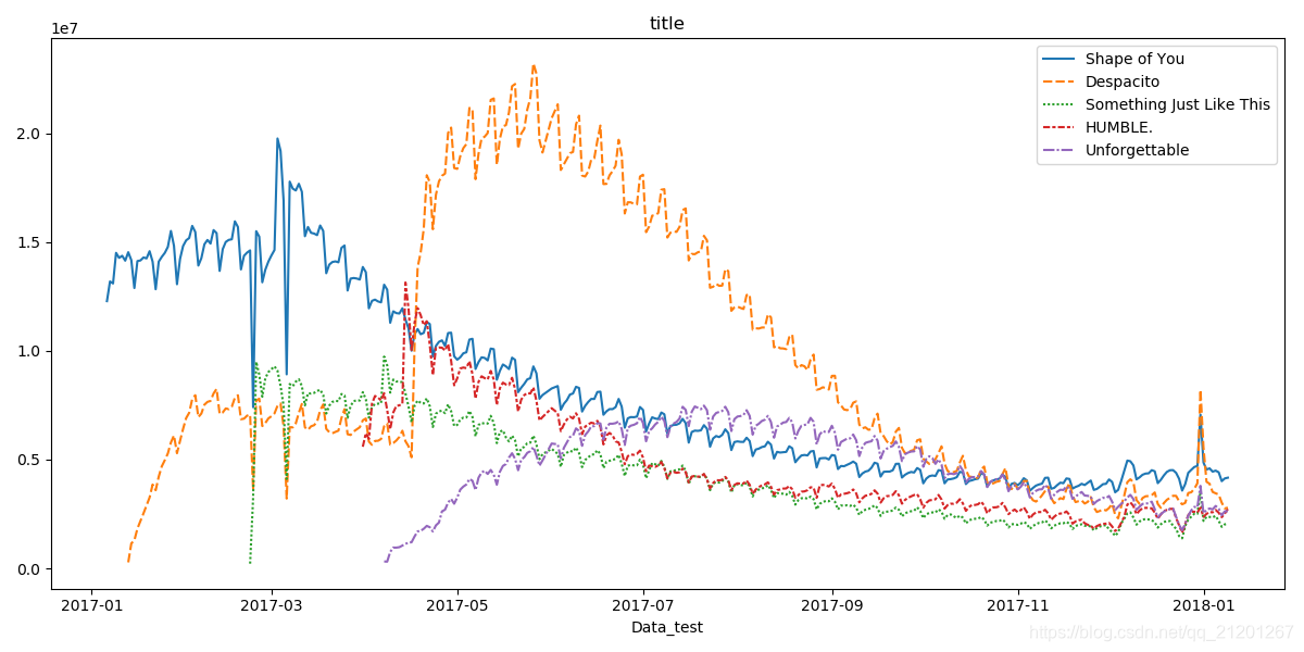
plt.figure(figsize=(12, 6))
sns.lineplot(data=data) # 单个数据可以加 label="label_test"
plt.title("title")
plt.xlabel("Data_test")
plt.show()
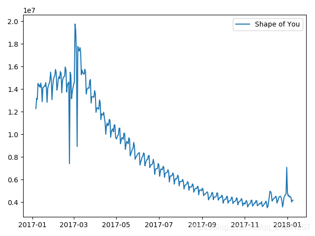
sns.lineplot(data=data['Shape of You'],label='Shape of You')
plt.show()
            Shape of You  Despacito  ...  HUMBLE.  Unforgettable
Date                                 ...
2017-01-06      12287078        NaN  ...      NaN            NaN
2017-01-07      13190270        NaN  ...      NaN            NaN
2017-01-08      13099919        NaN  ...      NaN            NaN
2017-01-09      14506351        NaN  ...      NaN            NaN
2017-01-10      14275628        NaN  ...      NaN            NaN
[5 rows x 5 columns]

            Shape of You  Despacito  ...    HUMBLE.  Unforgettable
Date                                 ...
2018-01-05       4492978  3450315.0  ...  2685857.0      2869783.0
2018-01-06       4416476  3394284.0  ...  2559044.0      2743748.0
2018-01-07       4009104  3020789.0  ...  2350985.0      2441045.0
2018-01-08       4135505  2755266.0  ...  2523265.0      2622693.0
2018-01-09       4168506  2791601.0  ...  2727678.0      2627334.0
[5 rows x 5 columns]

['Shape of You', 'Despacito', 'Something Just Like This', 'HUMBLE.', 'Unforgettable']

DatetimeIndex(['2017-01-06', '2017-01-07', '2017-01-08', '2017-01-09',
               '2017-01-10', '2017-01-11', '2017-01-12', '2017-01-13',
               '2017-01-14', '2017-01-15',
               ...
               '2017-12-31', '2018-01-01', '2018-01-02', '2018-01-03',
               '2018-01-04', '2018-01-05', '2018-01-06', '2018-01-07',
               '2018-01-08', '2018-01-09'],
              dtype='datetime64[ns]', name='Date', length=366, freq=None)
2. barplot 、heatmap 条形图、热图
2.1 barplot,条形图
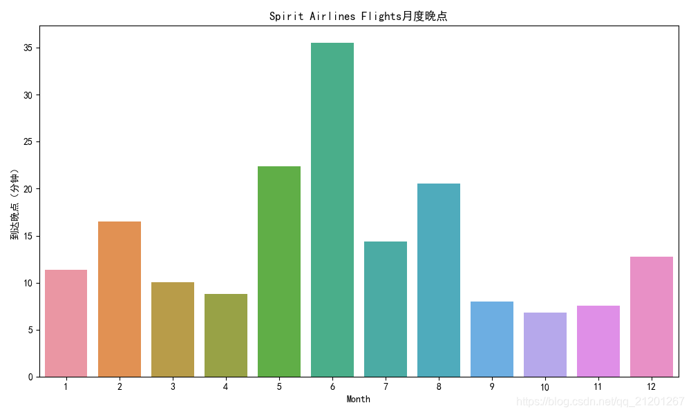
# 柱状图、热图
filepath = "flight_delays.csv"
flight_data = pd.read_csv(filepath, index_col="Month")
print(flight_data)

plt.figure(figsize=(10, 6))
plt.rcParams['font.sans-serif'] = 'SimHei'  # 消除中文乱码
plt.title("Spirit Airlines Flights月度晚点")
sns.barplot(x=flight_data.index, y=flight_data['NK']) # x,y可以互换
# 错误用法 x=flight_data['Month']
plt.ylabel("到达晚点(分钟)")
plt.show()
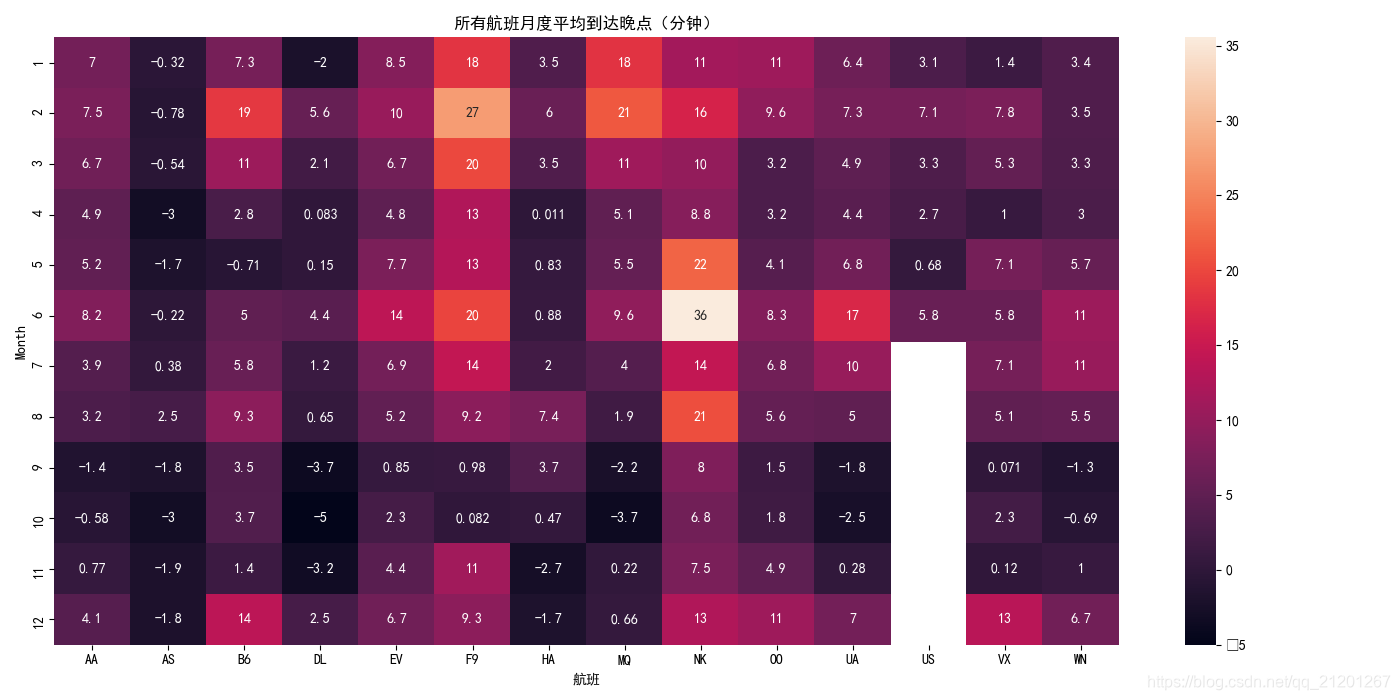
2.2 heatmap,热图
# 热图
plt.figure(figsize=(14,7))
plt.title("所有航班月度平均到达晚点(分钟)")
sns.heatmap(data=flight_data,annot=True)
# annot = True 每个单元格的值都显示在图表上
# (不选择此项将删除每个单元格中的数字!)
plt.xlabel("航班")
plt.show()
3. scatterplot、regplot 散点图
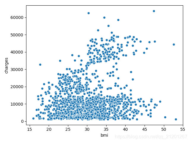
3.1 scatterplot,普通散点图
# 散点图
filepath = "insurance.csv"
insurance_data = pd.read_csv(filepath)
sns.scatterplot(x=insurance_data['bmi'], y=insurance_data['charges'])
plt.show()
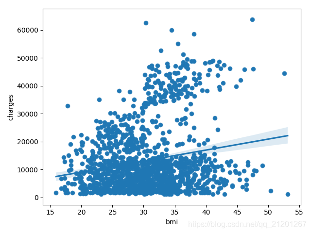
3.2 regplot,带回归线
# 带回归拟合线plot
sns.regplot(x=insurance_data['bmi'], y=insurance_data['charges'])
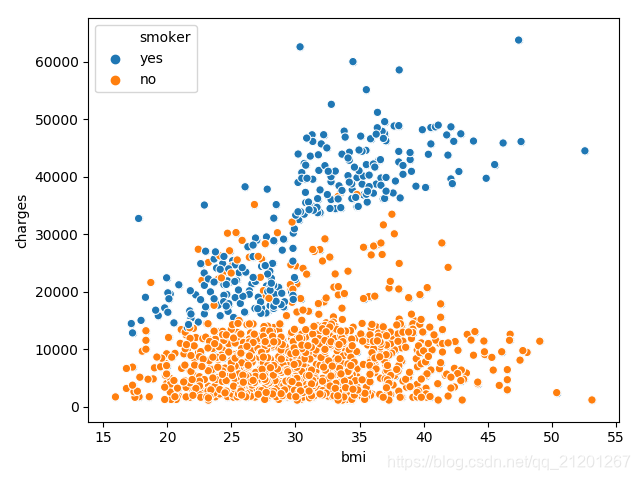
3.3 scatterplot(x=,y=,hue=) ,hue带第三个变量区分
# 查看区分,是否吸烟 hue
sns.scatterplot(x=insurance_data['bmi'], y=insurance_data['charges'],
                hue=insurance_data['smoker'])
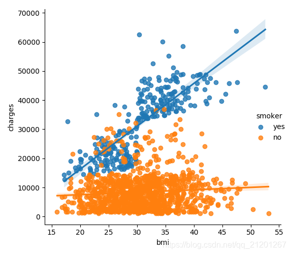
3.4 lmplot,3变量+2回归线
# 带两条回归线,展示3个变量的关系
sns.lmplot(x='bmi',y='charges',hue='smoker',data=insurance_data)
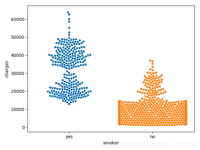
3.5 swarmplot,分类散点图
# 分类散点图,不吸烟的花钱较少
sns.swarmplot(x=insurance_data['smoker'],y=insurance_data['charges'])