目录
1、seaborn的优点
2、seaborn的官网
3、seaborn的作者介绍
4、seaborn的缩写为什么是sns,而不是sbn?
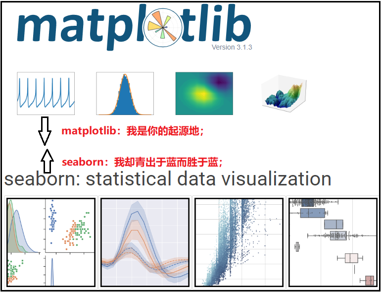
5、seaborn与matplotlib的关系?
6、使用seaborn绘图的3种方式(seaborn绘图的优势体现)
1、seaborn的优点
- 1、它简化了复杂数据集的表示;
- 2、可以轻松构建复杂的可视化,简洁的控制matplotlib图形样式与几个内置主题;
- 3、seaborn不可以替代matplotlib,而是matplotlib的很好补充;
2、seaborn的官网
学习某个知识点,最好的东西就是照着官网的提示学习,因为官网里面的知识点,够完整、够全面。seaborn的官网链接:http://seaborn.pydata.org
3、seaborn的作者介绍

4、seaborn的缩写为什么是sns,而不是sbn?
sns的使用来自于一个内部笑话,与美剧The West Wing有关。这部剧里有一个人物,名叫Samual Norman Seaborn,首字母简写为sns,因此最终简写为sns。
5、seaborn与matplotlib的关系?
seaborn是matplotlib的更高级的封装。因此学习seaborn之前,首先要知道matplotlib的绘图原理。matplotlib的绘图原理可以参考我之前的文章:https://blog.csdn.net/weixin_41261833/article/details/104299701。
我们知道,使用matplotlib绘图,需要调节大量的绘图参数,需要记忆的东西很多。而seaborn基于matplotlib做了更高级的封装,使得绘图更加容易,它不需要了解大量的底层参数,就可以绘制出很多比较精致的图形。不仅如此,seaborn还兼容numpy、pandas数据结构,在组织数据上起了很大作用,从而更大程度上的帮助我们完成数据可视化。
最关键:seaborn是matplotlib的更高级的封装。也就是说,对于matplotlib的那些调优参数设置,也都可以在使用seaborn绘制图形之后使用。
6、使用seaborn绘图的3种方式
- plt.style.use(“seaborn”):只是说调用了seaborn的绘图样式,并不能真正体现seaborn绘图的好处。
- sns.set():使用了这个方法后,所有之前写过的matplotlib中的参数都还原了。因此,像设置中文字体显示、设置负号的正常显示,都必须放在sns.set()这句代码之后。
- 直接调用seaborn函数绘图:这种方式能真正体现seaborn绘图的优势,也是我们经常使用的绘图方式。(最常用)
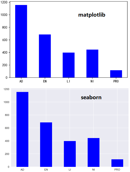
1)plt.style.use(“seaborn”)
df = pd.read_excel("data.xlsx",sheet_name="数据源")
df1 = df.groupby("品牌").agg({"销售数量":np.sum})

# 使用matplotlib风格绘图
plt.bar(x=df1.index,height=df1["销售数量"],width=0.5,color="blue")
plt.savefig(r"G:\6Tipdm\2 python绘图\seaborn\picture\seaborn绘图方式_1",dpi=300)

# 使用seaborn风格绘图
plt.style.use("seaborn")
plt.bar(x=df1.index,height=df1["销售数量"],width=0.5,color="blue")
plt.savefig(r"G:\6Tipdm\2 python绘图\seaborn\picture\seaborn绘图方式_2",dpi=300)
结果如下:
2)sns.set()
这个方法里面有几个参数,但是在实际中,我们都使用默认值即可,因为默认参数绘图就已经很好看啦,并不需要我们特意去设置。
① 常用参数:sns.set(style=, context=, font_scale=)
- style设置绘图的样式。
- context一般使用默认样式即可,不需要我们自己设置。默认是context=“notebook”。
- font_scale控制坐标轴的刻度,一般设置为font_scale=1.2即可。
② 演示如下
df = pd.read_excel("data.xlsx",sheet_name="数据源")
df1 = df.groupby("品牌").agg({"销售数量":np.sum})

# 使用matplotlib风格绘图
plt.bar(x=df1.index,height=df1["销售数量"],width=0.5,color="blue")
plt.savefig(r"G:\6Tipdm\2 python绘图\seaborn\picture\seaborn绘图方式_3",dpi=300)

# 使用seaborn风格绘图
sns.set()
plt.rcParams["font.sans-serif"] = "SimHei"
plt.rcParams["axes.unicode_minus"] = False

plt.bar(x=df1.index,height=df1["销售数量"],width=0.5,color="blue")
plt.savefig(r"G:\6Tipdm\2 python绘图\seaborn\picture\seaborn绘图方式_4",dpi=300)
结果如下:

3)直接调用seaborn函数绘图(最常用):seaborn绘图的优势体现
df = pd.read_excel("data.xlsx",sheet_name="数据源")

sns.set_style("dark")
plt.rcParams["font.sans-serif"] = ["SimHei"]
plt.rcParams["axes.unicode_minus"] = False
# 注意:estimator表示对分组后的销售数量求和。默认是求均值。
sns.barplot(x="品牌",y="销售数量",data=df,color="steelblue",orient="v",estimator=sum)
plt.savefig(r"G:\6Tipdm\2 python绘图\seaborn\picture\seaborn绘图方式_5",dpi=300)
结果如下:

注意:直接调用seaborn函数绘图的好处在这个代码中有很好的体现。可以看出,如果直接使用matplotlib中的代码绘图,需要先对数据集进行分组聚合,然后才能绘制最后的图形。【优势】:直接使用sns.barplot()函数绘图,barplot可以直接将 groupby 分组后的结果按照指定的汇总方式进行可视化展示,并不需要我们实现对数据进行处理。
