版权声明:本文为博主原创文章,遵循 CC 4.0 BY-SA 版权协议,转载请附上原文出处链接和本声明。
准备工作
import matplotlib.pyplot as plt
import seaborn as sns
%matplotlib inline
import numpy as np
import pandas as pd
plt.rcParams['axes.unicode_minus'] = False #用来正常显示负号
#seaborn中显示中文
sns.set_style('darkgrid',{'font.sans-serif':['SimHei','Arial']})

#去除部分警告
import warnings
warnings.filterwarnings('ignore')
sns.set() #返回seaborn默认设置
柱状图(条形图)
seaborn.barplot()
- x,y,hue:绘图中所使用的分类/连续变量/颜色分组变量名
- data:数据框名称
- order,hue_order:hue变量各类别取值的绘图顺序
- orient:“v” | “h”,条带绘制方向
- saturation = 0.75 : float, 直条颜色的饱和度
sns.set_style('darkgrid',{'font.sans-serif':['SimHei','Arial']})
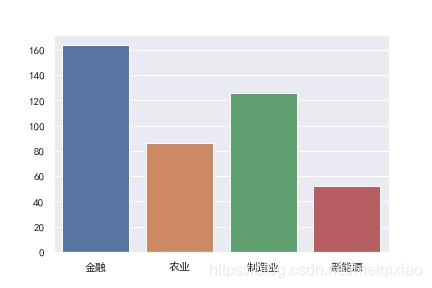
x = ['金融','农业','制造业','新能源']
y = [164,86,126,52]
sns.barplot(x,y)
plt.savefig("F:\\01.jpg")
结果:
按顺序排列:
sns.set_style('darkgrid',{'font.sans-serif':['SimHei','Arial']})
x = ['金融','农业','制造业','新能源']
y = [164,86,126,52]
sns.barplot(x,y,order = ['金融','制造业','农业','新能源'])
plt.savefig("F:\\01.jpg")
结果: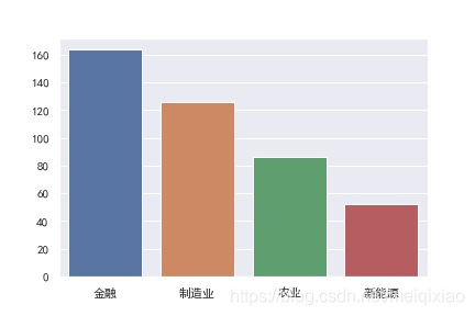
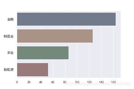
自定义透明度,并横着排放
sns.set_style('darkgrid',{'font.sans-serif':['SimHei','Arial']})
x = ['金融','农业','制造业','新能源']
y = [164,86,126,52]
sns.barplot(y,x,order = ['金融','制造业','农业','新能源'],
           orient = 'h',     #使之横过来,但前面要是y,x
           saturation = 0.25 #自定义透明度
           )
plt.savefig("F:\\01.jpg")
结果:
加载数据集
#加载数据集
tips = sns.load_dataset("tips")
tips.head()
- total_bill:一顿饭的餐费金额
- tip:该顿饭给的小费
- size:吃饭人数
- smoker:服务生是否抽烟
- day:星期几吃的饭
- sex:服务生性别
- time:吃饭时间,午餐或者晚餐
sns.barplot(x='day',y='tip',
            data=tips #数据取自tips数据集
           )
plt.savefig("F:\\01.jpg")
结果:
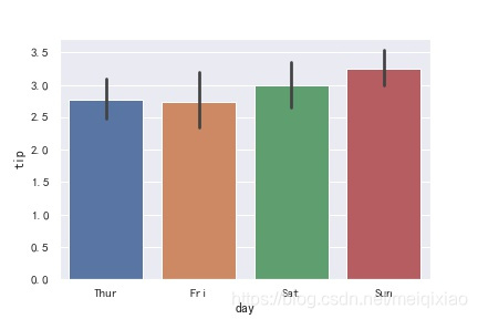
柱子高度是那一类别下所有值的平均数。图形上方竖线是误差线,一均值为中心的置信区间
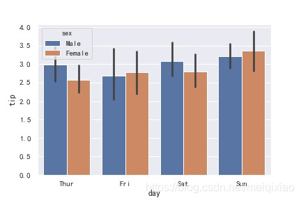
多组数据的直方图
sns.barplot(x='day',y='tip',
            data=tips,
            hue = 'sex'
           )
plt.savefig("F:\\01.jpg")
结果:
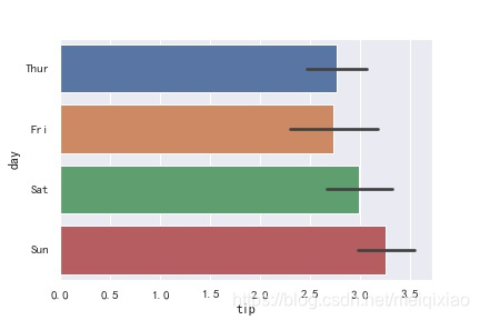
条形图——交换x,y
sns.barplot(y = 'day',x = 'tip',data = tips)
plt.savefig("F:\\01.jpg")
结果:
箱线图
sns.boxplot()
- saturation = 0.75 : float, 箱体颜色的饱和度
- width = 0.8 : float,箱体宽度所占比例
- fliersize = 5 : float,离群值散点大小
- linewidth = None : float,框线宽度
- whis = 1.5 : float,离群值确定标准,距离IQR上下界倍数
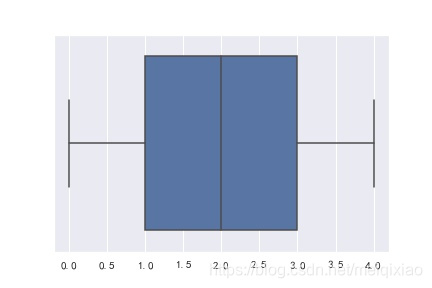
L = [3,2,0,1,4] #排序后:0,1,2,3,4;所以中位数为2
sns.boxplot(y = L)
plt.savefig("F:\\01.jpg")
结果:
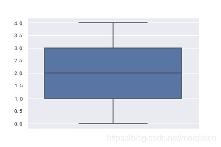
排序后:0,1,2,3,4;所以中位数为2
倒一倒
L = [3,2,0,1,4]
sns.boxplot(x = L)
plt.savefig("F:\\01.jpg")
结果:
多个箱线图
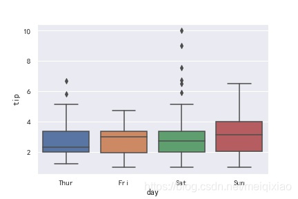
sns.boxplot(x = 'day',y = 'tip',data = tips)
plt.savefig("F:\\01.jpg")
结果:
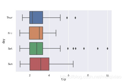
sns.boxplot( y= 'day',x = 'tip',data = tips)
plt.savefig("F:\\01.jpg")
结果:
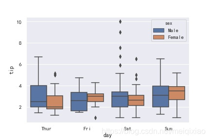
多组数据的箱线图
sns.boxplot(x = 'day',y = 'tip',data = tips,hue = 'sex')
plt.savefig("F:\\01.jpg")
结果:
小提琴图
sns.violinplot()
将箱线图和密度图组合在一起
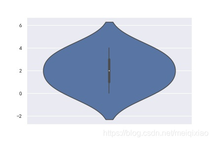
L = [3,2,0,1,4]
sns.violinplot(y = L)
plt.savefig("F:\\01.jpg")
结果:
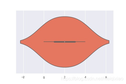
L = [3,2,0,1,4]
sns.violinplot(L,palette = 'Reds')
plt.savefig("F:\\01.jpg")
结果:
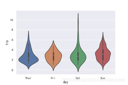
多个数据
sns.violinplot(x = 'day', y = 'tip', data = tips)
plt.savefig("F:\\01.jpg")
结果:
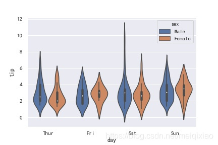
sns.violinplot(x = 'day', y = 'tip', hue = 'sex', data = tips)
plt.savefig("F:\\01.jpg")
结果:
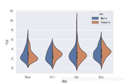
将小提琴图分开显示一半
因为小提琴图是对称的,所以可以只取一半
sns.violinplot(x = 'day', y = 'tip', hue = 'sex', data = tips,split = True)
plt.savefig("F:\\01.jpg")
结果:
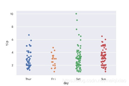
分类散点图:strip(带状),Swarm(蜂群图)
sns.stripplot(x = 'day',y = 'tip',data = tips)
plt.savefig("F:\\01.jpg")
结果:
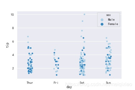
sns.stripplot(x = 'day',y = 'tip',data = tips,hue = 'sex',palette = "Blues")
plt.savefig("F:\\01.jpg")
结果:
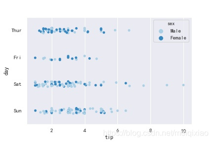
sns.stripplot(y = 'day',x = 'tip',data = tips,hue = 'sex',palette = "Blues")
plt.savefig("F:\\01.jpg")
结果:
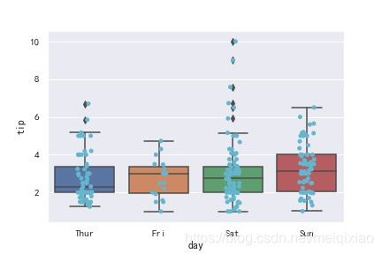
箱线图的组合
sns.boxplot(x='day',y='tip',data=tips)
sns.stripplot(x='day',y='tip',data=tips,color='c')
plt.savefig("F:\\01.jpg")
结果:
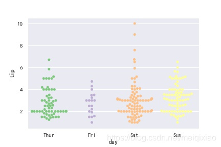
Swarm图
sns.set_palette("Accent")
sns.swarmplot(x = 'day',y = 'tip',data = tips)
plt.savefig("F:\\01.jpg")
结果:
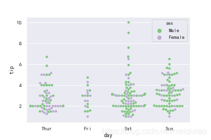
sns.swarmplot(x = 'day',y = 'tip',data = tips,hue='sex')
plt.savefig("F:\\01.jpg")
结果:
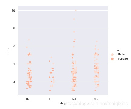
小提琴图的组合
sns.violinplot(x='day',y='tip',data=tips)
sns.swarmplot(x='day',y='tip',data=tips,color='blue')
结果:

分面网格图(FaceGrid)
catplot:
- row:在x轴上绘制数据
- col:在y轴上绘制数据
- col_wrap:在x轴上绘制子图的最大个数
- kind:绘制子图类型
sns.set_palette("Reds")
sns.catplot(x = 'day', y = 'tip', hue = 'sex', data = tips)
plt.savefig("F:\\01.jpg")
结果:
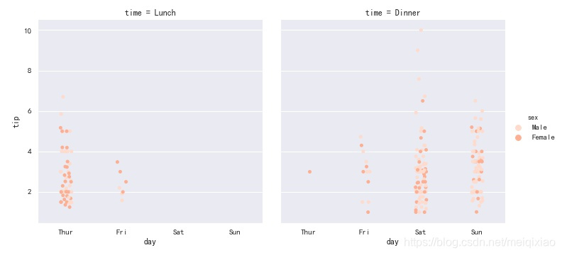
sns.catplot(x = 'day', y = 'tip', hue = 'sex', col = 'time', data = tips)
plt.savefig("F:\\01.jpg")
结果:
kind指明想展示的是什么图
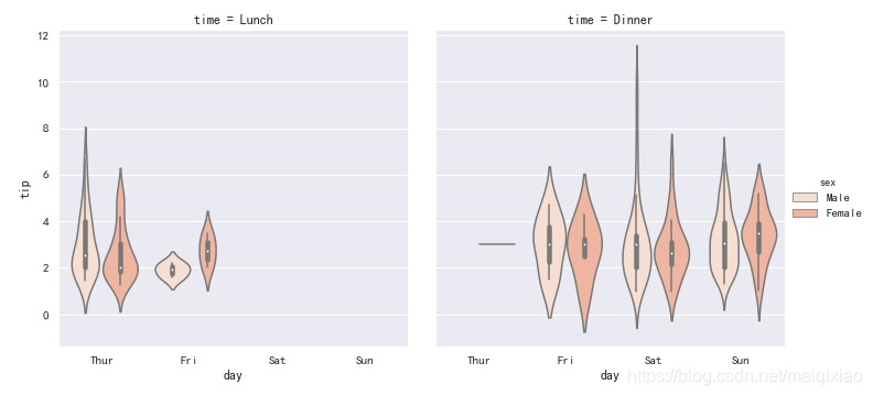
sns.catplot(x = 'day', y = 'tip', hue = 'sex', col = 'time', data = tips,kind = 'violin')
plt.savefig("F:\\01.jpg")
结果:
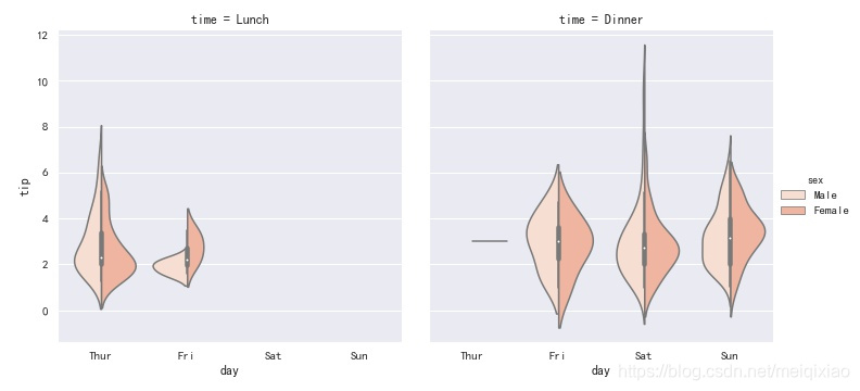
将小提琴图分割组合
sns.catplot(x = 'day', y = 'tip', hue = 'sex', col = 'time', data = tips,kind = 'violin',split = True)
plt.savefig("F:\\01.jpg")
结果:
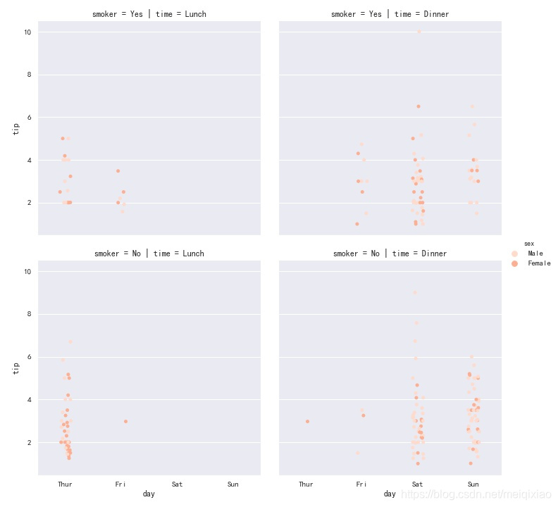
sns.catplot(x = 'day', y = 'tip', hue = 'sex', col = 'time',row = 'smoker', data = tips)
plt.savefig("F:\\01.jpg")
结果:
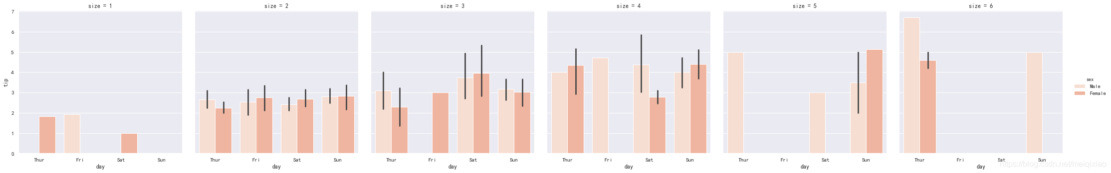
sns.catplot(x = 'day', y = 'tip', hue = 'sex', col = 'size', data = tips,kind = 'bar')
plt.savefig("F:\\01.jpg")
结果:
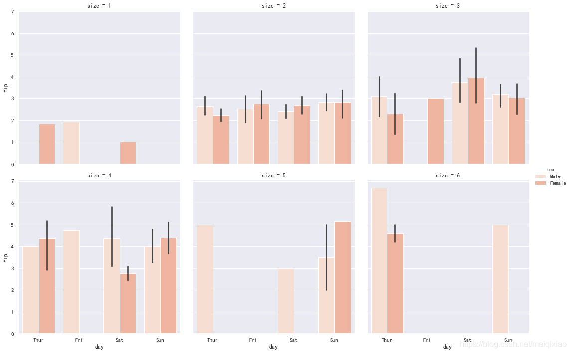
col_wrap:限制一行只放3个图
sns.catplot(x = 'day', y = 'tip', hue = 'sex', col = 'size',col_wrap = 3, data = tips,kind = 'bar')
plt.savefig("F:\\01.jpg")
结果:
散点图
sns.scatterplot(x,y,hue,style,size,data)
- x和y是有关联的两个变量数据集
- hue、size、style能够显示不同的数据集
- 若data设定,则x、y、hue、size、style取值是data中列名
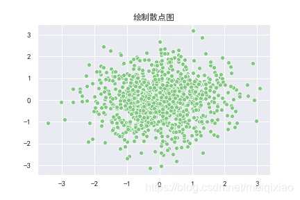
n = 1024
x = np.random.normal(0,1,n)
y = np.random.normal(0,1,n)
sns.set_palette('Accent')
sns.scatterplot(x = x,y = y)
plt.title('绘制散点图',fontproperties = 'SimHei')
plt.savefig("F:\\01.jpg")
结果:
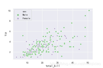
sns.scatterplot(x = 'total_bill',y = 'tip',hue = 'sex',data = tips)
结果:
设置点的形状,和图片大小
plt.figure(dpi = 150)
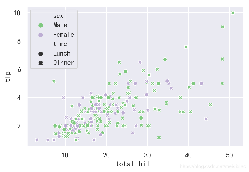
sns.scatterplot(x = 'total_bill',y = 'tip',hue = 'sex',style = 'time',data = tips)
结果:
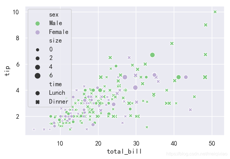
plt.figure(dpi = 150)
sns.scatterplot(x = 'total_bill',y = 'tip',hue = 'sex',style = 'time',data = tips,size = 'size')
plt.savefig("F:\\01.jpg")
结果:
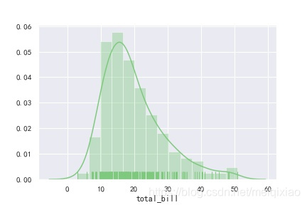
直方图(hist),密度图(kde),毛毯图(rug)
这三个图可以综合到一个图中
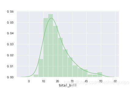
distplot默认绘制直方图,并带有KDE核密度估计函数
sns.distplot(tips['total_bill'])
plt.savefig("F:\\01.jpg")
结果:
sns.distplot(tips['total_bill'], hist = False, kde = False)
plt.savefig("F:\\01.jpg")
结果:
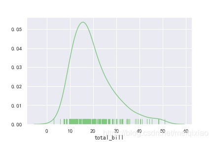
sns.distplot(tips['total_bill'],hist = False,rug = True)
plt.savefig("F:\\01.jpg")
结果:
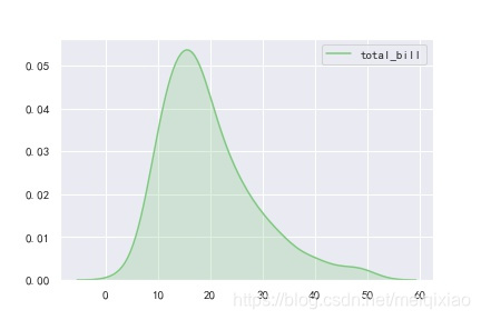
直接用kde可以对图做一些细致的修饰
sns.kdeplot(tips['total_bill'],shade = True) #是否填充阴影
plt.savefig("F:\\01.jpg")
结果:
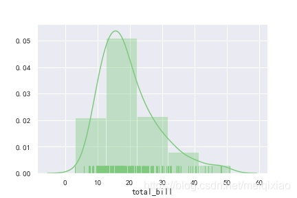
sns.distplot(tips['total_bill'],hist = True,kde = True,rug = True)
结果:
控制叠方块的数量
sns.distplot(tips['total_bill'],hist = True,kde = True,rug = True,bins = 5) #叠方块的数量
plt.savefig("F:\\01.jpg")
结果: