seaborn从入门到精通03-绘图功能实现03-分布绘图distributional plots
-
- 总结
- 参考
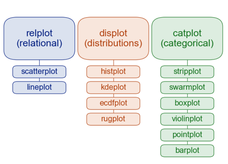
- 关系-分布-分类
- 分布绘图-Visualizing distributions data
总结
本文主要是seaborn从入门到精通系列第3篇,本文介绍了seaborn的绘图功能实现,本文是分布绘图,同时介绍了较好的参考文档置于博客前面,读者可以重点查看参考链接。本系列的目的是可以完整的完成seaborn从入门到精通。重点参考连接

参考
seaborn官方
seaborn官方介绍
seaborn可视化入门
【宝藏级】全网最全的Seaborn详细教程-数据分析必备手册(2万字总结)
Seaborn常见绘图总结
关系-分布-分类
relational “关系型”
distributional “分布型”
categorical “分类型”
分布绘图-Visualizing distributions data
An early step in any effort to analyze or model data should be to understand how the variables are distributed. Techniques for distribution visualization can provide quick answers to many important questions. What range do the observations cover? What is their central tendency? Are they heavily skewed in one direction? Is there evidence for bimodality? Are there significant outliers? Do the answers to these questions vary across subsets defined by other variables?
任何分析或建模数据的工作的早期步骤都应该是理解变量是如何分布的。分布可视化技术可以为许多重要问题提供快速答案。观察的范围是什么?它们的集中趋势是什么?它们是否严重偏向一个方向?是否有双态的证据?是否存在显著的异常值?这些问题的答案是否在其他变量定义的子集中有所不同?
The distributions module contains several functions designed to answer questions such as these. The axes-level functions are histplot(), kdeplot(), ecdfplot(), and rugplot(). They are grouped together within the figure-level displot(), jointplot(), and pairplot() functions…
分发模块包含几个旨在回答此类问题的函数。轴级函数是histplot()、kdeploy()、ecdfplot()和rugplot()。它们在图形级的displot()、jointplot()和pairplot()函数中组合在一起。
There are several different approaches to visualizing a distribution, and each has its relative advantages and drawbacks. It is important to understand these factors so that you can choose the best approach for your particular aim.
有几种不同的方法来可视化发行版,每种方法都有其相对的优点和缺点。了解这些因素是很重要的,这样你就可以为你的特定目标选择最好的方法。
图形级接口displot/jointplot/pairplot–figure-level interface
轴级接口histplot/kdeplot/ecdfplot/rugplot–axes-level interface
histplot
kdeplot
ecdfplot
rugplot
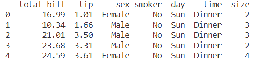
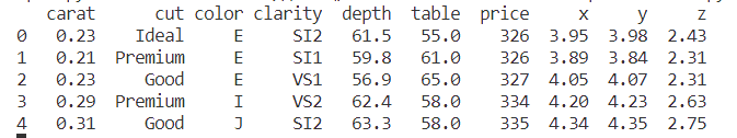
导入库与查看tips和diamonds 数据
import numpy as np
import pandas as pd
import matplotlib.pyplot as plt
import matplotlib as  mpl
import seaborn as sns
sns.set_theme(style="darkgrid")

mpl.rcParams['font.sans-serif']=['SimHei']
mpl.rcParams['axes.unicode_minus']=False

tips = sns.load_dataset("tips",cache=True,data_home=r"./seaborn-data")
tips.head()
diamonds = sns.load_dataset("diamonds",cache=True,data_home=r"./seaborn-data")
print(diamonds.head())
titanic = sns.load_dataset("titanic",cache=True,data_home=r"./seaborn-data")
print(titanic.info())
print(titanic.head())
输出:
<class 'pandas.core.frame.DataFrame'>
RangeIndex: 891 entries, 0 to 890
Data columns (total 15 columns):
 #   Column       Non-Null Count  Dtype
---  ------       --------------  -----
 0   survived     891 non-null    int64
 1   pclass       891 non-null    int64
 2   sex          891 non-null    object
 3   age          714 non-null    float64
 4   sibsp        891 non-null    int64
 5   parch        891 non-null    int64
 6   fare         891 non-null    float64
 7   embarked     889 non-null    object
 8   class        891 non-null    category
 9   who          891 non-null    object
 10  adult_male   891 non-null    bool
 11  deck         203 non-null    category
 12  embark_town  889 non-null    object
 13  alive        891 non-null    object
 14  alone        891 non-null    bool
dtypes: bool(2), category(2), float64(2), int64(4), object(5)
memory usage: 80.7+ KB
None
   survived  pclass     sex   age  sibsp  parch  ...    who adult_male deck  embark_town  alive  alone
0         0       3    male  22.0      1      0  ...    man       True  NaN  Southampton     no  False
1         1       1  female  38.0      1      0  ...  woman      False    C    Cherbourg    yes  False
2         1       3  female  26.0      0      0  ...  woman      False  NaN  Southampton    yes   True
3         1       1  female  35.0      1      0  ...  woman      False    C  Southampton    yes  False
4         0       3    male  35.0      0      0  ...    man       True  NaN  Southampton     no   True
penguins = sns.load_dataset("penguins",cache=True,data_home=r"./seaborn-data")
print(penguins.head())
直方图histplot
案例1-单变量直方图histplot
Perhaps the most common approach to visualizing a distribution is the histogram. This is the default approach in displot(), which uses the same underlying code as histplot(). A histogram is a bar plot where the axis representing the data variable is divided into a set of discrete bins and the count of observations falling within each bin is shown using the height of the corresponding bar:
也许可视化分布的最常用方法是直方图。这是displot()中的默认方法,它使用与histplot()相同的底层代码。直方图是一种条形图,其中表示数据变量的轴被划分为一组离散的bins,并且每个bin内的观测值的计数使用相应的bar的高度表示:
sns.displot(penguins, x="flipper_length_mm")
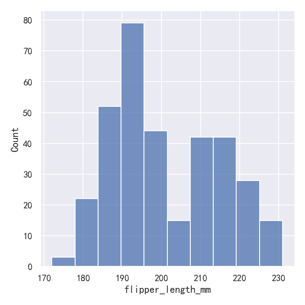
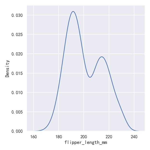
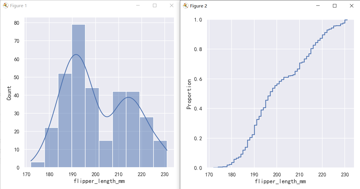
This plot immediately affords a few insights about the flipper_length_mm variable. For instance, we can see that the most common flipper length is about 195 mm, but the distribution appears bimodal, so this one number does not represent the data well.
这个图立即提供了关于flipper_length_mm变量的一些见解。例如,我们可以看到最常见的鳍长约为195 mm,但分布呈双峰,所以这一个数字并不能很好地代表数据。
案例2-直方图histplot-参数设置bin数量,大小和宽度
The size of the bins is an important parameter, and using the wrong bin size can mislead by obscuring important features of the data or by creating apparent features out of random variability. By default, displot()/histplot() choose a default bin size based on the variance of the data and the number of observations. But you should not be over-reliant on such automatic approaches, because they depend on particular assumptions about the structure of your data. It is always advisable to check that your impressions of the distribution are consistent across different bin sizes. To choose the size directly, set the binwidth parameter:
容器的大小是一个重要的参数,使用错误的容器大小可能会通过模糊数据的重要特征或通过随机可变性创建明显的特征而产生误导。默认情况下,displot()/histplot()根据数据的方差和观测值的数量选择默认的bin大小。但是您不应该过度依赖这种自动方法,因为它们依赖于对数据结构的特定假设。检查你对不同容器大小的分布的印象是否一致总是明智的。
sns.displot(penguins, x="flipper_length_mm", binwidth=3)
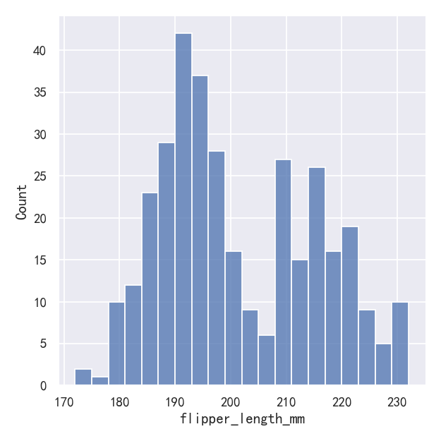
sns.displot(penguins, x="flipper_length_mm", bins=20)
In other circumstances, it may make more sense to specify the number of bins, rather than their size:
在其他情况下,指定箱子的数量而不是它们的大小可能更有意义:

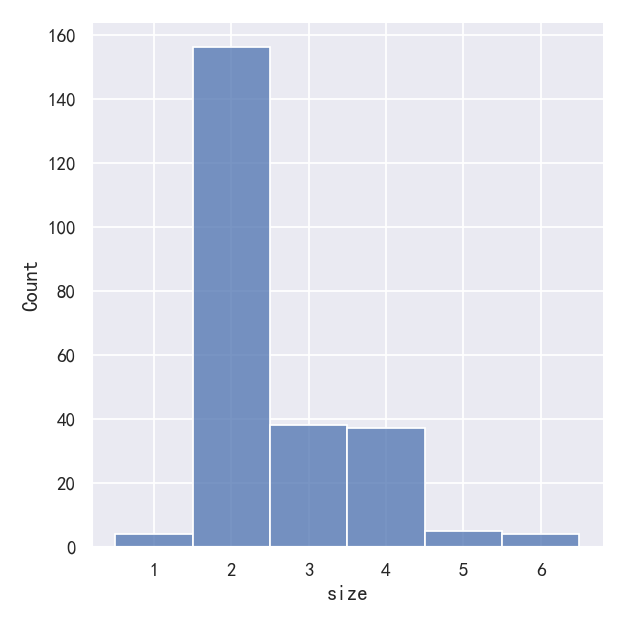
One example of a situation where defaults fail is when the variable takes a relatively small number of integer values. In that case, the default bin width may be too small, creating awkward gaps in the distribution:
默认值失败的一个例子是当变量接受相对较少的整数值时。在这种情况下,默认的bin宽度可能太小,在分布中产生尴尬的间隙:
sns.displot(tips, x="size")
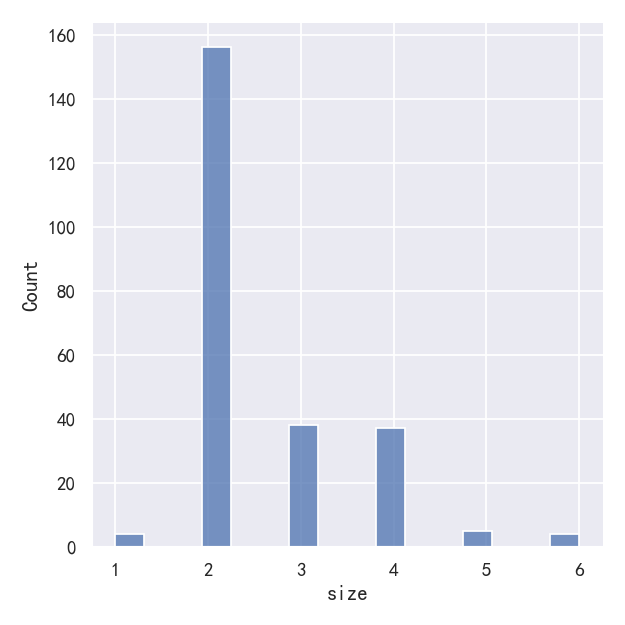
# sns.displot(tips, x="size")
sns.displot(tips, x="size", bins=[1, 2, 3, 4, 5, 6, 7])
One approach would be to specify the precise bin breaks by passing an array to bins:
一种方法是通过传递一个数组给bins来指定精确的bin换行符:

This can also be accomplished by setting discrete=True, which chooses bin breaks that represent the unique values in a dataset with bars that are centered on their corresponding value.
这也可以通过设置discrete=True来实现,它选择代表数据集中唯一值的分站符,其中的条以相应的值为中心。
sns.displot(tips, x="size", discrete=True)
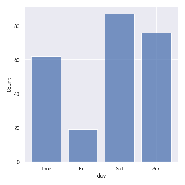
It’s also possible to visualize the distribution of a categorical variable using the logic of a histogram. Discrete bins are automatically set for categorical variables, but it may also be helpful to “shrink” the bars slightly to emphasize the categorical nature of the axis:
也可以使用直方图的逻辑来可视化分类变量的分布。离散箱是自动为分类变量设置的,但它可能也有助于“缩小”条,以强调轴的分类性质:
sns.displot(tips, x="day", shrink=.8)
案例3-直方图histplot-Conditioning on other variables
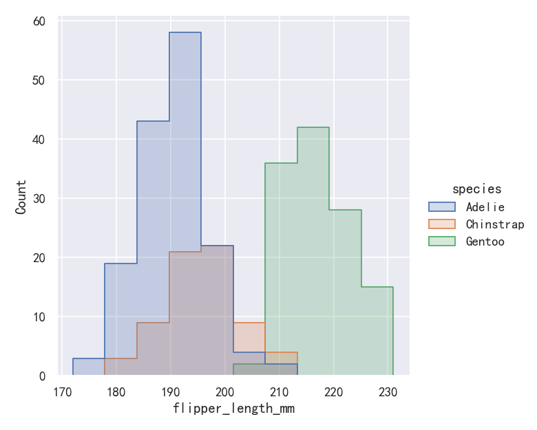
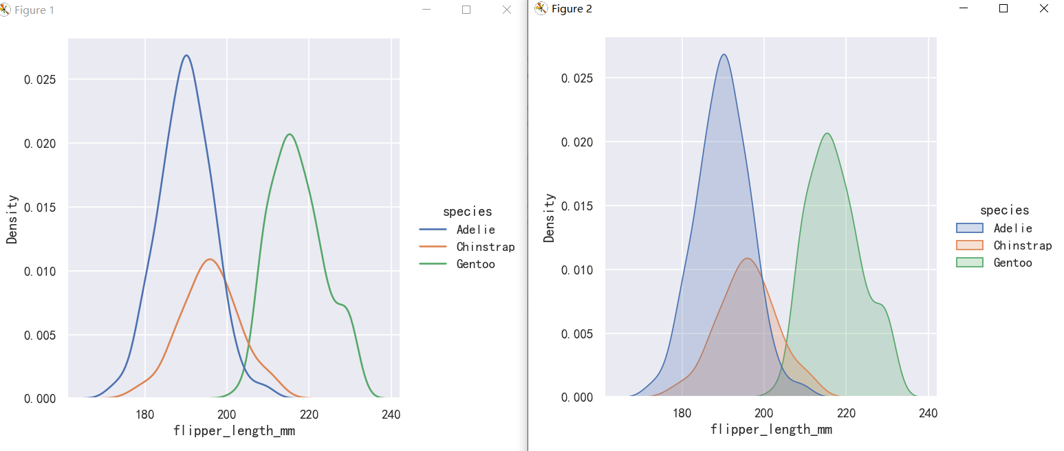
Once you understand the distribution of a variable, the next step is often to ask whether features of that distribution differ across other variables in the dataset. For example, what accounts for the bimodal distribution of flipper lengths that we saw above? displot() and histplot() provide support for conditional subsetting via the hue semantic. Assigning a variable to hue will draw a separate histogram for each of its unique values and distinguish them by color:
一旦你理解了一个变量的分布,下一步通常是问这个分布的特征在数据集中的其他变量之间是否不同。例如,是什么解释了我们上面看到的鳍状肢长度的双峰分布?Displot()和histplot()通过色调语义提供条件子集的支持。将变量赋值为hue将为每个变量的唯一值绘制单独的直方图,并通过颜色区分它们:
sns.displot(penguins, x="flipper_length_mm", hue="species")

案例4-直方图histplot转换为阶梯图
By default, the different histograms are “layered” on top of each other and, in some cases, they may be difficult to distinguish. One option is to change the visual representation of the histogram from a bar plot to a “step” plot:
默认情况下,不同的直方图是相互“分层”的,在某些情况下,它们可能很难区分。一种选择是将直方图的可视化表示从条形图更改为“阶梯”图:
# sns.displot(penguins, x="flipper_length_mm", hue="species")
sns.displot(penguins, x="flipper_length_mm", hue="species", element="step")
案例5-直方图histplot堆叠图stack
sns.displot(penguins, x="flipper_length_mm", hue="species", multiple="stack")
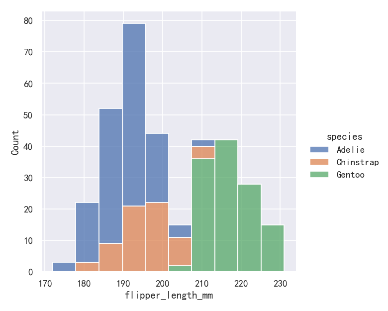
The stacked histogram emphasizes the part-whole relationship between the variables, but it can obscure other features (for example, it is difficult to determine the mode of the Adelie distribution. Another option is “dodge” the bars, which moves them horizontally and reduces their width. This ensures that there are no overlaps and that the bars remain comparable in terms of height. But it only works well when the categorical variable has a small number of levels:
堆叠直方图强调变量之间的部分-整体关系,但它可能会掩盖其他特征(例如,很难确定阿德利分布的模式。另一种选择是“dodge”,这将水平移动它们并减少它们的宽度。这确保了没有重叠,并且条在高度方面保持可比性。但它只在类别变量具有少量级别时才能很好地工作:
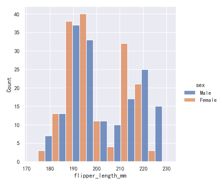
sns.displot(penguins, x="flipper_length_mm", hue="sex", multiple="dodge")
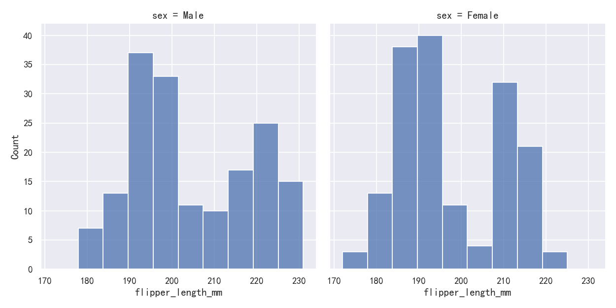
Because displot() is a figure-level function and is drawn onto a FacetGrid, it is also possible to draw each individual distribution in a separate subplot by assigning the second variable to col or row rather than (or in addition to) hue. This represents the distribution of each subset well, but it makes it more difficult to draw direct comparisons:
因为displot()是一个图形级函数,并且被绘制到FacetGrid上,所以还可以通过将第二个变量分配给col或row而不是(或加上)hue来在单独的子图中绘制每个单独的分布。这很好地代表了每个子集的分布,但它使进行直接比较变得更加困难:
sns.displot(penguins, x="flipper_length_mm", col="sex")
None of these approaches are perfect, and we will soon see some alternatives to a histogram that are better-suited to the task of comparison.
这些方法都不是完美的,我们很快就会看到一些替代直方图的方法,它们更适合进行比较。
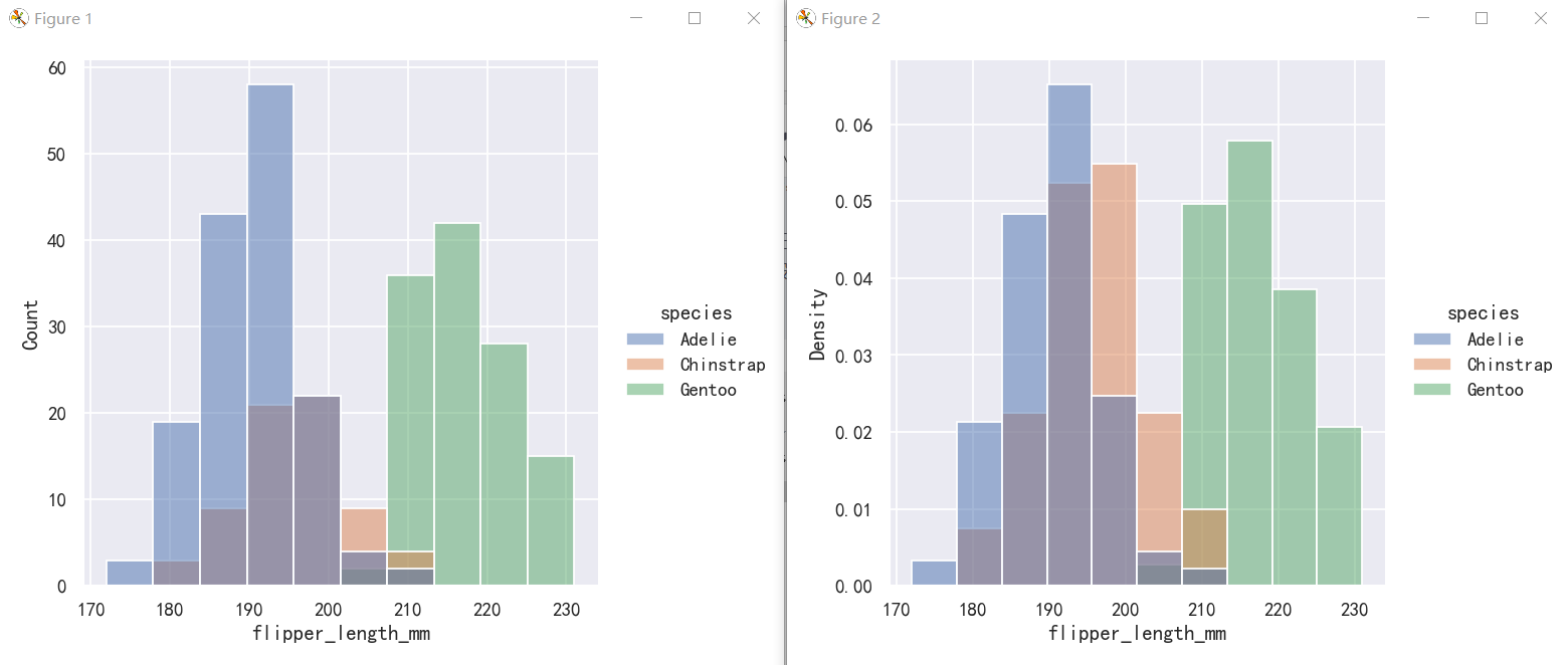
案例5-直方图hist-标准化直方图Normalized histogram statistics
Before we do, another point to note is that, when the subsets have unequal numbers of observations, comparing their distributions in terms of counts may not be ideal. One solution is to normalize the counts using the stat parameter:
在此之前,需要注意的另一点是,当子集具有不等数量的观测值时,比较它们在计数方面的分布可能并不理想。一种解决方案是使用stat参数规范化计数:
By default, however, the normalization is applied to the entire distribution, so this simply rescales the height of the bars. By setting common_norm=False, each subset will be normalized independently:
但是,默认情况下,归一化应用于整个分布,因此这只是重新调整了柱状图的高度。通过设置common_norm=False,每个子集将被独立地规范化:
sns.displot(penguins, x="flipper_length_mm", hue="species",)
# sns.displot(penguins, x="flipper_length_mm", hue="species", stat="density")
sns.displot(penguins, x="flipper_length_mm", hue="species", stat="density", common_norm=False)
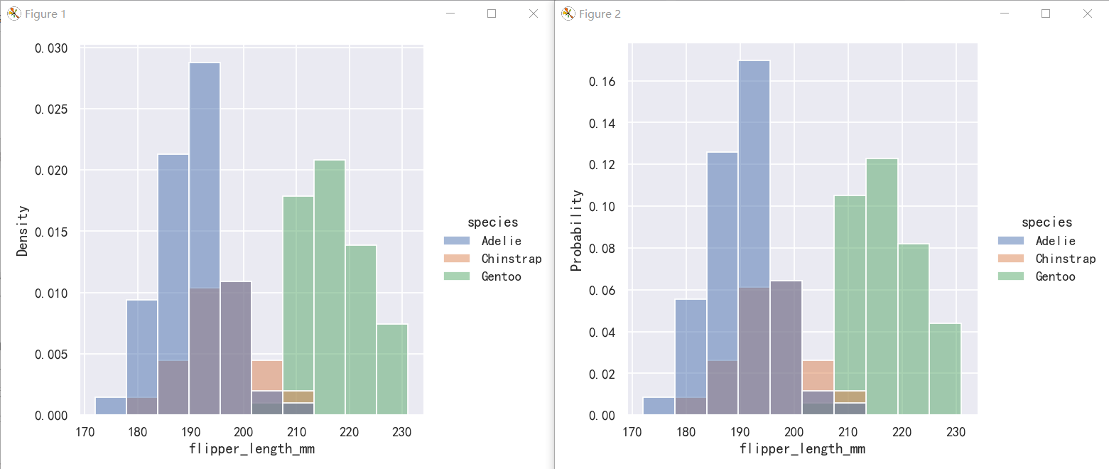
Density normalization scales the bars so that their areas sum to 1. As a result, the density axis is not directly interpretable. Another option is to normalize the bars to that their heights sum to 1. This makes most sense when the variable is discrete, but it is an option for all histograms:
密度归一化使条形图的面积之和为1。因此,密度轴是不能直接解释的。另一种选择是将柱形归一化,使其高度之和为1。当变量是离散的时,这是最有意义的,但它是所有直方图的一个选项:
sns.displot(penguins, x="flipper_length_mm", hue="species", stat="density")
sns.displot(penguins, x="flipper_length_mm", hue="species", stat="probability")
核密度估计图-Kernel density estimation
A histogram aims to approximate the underlying probability density function that generated the data by binning and counting observations. Kernel density estimation (KDE) presents a different solution to the same problem. Rather than using discrete bins, a KDE plot smooths the observations with a Gaussian kernel, producing a continuous density estimate:
直方图旨在通过对观察结果进行分类和计数来近似生成数据的底层概率密度函数。核密度估计(KDE)对同样的问题提出了不同的解决方案。KDE图不是使用离散箱,而是用高斯核平滑观察,产生连续的密度估计:
案例1-核密度估计图
sns.displot(penguins, x="flipper_length_mm", kind="kde")
案例2-核密度估计图-Choosing the smoothing bandwidth
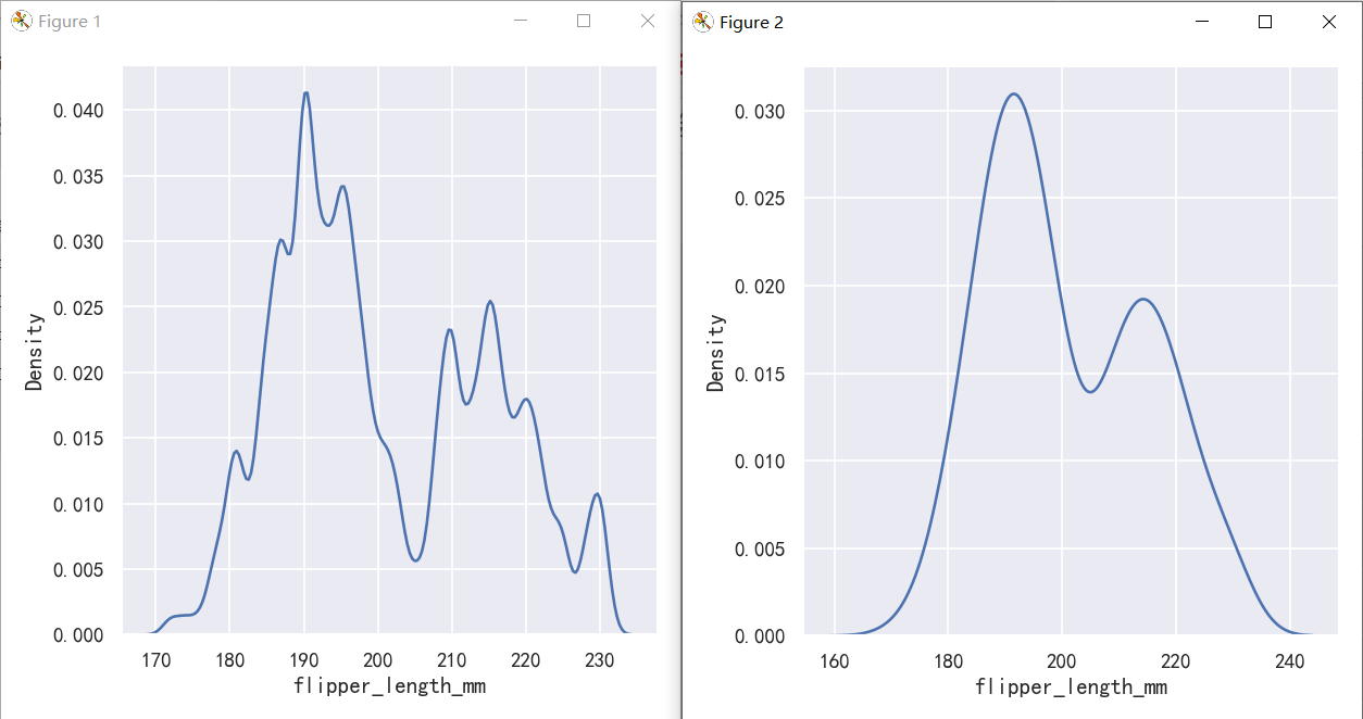
Much like with the bin size in the histogram, the ability of the KDE to accurately represent the data depends on the choice of smoothing bandwidth. An over-smoothed estimate might erase meaningful features, but an under-smoothed estimate can obscure the true shape within random noise. The easiest way to check the robustness of the estimate is to adjust the default bandwidth:
就像直方图中的箱子大小一样,KDE准确表示数据的能力取决于平滑带宽的选择。过度平滑的估计可能会抹去有意义的特征,但未平滑的估计可能会在随机噪声中掩盖真实的形状。检查估计的稳健性最简单的方法是调整默认带宽:
如果发现曲线还是不够平滑时,可以增大bw_adjust,即对bw乘以一个系数
sns.displot(penguins, x="flipper_length_mm", kind="kde", bw_adjust=.25)
sns.displot(penguins, x="flipper_length_mm", kind="kde", bw_adjust=1.0)
案例3-核密度估计图-参数hue与fill填充
与直方图一样,如果你分配了一个色调变量,将为该变量的每个级别计算一个单独的密度估计:
sns.displot(penguins, x="flipper_length_mm", hue="species", kind="kde")
sns.displot(penguins, x="flipper_length_mm", hue="species", kind="kde", fill=True)
案例4-核密度估计图缺陷-Kernel density estimation pitfalls
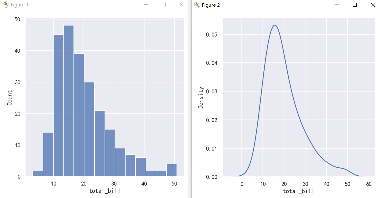
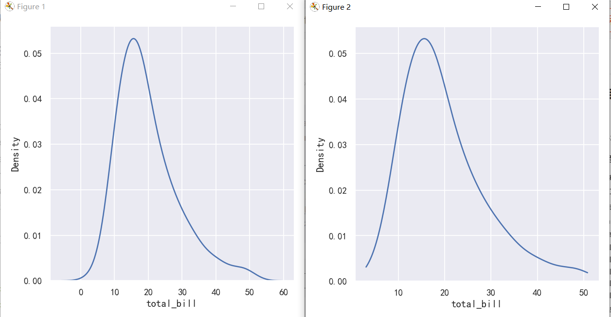
KDE plots have many advantages. Important features of the data are easy to discern (central tendency, bimodality, skew), and they afford easy comparisons between subsets. But there are also situations where KDE poorly represents the underlying data. This is because the logic of KDE assumes that the underlying distribution is smooth and unbounded. One way this assumption can fail is when a variable reflects a quantity that is naturally bounded. If there are observations lying close to the bound (for example, small values of a variable that cannot be negative), the KDE curve may extend to unrealistic values:
KDE图有很多优点。数据的重要特征很容易辨别(集中倾向、双峰性、歪斜),并且可以很容易地在子集之间进行比较。但是也有KDE不能很好地表示底层数据的情况。这是因为KDE的逻辑假设底层分布是平滑且无界的。当一个变量反映一个自然有界的量时,这个假设就会失败。如果观测值接近边界(例如,变量的小值不能为负),则KDE曲线可能扩展为不真实
sns.displot(tips, x="total_bill", kind="hist")
sns.displot(tips, x="total_bill", kind="kde")
This can be partially avoided with the cut parameter, which specifies how far the curve should extend beyond the extreme datapoints. But this influences only where the curve is drawn; the density estimate will still smooth over the range where no data can exist, causing it to be artificially low at the extremes of the distribution:
使用cut参数可以部分避免这种情况,该参数指定曲线应该超出极端数据点的范围。但这只会影响曲线的绘制位置;密度估计仍然会在没有数据存在的范围内平滑,导致在分布的极端处人为地降低:
sns.displot(tips, x="total_bill", kind="kde")
sns.displot(tips, x="total_bill", kind="kde", cut=0)
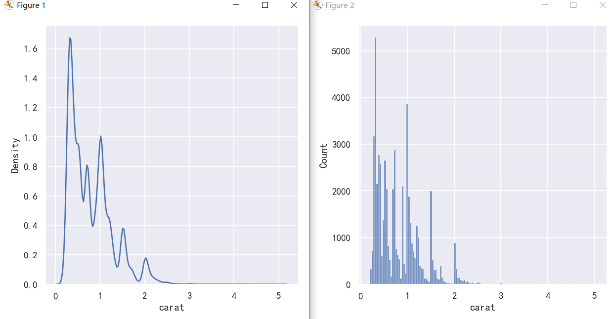
The KDE approach also fails for discrete data or when data are naturally continuous but specific values are over-represented. The important thing to keep in mind is that the KDE will always show you a smooth curve, even when the data themselves are not smooth. For example, consider this distribution of diamond weights:
KDE方法对于离散数据或当数据自然连续但特定值被过度表示时也会失败。需要记住的重要一点是,KDE将始终向您显示平滑的曲线,即使数据本身并不平滑。例如,考虑钻石重量的分布:
While the KDE suggests that there are peaks around specific values, the histogram reveals a much more jagged distribution:
虽然KDE表明在特定值周围有峰值,但直方图揭示了一个更加锯齿状的分布:
sns.displot(diamonds, x="carat", kind="kde")
sns.displot(diamonds, x="carat")
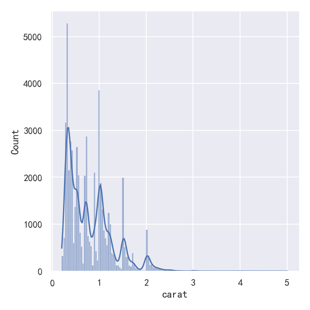
As a compromise, it is possible to combine these two approaches. While in histogram mode, displot() (as with histplot()) has the option of including the smoothed KDE curve (note kde=True, not kind=“kde”):
作为一种折衷,可以将这两种方法结合起来。在直方图模式下,displot()(与histplot()一样)可以选择包括平滑的KDE曲线(注意KDE =True, not kind=" KDE "):
sns.displot(diamonds, x="carat", kde=True)
经验累计分布-Empirical cumulative distributions
A third option for visualizing distributions computes the “empirical cumulative distribution function” (ECDF). This plot draws a monotonically-increasing curve through each datapoint such that the height of the curve reflects the proportion of observations with a smaller value:
可视化分布的第三个选项是计算“经验累积分布函数”(ECDF)。该图通过每个数据点绘制了一条单调递增的曲线,这样曲线的高度反映了具有较小值的观测值的比例:
案例1-经验累计分布图ecdf
sns.displot(penguins,x="flipper_length_mm",kde="kde")
sns.displot(penguins, x="flipper_length_mm", kind="ecdf")
案例2-经验累计分布图ecdf优势多个分布
The ECDF plot has two key advantages. Unlike the histogram or KDE, it directly represents each datapoint. That means there is no bin size or smoothing parameter to consider. Additionally, because the curve is monotonically increasing, it is well-suited for comparing multiple distributions:
ECDF地块有两个关键优势。与直方图或KDE不同,它直接表示每个数据点。这意味着不需要考虑bin大小或平滑参数。此外,由于曲线是单调递增的,它非常适合比较多个分布:
sns.displot(penguins, x="flipper_length_mm", hue="species", kind="ecdf")
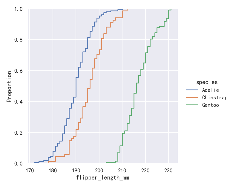
The major downside to the ECDF plot is that it represents the shape of the distribution less intuitively than a histogram or density curve. Consider how the bimodality of flipper lengths is immediately apparent in the histogram, but to see it in the ECDF plot, you must look for varying slopes. Nevertheless, with practice, you can learn to answer all of the important questions about a distribution by examining the ECDF, and doing so can be a powerful approach.
ECDF图的主要缺点是它表示分布的形状不如直方图或密度曲线直观。考虑鳍状肢长度的双峰性如何在直方图中立即显现,但要在ECDF图中看到它,必须寻找不同的斜率。尽管如此,通过实践,您可以通过检查ECDF来学习回答关于发行版的所有重要问题,这样做可能是一种强大的方法。
双变量分布可视化-Visualizing bivariate distributions
All of the examples so far have considered univariate distributions: distributions of a single variable, perhaps conditional on a second variable assigned to hue. Assigning a second variable to y, however, will plot a bivariate distribution:
到目前为止,所有的例子都考虑了单变量分布:单个变量的分布,可能取决于赋给色调的第二个变量。然而,将第二个变量赋值给y,将绘制一个二元分布:
案例1-双变量分布直方图与核密度图
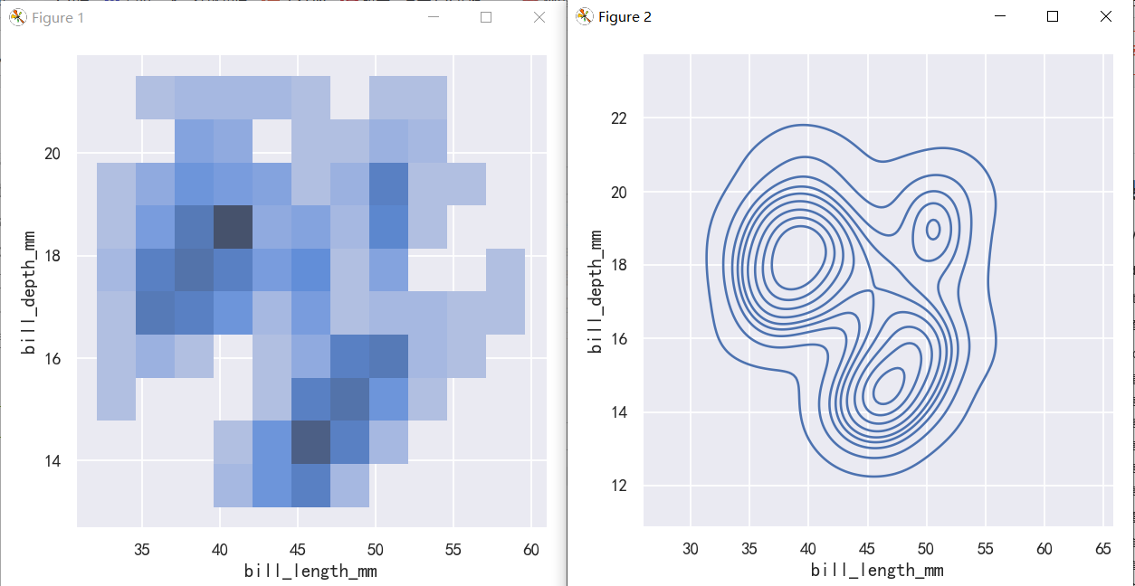
A bivariate histogram bins the data within rectangles that tile the plot and then shows the count of observations within each rectangle with the fill color (analogous to a heatmap()). Similarly, a bivariate KDE plot smoothes the (x, y) observations with a 2D Gaussian. The default representation then shows the contours of the 2D density:
二元直方图将数据装入平铺图的矩形中,然后用填充色显示每个矩形中的观察计数(类似于热图())。类似地,二元KDE图用二维高斯平滑(x, y)观测值。默认的表示形式然后显示2D密度的轮廓:
sns.displot(penguins, x="bill_length_mm", y="bill_depth_mm")
sns.displot(penguins, x="bill_length_mm", y="bill_depth_mm", kind="kde")
案例2-双变量分布直方图与核密度图-参数hue
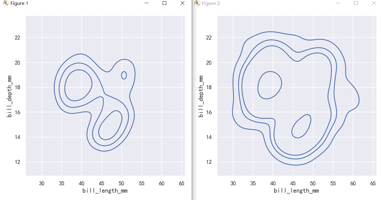
sns.displot(penguins, x="bill_length_mm", y="bill_depth_mm",hue="species")
sns.displot(penguins, x="bill_length_mm", y="bill_depth_mm",hue="species", kind="kde")
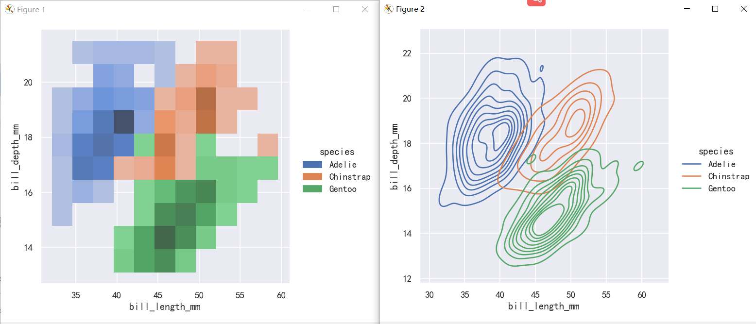
The contour approach of the bivariate KDE plot lends itself better to evaluating overlap, although a plot with too many contours can get busy:
二元KDE图的等高线方法更适合评估重叠
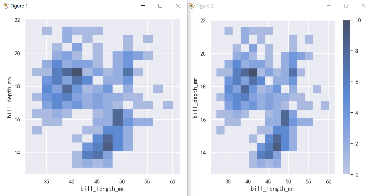
案例3-双变量分布直方图与核密度图-bin大小和颜色
To aid interpretation of the heatmap, add a colorbar to show the mapping between counts and color intensity:
为了帮助解释热图,添加一个颜色条来显示计数和颜色强度之间的映射:
sns.displot(penguins, x="bill_length_mm", y="bill_depth_mm", binwidth=(2, .5))
sns.displot(penguins, x="bill_length_mm", y="bill_depth_mm", binwidth=(2, .5), cbar=True)
The meaning of the bivariate density contours is less straightforward. Because the density is not directly interpretable, the contours are drawn at iso-proportions of the density, meaning that each curve shows a level set such that some proportion p of the density lies below it. The p values are evenly spaced, with the lowest level contolled by the thresh parameter and the number controlled by levels:
二元密度等高线的含义不那么直接。由于密度不能直接解释,等高线是按照密度的等比例绘制的,这意味着每条曲线都显示了一个水平集,使得密度的某个比例p位于它以下。p值均匀间隔,最低级别由thresh参数控制,数量由级别控制:
The levels parameter also accepts a list of values, for more control:
evel参数还接受一个值列表,以便进行更多的控制:
sns.displot(penguins, x="bill_length_mm", y="bill_depth_mm", kind="kde", thresh=.2, levels=4)
sns.displot(penguins, x="bill_length_mm", y="bill_depth_mm", kind="kde", levels=[.01, .05, .1, .8])
分布可视化-pairplot和joinplot
案例1-绘制节理和边际分布-Plotting joint and marginal distributions
The first is jointplot(), which augments a bivariate relatonal or distribution plot with the marginal distributions of the two variables. By default, jointplot() represents the bivariate distribution using scatterplot() and the marginal distributions using histplot():
第一个是jointplot(),它用两个变量的边际分布来增加一个双变量关系图或分布图。默认情况下,jointplot()使用scatterplot()表示二元分布,使用histplot()表示边际分布:
sns.jointplot(data=penguins, x="bill_length_mm", y="bill_depth_mm",)
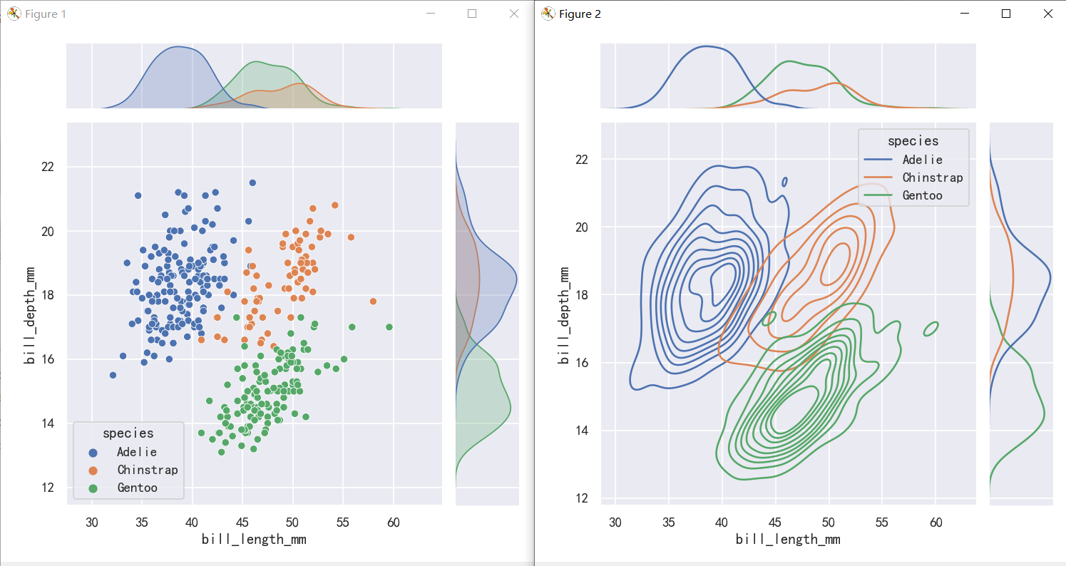
sns.jointplot(data=penguins, x="bill_length_mm", y="bill_depth_mm",hue="species",)
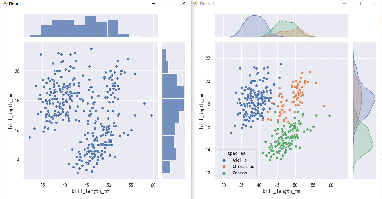
sns.jointplot(data=penguins, x="bill_length_mm", y="bill_depth_mm",hue="species",)
sns.jointplot(data=penguins,x="bill_length_mm", y="bill_depth_mm", hue="species",kind="kde")
jointplot() is a convenient interface to the JointGrid class, which offeres more flexibility when used directly:
jointplot()是JointGrid类的一个方便接口,直接使用时提供了更多的灵活性:
g = sns.JointGrid(data=penguins, x="bill_length_mm", y="bill_depth_mm")
g.plot_joint(sns.histplot)
g.plot_marginals(sns.boxplot)

案例2-绘制节理和边际分布-地毯图rugplot
A less-obtrusive way to show marginal distributions uses a “rug” plot, which adds a small tick on the edge of the plot to represent each individual observation. This is built into displot():
显示边际分布的一种不那么突兀的方法是使用“地毯”图,它在图的边缘添加一个小标记来表示每个单独的观察结果。这是内置在displot()中:
sns.displot(penguins, x="bill_length_mm", y="bill_depth_mm",kind="kde")
sns.displot(penguins, x="bill_length_mm", y="bill_depth_mm",kind="kde", rug=True)
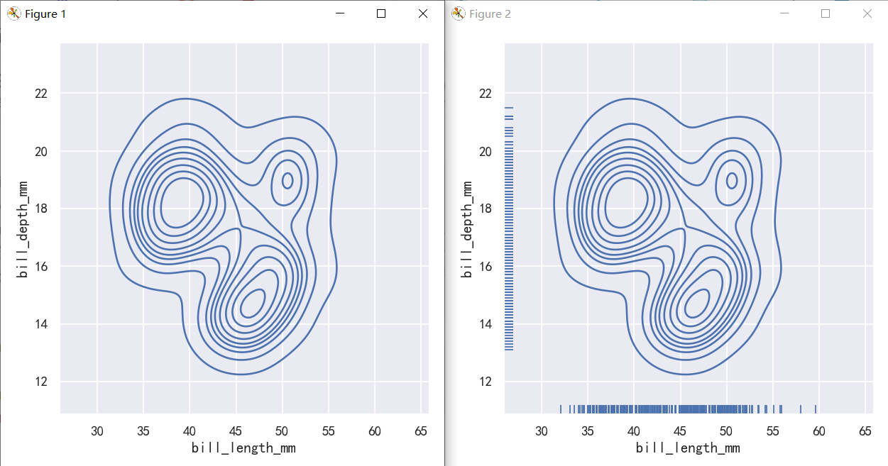
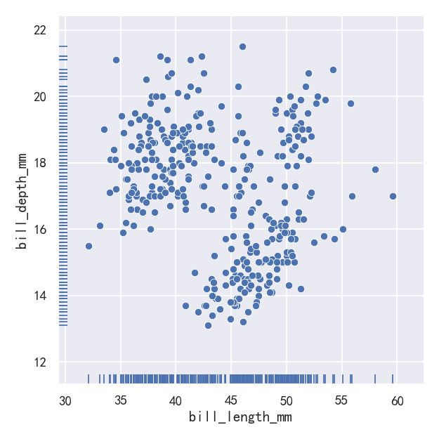
And the axes-level rugplot() function can be used to add rugs on the side of any other kind of plot:
轴级rugplot()函数可用于在任何其他类型的plot的一侧添加地毯:
g=sns.relplot(data=penguins, x="bill_length_mm", y="bill_depth_mm")
sns.rugplot(data=penguins, x="bill_length_mm", y="bill_depth_mm",ax=g.ax)
# sns.relplot(data=penguins, x="bill_length_mm", y="bill_depth_mm")
# sns.rugplot(data=penguins, x="bill_length_mm", y="bill_depth_mm")
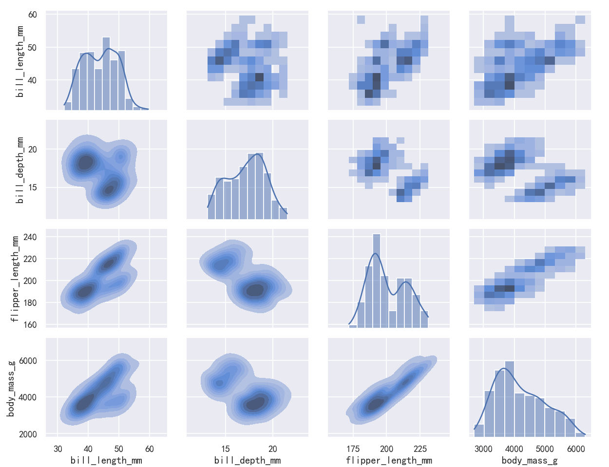
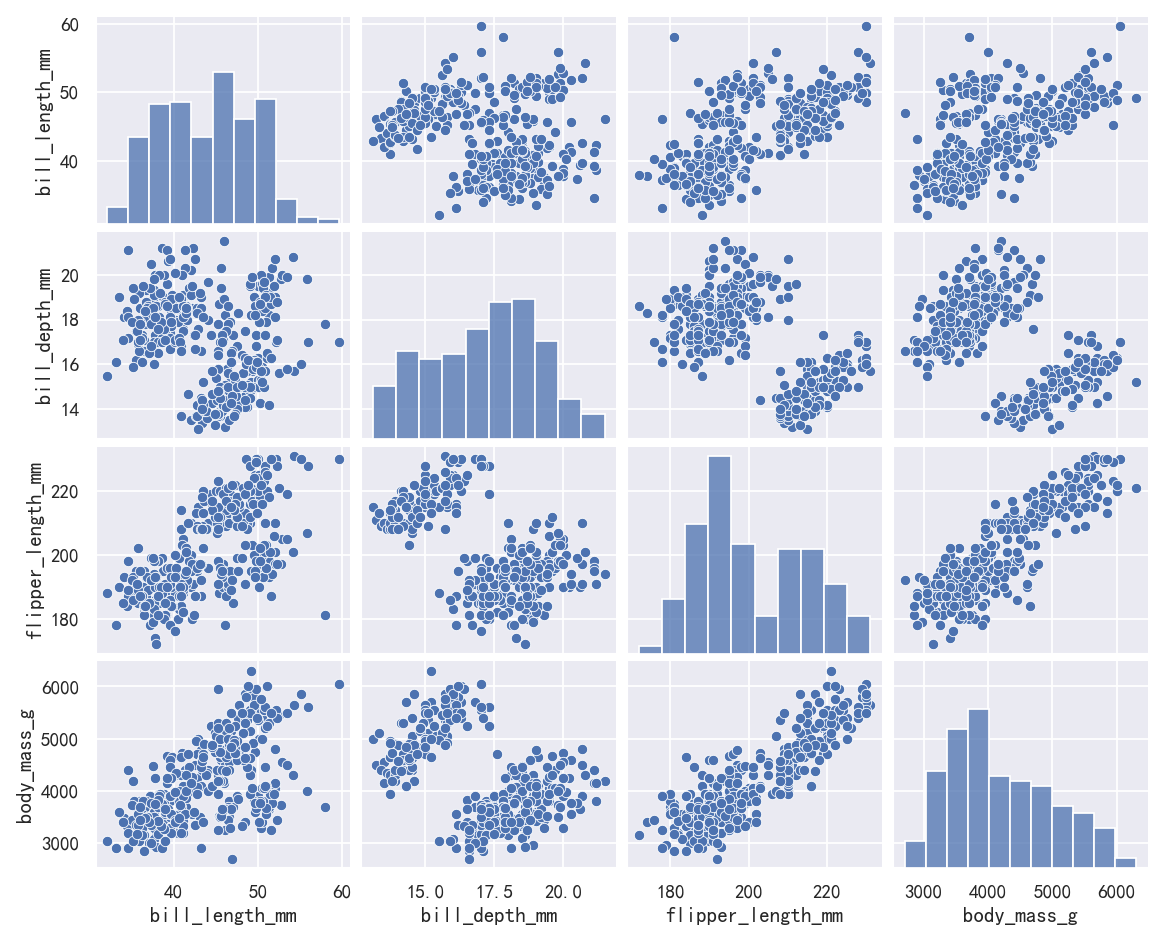
案例3-pairplot绘制多个分布
The pairplot() function offers a similar blend of joint and marginal distributions. Rather than focusing on a single relationship, however, pairplot() uses a “small-multiple” approach to visualize the univariate distribution of all variables in a dataset along with all of their pairwise relationships:
pairplot()函数提供了类似的联合分布和边际分布的混合。然而,pairplot()不是专注于单个关系,而是使用“小倍数”方法来可视化数据集中所有变量的单变量分布及其所有的成对关系:
sns.pairplot(penguins)
As with jointplot()/JointGrid, using the underlying PairGrid directly will afford more flexibility with only a bit more typing:
与jointplot()/JointGrid一样,直接使用底层的PairGrid将提供更多的灵活性,只需要多一点输入:
g = sns.PairGrid(penguins)
g.map_upper(sns.histplot)
g.map_lower(sns.kdeplot, fill=True)
g.map_diag(sns.histplot, kde=True)