微信小程序3天课程学习的第1天笔记
视频教程里,老师在开始讲微信小程序之前,补充了一个布局基础: flex布局
为后面正式的学习如何开发微信小程序,先打下一个理论基础
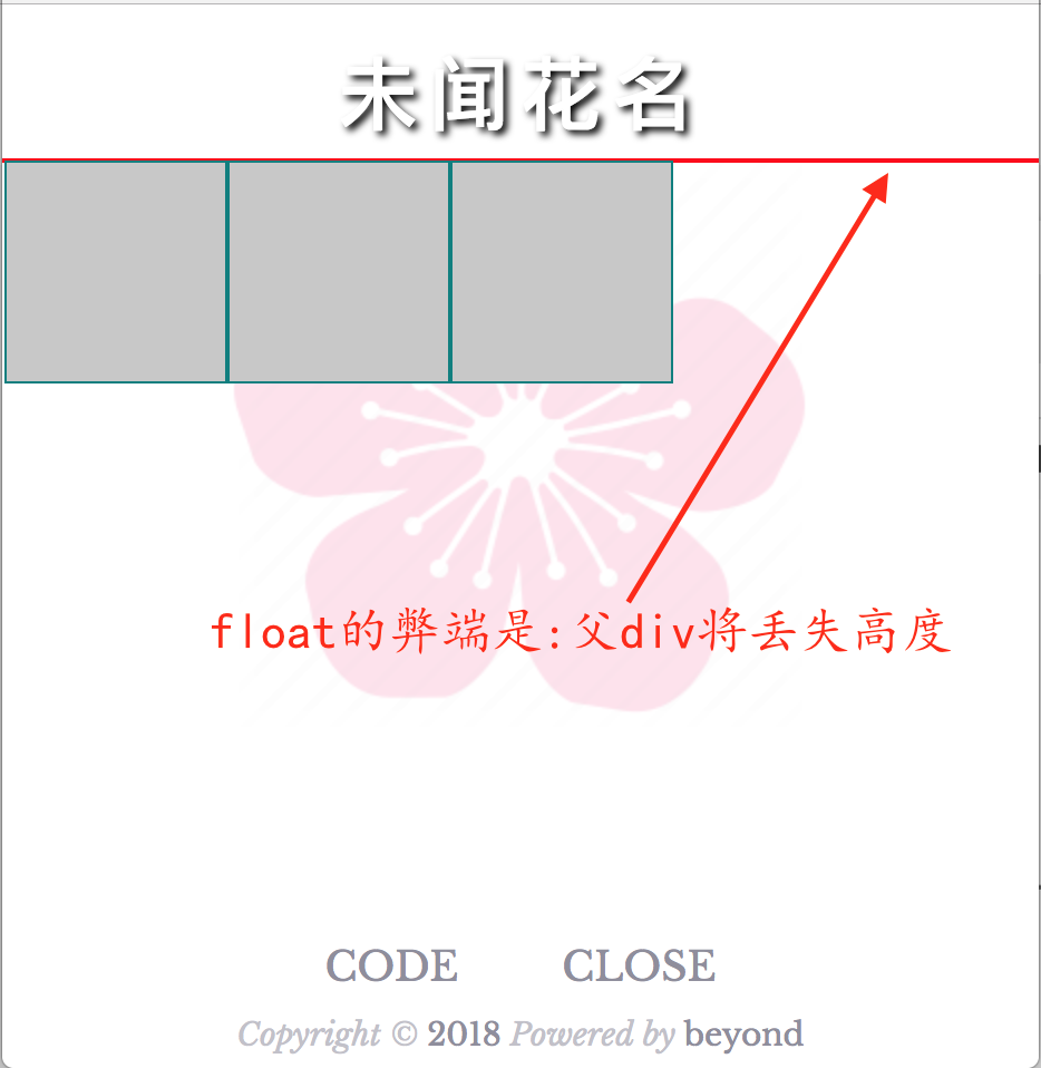
第1节课,老师讲了一下传统float会带来的影响及其解决方法
默认情况下: 一个父div里的3个子div 是会竖直排列的,并且父div的高度是自动撑起来的
1. 代码如下:
<div style="border:1px solid red;">
	<div style="border:1px solid teal;background-color:rgb(200,200,200);height:100px;width:100px;"></div>
	<div style="border:1px solid teal;background-color:rgb(200,200,200);height:100px;width:100px;"></div>
	<div style="border:1px solid teal;background-color:rgb(200,200,200);height:100px;width:100px;"></div>
</div>
1. 效果如下:
如果想让3个子div排列成一排,那么子div需要加入float:left;
但是这会有一个问题, 那就是父div丢失了高度
2. 代码如下:
<div style="border:1px solid red;">
	<div style="float:left;border:1px solid teal;background-color:rgb(200,200,200);height:100px;width:100px;"></div>
	<div style="float:left;border:1px solid teal;background-color:rgb(200,200,200);height:100px;width:100px;"></div>
	<div style="float:left;border:1px solid teal;background-color:rgb(200,200,200);height:100px;width:100px;"></div>
</div>
2. 效果如下:
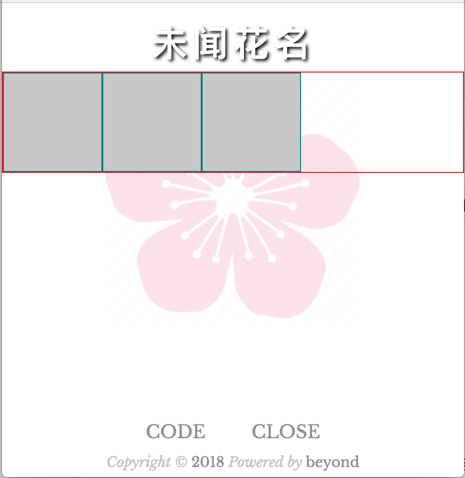
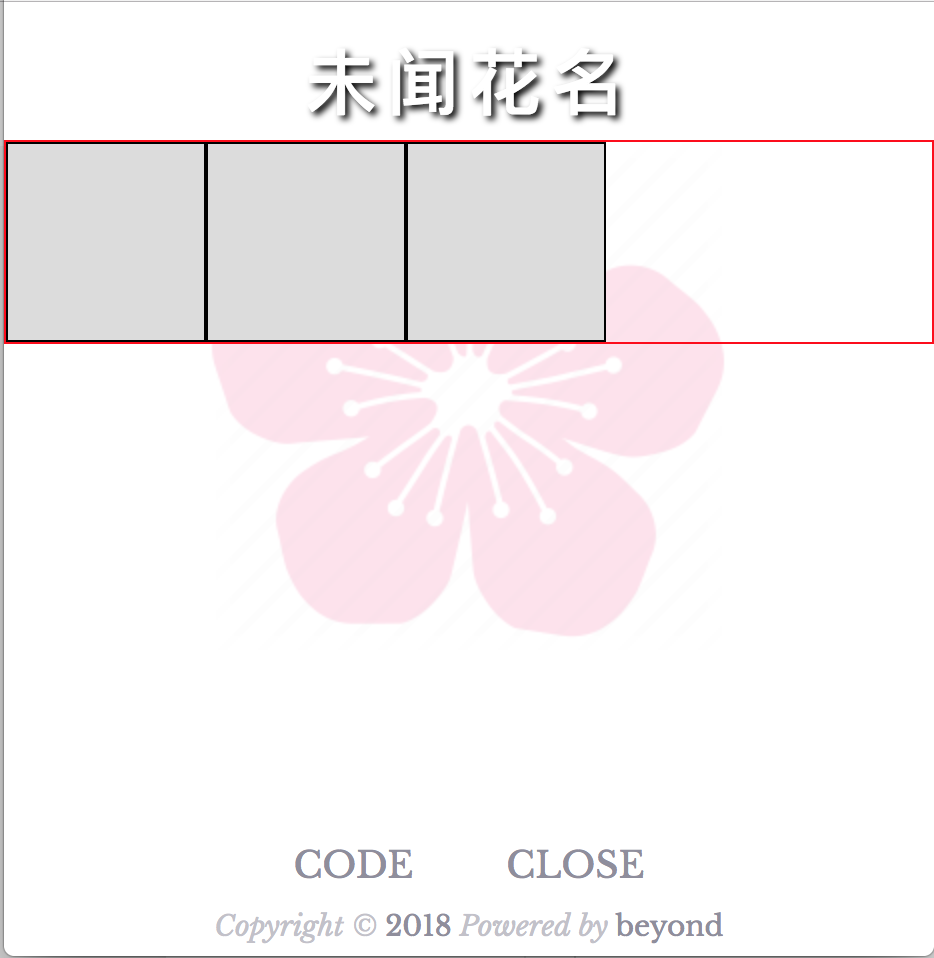
为了解决上面由float带来的 父div高度丢失的问题,
我们需要给父div添加一个overlow: hidden;来重新计算一下父div的高度
或者手动给父div指定一个高度了
3. 代码如下:
<div style="border:1px solid red;overflow:hidden;">
	<div style="float:left;border:1px solid teal;background-color:rgb(200,200,200);height:100px;width:100px;"></div>
	<div style="float:left;border:1px solid teal;background-color:rgb(200,200,200);height:100px;width:100px;"></div>
	<div style="float:left;border:1px solid teal;background-color:rgb(200,200,200);height:100px;width:100px;"></div>
</div>
3. 效果如下:
通过上面的float所存在的问题/缺陷, 老师引入了flex布局,又叫伸缩盒子模型
Flex的设置,分成两部分;
第1部分, 是设置父容器(这部分最常用)
第2部分, 是设置子div
回到最基本的1父div + 3个子div,
首先我们仅仅只是设置了一下 父div的 display: flex;就立即实现了三个子div水平排列了(好神奇!)
1. 代码如下:
<div style="border:1px solid red;display:flex;">
	<div style="border:1px solid black;background-color:rgb(220,220,220);height:100px;width:100px;"></div>
	<div style="border:1px solid black;background-color:rgb(220,220,220);height:100px;width:100px;"></div>
	<div style="border:1px solid black;background-color:rgb(220,220,220);height:100px;width:100px;"></div>
</div>
1. 效果如下:
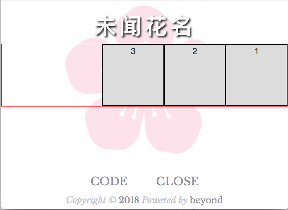
然后我们再设置了一下 父div的 flex-direction: row-reverse;就立即实现了三个子div 从右到左的水平排列了(真的好神奇!)
2. 代码如下:
<div style="border:1px solid red;display:flex;flex-direction:row-reverse">
	<div style="border:1px solid black;background-color:rgb(220,220,220);height:100px;width:100px;">1</div>
	<div style="border:1px solid black;background-color:rgb(220,220,220);height:100px;width:100px;">2</div>
	<div style="border:1px solid black;background-color:rgb(220,220,220);height:100px;width:100px;">3</div>
</div>
2. 效果如下:
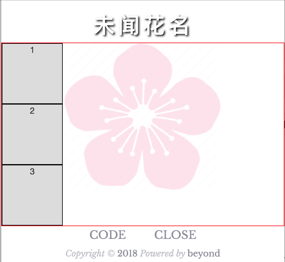
如果我们想把3个div在flex布局中,进行竖着排列呢
那么我们只需设置一下 父div的 flex-direction: coloumn;就立即实现了三个子div 从上到下的竖直排列了(是不是好神奇!)
3. 代码如下:
<div style="border:1px solid red;display:flex;flex-direction:column">
	<div style="border:1px solid black;background-color:rgb(220,220,220);height:100px;width:100px;">1</div>
	<div style="border:1px solid black;background-color:rgb(220,220,220);height:100px;width:100px;">2</div>
	<div style="border:1px solid black;background-color:rgb(220,220,220);height:100px;width:100px;">3</div>
</div>
3. 效果如下:
老师写的总结1:
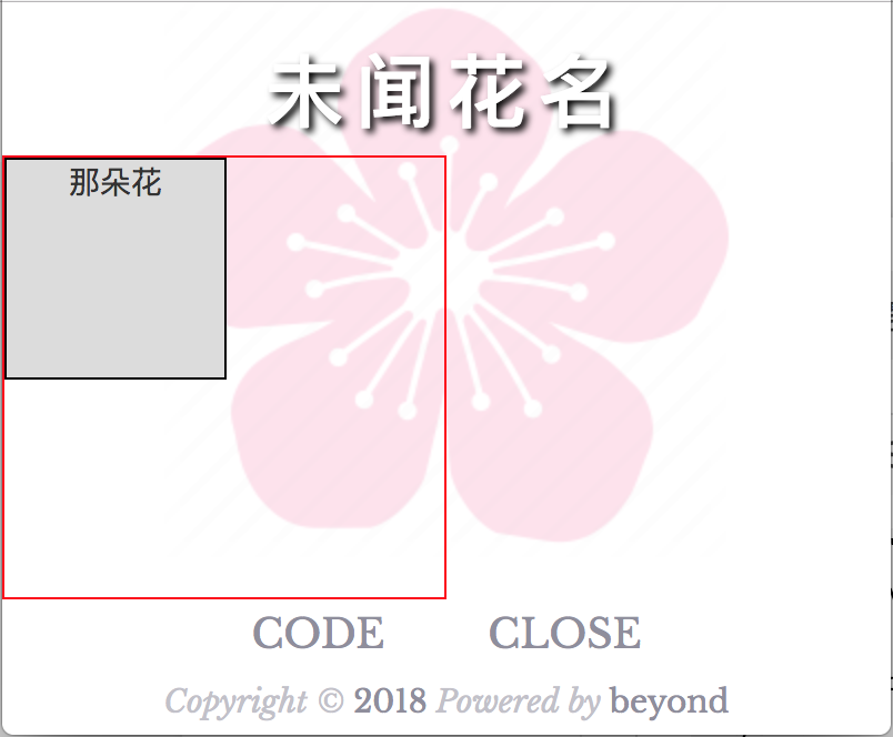
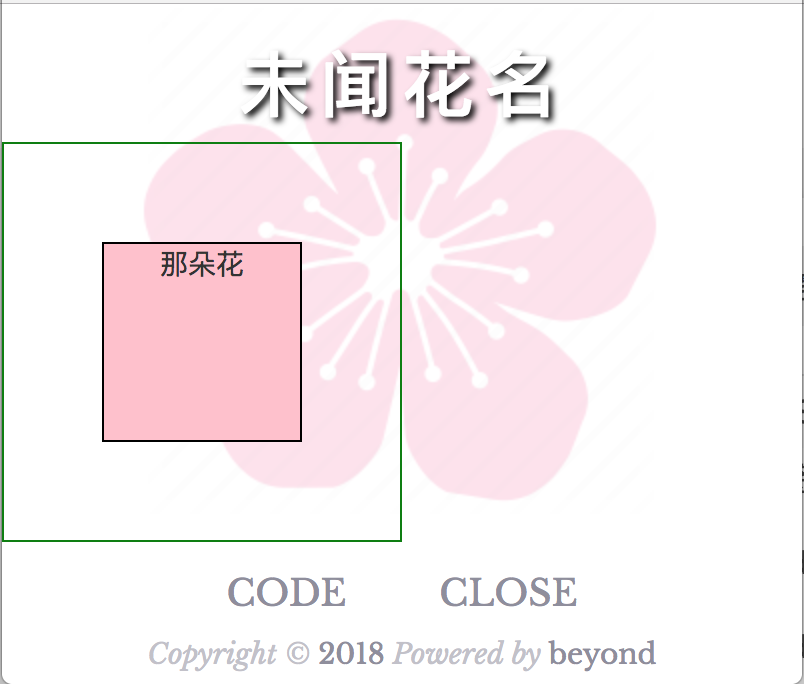
如果一个子div的大小 小于 它父div的尺寸的话
默认子div 会在父div的右上角
1. 代码如下:
<div style="width:200px;height:200px;border:1px solid red;">
	<div style="border:1px solid black;background-color:rgb(220,220,220);height:100px;width:100px;">
		那朵花
	</div>
</div>
1. 效果如下:
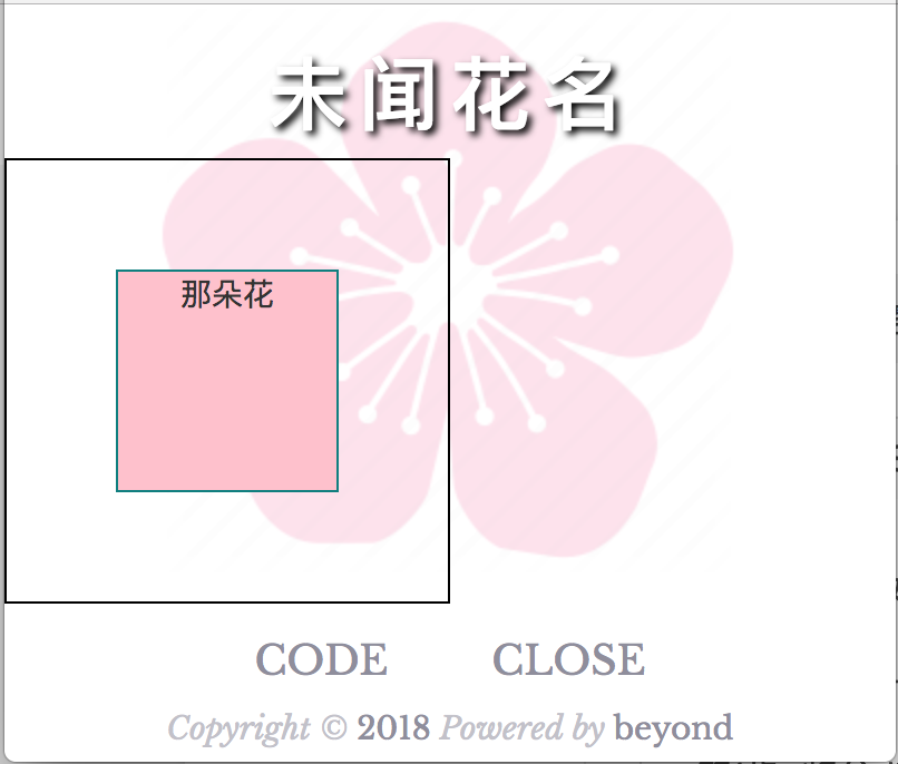
传统布局下,如果我们想把这个子div在父div中完全居中,
那么第1步, 将父div 的position设置为relative
第2步, 将子div 的postion设置为absolute
第3步, 将子div 的left设置为50%, top设置为50%
第4步, 将子div 的margin-left设置为 -1/2的自身的宽(不往回退的话,左边框就在中线上了)
将子div 的margin-top设置为 -1/2的自身的高(不往回退的话,上边框就在中线上了)
2. 代码如下:
<div style="position:relative;width:200px;height:200px;border:1px solid green;">
	<div style="position:absolute;
	left:50%;margin-left:-50px;
	top:50%;margin-top:-50px;
	border:1px solid black;background-color:pink;height:100px;width:100px;">
		那朵花
	</div>
</div>
2. 效果如下:
传统布局下,如果我们想把这个子div在父div中完全居中,还有第2种方法
前3步,都是一样的,只是第4步,换了一种写法而已,步骤如下:
第1步, 将父div 的position设置为relative
第2步, 将子div 的postion设置为absolute
第3步, 将子div 的left设置为50%, top设置为50%
第4步, 将子div 的transform设置为translate(-50%,-50%) (如果不往回退的话,左边框和上边框就在中线上了)
3. 代码如下:
<div style="position:relative;width:200px;height:200px;border:1px solid black;">
	<div style="position:absolute;
	left:50%;top:50%;
	transform:translate(-50%,-50%);
	border:1px solid teal;background-color:pink;height:100px;width:100px;">
		那朵花
	</div>
</div>
3. 效果如下:
是不是很复杂?
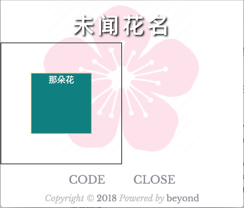
如果使用flex的话, 让一个子div在父div中居中, 只需要在父div里写下这3行代码即可(哇,好神奇!)
1. display: flex;
2. justify-content: center; (水平居中)
3. align-items: center; (垂直居中)
1. 代码如下:
<div style="display:flex;justify-content:center;align-items:center;
	 width:200px;height:200px;border:1px solid black;">

	<div style="
	border:1px solid orange;background-color:teal;color:white;
	height:100px;width:100px;">
		那朵花
	</div>
</div>
1. 效果如下:
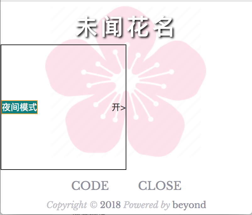
flex布局中,在水平方向上justify-content还有一个非常常见的设置: space-between
它的作用是: 让N子div在水平方向均布
例如最常见的设置菜单: 左边一个label文本, 右边一个arrow箭头或者switch开关
2. 代码如下:
<div style="display:flex;justify-content:space-between;align-items:center;
	 width:200px;height:200px;border:1px solid black;">

	<div style="
	border:1px solid orange;background-color:teal;color:white;
	">
		夜间模式
	</div>

		开>
</div>
2. 效果如下
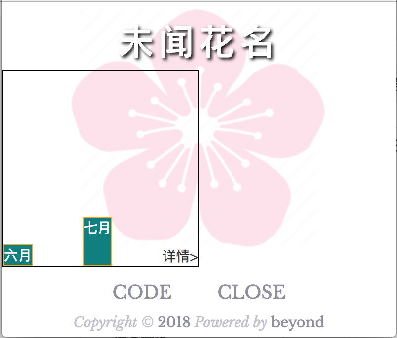
flex布局中,实际开发中,align-items还有一个值flex-end比较常见,
其作用是,让所有的子元素全部底部对齐
3. 代码如下:
<div style="display:flex;justify-content:space-between;align-items:flex-end;
	 width:200px;height:200px;border:1px solid black;">

	<div style="
	border:1px solid orange;background-color:teal;color:white;

	">
		六月
	</div>

	<div style="
	border:1px solid orange;background-color:teal;color:white;
	height:50px;
	">
		七月
	</div>

		详情>
</div>
3. 效果如下:
老师的总结2:
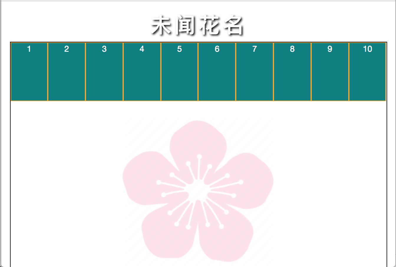
关于flex布局的换行问题,我们先来看一下
如果有10个item,想分成2行,每一行放5个item,每一个Item的 宽度为25%
但是,实际上却没有效果
1. 代码如下:
<style type="text/css">
	*{
		margin:0;
		padding: 0;
	}
	.class_div_container{
		/* 水平居中 */
		margin:0 auto;
		width:640px;
	 	height:600px;
	 	border:1px solid black;

		display:flex;
	}
	.class_div_sub{
		border:1px solid orange;
		background-color:teal;
		color:white;

		/*5个一排*/
		width:20%;
		height:100px;
	}
</style>


<div class="class_div_container">
	<div class="class_div_sub">1</div>
	<div class="class_div_sub">2</div>
	<div class="class_div_sub">3</div>
	<div class="class_div_sub">4</div>
	<div class="class_div_sub">5</div>
	<div class="class_div_sub">6</div>
	<div class="class_div_sub">7</div>
	<div class="class_div_sub">8</div>
	<div class="class_div_sub">9</div>
	<div class="class_div_sub">10</div>
</div>
2. 效果如下:
为此,我们需要引入flex中 父容器的另一个 属性 flex-warp: warp;
3. 代码如下:
<style type="text/css">

	.class_div_container{
		/* 水平居中 */
		margin:0 auto;
		width:750px;
	 	height:400px;
	 	border:1px solid black;

	 	display:flex;
		flex-wrap:wrap;
	}

	.class_div_sub{
		border:1px solid orange;
		background-color:teal;
		color:white;

		/*5个一排*/
		width:20%;
		height:100px;

	}
</style>


<div class="class_div_container">

		<div class="class_div_sub">1</div>
		<div class="class_div_sub">2</div>
		<div class="class_div_sub">3</div>
		<div class="class_div_sub">4</div>
		<div class="class_div_sub">5</div>
		<div class="class_div_sub">6</div>
		<div class="class_div_sub">7</div>
		<div class="class_div_sub">8</div>
		<div class="class_div_sub">9</div>
		<div class="class_div_sub">10</div>

</div>
3. 效果如下:
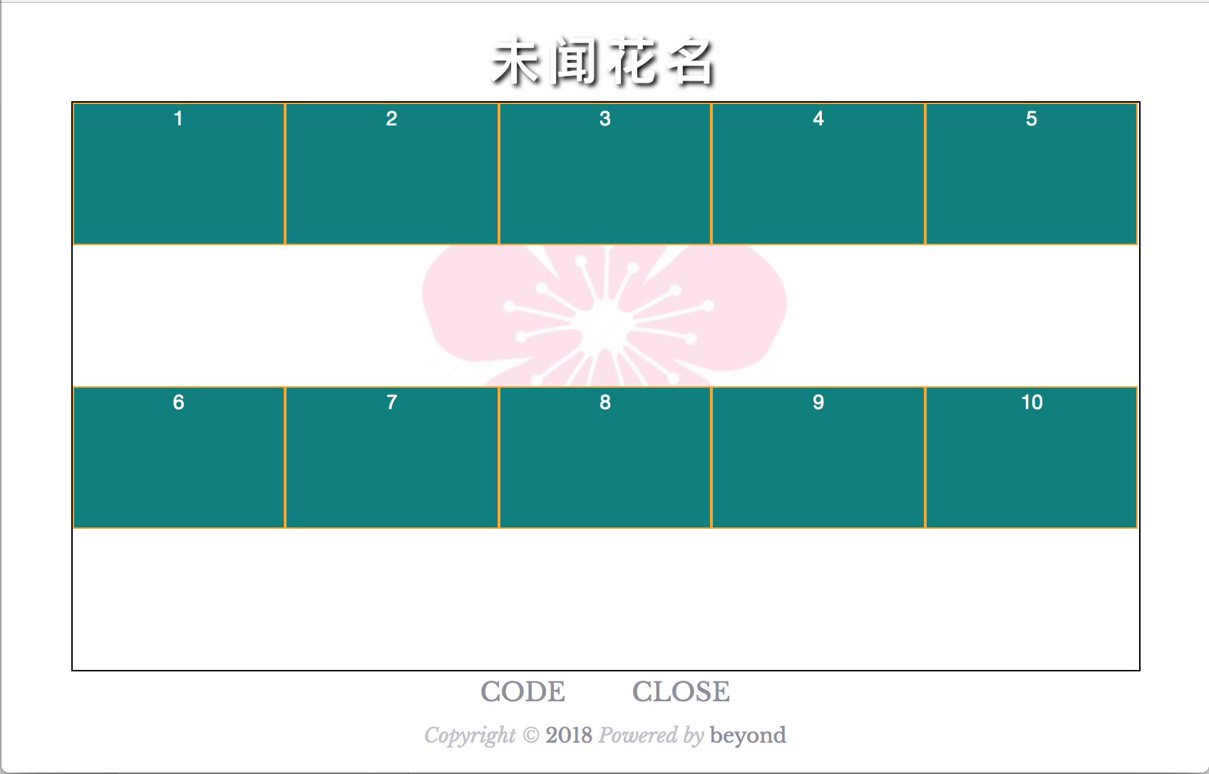
上面虽然按要求进行换行了, 但是又有一个问题...
那就是父容器的高度...太高了...
一般来说, 我们都是把这10个item放到一个header中(header里面进行flex-wrap:wrap),
然后再把header放到大的容器中
4. 代码如下:
<style type="text/css">
	/**{
		margin:0;
		padding: 0;
	}*/
	.class_div_container{
		/* 水平居中 */
		margin:0 auto;
		width:750px;
	 	height:300px;
	 	border:1px solid black;
	}

	/*必须加一个中间层,来自适应高度*/
	.class_div_header{
		display:flex;
		flex-wrap:wrap;
	}

	.class_div_sub{
		border:1px solid orange;
		background-color:teal;
		color:white;

		/*5个一排*/
		width:20%;
		height:100px;
		/*box-sizing: border-box;*/
	}
</style>


<div class="class_div_container">
	<div class="class_div_header">
		<div class="class_div_sub">1</div>
		<div class="class_div_sub">2</div>
		<div class="class_div_sub">3</div>
		<div class="class_div_sub">4</div>
		<div class="class_div_sub">5</div>
		<div class="class_div_sub">6</div>
		<div class="class_div_sub">7</div>
		<div class="class_div_sub">8</div>
		<div class="class_div_sub">9</div>
		<div class="class_div_sub">10</div>
	</div>
</div>
4. 效果如下:
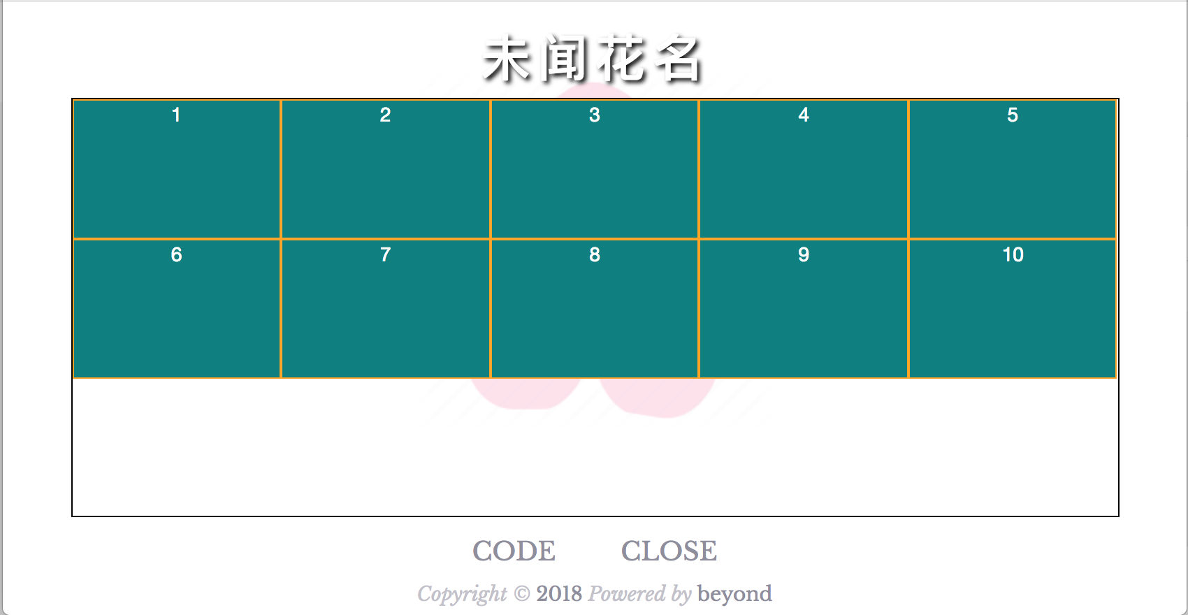
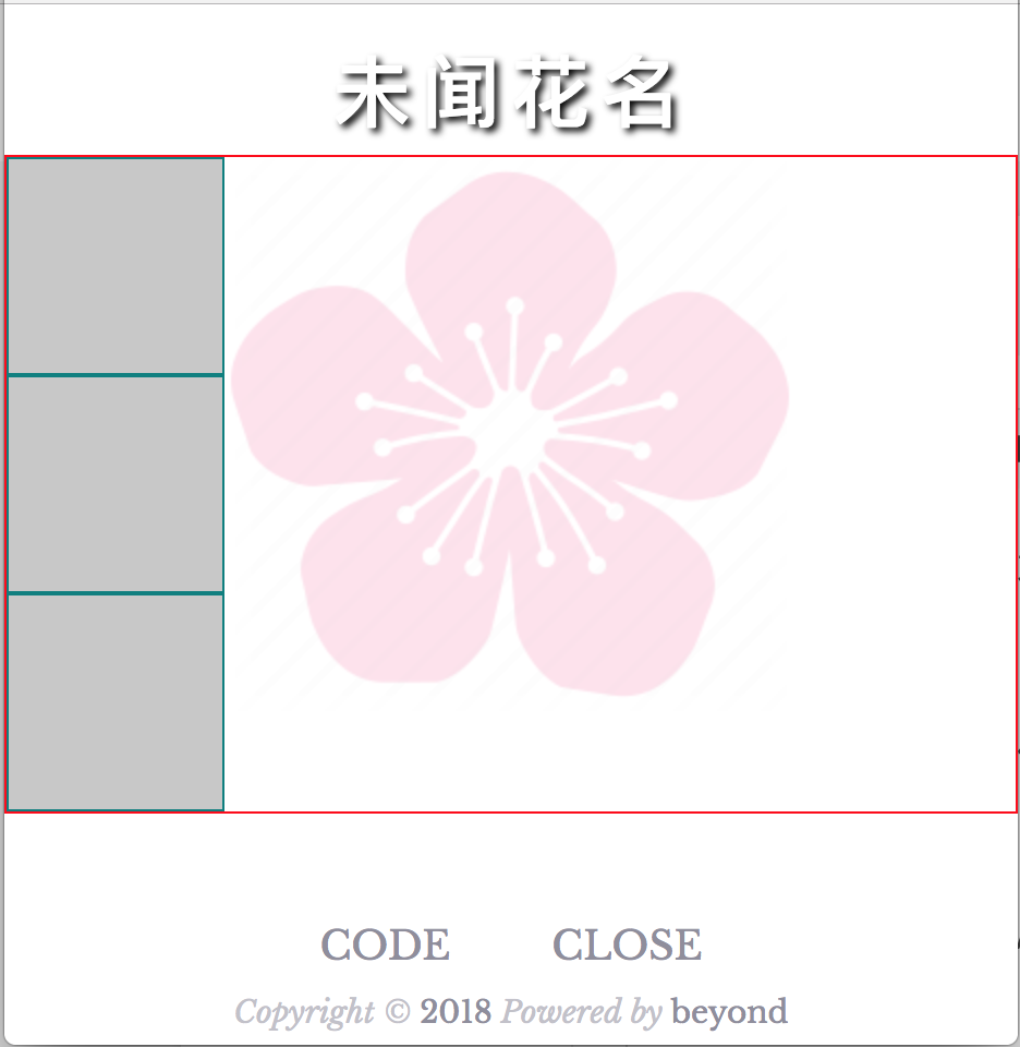
下面开始正式实现首页的样式
先用传统方法: float:left + overflow:hidden来实现
1. 代码如下:
<style type="text/css">
	*{
		margin:0;
		padding: 0;
		list-style: none;
		text-decoration: none;
	}
	.class_div_carousel img{
		width:100%;
	}
	.class_div_panel li {
		width: 33.3333%;
		height: 100px;
		border: 1px solid #ccc;
		text-align: center;
		/* 水平排列 */
		float:left;
		box-sizing: border-box;
	}

	/* 必须设置overflow: hidden; */
	.class_div_panel ul {
		overflow: hidden;
		background-color: white;
	}

	/* 图片 */
	.class_div_panel li img {
		width: 40px;
		/* 这是估算的 */
		margin-top: 22px;
	}
	/* 字体 */
	.class_div_panel li p {
		font-size: 14px;
		color: #333;
	}
</style>


<!-- 轮播图 -->
<div class="class_div_carousel">
	<img src="img/menma.jpg">
</div>

<!-- 面板 3*3 = 9个按钮 -->
<div class="class_div_panel">
	<ul>
		<li>
			<a href="">
				<img src="img/beyond.jpg" />
				<p>未闻花名</p>
			</a>
		</li>

		<li>
			<a href="">
				<img src="img/mathilda.jpg" />
				<p>mathilda</p>
			</a>
		</li>

		<li>
			<a href="">
				<img src="img/jennifer.png" />
				<p>美国往事</p>
			</a>
		</li>


		<li>
			<a href="">
				<img src="img/beyond.jpg" />
				<p>未闻花名</p>
			</a>
		</li>

		<li>
			<a href="">
				<img src="img/mathilda.jpg" />
				<p>mathilda</p>
			</a>
		</li>

		<li>
			<a href="">
				<img src="img/jennifer.png" />
				<p>美国往事</p>
			</a>
		</li>


		<li>
			<a href="">
				<img src="img/beyond.jpg" />
				<p>未闻花名</p>
			</a>
		</li>

		<li>
			<a href="">
				<img src="img/mathilda.jpg" />
				<p>mathilda</p>
			</a>
		</li>

		<li>
			<a href="">
				<img src="img/jennifer.png" />
				<p>美国往事</p>
			</a>
		</li>
	</ul>

</div>
1. 效果如下:
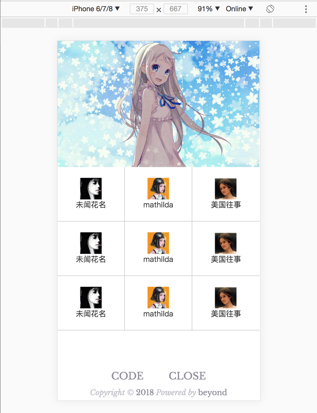
接下来使用flex布局,实现ul里的li水平排列, 3个一折行
并且使用flex布局,实现a里面的img和p 垂直排列,并居中
2. 代码如下:
<style type="text/css">
	*{
		margin:0;
		padding: 0;
		list-style: none;
		text-decoration: none;
	}
	.class_div_carousel img{
		width:100%;
	}

	/* 将ul 里的 li 水平排列并且flex-wrap */
	.class_div_panel ul {
		display: flex;
		flex-wrap:wrap;
	}

	.class_div_panel li {
		width: 33.3333%;
		border: 1px solid #ccc;
		box-sizing: border-box;
	}
	.class_div_panel li a {
		/* 要想 a 里的图片img 和 文字p 垂直居中
		   第1步, 给a这个父容器,设置flex布局
		 */
		 height: 100px;
		display: flex;
		/* 第2步, flex内的子元素 img 和 p 默认是水平排列
		   将img 和 p 改成垂直排列
		*/
		flex-direction: column;
		/* 第3步, 将img 和 p 居中*/
		/* 水平 */
		justify-content: center;
		/* 垂直 */
		align-items: center;
	 }


	.class_div_panel ul {
		background-color: white;
	}

	/* 图片 */
	.class_div_panel li img {
		width: 40px;
	}
	/* 字体 */
	.class_div_panel li p {
		font-size: 14px;
		color: #333;
	}
</style>


<!-- 轮播图 -->
<div class="class_div_carousel">
	<img src="img/menma.jpg">
</div>

<!-- 面板 3*3 = 9个按钮 -->
<div class="class_div_panel">
	<ul>
		<li>
			<a href="">
				<img src="img/beyond.jpg" />
				<p>未闻花名</p>
			</a>
		</li>

		<li>
			<a href="">
				<img src="img/mathilda.jpg" />
				<p>mathilda</p>
			</a>
		</li>

		<li>
			<a href="">
				<img src="img/jennifer.png" />
				<p>美国往事</p>
			</a>
		</li>


		<li>
			<a href="">
				<img src="img/beyond.jpg" />
				<p>未闻花名</p>
			</a>
		</li>

		<li>
			<a href="">
				<img src="img/mathilda.jpg" />
				<p>mathilda</p>
			</a>
		</li>

		<li>
			<a href="">
				<img src="img/jennifer.png" />
				<p>美国往事</p>
			</a>
		</li>


		<li>
			<a href="">
				<img src="img/beyond.jpg" />
				<p>未闻花名</p>
			</a>
		</li>

		<li>
			<a href="">
				<img src="img/mathilda.jpg" />
				<p>mathilda</p>
			</a>
		</li>

		<li>
			<a href="">
				<img src="img/jennifer.png" />
				<p>美国往事</p>
			</a>
		</li>
	</ul>

</div>
2. 效果如下:
补充一点: 关于 边框 的细节处理
首先使用传统的方法:
.class_div_panel li {
		width: 33.3333%;

		box-sizing: border-box;

		/*border: 1px solid #ccc;*/
		border-right: 1px solid #ccc;
		border-bottom: 1px solid #ccc;
	}
	/* 第3 6 9 的右边不需要边框*/
	.class_div_panel li:nth-child(3n) {
		border-right: 0 none;
	}
第2种, 使用伪元素的方法来设置右边框
代码如下:
.class_div_panel li {
		width: 33.3333%;
		box-sizing: border-box;

		/* 底部的边框直接写 */
		border-bottom: 1px solid #eee;
		/* 使用 绝对布局的伪元素 来实现右边框 */
		position: relative;
	}

	.class_div_panel li::after {
		/* content 必须写 */
		content: '';
		position: absolute;
		right: 0;
		top: 0;
		width: 1px;
		height: 100%;
		background: #eee

	}
	/* 第3 6 9 的右边不需要边框*/
	.class_div_panel li:nth-child(3n)::after {
		width: 0;
	}
效果如下:
未完待续,下一章节,つづく