一、折线图绘图基本内容如下所示,功能看代码后的注释。
二、其余功能可以通过访问函数介绍或者matplotlib官网,后者可以直接在模板上修改,非常方便。
(注:其中我调用字体的地址是自己电脑里的,如果路径不同需要修改。)
三、代码块
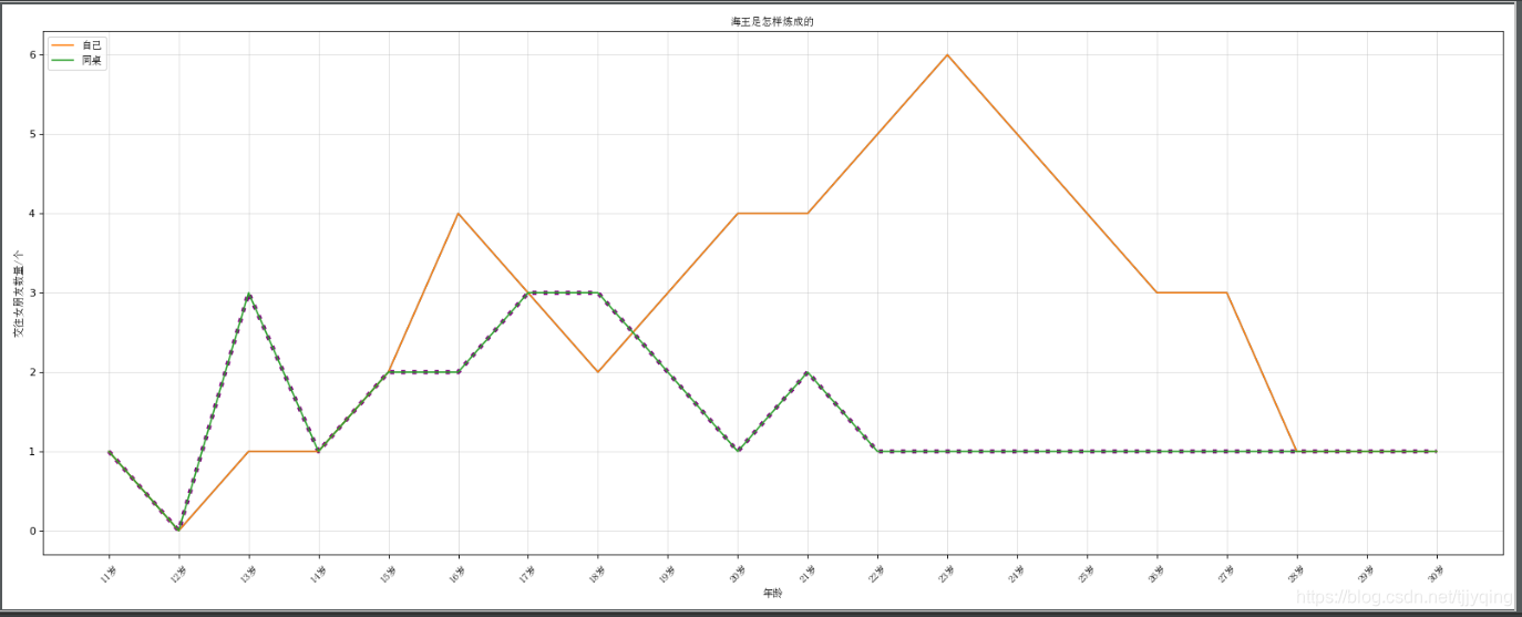
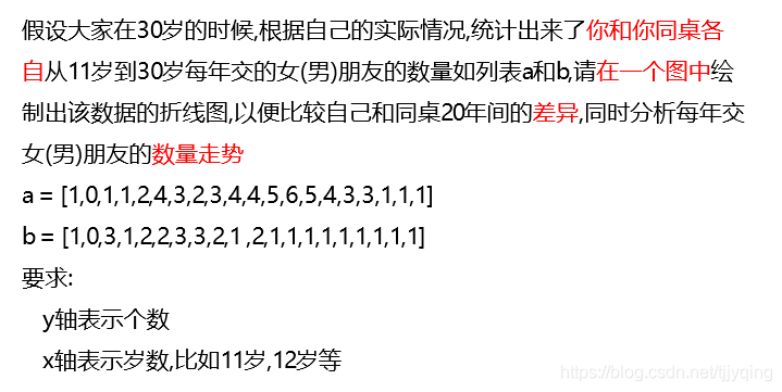
(1)问题
(2)代码
from matplotlib import pyplot as plt
from matplotlib import font_manager

my_font = font_manager.FontProperties(fname=r"G:\Python_Learning\untitled\test\simsun.ttc")  # 调取中文字体

plt.figure(figsize=(20, 8), dpi=80)  # 调图表大小

y_1 = [1, 0, 1, 1, 2, 4, 3, 2, 3, 4, 4, 5, 6, 5, 4, 3, 3, 1, 1, 1]  # 这些是数据,可供修改
x = list(range(11, 31))
y_2 = [1, 0, 3, 1, 2, 2, 3, 3, 2, 1, 2, 1, 1, 1, 1, 1, 1, 1, 1, 1]

plt.plot(x, y_1,)  # 绘图
plt.plot(x, y_2, color="purple", linestyle=":", linewidth=4)  # 这里演示一下调折线颜色、宽度和样式

plt.plot(x, y_1, label='自己')  # 画示意
plt.plot(x, y_2, label='同桌')
plt.legend(prop=my_font, loc="upper left")  # 只有这里显示中文用prop,其余都是用fontproperties。loc是改图例位置

_x_ticks_lables = ["{}岁".format(i) for i in x]  # 设置坐标的字符串
plt.xticks(x[::1], _x_ticks_lables, rotation=45, fontproperties=my_font)  # 设置坐标刻度和字符串

plt.xlabel("年龄", fontproperties=my_font)  # 贴轴标题
plt.ylabel("交往女朋友数量/个", fontproperties=my_font)
plt.title("海王是怎样炼成的", fontproperties=my_font)

# 绘制网格
plt.grid(alpha=0.4)  # alpha是透明度
plt.show()
plt.savefig("line_graph.png")
"""
很多其余的修改都可以参考源码哦,直接ctrl点击函数就可以了
还有matplotlib官网上有很多代码和图,可以参考图去找代码 matplotlib.org
"""
(3)示意图