经济走势图、销售波动图、PV监控图用折线图
plt.hist()
但好像一直都会用plt.plot()函数应用
plt.hist(x,y,linestyle,
        linewidth,color,marker,
        markersize,markeredgecolor,
        markerfactcolor,label,alpha)
x:指定折线图的x轴数据;
y:指定折线图的y轴数据;
linestyle:指定折线的类型,可以是实线、虚线、点虚线、点点线等,默认文实线;
linewidth:指定折线的宽度
marker:可以为折线图添加点,该参数是设置点的形状;
markersize:设置点的大小;
markeredgecolor:设置点的边框色;
markerfactcolor:设置点的填充色;
label:为折线图添加标签,类似于图例的作用;
扫描二维码关注公众号,回复:
3572361 查看本文章

#经济走势图、销售波动图、PV监控图用折线图
#一元折线图的绘制
#案例:每天进步一点点2015公众号文章阅读人数
#导入模块
import pandas as pd
import matplotlib.pyplot as plt
#设置绘图风格
plt.style.use('ggplot')
#设置中文编码和负号正常显示
plt.rcParams['font.sans-serif']=['Microsoft YaHei']
plt.rcParams['axes.unicode_minus']=False
#忽略警告
import warnings
warnings.filterwarnings('ignore')
#读取需要绘图的数据
# file=open('E:\知乎文件保存\python_curveplot\wechart.xlsx','rb')
article_reading=pd.read_excel('E:\知乎文件保存\python_curveplot\wechart.xlsx')
#取数:取出8月份至9月28号的数据
sub_data=article_reading.loc[article_reading.date>='2017-08-01',:]
#可以用data函数直接读取数据,日期数据是具有运算的
#设置图框大小
fig=plt.figure(figsize=(10,6))
#绘图
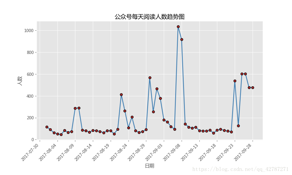
plt.plot(
sub_data.date,#x轴数据
sub_data.article_reading_cnts,#y轴数据
linestyle='-',#折线类型
linewidth=2,#折线宽度
color='steelblue',#折线颜色
marker='o',#点的形状
markersize=6,#点的大小
markeredgecolor='black',#点的边框色
markerfacecolor='brown'#点的填充色
)
#添加标题和坐标轴标签
plt.title('公众号每天阅读人数趋势图')
plt.xlabel('日期')
plt.ylabel('人数')
#剔除图框上边界和右边界的刻度
plt.tick_params(top='off',right='off')
#此步是为了进一步优化图像,比如将刻度标签展现的形式是‘yyyy-mm-dd',又想以固定几天作为间隔
#只需要在上述代码的基础上添加几行代码
import matplotlib as mpl
#获取图的坐标信息
ax=plt.gca()
#设置日期的显示格式
date_format=mpl.dates.DateFormatter('%Y-%m-%d')
ax.xaxis.set_major_formatter(date_format)
#设置x轴显示多少个日期刻度
#xlocator=mpl.ticker.LinearleLocator(10)
#设置x轴每个刻度的间隔天数
xlocator=mpl.ticker.MultipleLocator(5)
ax.xaxis.set_major_locator(xlocator)
#为了避免x轴日期刻度标签的重叠,设置x轴刻度自动展现,并且45度倾斜
fig.autofmt_xdate(rotation=45)
plt.show()
######多元折线图绘制############
#如果需要在一张图上中划出两条折线图,也很简单,只需要在代码中写入两次plot函数即可,其他都不需要改动。
#导入模块
import pandas as pd
import matplotlib.pyplot as plt
#设置绘图风格
plt.style.use('ggplot')
#设置中文编码和负号正常显示
plt.rcParams['font.sans-serif']=['Microsoft YaHei']
plt.rcParams['axes.unicode_minus']=False
#忽略警告
import warnings
warnings.filterwarnings('ignore')
#读取需要绘图的数据
# file=open('E:\知乎文件保存\python_curveplot\wechart.xlsx','rb')
article_reading=pd.read_excel('E:\知乎文件保存\python_curveplot\wechart.xlsx')
#取数:取出8月份至9月28号的数据
sub_data=article_reading.loc[article_reading.date>='2017-08-01',:]
#可以用data函数直接读取数据,日期数据是具有运算的
#设置图框大小
fig=plt.figure(figsize=(10,6))
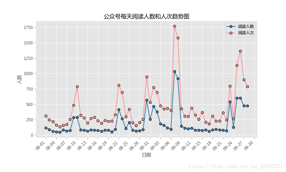
#绘图--阅读人数趋势
plt.plot(
sub_data.date,#x轴数据
sub_data.article_reading_cnts,#y轴数据
linestyle='-',#折线类型
linewidth=2,#折线宽度
color='steelblue',#折线颜色
marker='o',#点的形状
markersize=6,#点的大小写
markeredgecolor='black',#点的边框色
markerfacecolor='steelblue',#点的填充色
label='阅读人数'#添加标签
)
#绘图--阅读人次趋势
plt.plot(
sub_data.date,#x轴标签
sub_data.article_reading_times,#y轴数据
linestyle='-',#折线类型
linewidth=2,#折线宽度
color='#ff9999',#折线颜色
marker='o',#点的形状
markersize=6,#点的大小
markeredgecolor='black',#点的边框色
markerfacecolor='#ff9999',#点的填充色
label='阅读人次'
)
#添加标题和坐标轴标签
plt.title('公众号每天阅读人数和人次趋势图')
plt.xlabel('日期')
plt.ylabel('人数')
#剔除图框上边界和右边界的刻度
plt.tick_params(top='off',right='off')
#获取图的坐标信息
ax=plt.gca()
#设置日期的显示格式
date_format=mpl.dates.DateFormatter('%m-%d')
ax.xaxis.set_major_formatter(date_format)
#设置x轴显示多少个日期刻度
#xlocator=mpl.ticker.LinearLocator(10)
#设置x轴每个刻度的间隔天数
xlocator=mpl.ticker.MultipleLocator(3)
ax.xaxis.set_major_locator(xlocator)
#为了避免x轴日期刻度标签的重叠,设置x轴刻度自动展现,并且倾斜45度
fig.autofmt_xdate(rotation=45)
plt.legend()
plt.show()