基于逻辑回归的分类预测模型
一、Demo实例
Step1:库函数导入
##  基础函数库
import numpy as np

## 导入画图库
import matplotlib.pyplot as plt
import seaborn as sns

## 导入逻辑回归模型函数
from sklearn.linear_model import LogisticRegression
Step2:模型训练
##Demo演示LogisticRegression分类

## 构造数据集
x_fearures = np.array([[-1, -2], [-2, -1], [-3, -2], [1, 3], [2, 1], [3, 2]])
y_label = np.array([0, 0, 0, 1, 1, 1])

## 调用逻辑回归模型
lr_clf = LogisticRegression()

## 用逻辑回归模型拟合构造的数据集
lr_clf = lr_clf.fit(x_fearures, y_label) #其拟合方程为 y=w0+w1*x1+w2*x2
Step3:模型参数查看
##查看其对应模型的w
print('the weight of Logistic Regression:',lr_clf.coef_)#coef_是回归模型中得权重属性
##查看其对应模型的w0
print('the intercept(w0) of Logistic Regression:',lr_clf.intercept_)
#intercept_是回归模型中的偏差
##the weight of Logistic Regression:[[0.73462087 0.6947908]]
##the intercept(w0) of Logistic Regression:[-0.03643213]
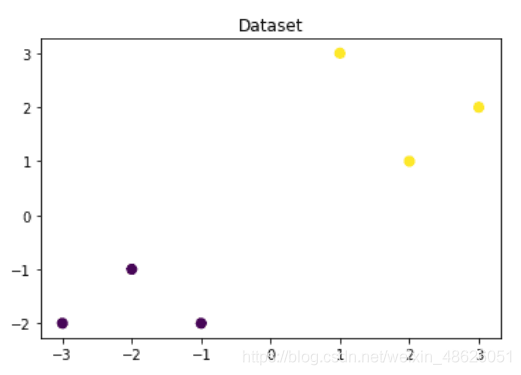
Step4:数据和模型可视化
可视化构造得数据样本点
## 可视化构造的数据样本点
plt.figure()#构造一张画布
plt.scatter(x_fearures[:,0],x_fearures[:,1], c=y_label, s=50, cmap='viridis') #画出散点图,
plt.title('Dataset')#散点图的标题
plt.show()
plt.scatter(), scatter的用法以及属性
其中散点的形状参数marker如下:
3、其中颜色参数c如下:
可视化决策边界
plt.figure()#构造画布
plt.scatter(x_fearures[:,0],x_fearures[:,1], c=y_label, s=50, cmap='viridis')
plt.title('Dataset')#画散点图

nx, ny = 200, 100
x_min, x_max = plt.xlim() #取或者是设定x座标轴的范围,当前axes上的座标轴。
y_min, y_max = plt.ylim()#取或者是设定x座标轴的范围,当前axes上的座标轴。
x_grid, y_grid = np.meshgrid(np.linspace(x_min, x_max, nx),np.linspace(y_min, y_max, ny))
'''
#numpy.meshgrid()——生成网格点坐标矩阵。
#np.linspace主要用来创建等差数列
#numpy.linspace(start, stop, num=50, endpoint=True, retstep=False, dtype=None, axis=0)
start:返回样本数据开始点
stop:返回样本数据结束点
num:生成的样本数据量,默认为50
endpoint:True则包含stop;False则不包含stop
retstep:If True, return (samples, step), where step is the spacing between samples.(即如果为True则结果会给出数据间隔)
dtype:输出数组类型
axis:0(默认)或-1
'''
z_proba = lr_clf.predict_proba(np.c_[x_grid.ravel(), y_grid.ravel()])

'''numpy.ravel()将多维数组拉平
np.c_np.c_是按行连接两个矩阵,就是把两矩阵左右相加,要求行数相等,类似于pandas中的merge()。
-------------------a------------------
[[1 2 3]
[4 5 6]]
-------------------b------------------
[[0 0 0]
[1 1 1]]
-------------------np.r_[a,b]--------------------
[[1 2 3]
[4 5 6]
[0 0 0]
[1 1 1]]
--------------------np.c_[a,b]-------------------
[[1 2 3 0 0 0]
[4 5 6 1 1 1]]
'''
z_proba = z_proba[:, 1].reshape(x_grid.shape)
#z_proba 第一列是为0的概率,第二列是为1的概率,把20000*1 变成100*200
plt.contour(x_grid, y_grid, z_proba, [0.5], linewidths=2., colors='blue')
#等高线的用法看下面的链接
plt.show()

可视化预测新样本
plt.figure()#新画布
x_fearures_new1 = np.array([[0, -1]])#一个新的要预测的样本点
plt.scatter(x_fearures_new1[:,0],x_fearures_new1[:,1], s=50, cmap='viridis')
plt.annotate(s='New point 1',xy=(0,-1),xytext=(-2,0),color='blue',arrowprops=dict(arrowstyle='-|>',connectionstyle='arc3',color='red'))#对样本文字进行标注,具体用法看下面链接

x_fearures_new2 = np.array([[1, 2]])#一个新的要预测的样本点
plt.scatter(x_fearures_new2[:,0],x_fearures_new2[:,1], s=50, cmap='viridis')
plt.annotate(s='New point 2',xy=(1,2),xytext=(-1.5,2.5),color='red',arrowprops=dict(arrowstyle='-|>',connectionstyle='arc3',color='red'))

## 训练样本
plt.scatter(x_fearures[:,0],x_fearures[:,1], c=y_label, s=50, cmap='viridis')
plt.title('Dataset')

# 可视化决策边界
plt.contour(x_grid, y_grid, z_proba, [0.5], linewidths=2., colors='blue')

plt.show()

Step5:模型预测
##在训练集和测试集上分布利用训练好的模型进行预测
y_label_new1_predict=lr_clf.predict(x_fearures_new1)
y_label_new2_predict=lr_clf.predict(x_fearures_new2)
print('The New point 1 predict class:\n',y_label_new1_predict)
print('The New point 2 predict class:\n',y_label_new2_predict)
##由于逻辑回归模型是概率预测模型(前文介绍的p = p(y=1|x,\theta)),所有我们可以利用predict_proba函数预测其概率
y_label_new1_predict_proba=lr_clf.predict_proba(x_fearures_new1)
y_label_new2_predict_proba=lr_clf.predict_proba(x_fearures_new2)
print('The New point 1 predict Probability of each class:\n',y_label_new1_predict_proba)
print('The New point 2 predict Probability of each class:\n',y_label_new2_predict_proba)
##TheNewpoint1predictclass:
##[0]
##TheNewpoint2predictclass:
##[1]
##TheNewpoint1predictProbabilityofeachclass:
##[[0.695677240.30432276]]
##TheNewpoint2predictProbabilityofeachclass:
##[[0.119839360.88016064]]
可以发现训练好的回归模型将X_new1预测为了类别0(判别面左下侧),X_new2预测为了类别1(判别面右上侧)。其训练得到的逻辑回归模型的概率为0.5的判别面为上图中蓝色的线。
二、基于鸢尾花(iris)数据集的逻辑回归分类实践
在实践的最开始,我们首先需要导入一些基础的函数库包括:numpy (Python进行科学计算的基础软件包),pandas(pandas是一种快速,强大,灵活且易于使用的开源数据分析和处理工具),matplotlib和seaborn绘图。
Step1:函数库导入
##  基础函数库
import numpy as np
import pandas as pd

## 绘图函数库
import matplotlib.pyplot as plt
import seaborn as sns
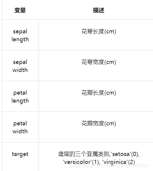
本次我们选择鸢花数据(iris)进行方法的尝试训练,该数据集一共包含5个变量,其中4个特征变量,1个目标分类变量。共有150个样本,目标变量为 花的类别 其都属于鸢尾属下的三个亚属,分别是山鸢尾 (Iris-setosa),变色鸢尾(Iris-versicolor)和维吉尼亚鸢尾(Iris-virginica)。包含的三种鸢尾花的四个特征,分别是花萼长度(cm)、花萼宽度(cm)、花瓣长度(cm)、花瓣宽度(cm),这些形态特征在过去被用来识别物种。
Step2:数据读取/载入
##我们利用sklearn中自带的iris数据作为数据载入,并利用Pandas转化为DataFrame格式
from sklearn.datasets import load_iris
data = load_iris() #得到数据特征
iris_target = data.target #得到数据对应的标签
iris_features = pd.DataFrame(data=data.data, columns=data.feature_names) #利用Pandas转化为DataFrame格式
Step3:数据信息简单查看
##利用.info()查看数据的整体信息
iris_features.info()

##<class'pandas.core.frame.DataFrame'>
##RangeIndex:150entries,0to149
##Datacolumns(total4columns):
###ColumnNon-NullCountDtype
##----------------------------
##0sepallength(cm)150non-nullfloat64
##1sepalwidth(cm)150non-nullfloat64
##2petallength(cm)150non-nullfloat64
##3petalwidth(cm)150non-nullfloat64
##dtypes:float64(4)
##memoryusage:4.8KB
##进行简单的数据查看,我们可以利用.head()头部.tail()尾部
iris_features.head()

iris_features.tail()
##其对应的类别标签为,其中0,1,2分别代表'setosa','versicolor','virginica'三种不同花的类别

iris_target


##array([0,0,0,0,0,0,0,0,0,0,0,0,0,0,0,0,0,0,0,0,0,0,


##0,0,0,0,0,0,0,0,0,0,0,0,0,0,0,0,0,0,0,0,0,0,


##0,0,0,0,0,0,1,1,1,1,1,1,1,1,1,1,1,1,1,1,1,1,


##1,1,1,1,1,1,1,1,1,1,1,1,1,1,1,1,1,1,1,1,1,1,


##1,1,1,1,1,1,1,1,1,1,1,1,2,2,2,2,2,2,2,2,2,2,


##2,2,2,2,2,2,2,2,2,2,2,2,2,2,2,2,2,2,2,2,2,2,


##2,2,2,2,2,2,2,2,2,2,2,2,2,2,2,2,2,2])
##利用value_counts函数查看每个类别数量

pd.Series(iris_target).value_counts()

##2    50

##1    50

##0    50

##dtype:int64
##对于特征进行一些统计描述

iris_features.describe()

Step4:可视化描述
## 合并标签和特征信息
iris_all = iris_features.copy() ##进行浅拷贝,防止对于原始数据的修改
iris_all['target'] = iris_target #对iris_all 这个dataframe增加一列'target'
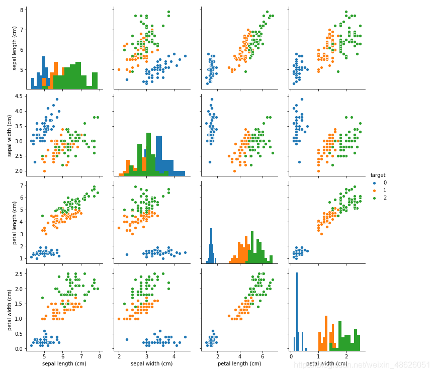
## 特征与标签组合的散点可视化
sns.pairplot(data=iris_all,diag_kind='hist', hue= 'target')
#用法见下面链接
plt.show()
链接:sns.pairplot的用法
从上图可以发现,在2D情况下不同的特征组合对于不同类别的花的散点分布,以及大概的区分能力。
for col in iris_features.columns :
    sns.boxplot(x='target', y=col, saturation=0.5,
palette='pastel', data=iris_all) #对iris_features四个特征即每个列画出箱线图,用法见下面链接
    plt.title(col)
    plt.show()


利用箱型图我们也可以得到不同类别在不同特征上的分布差异情况。
链接 :sns.boxplot用法
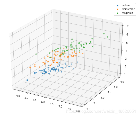
# 选取其前三个特征绘制三维散点图
from mpl_toolkits.mplot3d import Axes3D
#导入3d包
fig = plt.figure(figsize=(10,8)) #创建画布,figsize画布的大小
ax = fig.add_subplot(111, projection='3d')#添加一个子图,用法见下面链接

iris_all_class0 = iris_all[iris_all['target']==0].values #获取iris类别为0的值
iris_all_class1 = iris_all[iris_all['target']==1].values
iris_all_class2 = iris_all[iris_all['target']==2].values
# 'setosa'(0), 'versicolor'(1), 'virginica'(2)
ax.scatter(iris_all_class0[:,0], iris_all_class0[:,1], iris_all_class0[:,2],label='setosa')
ax.scatter(iris_all_class1[:,0], iris_all_class1[:,1], iris_all_class1[:,2],label='versicolor')
ax.scatter(iris_all_class2[:,0], iris_all_class2[:,1], iris_all_class2[:,2],label='virginica')
plt.legend()#添加图例
plt.show()
Step5:利用 逻辑回归模型 在二分类上 进行训练和预测
##为了正确评估模型性能,将数据划分为训练集和测试集,并在训练集上训练模型,在测试集上验证模型性能。
from sklearn.model_selection import train_test_split
##选择其类别为0和1的样本(不包括类别为2的样本)
iris_features_part=iris_features.iloc[:100]
iris_target_part=iris_target[:100]
##测试集大小为20%,80%/20%分
x_train,x_test,y_train,y_test=train_test_split(iris_features_part,iris_target_part,test_size=0.2,random_state=2020)
##从sklearn中导入逻辑回归模型
from sklearn.linear_model import LogisticRegression
##从sklearn中导入逻辑回归模型
from sklearn.linear_model import LogisticRegression
##在训练集上训练逻辑回归模型
clf.fit(x_train,y_train)
##查看其对应的w
print('the weight of Logistic Regression:',clf.coef_)

##查看其对应的w0
print('the intercept(w0) of Logistic Regression:',clf.intercept_)
##在训练集和测试集上分布利用训练好的模型进行预测
train_predict=clf.predict(x_train)
test_predict=clf.predict(x_test)
from sklearn import metrics
##利用accuracy(准确度)【预测正确的样本数目占总预测样本数目的比例】评估模型效果
print('The accuracy of the Logistic Regression is:',metrics.accuracy_score(y_train,train_predict))
print('The accuracy of the Logistic Regression is:',metrics.accuracy_score(y_test,test_predict))

##查看混淆矩阵(预测值和真实值的各类情况统计矩阵)
confusion_matrix_result=metrics.confusion_matrix(test_predict,y_test)
print('The confusion matrix result:\n',confusion_matrix_result)

##利用热力图对于结果进行可视化
plt.figure(figsize=(8,6))
sns.heatmap(confusion_matrix_result,annot=True,cmap='Blues')
plt.xlabel('Predictedlabels')
plt.ylabel('Truelabels')
plt.show()

##The accuracy of the Logistic Regressionis:1.0
##The accuracy of the Logistic Regressionis:1.0
##The confusion matrix result:
##[[9  0]
##[0  11]]
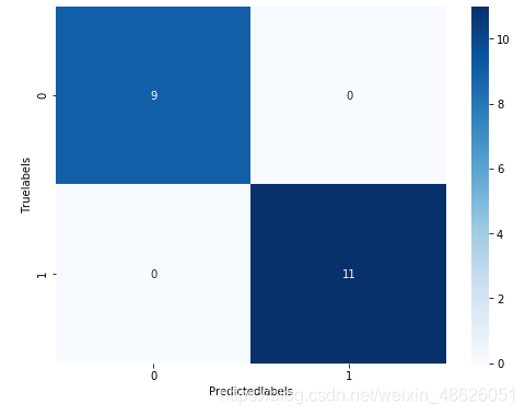
我们可以发现其准确度为1,代表所有的样本都预测正确了。
Step6:利用 逻辑回归模型 在三分类(多分类)上 进行训练和预测
##测试集大小为20%,80%/20%分
x_train,x_test,y_train,y_test=train_test_split(iris_features,iris_target,test_size=0.2,random_state=2020)
##定义逻辑回归模型
clf=LogisticRegression(random_state=0,solver='lbfgs')
##在训练集上训练逻辑回归模型
clf.fit(x_train,y_train)
##查看其对应的w
print('the weight of Logistic Regression:\n',clf.coef_)
##查看其对应的w0
print('the intercept(w0) of Logistic Regression:\n',clf.intercept_)
##由于这个是3分类,所有我们这里得到了三个逻辑回归模型的参数,其三个逻辑回归组合起来即可实现三分类
##在训练集和测试集上分布利用训练好的模型进行预测
train_predict=clf.predict(x_train)
test_predict=clf.predict(x_test)
##由于逻辑回归模型是概率预测模型(前文介绍的p=p(y=1|x,\theta)),所有我们可以利用predict_proba函数预测其概率

train_predict_proba=clf.predict_proba(x_train)
test_predict_proba=clf.predict_proba(x_test)

print('The test predict Probability of each class:\n',test_predict_proba)
##其中第一列代表预测为0类的概率,第二列代表预测为1类的概率,第三列代表预测为2类的概率。

##利用accuracy(准确度)【预测正确的样本数目占总预测样本数目的比例】评估模型效果
print('The accuracy of the Logistic Regression is:',metrics.accuracy_score(y_train,train_predict))
print('The accuracy of the Logistic Regression is:',metrics.accuracy_score(y_test,test_predict))
##查看混淆矩阵
confusion_matrix_result=metrics.confusion_matrix(test_predict,y_test)
print('The confusion matrix result:\n',confusion_matrix_result)

##利用热力图对于结果进行可视化
plt.figure(figsize=(8,6))
sns.heatmap(confusion_matrix_result,annot=True,cmap='Blues')
plt.xlabel('Predicted labels')
plt.ylabel('True labels')
plt.show()

##The confusion matrix result:
##[[10  0   0]
##[0   8   2]
##[0   2   8]]

三、逻辑回归原理简介
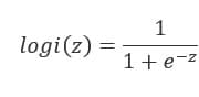
当z≥0 时,y≥0.5,分类为1,当 z<0时,y<0.5,分类为0,其对应的y值我们可以视为类别1的概率预测值。Logistic回归虽然名字里带“回归”,但是它实际上是一种分类方法,主要用于两分类问题(即输出只有两种,分别代表两个类别),所以利用了Logistic函数(或称为Sigmoid函数),函数形式为:
对应的函数图像可以表示如下:
import numpy as np
import matplotlib.pyplot as plt
x = np.arange(-5,5,0.01)
y = 1/(1+np.exp(-x))

plt.plot(x,y)
plt.xlabel('z')
plt.ylabel('y')
plt.grid()
plt.show()

通过上图我们可以发现 Logistic 函数是单调递增函数,并且在z=0
而回归的基本方程,
将回归方程写入其中为: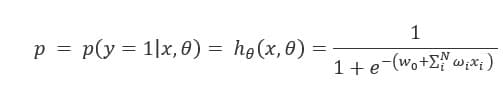
所以,
逻辑回归从其原理上来说,逻辑回归其实是实现了一个决策边界:对于函数
,当z≥0 时,y≥0.5,分类为1,当 z<0时,y<0.5,分类为0,其对应的y值我们可以视为类别1的概率预测值。
对于模型的训练而言:实质上来说就是利用数据求解出对应的模型的特定的ω。从而得到一个针对于当前数据的特征逻辑回归模型。
而对于多分类而言,将多个二分类的逻辑回归组合,即可实现多分类。
EN