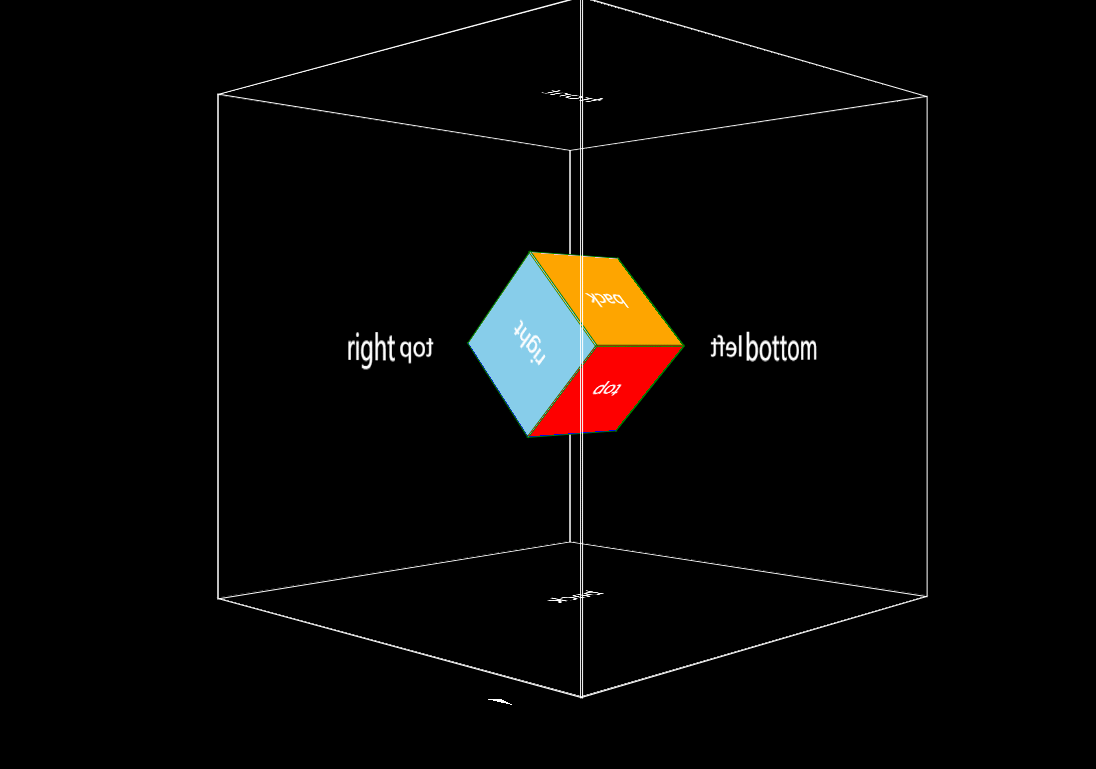
CSS3D实现两层立方体旋转嵌套
<!DOCTYPE html>
<html>
<head>
	<title></title>
	<style type="text/css">
		body {
			perspective:1000px;
			background: #000;
		}
		.wrap {
			animation: run 5s linear infinite;
			transform-style:preserve-3d;
			position: relative;
			width: 400px;
			height:400px;
			/*border:1px solid red;*/
			margin: 100px auto;
		}
		.wrap1 {
			transform-style:preserve-3d;
			animation: run1 5s linear infinite;
			position: absolute;
			top: 150px;
			left: 150px;
			width:100px;
			height: 100px;
			/*border:1px solid pink;*/
		}
		.box {

			position: absolute;
			top:0;
			width:400px;
			height:400px;
			border:1px solid #fff;
			color: #fff;
			font-size: 24px;
			text-align: center;
			line-height: 400px;
		}