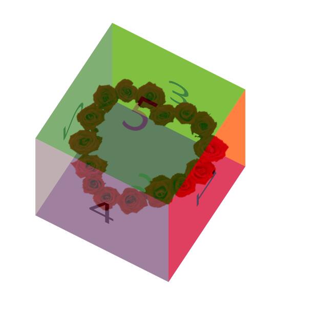
今天给大家分享一个立方体制作小案例,成品如下:
html代码
    <section>
        <div>1</div>
        <div>2</div>
        <div>3</div>
        <div>4</div>
        <div>5</div>
        <div>6</div>
    </section>
css代码。想象你手上托举有6本书,试着移动下,怎么样才能让六个面组成一个立方体呢?
section{
            width: 300px;
            height: 300px;
            position: fixed;
            left: 0;right: 0;
            top: 0;bottom: 0;
            margin: auto;
            transform-style: preserve-3d;
            transform:rotateX(30deg) rotate(30deg);
            background: url(images/hua2.png);
            background-size:100% 100%;
        }
div{
            width: 300px;
            height: 300px;
            font-size: 100px;
            color: #000;
            text-align: center;
            line-height: 300px;
            position: absolute;
            left: 0;top: 0;
            opacity: 0.5;

        }
div:nth-child(1){
            background: red;
            transform:translateX(150px) rotateY(90deg);
        }
div:nth-child(2){
            background: pink;
            transform:translateX(-150px) rotateY(-90deg);
        }
div:nth-child(3){
            background: yellow;
            transform:translateY(-150px) rotateX(90deg);
        }
div:nth-child(4){
            background: gray;
            transform:translateY(150px) rotateX(-90deg);
        }
div:nth-child(5){
            background: green;
            transform:translateZ(150px);
        }
div:nth-child(6){
            background:purple;
            transform:translateZ(-150px) rotateY(180deg);
        }