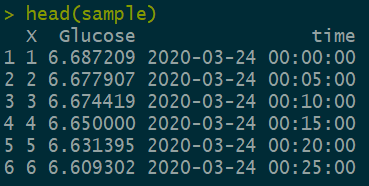
数据格式
sample=read.csv("sample.csv",header = T,stringsAsFactors = F)
head(sample)
创建等距时间序列的方法(分钟)
time=strptime("00:00:00","%H:%M:%S")+300*0:287
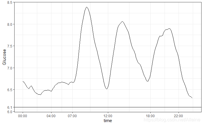
画图代码
sample$time=as.POSIXct(sample$time)
ggplot(sample,aes(x=time,y=Glucose,group=1))+geom_line()+scale_x_datetime(
limits = c(as.POSIXct("2020-03-24 00:00:00 CST"),as.POSIXct("2020-03-24 23:59:59 CST")),
breaks = c(as.POSIXct("2020-03-24 00:00:00 CST"),as.POSIXct("2020-03-24 04:00:00 CST"),as.POSIXct("2020-03-24 07:00:00 CST"),as.POSIXct("2020-03-24 12:00:00 CST"),as.POSIXct("2020-03-24 18:00:00 CST"),as.POSIXct("2020-03-24 22:00:00 CST")),
labels = c("00:00","04:00","07:00","12:00","18:00","22:00")
)+scale_y_continuous(
breaks = c(6.0,6.1,6.5,7.0,7.5,8.0,8.5),labels = c("6.0","6.1","6.5","7.0","7.5","8.0","8.5")
)+theme_bw() +
theme(axis.text = element_text(size=16),axis.title = element_text(size=24))
+ geom_hline(yintercept = c(6.1))