matplotlib
文章目录
1.保存
import matplotlib.pyplot as plt
plt.figure()
plt.plot([4,4,5],[4,5,6])
plt.savefig("d:/1.png")
plt.show()


2.实例
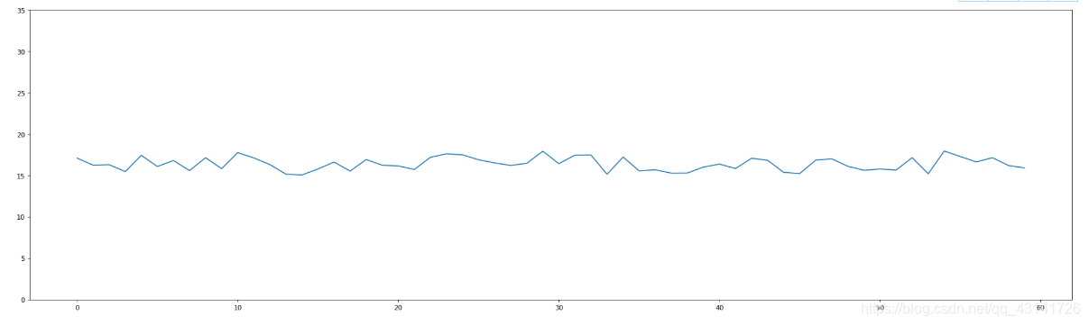
import matplotlib.pyplot as plt
import random
import numpy as np
x = range(60)
y = [random.uniform(15,18) for i in x]
# 创建画布
plt.figure(figsize = (28, 8), dpi = 88)
# 绘制折线图
plt.plot(x,y)
# 显示图像
plt.show()

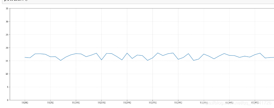
2.1 添加刻度
- plt.xticks(x, **kwargs)
显示x的刻度 - plt.yticks(y, **kwargs)
显示y的刻度
在上面的代码中加入下面的代码:
plt.yticks(range(40))

如果添加下面的代码的话
plt.yticks(range(40)[::5])
# 或者
plt.yticks(range(0, 40, 5))
说明步长为5
2.2 显示网格
添加如下的代码
# 显示网格
plt.grid(True, linestyle = "--", alpha = 0.5)
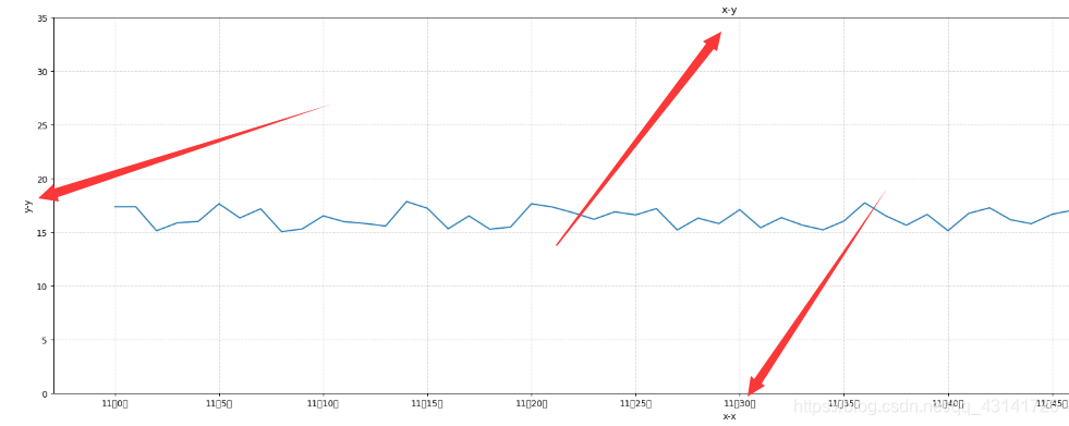
2.3 添加标题
添加如下代码
plt.xlabel("x-x")
plt.ylabel("y-y")
plt.title("x-y")
2.4 两个折线图
2.4.1 一起
import matplotlib.pyplot as plt
import random
import numpy as np
x = range(60)
y = [random.uniform(15,18) for i in x]
z = [random.uniform(4,7) for i in x]
# 创建画布
plt.figure(figsize = (28, 8), dpi = 88)
# 绘制折线图
plt.plot(x,y)
plt.plot(x,z)
x_label = ["11点{}分".format(i) for i in x]

plt.xticks(x[::5], x_label[::5])
plt.yticks(range(40)[::5])

# 显示网格
plt.grid(True, linestyle = "--", alpha = 0.5)

# 添加标题
plt.xlabel("x-x")
plt.ylabel("y-y")
plt.title("x-y")
# 显示图像
plt.show()

2.4.2 不同
创建两个不同的画布
import matplotlib.pyplot as plt
import random
import numpy as np
x = range(60)
y = [random.uniform(15,18) for i in x]
z = [random.uniform(4,7) for i in x]
# 创建画布
plt.figure(figsize = (28, 8), dpi = 88)
# 绘制折线图
plt.plot(x,y)

x_label = ["11点{}分".format(i) for i in x]

# plt.xticks(x[::5], x_label[::5])
# plt.yticks(range(40)[::5])

# 显示网格
plt.grid(True, linestyle = "--", alpha = 0.5)

# 添加标题
plt.xlabel("x-x")
plt.ylabel("y-y")
plt.title("x-y")
# 显示图像
plt.show()

plt.figure(figsize = (23,10), dpi = 88)
plt.plot(x,z)
plt.show()

或者添加如下的代码
import matplotlib.pyplot as plt
import random
import numpy as np
x = range(60)
y = [random.uniform(15,18) for i in x]
z = [random.uniform(4,7) for i in x]

# 创建画布
figure, axis = plt.subplots(nrows = 1, ncols = 2, figsize = (24,6),dpi = 88)
axis[0].plot(x,y, color = "r",linestyle = "--")
axis[1].plot(x,z)

# 绘制折线图
x_label = ["11点{}分".format(i) for i in x]
# plt.xticks(x[::5], x_label[::5])
# plt.yticks(range(40)[::5])

# 显示网格
plt.grid(True, linestyle = "--", alpha = 0.5)

# 添加标题
plt.xlabel("x-x")
plt.ylabel("y-y")
plt.title("x-y")
# 显示图像
plt.show()
行是2,列是1(nrows = 1,ncols = 2)

2.5 变换颜色和线条
plt.plot(x,y, color = "r",linestyle = "--")

3.中文问题的解决
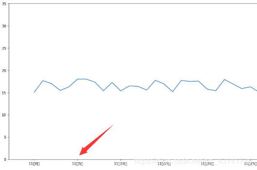
import matplotlib.pyplot as plt
import random
import numpy as np
x = range(60)
y = [random.uniform(15,18) for i in x]
# 创建画布
plt.figure(figsize = (28, 8), dpi = 88)
# 绘制折线图
plt.plot(x,y)
x_label = ["11点{}分".format(i) for i in x]

plt.xticks(x[::5], x_label[::5])

plt.yticks(range(40)[::5])
# 显示图像
plt.show()
解决方法
1.找一个喜欢的字体
字体的话,我们可以去网上下载,也可以用系统自带的。我们可以进入到目录:C:\Windows\Fonts中,里面有很多字体,这里我选择了微软雅黑,这里将它复制。

2.将字体放到默认Matplotlib默认字体目录
在我电脑中Matplotlib默认字体目录是:D:\Anaconda3\Lib\site-packages\matplotlib\mpl-data\fonts\ttf。我们将复制的微软雅黑字体粘贴到这个目录下,然后双击安装。
(因为安装的时候我修改了路径,将Anaconda安装到了D盘,如果你安装到C盘或者使用默认目录的话会有一些出入。)

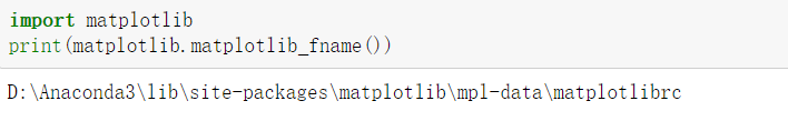
3.用下面代码找到Matplotlib的配置文件
import matplotlib
print(matplotlib.matplotlib_fname())
效果如下图:
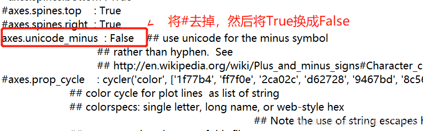
4.打开步骤3中得到的文件,然后修改

这里我们顺便解决一下Matplotlib中负号不显示的问题,还是修改这个文件。
5.将Matplotlib中的缓存文件删除
目录:C:\Users\用户.matplotlib中存放的是Matplotlib的缓存目录,我们只要将这个.matplotlib文件删除即可。
4.不同的图
4.1 折线图
应用场景:
数学公式
import matplotlib.pyplot as plt
import numpy as np
# x,y
x = np.linspace(-1,1,1000)
y = x**2 + 1
# 画布
plt.figure(figsize = (10,8), dpi = 88)
# 绘图
plt.plot(x,y)
# 网格
plt.grid(True, linestyle = "--", alpha = 0.5)
# 显示
plt.show()

4.2 散点图
scatter
方便观察数量的关系趋势,展示离群点(分布规律)
import matplotlib.pyplot as plt
import random
x = range(60)
y = [random.uniform(10,20) for i in x]
plt.scatter(x,y)
plt.show()

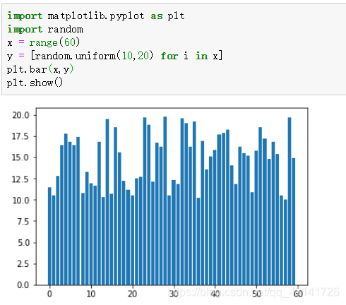
4.3 柱状图
bar
import matplotlib.pyplot as plt
import random
x = range(60)
y = [random.uniform(10,20) for i in x]
plt.bar(x,y)
plt.show()
4.4 直方图
histogram
import matplotlib.pyplot as plt
import random
x = range(60)
y = [random.uniform(10,20) for i in x]
plt.hist(y)
plt.show()

直方图和柱形图的区别在于一个中间有空隙一个中间没有空隙。
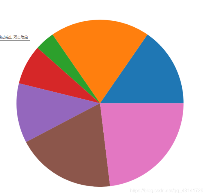
4.5 饼图
pie
占比,百分比
mport matplotlib.pyplot as plt
x1 = [4,5,1,2,3,5,6]
plt.figure(figsize = (18,10), dpi = 80)
plt.pie(x1)
plt.show()