版权声明:本文为博主原创文章,未经博主允许不得转载。 https://blog.csdn.net/fly_wt/article/details/84647333
import matplotlib.pyplot as plt
"""
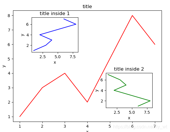
图中图实验
"""
# 绘制大图
fig = plt.figure() # 使用figure后往往在函数前要加set_或add_等前缀
x = [1,2,3,4,5,6,7]
y = [1,3,4,2,5,8,6]
left, bottom,width, height = 0.1, 0.1, 0.8, 0.8
ax1 = fig.add_axes([left, bottom,width, height])
ax1.plot(x,y,'r')
ax1.set_xlabel('x')
ax1.set_ylabel('y')
ax1.set_title('title')
# 绘制第一个小图
x = [1,2,3,4,5,6,7]
y = [1,3,4,2,5,8,6]
left, bottom,width, height = 0.2, 0.6, 0.25, 0.25
ax1 = fig.add_axes([left, bottom,width, height])
ax1.plot(y,x,'b')
ax1.set_xlabel('x')
ax1.set_ylabel('y')
ax1.set_title('title inside 1')
# 绘制第二个小图
plt.axes([0.6, 0.2, 0.25, 0.25]) #不用figure的形式则无须用set
plt.plot(y[::-1], x, 'g')
plt.xlabel('x')
plt.ylabel('y')
plt.title('title inside 2')
plt.show()