Hello!又到了我们逆战班成员每周分享一个所学知识点的时间段,这周我为大家带来的是一个简易正方体的制作,下面我简单说一下。
1:我们首先给一个父元素,我想用列表来做这个正方体,所以我的父元素就是ul,给ul设置一下初始的宽高及样式以及我们需要的全局样式:
<style type="text/css">
   *{margin:0;padding:0;}
   li{list-style:none;}
   body,html{height:100%;}
   .box{
    width:200px;
    height:200px;
    background:#00FFFF;
    margin:250px auto;
    }
如图:

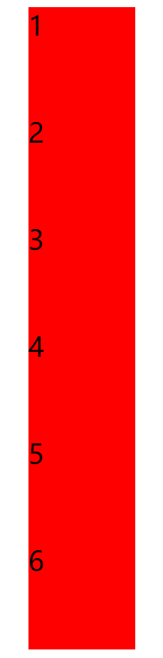
2、然后一个正方体是由六个面组成的,而且每个面的大小形状都一样,这就需要我们先写下六个相同的元素,我这里用的是列表的写法,即用六个li代表正方体的六个面,然后给每一个li设置200px的宽高:
<ul class="box">
   <li>1</li>
   <li>2</li>
   <li>3</li>
   <li>4</li>
   <li>5</li>
   <li>6</li>
  </ul>
.box li{
width:200px;
height:200px;
background:#f00;
font-size:50px;
}如图:
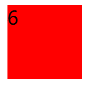
3、我们需要让这六个li初始在一个地方显示,所以就需要给它们加定位,即:
.box{
    width:200px;
    height:200px;
    background:#00FFFF;
    margin:250px auto;
    position:relative;

   .box li{
    width:200px;
    height:200px;
    background:#f00;
    font-size:50px;
    position:absolute;
    left:0px;top:0px;
   }
如图:
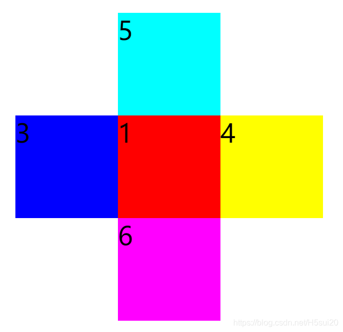
4:然后我们需要让每一个li位移到其需要在的位置,这里因为五个li都需要位移,所以我们用的是nth-child选择符的方式,为了更方便看,我在给它们换上不同的背景色,然后因为是正方体,所以它们肯定在3d空间里,我们就还需要给父元素即ul加上3D属性:
.box li:nth-child(2){
    transform:translateZ(-200px);
    background:#0f0;
   }
   .box li:nth-child(3){
    transform:translateX(-200px);
    background:#00f;
   }
   .box li:nth-child(4){
    transform:translateX(200px);
    background:#ff0;
   }
   .box li:nth-child(5){
    transform:translateY(-200px);
    background:#0ff;
   }
   .box li:nth-child(6){
    transform:translateY(200px);
    background:#f0f;
   }
如图:
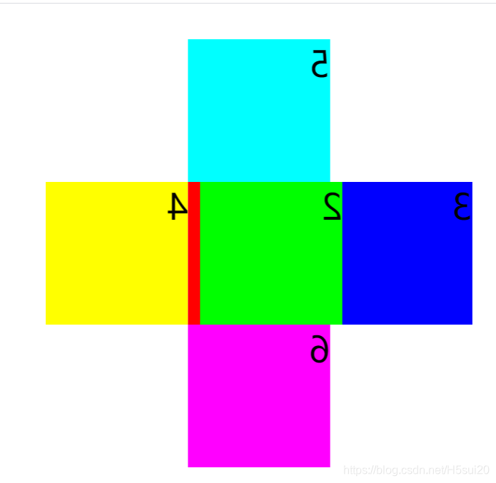
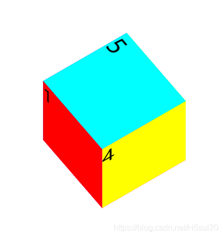
5、然后我们需要给这些li添加旋转属性以及改变原点的方式,让其变成一个正方体:
.box li:nth-child(2){
    transform:translateZ(-200px) rotateY(180deg);
    background:#0f0;
   }
   .box li:nth-child(3){
    transform:translateX(-200px) rotateY(-90deg);
    transform-origin:right center;
    background:#00f;
   }
   .box li:nth-child(4){
    transform:translateX(200px) rotateY(90deg);
    transform-origin:left center;
    background:#ff0;
   }
   .box li:nth-child(5){
    transform:translateY(-200px) rotateX(90deg);
    transform-origin:center bottom;
    background:#0ff;
   }
   .box li:nth-child(6){
    transform:translateY(200px) rotateX(-90deg);
    transform-origin:center top;
    background:#f0f;
   }
如图:

6:我们在对ul加一个滑过旋转的属性以及过渡时间便于我们看这个正方体:
.box{
    width:200px;
    height:200px;
    background:#00FFFF;
    margin:250px auto;
    position:relative;
    transform-style:preserve-3d;
    transition:6s;
}.box:hover{
transform:rotateX(-360deg) rotateY(-360deg);
}
看!一个正方体就做出来了。
附:完整代码
<!DOCTYPE html>
<html>
<head>
<meta charset="utf-8">
<title></title>
<style type="text/css">
*{margin:0;padding:0;}
li{list-style:none;}
body,html{height:100%;}
.box{
width:200px;
height:200px;
margin:250px auto;
position:relative;
transform-style:preserve-3d;
transition:6s;
}
.box li{
width:200px;
height:200px;
background:#f00;
font-size:50px;
position:absolute;
left:0px;top:0px;
}
.box li:nth-child(2){
transform:translateZ(-200px) rotateY(180deg);
background:#0f0;
}
.box li:nth-child(3){
transform:translateX(-200px) rotateY(-90deg);
transform-origin:right center;
background:#00f;
}
.box li:nth-child(4){
transform:translateX(200px) rotateY(90deg);
transform-origin:left center;
background:#ff0;
}
.box li:nth-child(5){
transform:translateY(-200px) rotateX(90deg);
transform-origin:center bottom;
background:#0ff;
}
.box li:nth-child(6){
transform:translateY(200px) rotateX(-90deg);
transform-origin:center top;
background:#f0f;
}
.box:hover{
    transform:rotateX(-360deg) rotateY(-360deg);
   }
</style>
</head>
<body>
<ul class="box">
<li>1</li>
<li>2</li>
<li>3</li>
<li>4</li>
<li>5</li>
<li>6</li>
</ul>
</body>
</html>
