这个东东,虽然好像找不到应用场景,但是好喜欢的说
HTML代码:
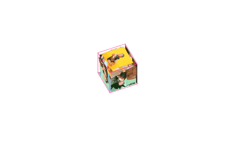
 1 <!-- 立方体容器 -->
 2     <div class="box_case">
 3         <!-- 小立方体 -->
 4         <div class="small_box"><img src="./IMG/1A.png" ></div>
 5         <div class="small_box"><img src="./IMG/1B.png" ></div>
 6         <div class="small_box"><img src="./IMG/1L.png" ></div>
 7         <div class="small_box"><img src="./IMG/1O.png" ></div>
 8         <div class="small_box"><img src="./IMG/1V.png" ></div>
 9         <div class="small_box"><img src="./IMG/1E.png" ></div>
10
11         <!-- 大立方体 -->
12         <div class="big_box"><img src="./IMG/2A.png" ></div>
13         <div class="big_box"><img src="./IMG/21.png" ></div>
14         <div class="big_box"><img src="./IMG/22.png" ></div>
15         <div class="big_box"><img src="./IMG/23.png" ></div>
16         <div class="big_box"><img src="./IMG/24.png" ></div>
17         <div class="big_box"><img src="./IMG/25.png" ></div>
18
19     </div>
CSS代码:
/* 立方体容器 */
.box_case {
  width: 100px;
  height: 100px;
  margin: 200px auto;
  position: relative;
  transform-style: preserve-3d;
  animation: rotate linear 5s infinite;
}

/* 立方体动画 */
@keyframes rotate {
  from {
    transform: rotateX(0deg) rotateY(0deg);
  }

  to {
    transform: rotateX(720deg) rotateY(360deg);
  }
}

/* 小立方体大小位置 */
.box_case .small_box {
  width: 50px;
  height: 50px;
  position: absolute;
  border: 1px solid pink;
  top: 20px;
  left: 20px;
}

.box_case .small_box img {
  width: 50px;
  height: 50px;
}

/* 小立方体6个面的完成 */
.box_case .small_box:nth-child(1) {
  transform: rotateX(90deg) translateZ(25px);
}

.box_case .small_box:nth-child(2) {
  transform: rotateX(-90deg) translateZ(25px);
}

.box_case .small_box:nth-child(3) {
  transform: translateZ(25px);
}

.box_case .small_box:nth-child(4) {
  transform: rotateY(90deg) translateZ(25px);
}

.box_case .small_box:nth-child(5) {
  transform: rotateY(180deg) translateZ(25px);
}

.box_case .small_box:nth-child(6) {
  transform: rotateY(-90deg) translateZ(25px);
}

/* 大立方体大小位置 */
.box_case .big_box {
  width: 100px;
  height: 100px;
  margin: 0 auto;
  border: 1px solid deeppink;
  position: absolute;
  top: 0px;
  left: 0px;
  transition: all .4s;
}

.box_case .big_box img {
  width: 100px;
  height: 100px;
}

/* 大立方体6个面的完成 */
.box_case .big_box:nth-child(7) {
  transform: rotateX(90deg) translateZ(50px);
}

.box_case .big_box:nth-child(8) {
  transform: rotateX(-90deg) translateZ(50px);
}

.box_case .big_box:nth-child(9) {
  transform: translateZ(50px);
}

.box_case .big_box:nth-child(10) {
  transform: rotateY(90deg) translateZ(50px);
}

.box_case .big_box:nth-child(11) {
  transform: rotateY(180deg) translateZ(50px);
}

.box_case .big_box:nth-child(12) {
  transform: rotateY(-90deg) translateZ(50px);
}

/* 大立方体hover时变化,每个面都要给 */
.box_case:hover .big_box:nth-child(7) {
  transform: rotateX(90deg) translateZ(100px);
}

.box_case:hover .big_box:nth-child(8) {
  transform: rotateX(-90deg) translateZ(100px);
}

.box_case:hover .big_box:nth-child(9) {
  transform: translateZ(100px);
}

.box_case:hover .big_box:nth-child(10) {
  transform: rotateY(90deg) translateZ(100px);
}

.box_case:hover .big_box:nth-child(11) {
  transform: rotateY(180deg) translateZ(100px);
}

.box_case:hover .big_box:nth-child(12) {
  transform: rotateY(-90deg) translateZ(100px);
}
运行效果: