参考资料:
《Python数据分析基础》,作者[美]Clinton W. Brownley,译者陈光欣,中国工信出版集团,人民邮电出版社
数据可视化主要旨在借助于图形化手段,清晰有效地传达与沟通信息。它可以使我们看到变量的分布和变量之间的关系,还可以检查建模过程中的假设。
Python提供了若干种用于绘图的扩展包,包括matplotlib, pandas, ggplot和seaborn。
这一节主要对matplotlib进行学习。
有关matplotlib的相关函数及说明,可以参考我以前写的两篇博客:《【总结篇】Python matplotlib之使用函数绘制matplotlib的图表组成元素》《【总结篇】Python matplotlib之使用统计函数绘制简单图形》。
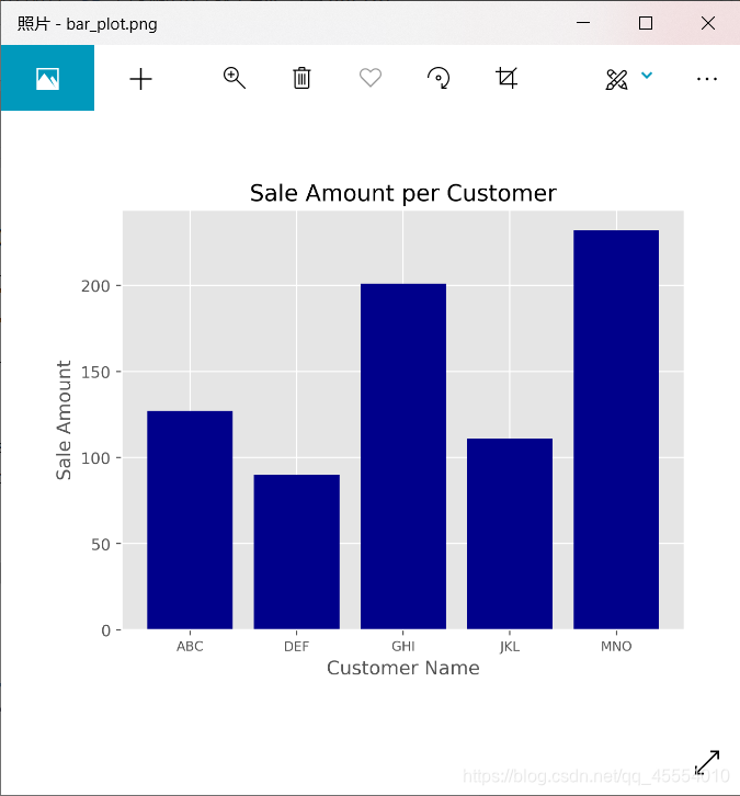
使用matplotlib绘制条形图
代码如下:
#!/usr/bin/env python3

import matplotlib.pyplot as plt

plt.style.use('ggplot')                     # 使用ggplot样式表来模拟ggplot2风格的图形

# 为条形图准备数据
customers = ['ABC', 'DEF', 'GHI', 'JKL', 'MNO']
customers_index = range(len(customers))
sale_amounts = [127, 90, 201, 111, 232]

# 绘图
fig = plt.figure()                          # 创建了一个基础图
ax1 = fig.add_subplot(1, 1, 1)              # 在基础图中创建1行1列的子图,并使用第1个也是唯一的一个子图
ax1.bar(customers_index, sale_amounts, align='center', color='darkblue')    # 创建条形图
ax1.xaxis.set_ticks_position('bottom')      # x刻度线位置
ax1.yaxis.set_ticks_position('left')        # y刻度线位置
plt.xticks(customers_index, customers, rotation=0, fontsize='small')        # 将刻度线标签更改为实际的客户名称
plt.xlabel('Customer Name')                 # 添加x轴标签
plt.ylabel('Sale Amount')                   # 添加y轴标签
plt.title('Sale Amount per Customer')       # 添加图形标题
plt.savefig('bar_plot.png', dpi=400, bbox_inches='tight')       # 保存统计图到当前文件夹
plt.show()
Tips:
ax1.bar(customers_index, sale_amounts, align=‘center’, color=‘darkblue’)
customer_index:设置条形图左侧在x轴上的坐标
sale_amounts:设置条形的高度
align=‘center’:设置条形与标签中间对齐
color=‘darkblue’:设置标签的颜色
Tips:
plt.xticks(customers_index, customers, rotation=0, fontsize=‘small’)
rotation=0:刻度标签是水平的
fontsize=‘small’:将刻度标签的字体设为小字体
Tips:
plt.savefig(‘bar_plot.png’, dpi=400, bbox_inches=‘tight’)
dpi=400:设置图形分辨率
bbox_inches=‘tight’:在保存图形时,将图形四周的空白部分去掉
运行结果如下图所示。
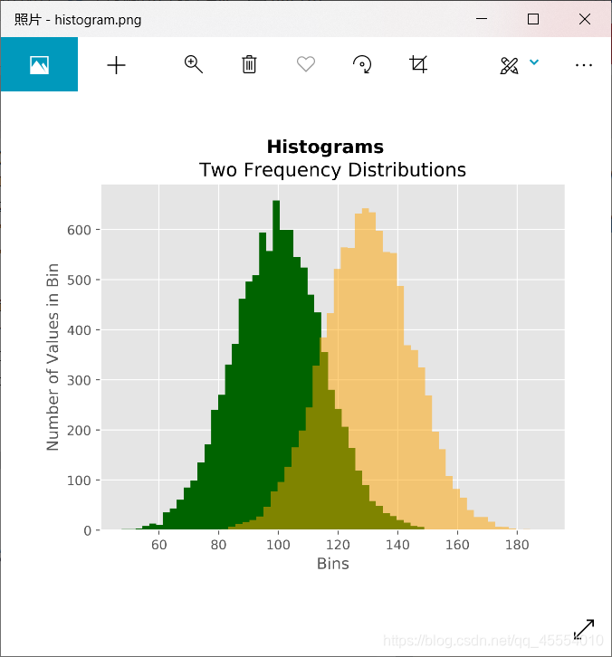
使用matplotlib绘制直方图
代码如下:
#!/usr/bin/env python3

import numpy as np
import matplotlib.pyplot as plt

plt.style.use('ggplot')

# 为直方图准备数据
mu1, mu2, sigma = 100, 130, 15
x1 = mu1 + sigma * np.random.randn(10000)        # 使用随机数生成器创建两个正态分布变量
x2 = mu2 + sigma * np.random.randn(10000)

# 绘图
fig = plt.figure()
ax1 = fig.add_subplot(1, 1, 1)
n, bins, patches = ax1.hist(x1, bins=50, density=False, color='darkgreen')          # 创建概率分布图
n, bins, patches = ax1.hist(x2, bins=50, density=False, color='orange', alpha=0.5)
ax1.xaxis.set_ticks_position('bottom')
ax1.yaxis.set_ticks_position('left')
plt.xlabel('Bins')
plt.ylabel('Number of Values in Bin')
fig.suptitle('Histograms', fontsize=14, fontweight='bold')      # 为基础图添加一个居中的标题
ax1.set_title('Two Frequency Distributions')    # 为子图添加一个居中的标题,位于基础图标题下面
plt.savefig('histogram.png', dpi=400, bbox_inches='tight')
plt.show()
Tips:
n, bins, patches = ax1.hist(x2, bins=50, density=False, color=‘orange’, alpha=0.5)
bins=50:每个变量的值被分成50份
density=False:直方图显示的是频率分布,而不是概率密度
color=‘darkgreen’:直方图颜色
alpha=0.5:透明度
运行结果如下图所示。
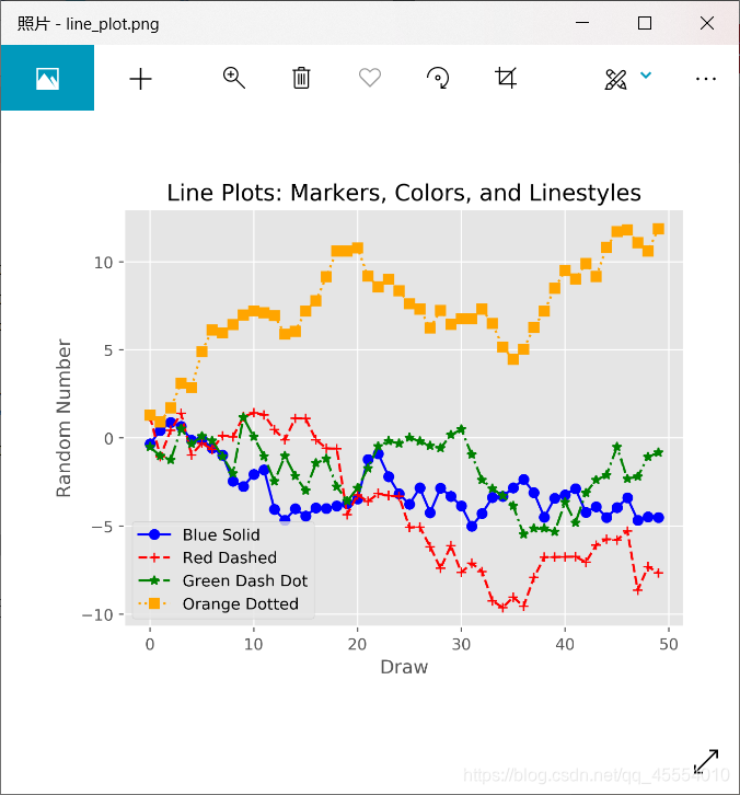
使用matplotlib绘制折线图
代码如下:

#!/usr/bin/env python3

from numpy.random import randn
import matplotlib.pyplot as plt

plt.style.use('ggplot')

# 为折线图准备数据
plot_data1 = randn(50).cumsum()         # 使用randn创建绘图所用的随机数据
plot_data2 = randn(50).cumsum()
plot_data3 = randn(50).cumsum()
plot_data4 = randn(50).cumsum()

# 绘图
fig = plt.figure()
ax1 = fig.add_subplot(1, 1, 1)
ax1.plot(plot_data1, marker=r'o', color=u'blue', linestyle='-', label='Blue Solid')     # 创建4条折线
ax1.plot(plot_data2, marker=r'+', color=u'red', linestyle='--', label='Red Dashed')
ax1.plot(plot_data3, marker=r'*', color=u'green', linestyle='-.', label='Green Dash Dot')
ax1.plot(plot_data4, marker=r's', color=u'orange', linestyle=':', label='Orange Dotted')
ax1.xaxis.set_ticks_position('bottom')
ax1.yaxis.set_ticks_position('left')
ax1.set_title('Line Plots: Markers, Colors, and Linestyles')
plt.xlabel('Draw')
plt.ylabel('Random Number')
plt.legend(loc='best')      # 创建图例,根据图中的空白部分将图例放在最合适的位置
plt.savefig('line_plot.png', dpi=400, bbox_inches='tight')
plt.show()
Tips:
ax1.plot(plot_data2, marker=r’+’, color=u’red’, linestyle=’–’, label=‘Red Dashed’)
marker=r’+’:数据点类型
color=u’red’:颜色
linestyle=’–’:线型
label=‘Red Dashed’:保证折线在图例中可以正确标记
运行结果如下图所示。
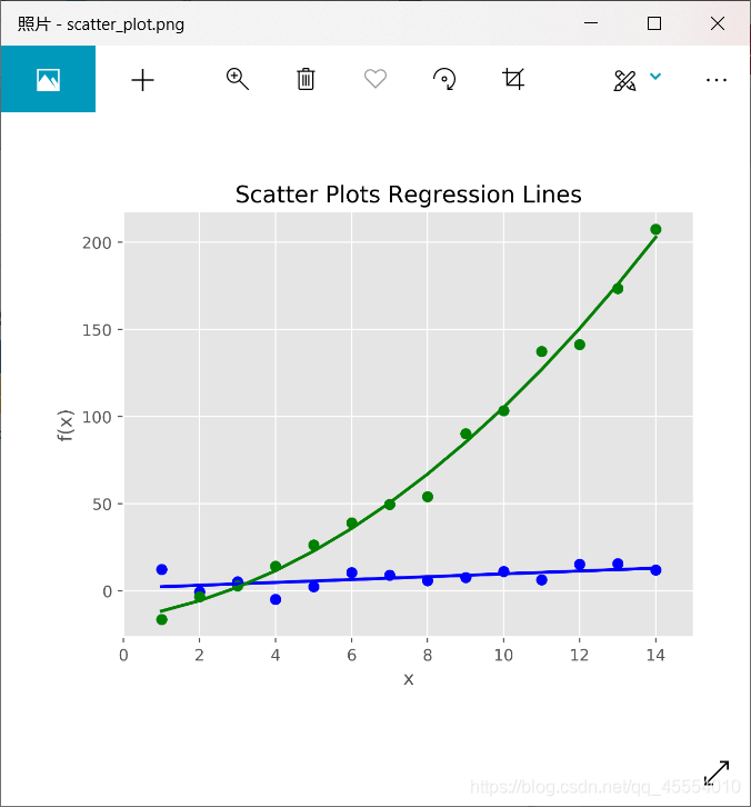
使用matplotlib绘制散点图
代码如下:
#!/usr/bin/env python3

import numpy as np
import matplotlib.pyplot as plt

plt.style.use('ggplot')

# 为散点图准备数据
x = np.arange(start=1, stop=15, step=1)
y_linear = x + 5 * np.random.randn(14)
y_quadratic = x**2 + 10 * np.random.randn(14)
fn_linear = np.poly1d(np.polyfit(x, y_linear, deg=1))
fn_quadratic = np.poly1d(np.polyfit(x, y_quadratic, deg=2))

# 绘图
fig = plt.figure()
ax1 = fig.add_subplot(1, 1, 1)
ax1.plot(x, y_linear, 'bo', x, y_quadratic, 'go', x, fn_linear(x), 'b-',
         x, fn_quadratic(x), 'g-', linewidth=2)                # 创建带有两条回归曲线的散点图
ax1.xaxis.set_ticks_position('bottom')
ax1.yaxis.set_ticks_position('left')
ax1.set_title('Scatter Plots Regression Lines')
plt.xlabel('x')
plt.ylabel('f(x)')
plt.xlim((min(x) - 1, max(x) + 1))        # 设置x轴范围
plt.ylim((min(y_quadratic) - 10, max(y_quadratic) + 10))      # 设置y轴范围
plt.savefig('scatter_plot.png', dpi=400, bbox_inches='tight')
plt.show()
Tips:
ax1.plot(x, y_linear, ‘bo’, x, y_quadratic, ‘go’, x, fn_linear(x), ‘b-’, x, fn_quadratic(x), ‘g-’, linewidth=2)
‘bo’:(x, y_linear)点是蓝色圆圈
‘go’:(x, y_quadratic)点是绿色圆圈
‘b-’:(x, y_linear)点之间的线是一条蓝色实线
‘g-’:(x, y_quadratic)点之间的线是一条绿色实线
linewidth=2:线的宽度
运行结果如下图所示。
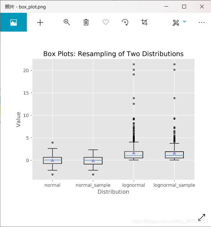
使用matplotlib绘制箱线图
代码如下:
#!/usr/bin/env python3

import numpy as np
import matplotlib.pyplot as plt

plt.style.use('ggplot')

# 为箱线图准备数据
N = 500
normal = np.random.normal(loc=0.0, scale=1.0, size=N)
lognormal = np.random.lognormal(mean=0.0, sigma=1.0, size=N)
index_value = np.random.random_integers(low=0, high=N-1, size=N)
normal_sample = normal[index_value]
lognormal_sample = lognormal[index_value]
box_plot_data = [normal, normal_sample, lognormal, lognormal_sample]

# 绘图
fig = plt.figure()
ax1 = fig.add_subplot(1, 1, 1)
box_labels = ['normal', 'normal_sample', 'lognormal', 'lognormal_sample']       # 保存每个箱线图的标签
ax1.boxplot(box_plot_data, notch=False, sym='.', vert=True, whis=1.5, showmeans=True,
            labels=box_labels)          # 创建4个箱线图
ax1.xaxis.set_ticks_position('bottom')
ax1.yaxis.set_ticks_position('left')
ax1.set_title('Box Plots: Resampling of Two Distributions')
plt.xlabel('Distribution')
plt.ylabel('Value')
plt.savefig('box_plot.png', dpi=400, bbox_inches='tight')
plt.show()
Tips:
ax1.boxplot(box_plot_data, notch=False, sym=’.’, vert=True, whis=1.5, showmeans=True, labels=box_labels)
notch=False:箱体是矩形,而不是在中间收缩
sym=’.’:表示离群点使用圆点,而不是默认的+符号
vert=True:箱体是垂直的,不是水平的
whis=1.5:设定了直线从第一四分位数和第三四分位数延伸出的范围
showmeans=True:箱体在显示中位数的同时也显示均值
labels=box_labels:使用box_labels中的值来标记箱线图
运行结果如下图所示。