p y t h o n 常 用 数 据 分 析 图 表 python常用数据分析图表 python常用数据分析图表
plt.figure(figsize=(10, 5)) # 指定图显示的大小
ax1 = plt.subplot(131) # 指定图显示的位置
ax2 = plt.subplot(133)
# 注意:其中各个参数也可以用逗号,分隔开。第一个参数代表子图的行数;第二个参数代表该行图像的列数; 第三个参数代表每行的第几个图像。
ax1 = plt.subplot(131)
fig, ax = plt.subplots()等价于:
fig = plt.figure()
ax = fig.add_subplot(1, 1, 1)
有时间整理一下pandas的plot函数
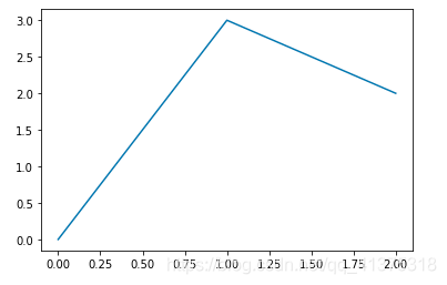
一 折线图
import matplotlib.pyplot as plt
x = [0,1,2]
y = [0,3,2]
plt.plot(x, y)
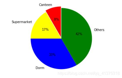
二 饼状图
labels = [u'Canteen', u'Supermarket', u'Dorm', u'Others']
sizes = [1, 2, 4, 5]
patches, l_text, p_text = plot.pie(sizes, explode=explode, labels=labels, colors=colors,
                                   labeldistance=1.1, autopct='%2.0f%%', shadow=False,
                                   startangle=90, pctdistance=0.6)
# # 设置x,y轴刻度一致,这样饼图才能是圆的
plot.axis('equal')
plot.grid()
plot.show()
分区
score_list = np.random.randint(25, 100, size=20)
print(score_list)
# [27 70 55 87 95 98 55 61 86 76 85 53 39 88 41 71 64 94 38 94]
# 指定多个区间
bins = [0, 59, 70, 80, 100]
score_cut = pd.cut(score_list, bins)
# print(df.groupby(age_groups).count())
import random
import pandas as pd
import numpy as np
from pandas import Series,DataFrame
#用随机数产生一个二维数组。分别是年龄的性别。
df=pd.DataFrame({

    'Age':np.random.randint(0,70,100),
                'Sex':np.random.choice(['M','F'],100),
                })
#用cut函数对于年龄进行分段分组,用bins来对年龄进行分段,左开右闭
age_groups=pd.cut(df['Age'],bins=[0,18,35,55,70,100])
# print(age_groups)
print(df.groupby(age_groups).count())
Series按索引排序.sort_index()
death_df.cp.value_counts().sort_index().plot(kind="bar")