css3新增基本常用属性大全
border-radius: 圆角
border-radius: 一个值/四个值/每个值拆分成两个方向值
实例eg:
<!DOCTYPE html>
<html lang="en">
<head>
    <meta charset="UTF-8">
    <meta name="viewport" content="width=device-width, initial-scale=1.0">
    <meta http-equiv="X-UA-Compatible" content="ie=edge">
    <title>border-radius</title>
    <style>
        body {
            color: #fff;
            text-align: center;
        }
        .btn {
            width: 50px;
            height: 30px;
            border-radius: 10px;
            line-height: 30px;
            background-color: gold;
        }

        .circle {
            width: 100px;
            height: 100px;
            background-color: green;
            border-radius: 50%;
            line-height: 100px;
        }

        .container {
            width: 200px;
            height: 100px;
            /* 左上角 右上角 右下角 左下角 */
            border-radius: 20px 200px 20px 200px;
            background-color: blue;
        }

        .box {
            width: 200px;
            height: 200px;
            /* 左上角x值, y值, 右上角x值, y值, 左下角... 右下角... */
            border-top-left-radius: 20px 20px;
            border-top-right-radius: 20px 20px;
            border-bottom-left-radius: 20px 20px;
            border-bottom-right-radius: 20px 20px;
            background-color: darkorange;
        }
    </style>
</head>
<body>
    <!-- 通过css生成一个按钮 -->
    <div class="btn">按钮</div>

    <!-- 通过css生成一个圆 -->
    <div class="circle">圆</div>

    <!-- 拆分成四个值的border-radius -->
    <div class="container">
        异性效果
    </div>

    <!-- 拆分成八个值得border-radius -->
    <div class="box"></div>
</body>
</html>
box-shadow: 盒子阴影
box-shadow: x y 模糊半径 阴影拓展半径 阴影颜色 投影方式

x: 数值越大向右的偏移量就越大, 如果为负数则方向相反

y: 数值越大向下的偏移量就越大, 如果为负数则方向相反

模糊半径: 如果为0则是不模糊, 小于0无效, 大于0数值越大阴影越模糊

阴影拓展半径: 阴影的大小, 阴影可以跟原dom元素大小不一致, 所以这个值越大阴影越大, 为0阴影跟dom元素一样大, 如果小于0则阴影小于原dom元素

阴影颜色: 控制阴影的色值

投影方式: 默认值为outset, 代表向外投影 可以设置成inset,  向内投影
实例 eg:也是做一个日常开发中我们使用比较多的小卡片效果如图
![[外链图片转存失败,源站可能有防盗链机制,建议将图片保存下来直接上传(img-PJyApINJ-1581769767555)('..')];](https://img-blog.csdnimg.cn/20200215203004258.png?x-oss-process=image/watermark,type_ZmFuZ3poZW5naGVpdGk,shadow_10,text_aHR0cHM6Ly9ibG9nLmNzZG4ubmV0L3dlaXhpbl80NDIzODc5Ng==,size_16,color_FFFFFF,t_70#pic_center)
<!-- 代码相对来说比较简单, 真正控制阴影的也就那一句box-shadow -->
<!DOCTYPE html>
<html lang="en">
<head>
    <meta charset="UTF-8">
    <meta name="viewport" content="width=device-width, initial-scale=1.0">
    <meta http-equiv="X-UA-Compatible" content="ie=edge">
    <title>box-shadow</title>
    <style>
        :root, body {
            width: 100%;
            height: 100%;
            background-color: #f5f5f5;
            color: #999;
            text-align: center;
            font-size: 12px;
        }
        .card {
            margin: 100px auto;
            width: 300px;
            height: 100px;
            line-height: 100px;
            background-color: #fff;
            box-shadow: 1px 3px 6px 2px #ccc;
        }

    </style>
</head>
<body>
    <div class="card">我是小卡片儿</div>
</body>
</html>
box-shadow还可以玩出很多花样, 比如倒影, 比如色值重合产生的光环
![[外链图片转存失败,源站可能有防盗链机制,建议将图片保存下来直接上传(img-JyuXWmau-1581769767556)('..')]](https://img-blog.csdnimg.cn/20200215203029956.png?x-oss-process=image/watermark,type_ZmFuZ3poZW5naGVpdGk,shadow_10,text_aHR0cHM6Ly9ibG9nLmNzZG4ubmV0L3dlaXhpbl80NDIzODc5Ng==,size_16,color_FFFFFF,t_70#pic_center)
<!DOCTYPE html>
<html lang="en">
<head>
    <meta charset="UTF-8">
    <meta name="viewport" content="width=device-width, initial-scale=1.0">
    <meta http-equiv="X-UA-Compatible" content="ie=edge">
    <title>box-shadow</title>
    <style>
        :root, body {
            width: 100%;
            height: 100%;
            background-color: #f5f5f5;
            color: #999;
            text-align: center;
            font-size: 12px;
        }

        div.drama-wrapper {
            width: 600px;
            height: 400px;
            background-color: #000;
            margin:  150px auto;
            overflow: hidden;
        }
        .drama-circle {
            width: 300px;
            height: 300px;
            margin: 40px auto;
            box-shadow: 0px 0px 10px 0px #fff,
                        -5px 0px 15px 0px #f0f,
                        5px 0px 15px 0px #0ff,
                        10px 0px 15px 0px #f0f inset,
                        -10px 0px 15px 0px #0ff inset,
                        0px 0px 10px 0px #fff inset,
                        5px 0px 40px 0px #f0f inset,
                        -5px 0px 40px 0px #0ff inset;
            border-radius: 50%;
        }
    </style>
</head>
<body>
    <div class="drama-wrapper">
        <div class="drama-circle"></div>
    </div>
</body>
</html>
还有很多阴影特效, box-shadow的可玩性还是很高的
text-shadow: 文本阴影
text-shadow: x y 模糊半径 阴影颜色
实例: text-shadow其实我们可以来做个镂空或者浮雕字
<!DOCTYPE html>
<html lang="en">
<head>
    <meta charset="UTF-8">
    <meta name="viewport" content="width=device-width, initial-scale=1.0">
    <meta http-equiv="X-UA-Compatible" content="ie=edge">
    <title>text-shadow</title>
    <style>
        :root, body {
            width: 100%;
            height: 100%;
            background-color: slategrey;
            overflow: hidden;
            font-family: Menlo;
            font-size: 80px;
            color: #fff;
            font-weight: bold;
            text-align: center;
        }
        .outer {
            margin: 100px 0;
            text-shadow: -2px 2px #000, -1px 1px #fff;
        }

        .inner {
            margin-top: 100px;
            text-shadow: -1px -1px #000, 1px 1px #fff;
        }
    </style>
</head>
<body>
    <!-- 浮雕 -->
    <div class="outer">
        Relief
    </div>
    <!-- 正常 -->
    <div class="normal">
        Normal
    </div>
    <!-- 镂空 -->
    <div class="inner">
        Hollowing Out
    </div>
</body>
</html>
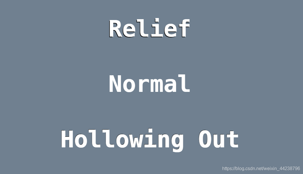
其实text-shadow还可以写很多有趣的特效比如荧光字等
rgba: 带透明的色值
这哥们就是给你设置带opacity的色值的, 跟opacity不同的是, opacity是一透明就整个dom元素不管是啥都给爷透明, 而rgba只针对色值进行透明

这么简单就不演示了,吃亏
linear-gradient
linear-gradient(线性渐变): 渐变方向, 渐变颜色 百分比,

渐变方向:

1. 写方向: to bottom, to right, to bottom right 之类的

2. 写角度: 0deg, 45deg
这哥们确实牛皮, 直接给你背景色都渐变了, 话不多说直接来看个实例
<!DOCTYPE html>
<html lang="en">
<head>
    <meta charset="UTF-8">
    <meta name="viewport" content="width=device-width, initial-scale=1.0">
    <meta http-equiv="X-UA-Compatible" content="ie=edge">
    <title>线性渐变</title>
    <style>
        .linear-dir {
            width: 200px;
            height: 200px;
            /* 写方向 */
            background-image: linear-gradient(to left, yellow, green);
            /* 可以加上百分比, 颜色的话想写多少个颜色写多少个, 用逗号就行 */
            /* background-image: linear-gradient(to top right, yellow 50%, red 80%, green); */
        }

        .linear-deg {
            width: 200px;
            height: 200px;
            /* 写角度 */
            background-image: linear-gradient(45deg, red, orange);
            /* 同样也是可以加上百分比和更多的颜色 */
            /* background-image: linear-gradient(30deg, blue 50%, gray 80%, green); */
        }
    </style>
</head>
<body>
    <!-- 线性渐变 -->
    <div class="linear-dir"></div>
    <div class="linear-deg"></div>
</body>
</html>
效果如图就实现了一个渐变, 唯一需要注意的是这个渐变他不是background-color, 而是background-image, 莫搞混了
![[外链图片转存失败,源站可能有防盗链机制,建议将图片保存下来直接上传(img-RwZYiaiT-1581769767557)('...')]](https://img-blog.csdnimg.cn/20200215203132216.png#pic_center)
radial-gradient
radial-gradient(径向渐变): 形状 (半径/长短轴) at 中心点, 颜色 百分比

形状:

1. 圆: 直接给他第一个参数上个circle

2. 椭圆: 直接给他第一个参数上个ellipse

半径/长短轴:

1. 半径: 如果形状是圆, 那肯定是半径

2. 长短轴: 如果形状是椭圆, 笔者眼睛写长短轴(x, y)

中心点:

1. 可以写成像素值

2. 可以写成百分比

3. 还可以整成方向, 就是at top left 这种的
给老铁整两个实例:
<!DOCTYPE html>
<html lang="en">
<head>
    <meta charset="UTF-8">
    <meta name="viewport" content="width=device-width, initial-scale=1.0">
    <meta http-equiv="X-UA-Compatible" content="ie=edge">
    <title>径向渐变</title>
    <style>
        /* 圆 */
        .circle {
            width: 200px;
            height: 200px;
            /* circle -> 形状, 半径100 从50% 也就是中心点开始 */
            background-image: radial-gradient(circle 100px at 50%, transparent 50%, red 80%, transparent);
        }

        /* 椭圆 */
        .ellipse {
            width: 200px;
            height: 200px;
            background-image: radial-gradient(ellipse 50px 100px at center, red 50%, orange 85%, transparent);
        }
    </style>
</head>
<body>
    <div class="circle"></div>
    <div class="ellipse"></div>
</body>
</html>
![[外链图片转存失败,源站可能有防盗链机制,建议将图片保存下来直接上传(img-IqVCsNK6-1581769767557)(...)]](https://img-blog.csdnimg.cn/20200215203153718.png#pic_center)
这个渐变我也不是很熟, 用的少老铁有空就看官方文档, 我这个图个乐呵和眼熟
background-origin, background-clip, background-size
background-origin: 指定绘制背景图像时的起点, 这个属性就是控制图片从哪个地方开始引入, 我们来看一个例子
        <!DOCTYPE html>
            <html lang="en">
            <head>
                <meta charset="UTF-8">
                <meta name="viewport" content="width=device-width, initial-scale=1.0">
                <meta http-equiv="X-UA-Compatible" content="ie=edge">
                <title>background-origin</title>
                <style>
                    .origin {
                        margin: 100px auto;
                        width: 400px;
                        height: 400px;
                        background-image: url('http://img1.imgtn.bdimg.com/it/u=16577088,3159930271&fm=26&gp=0.jpg');
                        padding: 80px;
                        border: 50px solid rgba(255, 255, 255, 0.3);
                    }

                </style>

            </head>
            <body>
                <div class="origin"></div>
            </body>
        </html>
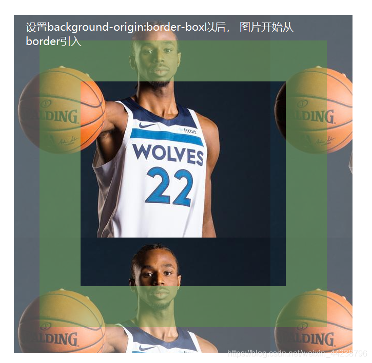
在盒模型中, 该.origin元素显示如下
![[外链图片转存失败,源站可能有防盗链机制,建议将图片保存下来直接上传(img-twxhdgpk-1581769767558)('../')]](https://img-blog.csdnimg.cn/20200216084433730.png?x-oss-process=image/watermark,type_ZmFuZ3poZW5naGVpdGk,shadow_10,text_aHR0cHM6Ly9ibG9nLmNzZG4ubmV0L3dlaXhpbl80NDIzODc5Ng==,size_16,color_FFFFFF,t_70)
我们发现该元素的背景图从padding区域就已经开始渲染了, 而background-origin属性确实是控制背景图片从什么区域开始渲染
他的默认属性为padding-box, 将图片从padding区域开始渲染
-
border-box
当我们设置background-position:border-box以后, 该图片开始从border区域引入
  .origin {
    margin: 100px auto;
    width: 400px;
    height: 400px;
    background-image: url('http://img1.imgtn.bdimg.com/it/u=16577088,3159930271&fm=26&gp=0.jpg');
    padding: 80px;
    border: 50px solid rgba(255, 255, 255, 0.3);
    background-origin: border-box;
}
-
padding-box
当我们设置background-position:padding-box以后, 该图片开始从padding区域引入, 同时padding-box也是默认值
.origin { ... background-origin: border-box; }-
content-box
当我们设置background-position:content-box以后, 该图片开始从content区域引入
.origin { ... background-origin: content-box; }![[外链图片转存失败,源站可能有防盗链机制,建议将图片保存下来直接上传(img-hPLez8P1-1581769767558)('../')]](https://img-blog.csdnimg.cn/2020021520332984.png?x-oss-process=image/watermark,type_ZmFuZ3poZW5naGVpdGk,shadow_10,text_aHR0cHM6Ly9ibG9nLmNzZG4ubmV0L3dlaXhpbl80NDIzODc5Ng==,size_16,color_FFFFFF,t_70)
-
background-clip: 指定背景的显示范围,
跟background-origin的三个属性性质差不多, 他的默认值是border-box, 也意味着border以内都要保留(包括border)
- border-box
背景会被保留border(包含border)以内的内容
.origin ... background-origin: content-box; background-clip: border-box }- padding-box
背景背会保留padding(包含padding)以内的内容
.origin { ... background-clip: padding-box }- content-box
背景会被保留content(包含content)以内的内容
.origin { ... background-clip: content-box; } -
background-size: 指定背景中图像的尺寸
-
auto
默认就是图片多大就多大, 放得下就放放不下也不会缩放
-
length
直接用数值设置大小
-
percentage
设置百分比, 比如100% 100% 就是狂高都是100%
-
cover
等比改变大小, 图片会被铺满整个容器为止
-
contain
设置了contain的话, 那么图片会被等比改变大小, 知道容器可以放置进一张图片为止
反正就是一控制大小的, 自己把每个属性试试就得了
-
-
border-image
border-image: 图片边框, 这个我真不想写, 查查api文档就会了
word-wrap
word-wrap: 超出换行, 浏览器默认只会对汉字或全角空格与半角空格进行超出换行, 而连续字符则不会换行, 如果我们想要文字自动换行的话, 就要用到该属性
<!DOCTYPE html>
<html lang="en">
<head>
    <meta charset="UTF-8">
    <meta name="viewport" content="width=device-width, initial-scale=1.0">
    <meta http-equiv="X-UA-Compatible" content="ie=edge">
    <title>word-wrap</title>
    <style>
        div {
            width: 100px;
            border: 2px solid salmon;
            margin: 50px auto;
        }
    </style>
</head>
<body>
    <!-- 汉字也会自动换行 -->
    <div>你好, 我是一名工程师, 很高兴认识你</div>
    <!-- 这种带空格的是会自动换行的 -->
    <div>hello world, i am a engineer</div>
    <!-- 换行他 盘他 -->
    <div>abcdefghijklmnopqrstuvwxyz</div>
</body>
</html>
上方代码效果如下, 我们可以看到第三个div是没有进行换行的
![[外链图片转存失败,源站可能有防盗链机制,建议将图片保存下来直接上传(img-tt4s867T-1581773768824)('word-wrap')]](https://img-blog.csdnimg.cn/20200215213720400.png?x-oss-process=image/watermark,type_ZmFuZ3poZW5naGVpdGk,shadow_10,text_aHR0cHM6Ly9ibG9nLmNzZG4ubmV0L3dlaXhpbl80NDIzODc5Ng==,size_16,color_FFFFFF,t_70#pic_center)
如果我们想让它换行直接css后面整个属性, word-wrap: break-word,立马给你换了
div {
    ...
    word-wrap: break-word;
}
text-overflow, white-space
这两个一个是控制文字溢出怎么处理, 一个是控制文字到底能不能换行, 因为就算我们不写word-wrap: break-word也会有些会默认换行, 所以white-space是来控制所有文字到底换不换, 这两个一起讲的原因呢, 是因为他们有一个组合使用叫做单行文字超出打点儿
<!DOCTYPE html>
<html lang="en">
<head>
    <meta charset="UTF-8">
    <meta name="viewport" content="width=device-width, initial-scale=1.0">
    <meta http-equiv="X-UA-Compatible" content="ie=edge">
    <title>单行文字溢出打点儿</title>
    <style>
        div {
            width: 200px;
            border: 2px solid salmon;
            margin:  20px auto;

        }
    </style>
</head>
<body>
    <div>你好我是一名前端工程师, 很高兴认识你</div>
</body>
</html>
上方的代码其实在浏览器中一定会自动换行的, 我们现在只想让他们不要自动换行, 而是溢出打点怎么办呢, 直接三件套操作一步到位
div {
    ...
    /* 不准换行 */
    white-space: nowrap;
    /* 文字溢出宽度给我打点 */
    text-overflow: ellipsis;
    /* 超出宽度直接隐藏 */
    overflow: hidden;
}
我这给你一步到位处理的, 秀儿, 经过上面操作, 文字乖乖溢出打点
哥再教你个劲爆的多行打点, 虽然兼容性不好, 凑合用用呗, 像公司内部系统都用chrome的不就可以省去js的操作啦
多行打点, 效果图如下

代码:
<!DOCTYPE html>
<html lang="en">

<head>
    <meta charset="UTF-8">
    <meta name="viewport" content="width=device-width, initial-scale=1.0">
    <meta http-equiv="X-UA-Compatible" content="ie=edge">
    <title>单行文字溢出打点儿</title>
    <style>
        div {
            width: 200px;
            border: 2px solid salmon;
            margin: 20px auto;
            /* 你想第几行的时候开始打点儿 */
            -webkit-line-clamp: 2;
            /* 你要用line-clamp 就得给我整这个box布局,
            跟flex一样也是一种布局形式, 效果跟flex也差不离太多
            只是兼容性差 */
            display: -webkit-box;
            /* 这跟上面那个display: box一起出现的, 你可以理解为flex-direction: column */
            -webkit-box-orient: vertical;
            /* 这玩意是必须在的 */
            text-overflow: ellipsis;
            overflow: hidden;
        }
    </style>
</head>

<body>
    <div>你好我是一名前端工程师, 很高兴认识你, 我今年18岁, 明年也是18岁</div>
</body>

</html>
@font-face
@font-face: 自定义字体, 这个主要是用来当我们需要在页面中融入自己的字体, 就可以通过@font-face引入字体,也是类似于封装
body {
    font-family: '宋体'
}

@font-face {
    font-family: '宋体',
    src: './宋体.ttf'
}
我们经常可以在引入字体图标的时候看到@font-face
