-
前端中的CSS3
(1) 旋转
其中旋转分为顺时针旋转和逆时针旋转
旋转的主要代码是:transform: rotate()来实现的
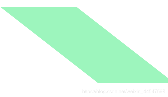
(2) 扭曲
其中扭曲分为顺时针旋转和逆时针扭曲
扭曲的主要代码是:transform: skew()来实现的
(3) 位移
位移则是在一个空间内任意位移
位移的主要代码是:transform: translate()来实现的
(4) 缩放
缩放分为缩小和放大
缩放的主要代码是:transform:scale()来实现的 -
这些CSS3都是沿着X轴和Y轴来进行动画
-
CSS3中的动画还与一个transition密不可分
(1) transition简写属性,用于在一个属性中设置四个过渡属性
(2) transition-property规定应用过渡的 CSS 属性的名称
(3) transition-duration定义过渡效果花费的时间。默认是 0
(4) transition-timing-function规定过渡效果的时间曲线。默认是 “ease”
(5) transition-delay规定过渡效果何时开始。默认是 0 -
CSS3中的动画需要transition来过渡才能显示出更好的效果
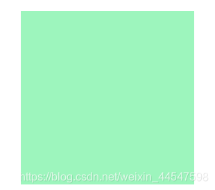
(1)这是rotate和transition的使用和其效果
<!doctype html>
<html>
<head>
<meta charset="utf-8">
<title>自定义</title>
<style>
	/*---------旋转及其过渡效果----------*/
	.rotate{
		width: 200px;
		height: 200px;
		background: #9DF5BD;
		margin:100px auto;
		transition-duration: 2s;
		transition-delay: 1s;
		transition-timing-function: ease-in-out;
		transition-property: all;
	}
	.rotate:hover{
		transform: skew(60deg);
	}
	</style>
</head>

<body>
	<!--------旋转---------->
	<div class="rotate"></div>

</body>
</html>


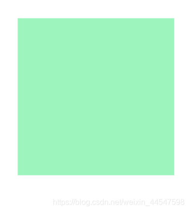
(2)这是scale和transition的使用和其效果`
<!doctype html>
<html>
<head>
<meta charset="utf-8">
<title>自定义</title>
<style>
	/*---------缩放及其过渡效果----------*/
	.scale{
		width: 200px;
		height: 200px;
		background: #9DF5BD;
		margin:100px auto;
		transition-duration: 2s;
		transition-delay: 1s;
		transition-timing-function: ease-in-out;
		transition-property: all;
	}
	.scale:hover{
		transform: scale(1.8);
	}
	</style>
</head>

<body>
	<!--------缩放---------->
	<div class="scale"></div>

</body>
</html>
(3)这是translate和transition的使用
<!doctype html>
<html>
<head>
<meta charset="utf-8">
<title>自定义</title>
<style>
	/*---------位移及其过渡效果----------*/
	.translate{
		width: 200px;
		height: 200px;
		background: #9DF5BD;
		margin:100px auto;
		transition-duration: 2s;
		transition-delay: 1s;
		transition-timing-function: ease-in-out;
		transition-property: all;
	}
	.translate:hover{
		transform: translate(50px,50px);
	}
	</style>
</head>

<body>
	<!--------位移---------->
	<div class="translate"></div>

</body>
</html>
(4)这是skew和transition的使用和其效果
<!doctype html>
<html>
<head>
<meta charset="utf-8">
<title>自定义</title>
<style>
	/*---------扭曲及其过渡效果----------*/
	.skew{
		width: 200px;
		height: 200px;
		background: #9DF5BD;
		margin:100px auto;
		transition-duration: 2s;
		transition-delay: 1s;
		transition-timing-function: ease-in-out;
		transition-property: all;
	}
	.skew:hover{
		transform: skew(60deg);
	}
	</style>
</head>

<body>
	<!--------扭曲---------->
	<div class="skew"></div>

</body>
</html>

- 这些动画效果在一个类名内只能出现一次,但通过多层盒子一起嵌入可以实现在一个主盒子内一起完成CSS3动画
- 这一段代码是CSS3动画的一些混合使用
<!doctype html>
<html>
<head>
<meta charset="utf-8">
<title>css动画混合使用</title>
<style>

	.a{
	width: 250px;
	height: 250px;
	border-radius: 50%;
	margin: 200px auto;
	cursor: pointer;
	position: relative;
	box-shadow: 0px 0px 150px #F4880E;
}
.i img{
	width: 250px;
	height: 250px;
	border-radius: 50%;
}
.b{
	width: 250px;
	height: 250px;
	border-radius: 50%;
	z-index: 1;
	position: absolute;
	top: 0px;
	transition-duration: 1s;
}
.a:hover .b{
	background:#0729F5;
	opacity: 0.2;
}
.c{
	width: 150px;
	height: 150px;
	position: absolute;
	top: 55px;
	left: 50px;
	border: 1.5px solid #818181;
	z-index: 5;
	transform: scale(0.000000001);
	transition-duration: 1s;
	opacity: 1;
}
.b:hover .c{
	transform: scale(1);
	transition-duration: 1s;
}
.d{
	width: 20px;
	height: 20px;
	border-radius: 50%;
	background: #0AFB4A;
	transition-duration: 1.5s;
}
.e{
	width: 20px;
	height: 20px;
	border-radius: 50%;
	background: #0AFB4A;
	position: absolute;
	top: 0px;
	right: 0px;
	transition-duration: 1.5s;
}
.f{
	width: 20px;
	height: 20px;
	border-radius: 50%;
	background: #0AFB4A;
	position: absolute;
	bottom: 0px;
	left: 0px;
	transition-duration: 1.5s;
}
.g{
	width: 20px;
	height: 20px;
	border-radius: 50%;
	background: #0AFB4A;
	position: absolute;
	bottom: 0px;
	right: 0px;
	transition-duration: 1.5s;
}
.c:hover .d{
	transform: translate(65px,65px);
}
.c:hover .e{
	transform: translate(-65px,65px);
}
.c:hover .f{
	transform: translate(65px,-65px);
}
.c:hover .g{
	transform: translate(-65px,-65px);
}
.h{
	width: 250px;
	height: 250px;
	position: absolute;
	z-index: 3;
}
.b:hover .h{
	transform: skew(180deg);
	transition-duration: 5s;
	background:#000;
	opacity: 0.3;
}
.i{
	width: 250px;
	height: 250px;
	border-radius: 50%;
	position: absolute;
	top: 0px;
	left: 0px;
	z-index: 0.1;
	transition-duration: 1s;
}
.a:hover .i{
	transform:scale(1.2);
}
.n{
	width: 150px;
	height: 2px;
	position: absolute;
	background: #F7EE04;
	top: 50%;
	left: 0px;
	z-index:3;
	transition-duration: 200s;
}
.c:hover .n{
	transform: rotate(72000deg);
}

	</style>
</head>

<body style="background:#000;">
<!---------------缩放· 位移· 扭曲 ·旋转于一个盒子一起动画------->
	<div class="a">
		<div class="i">
			<img src="../images/t0119935da5cd841bff.jpg" alt="">
			<div class="b">
				<div class="c">
					<div class="d"></div>
					<div class="e"></div>
					<div class="f"></div>
					<div class="g"></div>
					<div class="n"></div>
				</div>
				<div class="h"></div>
			</div>
		</div>
	</div>
</body>
</html>
-
实现多个CSS3动画的关键是div的分层,由父盒子慢慢的继承子盒子,再由伪类hover来实现鼠标移入触发多个CSS3动画的效果
-
CSS3中还有@keyframes动画,这种动画可以称之为关键帧,因为你可以通过@keyframes来实现每一帧的动画效果
(1)@keyframes myfirst
{
from {background: red;}
to {background: yellow;}
}
@keyframes的每一帧可以通过from-to来实现
(2)@keyframes myfirst
{
0% {background: red;}
25% {background: yellow;}
50% {background: blue;}
100% {background: green;}
}
@keyframes的每一帧可以通过%X—%X来实现(3)其中在@keyframes的每一帧中还可以运用transform来实现更多的动画效果,与 transform相同@keyframes也有过渡属性-animation
-
animation的所有属性
(1)animation简写属性,用于在一个属性中设置其他过渡属性
(2)animation-name规定 @keyframes 动画的名称
(3) animation-duration规定动画完成一个周期所花费的秒或毫秒,默认是 0
(4) animation-timing-function规定动画的速度曲线。默认是 “ease”
(5) animation-delay规定动画何时开始。默认是 0
(6) animation-iteration-count规定动画被播放的次数。默认是 1
(7) animation-direction规定动画是否在下一周期逆向地播放。默认是 “normal”
(8) animation-play-state规定动画是否正在运行或暂停。默认是 “running”
(9) animation-fill-mode规定对象动画时间之外的状态 -
下面一段是我写的@keyframes代码
<!doctype html>
<html>
<head>
<meta charset="utf-8">
<title>css动画</title>
<style>
.a{
background: #000;
height: 200px;
width: 200px;
margin: auto;
margin-top: 200px;
position: relative;
	}
	.span{
display:block;
width: 30px;
height: 30px;
border-radius: 50%;
background: #E52A2D;
animation: span 12s ease infinite;
border: 1px solid #0B34F7;
cursor: pointer;
}
	.span:active{
animation-name: span;
animation-play-state: paused;
opacity: 1;
	}
.b:before{
transition: all 0.45s;
}
.b:after{
	transition: all 0.45s;
}
	.b:before{
content: "";
z-index: 1;
border-style: solid;
position: absolute;
}
.b:after{
content: "";
z-index: 1;
border-style: solid;
position: absolute;
}
.b:before{
width: 0;
height: 100%;
top: -1px;
left: 0px;
border-width: 1px 0;
}
.b:after{
width: 100%;
height: 0;
top: 0px;
left: -1px;
border-width:0 1px;
}
	.b:hover:before{
width: 100%;
	}
.b:hover:after{
	height: 100%;
}
.b:before, .b:after {
 	border-color:white;
}
	.b:hover {
    color: #2ecc71;
background: #5BF3E2;
opacity: 1;
}
@keyframes span{
0%{
	transform: translateX(0);
 	background: #5AD9DB;
	opacity: 0.1;
}
10%{
	transform: translateY(85px);
	background: #C9E431;
	opacity: 0.6;
}
20%{
	transform: translate(85px,0);
	background: #7F59FF;
	opacity: 0.3;
}
30%{
	transform:translate(170px,85px):
background: #F4361C;
opacity: 0.1;
width: 45px;
height: 45px;
border-radius: 50%;
}
40%{
	transform: translate(85px,170px);
	background: #69949F;
	opacity: 0.9;
	}
50%{
	transform: translate(0,85px);
	background: #43F857;
	opacity: 0.01;
	}
	60%{
	transform: translate(0,0);
	background: #124DF0;
	opacity: 0.7;
	width: 30px;
	height: 30px;
	border-radius: 50%;
	}
	70%{
	transform: translate(170px,170px);
	background: #fff;
	opacity: 0.2;
	}
	80%{
	transform: translate(0,170px);
	background: #000;
	opacity: 0.5;
	width: 50px;
	height: 50px;
	border-radius: 50%;

	90%{
	transform: translate(170px,0);
	background: red;
	opacity:1;
	}
	}
	</style>
</head>

<body>
	<!-------------关键帧动画----------------->
	<div class="a">
		<span class="span b"></span>
	</div>
</body>
</html>
- @keyframes需要用animation来调用而不是用transition这是很多初学者会犯的错误