文章目录
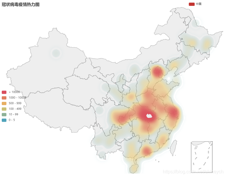
运行结果(2020-2-13)
基本流程
- 抓取疫情数据,全国数据来源于腾讯实时疫情动态,直接get到json
- 过滤掉geo中不存在的地区(否则geo会报错)
- geo绘制热力图
数据格式
请参考以下文章中的抓包分析
用Python抓新型冠状病毒肺炎疫情数据,绘制全国疫情分布图
另外,如果是数据是新闻文本的话,主要用正则表达式,下面一篇可参考
用Python抓新型冠状病毒肺炎实时数据,绘制市内疫情地图
代码实现
#%%
# 全国疫情地区分布(各省确诊病例)
def catch_cn_disease_dis_ex():
timestamp = '%d'%int(time.time()*1000)
url_area = ('https://view.inews.qq.com/g2/getOnsInfo?name=disease_h5'
'&callback=&_=') + timestamp
world_data = json.loads(requests.get(url=url_area).json()['data'])
china_data = jsonpath.jsonpath(world_data,
expr='$.areaTree[0].children[*]')
ls_province_names = jsonpath.jsonpath(china_data, expr='$[*].name')
ls_confirm_vals = jsonpath.jsonpath(china_data, expr='$[*].total.confirm')
ls_province_confirm = list(zip(ls_province_names, ls_confirm_vals,))
ls_city_names = jsonpath.jsonpath(china_data, expr='$[*].children[*].name')
ls_city_confirm_vals = jsonpath.jsonpath(china_data, expr='$[*].children[*].total.confirm')
ls_city_confirm = list(zip(ls_city_names, ls_city_confirm_vals))
return ls_province_confirm, world_data, ls_city_confirm
#%%
g_ls_area_cfm_tuple = catch_cn_disease_dis_ex()[2]
#%%
import numpy as np
from pyecharts import options as opts
from pyecharts.charts import Geo
from pyecharts.globals import ChartType
# 过滤掉无效地区,如'地区待确认'、'外地来沪'等
# 注:数据源中台湾部分的数据未细化到城市,城市name为‘地区待确认’
def filter_city_cfm_by_geo(ls_area_cfm_tuple):
ls_cfm_legal_cities = []
c = Geo().add_schema(maptype='china')
for city_name, city_cfm_val in ls_area_cfm_tuple:
if c.get_coordinate(name=city_name) is None:
print(city_name)
else:
ls_cfm_legal_cities.append(tuple([city_name, city_cfm_val]))
print(ls_cfm_legal_cities)
return ls_cfm_legal_cities
#%%
ls_cfm_legal_cities = filter_city_cfm_by_geo(g_ls_area_cfm_tuple)
print(ls_cfm_legal_cities)
#%%
# 绘制全国疫情热力图
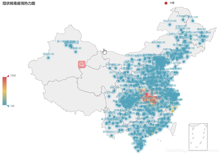
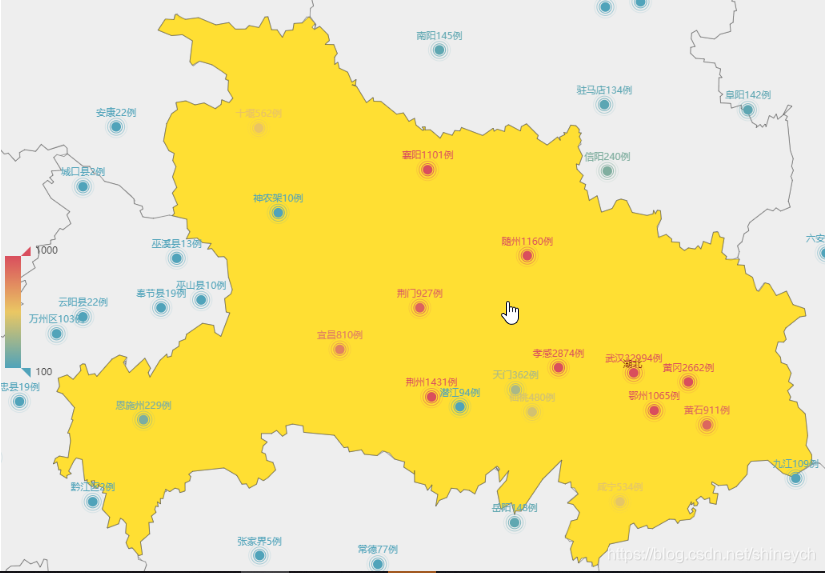
def heatmap_cn_disease_dis(ls_cfm_legal_cities) -> Geo:
c = (
Geo(init_opts=opts.InitOpts(width='100%', height='900px'))
.add_schema(maptype='china')
.add('中国', ls_cfm_legal_cities, type_=ChartType.HEATMAP) # EFFECT_SCATTER|SCATTER|HEATMAP
# .set_series_opts(label_opts=opts.LabelOpts(is_show=False))
.set_series_opts(label_opts=opts.LabelOpts(is_show=True,
# 把name中的经纬度干掉
formatter=JsCode("""
function(params){
if (typeof(params.data) == 'undefined') {
return params.value[2];
} else {
return params.data.name + params.data.value[2] + '例' ;
}
}"""
))
)
# 数目差别太大不宜用连续颜色,opts.VisualMapOpts(is_show=True, min_=0, max_=1000),
.set_global_opts(visualmap_opts=opts.VisualMapOpts(is_show=True,
#is_piecewise=False, # 是否为分段型
pos_top='center',
# min_=0,
# max_=500, # 怎么设置差额巨大数据的颜色分布呢用分段?
is_piecewise=True, # 是否为分段型
pieces=[
{'min': 10000},
{'min': 1000, 'max': 10000},
{'min': 500, 'max': 999},
{'min': 100, 'max': 499},
{'min': 10, 'max': 99},
{'min': 0, 'max': 5} ],
),
title_opts=opts.TitleOpts(title='冠状病毒疫情热力图')
)
)
return c
#%%
heatmap_cn_disease_dis(ls_cfm_legal_cities).render('中国疫情热力地图.html')
系列文章
第一篇:用Python抓新型冠状病毒肺炎实时数据,基于Basemap绘制省级疫情分布图
第二篇:用Python抓新型冠状病毒肺炎疫情数据,绘制全国疫情分布(Basemap)和走势图
第三篇:用Python抓新型冠状病毒肺炎实时数据,基于Basemap绘制市内疫情地图
第四篇:用Python爬取新型冠状病毒肺炎实时数据,pyecharts v1.x绘制省市区疫情地图
另外,pyecharts案例:
用Python pyecharts v1.x 绘制图形(一):柱状图、柱状堆叠图、条形图、直方图、帕累托图、饼图、圆环图、玫瑰图
用Python pyecharts v1.x 绘制图形(二):折线图、折线面积图、散点图、雷达图、箱线图、词云图
尽量不出门,出门戴口罩,众志成城战疫魔!
天佑湖北!天佑中国!
