本文代码在https://blog.csdn.net/xufive/article/details/104093197的基础上修改
原代码的作者着重写了程序实现的原理,但是对于资源库的安装没有详细讲解,因此我在这里把我踩过的坑分享给大家。另外,对于原代码,我写成了一个类方法。
import time
import json
import requests
from datetime import datetime
from pymysql import *
import numpy as np
import matplotlib
import matplotlib.figure
from matplotlib.font_manager import FontProperties
from matplotlib.backends.backend_agg import FigureCanvasAgg
from matplotlib.patches import Polygon
from matplotlib.collections import PatchCollection
from mpl_toolkits.basemap import Basemap
import matplotlib.pyplot as plt
import matplotlib.dates as mdates
import matplotlib.image as mpimg
这是要安装的资源库,前几个都可以通过pip直接安装,比较难安装的是Basemap,这是GitHub上的地址:
https://github.com/matplotlib/basemap
下载时,出现了以下状况:
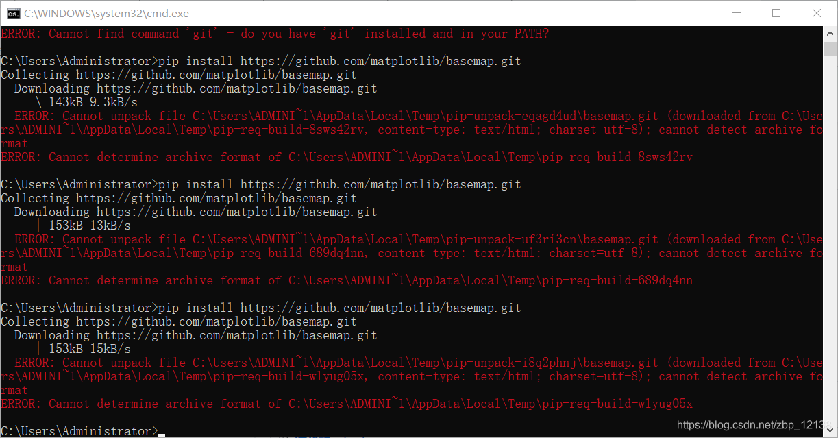
试了三次都不行,于是我换用浏览器下载:
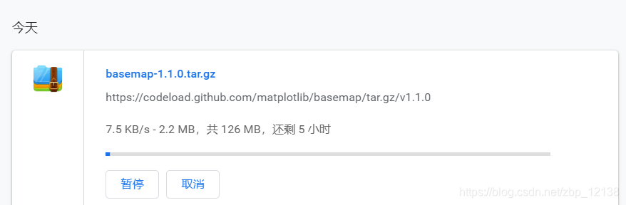
一百多兆的东西要下五个小时???
我的网络是没问题的,可以正常上网,但是下载速度很慢,没关系,检查一下网络:
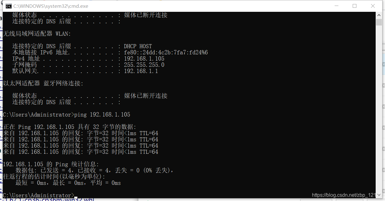
网络是没问题的,我之前也遇到过这样的问题,估计是服务器的问题了,过一阵再试一下就好了。
在这里,为了节省大家的时间,大家可以直接用下面这个链接下载:
https://download.lfd.uci.edu/pythonlibs/q4hpdf1k/basemap-1.2.1-cp37-cp37m-win_amd64.whl
注意:python3.7版本且64位机的Windows系统才适用!
如需下载对应版本的.whl文件,还需要到这个链接下载:
http://www.lfd.uci.edu/~gohlke/pythonlibs/#basemap
好了,关于basemap模块的安装就讲到这里,接下来讲一下我改进的代码:
class Inquire(object):
    def __init__(self):
        try:
            self.conn = connect(host = '127.0.0.1',
                                port = 3306,
                                user = 'root',
                                password = 'root',
                                charset = 'utf8',
                                db = '2019_ncov')
            self.cursor = self.conn.cursor()
            print("数据库连接成功!")
        except Exception as e:
            print(e)
        plt.rcParams['font.sans-serif'] = ['FangSong']  # 设置默认字体
        plt.rcParams['axes.unicode_minus'] = False  # 解决保存图像时'-'显示为方块的问题
先定义一个Inquire类,再定义一个初始化函数,用于连接数据库
	def ticks_time(self):
        ticks = time.strftime("%Y%m%da1", time.localtime())
        # print("当前时间为:", ticks)
        return ticks

    def creat_table(self):
        ticks = self.ticks_time()
        self.cursor.execute("CREATE TABLE `%s` (id INT AUTO_INCREMENT PRIMARY KEY,province CHAR(10),num INT(10))"%ticks)
        print("数据表'%s'创建成功!"%ticks)
我的想法是给每天的数据建一个数据表,当然,也可以根据需要,每小时建一个数据表。我建的数据表主要有两个字段:省份以及人数
有了数据表,就要开始填入数据了,我的数据源是:
https://news.qq.com/zt2020/page/feiyan.htm?from=timeline&isappinstalled=0
	def catch_daily(self):
        """抓取每日确诊和死亡数据"""
        url = 'https://view.inews.qq.com/g2/getOnsInfo?name=wuwei_ww_cn_day_counts&callback=&_=%d'%int(time.time()*1000)
        data = json.loads(requests.get(url=url).json()['data'])
        data.sort(key=lambda x:x['date'])
        date_list = list() # 日期
        confirm_list = list() # 确诊
        suspect_list = list() # 疑似
        dead_list = list() # 死亡
        heal_list = list() # 治愈
        for item in data:
            month, day = item['date'].split('.')
            date_list.append(datetime.strptime('2020-%s-%s'%(month, day), '%Y-%m-%d'))
            confirm_list.append(int(item['confirm']))
            suspect_list.append(int(item['suspect']))
            dead_list.append(int(item['dead']))
            heal_list.append(int(item['heal']))
        # print('date_list =',date_list)
        return date_list, confirm_list, suspect_list, dead_list, heal_list

    def catch_distribution(self):
        ticks = self.ticks_time()
        """抓取行政区域确诊分布数据"""
        data = {'西藏':0}
        url = 'https://view.inews.qq.com/g2/getOnsInfo?name=wuwei_ww_area_counts&callback=&_=%d'%int(time.time()*1000)
        for item in json.loads(requests.get(url=url).json()['data']):
            if item['area'] not in data:
                data.update({item['area']:0})
            data[item['area']] += int(item['confirm'])
        print(data)
        for key, value in data.items():
            # print(key, value)
            if (key != None and value != None):
                sql = 'insert into %s(province,num)'%ticks + 'value(%s,%s)'
                self.cursor.execute(sql,[key,value])
                self.conn.commit()
        return data
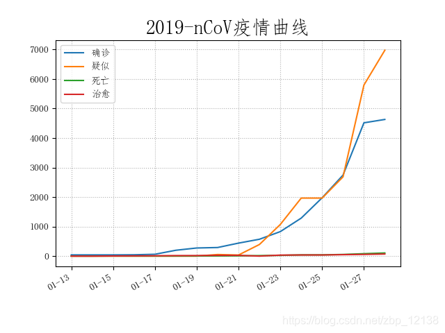
有了数据,我们可以开始数据可视化了:
def plot_daily(self):
        """绘制每日确诊和死亡数据"""
        date_list, confirm_list, suspect_list, dead_list, heal_list = self.catch_daily() # 获取数据
        plt.figure('2019-nCoV疫情统计图表', facecolor='#f4f4f4')
        plt.title('2019-nCoV疫情曲线', fontsize=20)
        plt.plot(date_list, confirm_list, label='确诊')
        plt.plot(date_list, suspect_list, label='疑似')
        plt.plot(date_list, dead_list, label='死亡')
        plt.plot(date_list, heal_list, label='治愈')
        plt.gca().xaxis.set_major_formatter(mdates.DateFormatter('%m-%d')) # 格式化时间轴标注
        plt.gcf().autofmt_xdate() # 优化标注(自动倾斜)
        plt.grid(linestyle=':') # 显示网格
        plt.legend(loc='best') # 显示图例
        plt.savefig('2019-nCoV疫情曲线.png') # 保存为文件
        plt.show()

    def plot_distribution(self):
        """绘制行政区域确诊分布数据"""
        data = self.catch_distribution()
        font = FontProperties(fname='res/BitCheese10(sRB).TTF', size=14)
        lat_min = 0
        lat_max = 60
        lon_min = 70
        lon_max = 140
        handles = [matplotlib.patches.Patch(color='#ffaa85', alpha=1, linewidth=0),
                    matplotlib.patches.Patch(color='#ff7b69', alpha=1, linewidth=0),
                    matplotlib.patches.Patch(color='#bf2121', alpha=1, linewidth=0),
                    matplotlib.patches.Patch(color='#7f1818', alpha=1, linewidth=0),]
        labels = [ '1-9人', '10-99人', '100-999人', '>1000人']
        fig = matplotlib.figure.Figure()
        fig.set_size_inches(10, 8) # 设置绘图板尺寸
        axes = fig.add_axes((0.1, 0.12, 0.8, 0.8)) # rect = l,b,w,h
        m = Basemap(llcrnrlon=lon_min, urcrnrlon=lon_max, llcrnrlat=lat_min, urcrnrlat=lat_max, resolution='l', ax=axes)
        # m = Basemap(projection='ortho', lat_0=30, lon_0=105, resolution='l', ax=axes)
        m.readshapefile('res/china-shapefiles-master/china', 'province', drawbounds=True)
        m.readshapefile('res/china-shapefiles-master/china_nine_dotted_line', 'section', drawbounds=True)
        m.drawcoastlines(color='black') # 洲际线
        m.drawcountries(color='black')  # 国界线
        m.drawparallels(np.arange(lat_min,lat_max,10), labels=[1,0,0,0]) #画经度线
        m.drawmeridians(np.arange(lon_min,lon_max,10), labels=[0,0,0,1]) #画纬度线
        for info, shape in zip(m.province_info, m.province):
            pname = info['OWNER'].strip('\x00')
            fcname = info['FCNAME'].strip('\x00')
            if pname != fcname: # 不绘制海岛
                continue
            for key in data.keys():
                if key in pname:
                    if data[key] == 0:
                        color = '#f0f0f0'
                    elif data[key] < 10:
                        color = '#ffaa85'
                    elif data[key] <100:
                        color = '#ff7b69'
                    elif  data[key] < 1000:
                        color = '#bf2121'
                    else:
                        color = '#7f1818'
                    break
            poly = Polygon(shape, facecolor=color, edgecolor=color)
            axes.add_patch(poly)
        axes.legend(handles, labels, bbox_to_anchor=(0.5, -0.11), loc='lower center', ncol=4, prop=font)
        axes.set_title("2019-nCoV疫情地图", fontproperties=font)
        FigureCanvasAgg(fig)
        fig.savefig('2019-nCoV疫情地图.png')
        pic = mpimg.imread('2019-nCoV疫情地图.png')
        plt.figure('2019-nCoV疫情地图', facecolor='#f4f4f4')
        plt.imshow(pic)
        plt.show()
最后下一个main函数,并进行调用:
def main():
    inquire = Inquire()
    inquire.creat_table()
    inquire.plot_daily()
    inquire.plot_distribution()

if __name__ == '__main__':
    main()
大功告成!我们在MySQL里排个序:
SELECT * FROM 20200128a1 ORDER BY num DESC
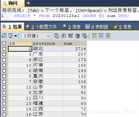
再来看看图:
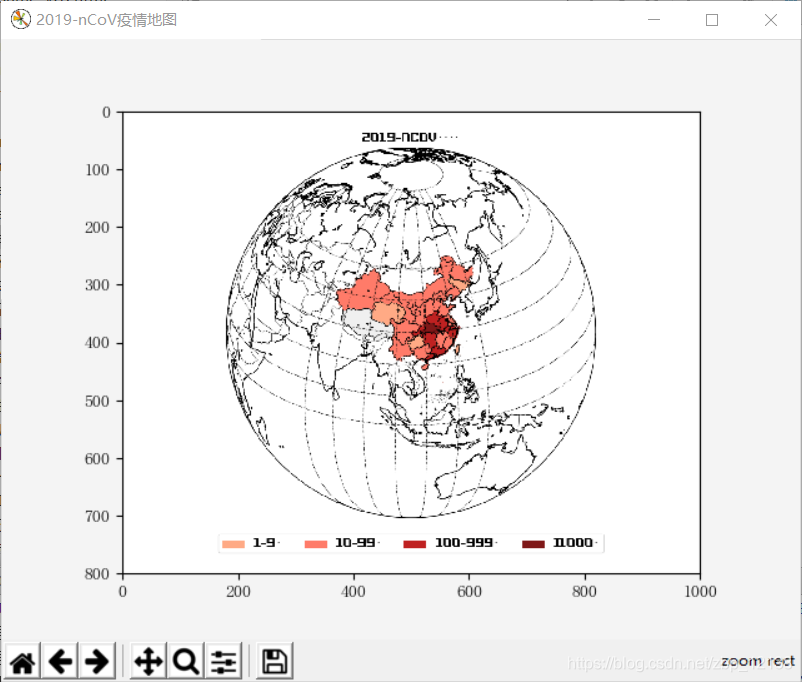
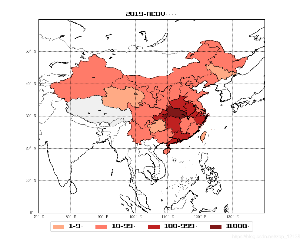
此数据截止到2020年1月28日
最后希望此次疫情尽快结束!
