前言
html中制作几何图形的方法有很多,canvas,SVG等等。
我们可以运用css的border样式来制作一些常见的几何图形,相对于canvas来说只使用css就能实现,相对于SVG来说便于理解,上手容易。
常见的几何图形总体可以分为两种,一种是有棱角的(多边形)和边为弧线的(圆),稍微复杂一点的类型像星星之类的也可以理解为是这两种类型的拼接而成的。
三角形-border
css制作三角形其实是基于调整容器四条border来实现的,可能平时使用border时四条边的样式基本都是统一的,且粗细基本都很细,并没有发现其中的原理。
先创建一个div,将border设置为很粗,然后将四边都设置不同的颜色,就会发现四条border拼接处都是斜线。
<style>
.box{
    width: 50px;
    height: 50px;
    border: 50px solid;
    border-top-color: red;
    border-right-color: green;
    border-bottom-color: yellow;
    border-left-color: blue;
}
</style>
<body>
	<div class="box"></div>
</body>
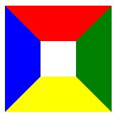
如果将box的长度和高度全部设为0,即可以看出每一个border都是一个三角形
这样我们就可以将其他三条边的颜色设置为透明,可以获得到一个三角形
.box{
    width: 0;
    height: 0;
    border: 50px solid transparent;/* 设置透明色 */
    border-bottom-color: yellow;
}
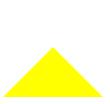
当然可以调节三角形的尺寸,对三角形进行变形,以bottom为底边为例,可以根据下图来进行理解

如果想要不同方向的底边的三角形,举一反三即可
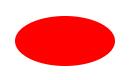
圆形-border-radius
对于制作圆形大部分人应该都了解,通过容器的border-radius属性即添加边框圆角属性,将值设置为50%即可
<style>
.box{
    width: 50px;
    height: 50px;
    background-color: red;
    border-radius: 50%;
}
</style>
<body>
	<div class="box"></div>
</body>

也可以设置容器的大小来做一个椭圆
width: 100px;
height: 50px;
css参考手册中,border-radius的值可为四个,类似于margin,分别对应四个角的圆角长度
border-radius: 10px 20px 30px 40px;/* 左上 右上 右下 左下 */
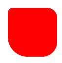
也可以设置为两个值,即为左上&右下,右上&左下的尺寸
border-radius: 100% 0;/* 左上&右下 右上&左下 */
图形实例
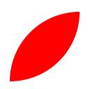
1.水滴
<style>
.water{
    width: 100px;
    height: 100px;
    background-color: rgba(0, 0, 255, 0.466);
    border-radius: 50% 0 50% 50%;/* 左上 右上 右下 左下 */
    margin: 50px;
    transform: rotate(-45deg);/* 旋转调正 */
}
</style>
<body>
	<div class="water"></div>
</body>
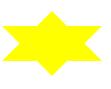
2.六角星
<style>
.star-6 *{
    width: 0;
    height: 0;
    border: 50px solid transparent;
    position: absolute;
}
.star-6-top{
    border-top-color: yellow;
}
.star-6-bottom{
    border-bottom-color: yellow;
    margin-top: -65px;
}
</style>
<body>
	<div class="star-6">
        <div class="star-6-top"></div>
        <div class="star-6-bottom"></div>
    </div>
</body>
3.五角星
五角星为三个三角形拼成,通过旋转合成的,尺寸为当前比较流行的一种比例,整体的长度有一点误差(有请数学大佬来计算!)
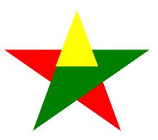
<style>
.star *{
    width: 0;
    height: 0;
}
.starItem1,.starItem2{
    border-left: 100px solid transparent;
    border-right: 100px solid transparent;
    border-bottom: 70px solid;
    position: absolute;
    margin-top: 50px;
}
.starItem1{
    border-bottom-color: yellow;
    transform: rotate(35deg);
}
.starItem2{
    border-bottom-color: yellow;
    transform: rotate(-35deg);
}
.starItem3{
    border-left: 30px solid transparent;
    border-right: 30px solid transparent;
    border-bottom: 80px solid;
    border-bottom-color: yellow;
    position: absolute;
    margin-left: 70px;
}
</style>
<body>
	<div clas="star">
        <div class="starItem1"></div>
        <div class="starItem2"></div>
        <div class="starItem3"></div>
    </div>
</body>
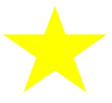
4.基于五角星的书签收藏图标
<style>
.favorite{
    width: 30px;
    height: 50px;
    background-color: chocolate;
}
.favorite::after{
    content: '';
    border-left: 15px solid transparent;
    border-right: 15px solid transparent;
    border-bottom: 15px solid #fff;
    position: relative;
    top: 14px;
}
.star{
    position: relative;
    top: 10px;
    margin-left: 5px;
}
.star * {
    width: 0;
    height: 0;
    }
.starItem1,.starItem2 {
    border-left: 10px solid transparent;
    border-right: 10px solid transparent;
    border-bottom: 7px solid;
    position: absolute;
    margin-top: 5px;
}
.starItem1 {
    border-bottom-color: #fff;
    transform: rotate(35deg);
}
.starItem2 {
    border-bottom-color: #fff;
    transform: rotate(-35deg);
}
.starItem3 {
    border-left: 3px solid transparent;
    border-right: 3px solid transparent;
    border-bottom: 8px solid #fff;
    position: absolute;
    margin-left: 7px;
}
</style>
<body>
	<div class="favorite">
        <div class="star">
            <div class="starItem1"></div>
            <div class="starItem2"></div>
            <div class="starItem3"></div>
        </div>
    </div>
</body>

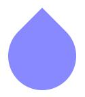
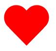
5.红心
<style>
.Circle{
    width: 50px;
    height: 80px;
    border-radius: 30px 30px 0 0;
    background-color: red;
    position: absolute;
}
.leftCircle{
    transform: rotate(-45deg);
    margin-left: 15px;
}
.rightCircle{
    transform: rotate(45deg);
    margin-left: 36px;
}
}
</style>
<body>
	<div class="heart">
        <div class="Circle leftCircle"></div>
        <div class="Circle rightCircle"></div>
    </div>
</body>
后记
通过这种拼接能制作很多这类的图形,本文也有很多思路和灵感来源于网络,还有很多大佬制作的复杂图形也不一一列举了。
萌新小白,欢迎大家批评指导!
