本文转载于:《https://blog.csdn.net/lyznice/article/details/54575905》
一、2D效果属性
要使用这些属性,我们需要通过 transform ,并且,为了保证兼容性,我们可能还需要添加带有浏览器内核前缀的属性,比如 -webkit-transform。
1、位移属性 translate( x , y )
简单来说,我们可以认为项目处于一个XY坐标轴的原点,translate( x , y ),当x为正的时候,则项目水平(x轴)向右移动[x]距离;负则向左移动[x]距离。y为正的时候,则项目垂直(y轴)向下移动[y],反之向上移动。
当然,我们也可以把该属性,拆分为translateX(n),和translateY(n),原理相同,不过一般我们还是推荐综合的写法。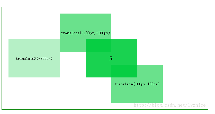
代码片段
.box01{
    background: rgba(7,204,63,0.9);
}
.box02{
    background: rgba(7,204,63,0.6);
    transform: translate(100px,100px);
}
.box03{
    background: rgba(7,204,63,0.6);
    transform: translate(-100px,-100px);
}
.box04{
    background: rgba(7,204,63,0.3);
    transform: translateX(-300px);
}
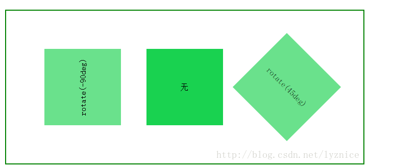
2、旋转属性 rotate()
这个属性也很简单,比如rotate( n deg),n是数字,deg是单位,我们可以理解为角度,0deg则不旋转。n为正时,顺时针旋转n度,反之,逆时针旋转。
而rotateX和rotateY属性,则可以归纳如3D立体效果的范畴,我们在下面再说。
.box01{
    background: rgba(7,204,63,0.6);
    transform: translate(-200px,0) rotate(-90deg);
}
.box02{
    background: rgba(7,204,63,0.9);
}
.box03{
    background: rgba(7,204,63,0.6);
    transform: translate(200px,0) rotate(45deg);
}
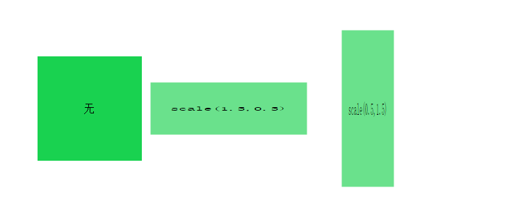
3、缩放属性 scale()
scale( x , y ),width为原有的值的 x 倍,height为原有的值的 y 倍。
.box01{
    background: rgba(7,204,63,0.9);
}
.box02{
    background: rgba(7,204,63,0.6);
    transform: scale(1.5,0.5);
}
.box03{
    background: rgba(7,204,63,0.6);
    transform: scale(0.5,1.5);
}
4、倾斜属性 skew()
skew( x deg, y deg ) ,分别表示 X轴和 Y轴倾斜的角度。值可以为负,反方向。
该属性也可以拆分为,skewX( ndeg ),skewY( ndeg ),对 X轴和 Y轴的倾斜角度分别描述。
就我本人而言,这个属性我项目中很少用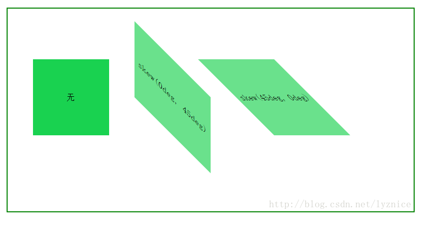
二、3D效果属性
3D效果就是立体效果,怎么实现一个3D效果的动画呢?让我们分步来说。
实现3D效果的,相关的属性,很多,兼容性也不一样,我们这里只说一些最常用的属性和使用方法。
我们在这里简单分为三步,第一步是立体环境,第二步是项目的动作或者说操作,第三部则是完成这些动作的规律,比如说时间,速度等。这些综合起来,就是一个3D效果的动画。
1、跟2D动画不同的是,我们需要在外层元素上添加这两个属性(环境):
1) transform-style:flat / preserve-3d 默认前一个,但是3D效果需要我们在整个动画的最外层元素,设置后一个属性值。
2) perspective:none / px 这个属性可以理解为视距,如果把屏幕当作空间,我们做的这个3D效果距离视图的距离,默认为none(那就不要用了),或者是像素值,如1000px。
2、实现一个3D动画,在2D相关属性使用的基础上,我们还经常用的这几个(动作):
1) 3D旋转 rotateX( deg ) rotateY( deg ) rotateZ( deg ) ,deg为旋转角度,单位deg,绕XYZ轴旋转的情况,来设定rotateX/Y/Z。
2) 3D偏移 translateZ() translate在2D动画中是偏移,在3D中同样也是如此,只是,在3D效果中我们增加了一个Z轴偏移。
3)3D缩放 scale3d(x,y,z) 也可以分开写,如scaleZ()
我们简单先来看一下效果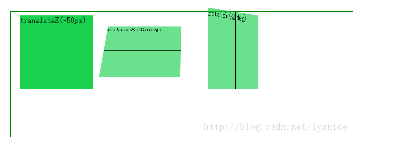
3、一个动画,我们怎么设置它的启动方式,动画效果怎么样,是快是慢,匀速还是其他,什么时候启动。我们一般都通过 transition 这个过渡属性来设置,当然,2D动画也可以用这个属性。
这个属性可以拆分为:
transition-property(过渡的属性的名称)。
transition-duration(定义过渡效果花费的时间,默认是 0)。
transition-timing-function:linear(匀速) ease(慢速开始,然后变快,然后慢速结束)(规定过渡效果的时间曲线,最常用的是这两个)。
transition-delay(规定过渡效果何时开始。默认是 0)。
当然,一般情况下,我们都是写一起的,比如:transition: width 2s ease 1s 。
综合上面三点下面附上一个简单demo的代码
<div class="box">
    <div class="box01">translateZ(-50px)</div>
    <div class="box02">rotateX(360deg)</div>
    <div class="box03">rotateY(360deg)</div>
</div>
.box{
    height: 300px;
    width: 700px;
    margin: 0 auto;
    margin-top: 100px;
    border: 2px solid green;
    position: relative;
    transform-style:preserve-3d;
    perspective:1000px;
}
.box div{
    height: 150px;
    width: 150px;
    float: left;
    margin-right: 30px;
    position: relative;
}
.box01{
    background: rgba(7,204,63,0.9);
    transition: all 3s;

}
.box02{
    background: rgba(7,204,63,0.6);
    transition: all 3s;
}
.box03{
    background: rgba(7,204,63,0.6);
    transition: all 3s
}
.box01:hover{
    transform: translateZ(-50px);
}
.box02:hover{
    transform: rotateX(360deg);

}
.box03:hover{
    ;
    transform: rotateY(360deg);
}
三、关键帧动画
实际项目中,仅仅是上面的那些知识,是不能满足我们对动画效果的要求的,还有个关键的知识点就是关键帧动画。
什么是关键帧动画,你可以理解为,我们可以通过这个对一个动画的过程的每一部分的表现都做出要求。
一个关键帧动画,最少包含两部分,animation 属性及属性值(动画的名称和运行方式运行时间等)。@keyframes(规定动画的具体实现过程)
animation 属性可以拆分为(当然,我们一般都写一起)
1)animation-name 规定@keyframes 动画的名称。
2)animation-duration 规定动画完成一个周期所花费的秒或毫秒。默认是 0。
3)animation-timing-function 规定动画的速度曲线。默认是 “ease”,常用的还有linear,同transtion 。
4)animation-delay 规定动画何时开始。默认是 0。
5)animation-iteration-count 规定动画被播放的次数。默认是 1,但我们一般用infinite,一直播放。
而@keyframes的使用方法,可以是from->to(等同于0%和100%),也可以是从0%->100%之间任意个的分层设置。我们通过下面一个稍微复杂点的demo来看一下,基本上用到了上面说到的大部分知识。
eg:
   @keyframes mymove
  {
      from {top:0px;}
      to {top:200px;}
  }

等同于:

  @keyframes mymove
  {
     0%   {top:0px;}
     25%  {top:200px;}
     50%  {top:100px;}
     75%  {top:200px;}
     100% {top:0px;}
  }
双重立方体旋转
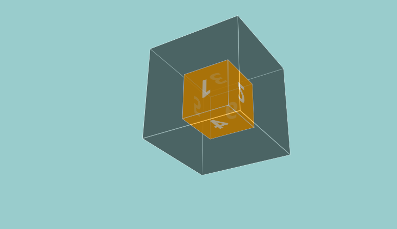
<!DOCTYPE html>
<html>
<head>
<meta charset="utf-8">
<meta http-equiv="X-UA-Compatible" content="IE=edge,chrome=1">
<title>Examples</title>
<style type="text/css">
*{
    padding:0;
    margin:0;
    box-sizing: border-box;
}
body{
    background: #9CC;
    perspective:1000px;
}
.box{
    height:200px;
    width: 200px;
    position: relative;
    margin:200px auto;
    transform-style:preserve-3d;
    -webkit-transform-style:preserve-3d;
    transform:rotateX(20deg) rotateY(20deg);
    animation:one 5s linear infinite;
    -webkit-animation:one 5s linear infinite;
}
@keyframes one{
    from{
        transform:rotateX(-20deg) rotateY(0deg) ;
    }
    to{
        transform:rotateX(340deg) rotateY(360deg) ;
    }
}
@-webkit-keyframes one{
    from{
        transform:rotateX(-20deg) rotateY(0deg) ;
    }
    to{
        transform:rotateX(340deg) rotateY(360deg) ;
    }
}
.box div{
    width:200px;
    height: 200px;
    background: black;
    opacity: 0.3;
    position: absolute;
    top:0;
    left:0;
    border: 1px solid white;
    transition:all 2s;
}
.box span{
    width: 100px;
    height: 100px;
    background: orange;
    position:absolute;
    border: 1px solid white;
    top:50%;
    left:50%;
    opacity: 0.7;
    margin-top: -50px;
    margin-left: -50px;
    font-size: 50px;
    color: white;
    font-weight: bold;
    text-align: center;
    line-height: 100px;
}
.box div:nth-child(1){
    transform:translateZ(100px);

}
.box div:nth-child(2){
    transform:translateZ(-100px);

}
.box div:nth-child(3){

    transform:rotateX(90deg) translateZ(100px);

}
.box div:nth-child(4){
    transform:rotateX(90deg) translateZ(-100px);

}
.box div:nth-child(5){
    transform:rotateY(90deg) translateZ(100px);

}
.box div:nth-child(6){
    transform:rotateY(90deg) translateZ(-100px);

}
.box:hover div:nth-child(1){
    transform:translateZ(200px);
}
.box:hover div:nth-child(2){
    transform:translateZ(-200px);

}
.box:hover div:nth-child(3){

    transform:rotateX(90deg) translateZ(200px);

}
.box:hover div:nth-child(4){
    transform:rotateX(90deg) translateZ(-200px);

}
.box:hover div:nth-child(5){
    transform:rotateY(90deg) translateZ(200px);

}
.box:hover div:nth-child(6){
    transform:rotateY(90deg) translateZ(-200px);

}
.box span:nth-child(7){
    transform:translateZ(50px);

}
.box span:nth-child(8){
    transform:translateZ(-50px) rotateY(180deg);

}
.box span:nth-child(9){
    transform:rotateX(90deg) translateZ(50px);

}
.box span:nth-child(10){
     transform:rotateX(90deg) translateZ(-50px);

}
.box span:nth-child(11){
    transform:rotateY(90deg) translateZ(50px);

}
.box span:nth-child(12){
     transform:rotateY(270deg) translateZ(50px);
}

</style>
</head>
<body>
<div class="box">
    <div></div>
    <div></div>
    <div></div>
    <div></div>
    <div></div>
    <div></div>
    <span>1</span>
    <span>6</span>
    <span>3</span>
    <span>4</span>
    <span>5</span>
    <span>2</span>
</div>


</body>
</html>