文章目录
animation(动画) 属性
语法
animation: name duration timing-function delay iteration-count direction fill-mode play-state;
| 值 | 说明 |
|---|---|
| animation-name | 指定要绑定到选择器的关键帧的名称 |
| animation-duration | 动画指定需要多少秒或毫秒完成 |
| animation-timing-function | 设置动画将如何完成一个周期 |
| animation-delay | 设置动画在启动前的延迟间隔。 |
| animation-iteration-count | 定义动画的播放次数。 |
| animation-direction | 指定是否应该轮流反向播放动画。 |
| animation-fill-mode | 规定当动画不播放时(当动画完成时,或当动画有一个延迟未开始播放时),要应用到元素的样式。 |
| animation-play-state | 指定动画是否正在运行或已暂停。 |
| initial | 设置属性为其默认值。 阅读关于 initial的介绍。 |
| inherit | 从父元素继承属性。 阅读关于 initinherital的介绍。 |
@keyframes 规则
语法
@keyframes animationname {keyframes-selector {css-styles;}}
| 值 | 说明 |
|---|---|
| animationname | 必需的。定义animation的名称。 |
| keyframes-selector | 必需的。动画持续时间的百分比。合法值:0-100% from (和0%相同) to (和100%相同)注意: 您可以用一个动画keyframes-selectors。 |
| css-styles | 必需的。一个或多个合法的CSS样式属性 |
一、animation 关键帧使用介绍
1.1 to from 关键字 帧
main {


  margin-top: 50px;
  width: 100px;
  height: 100px;
  background-color: white;
  animation-name: hj;
  animation-duration: 3s;
}
@keyframes hj {


    to {


        background-color: white;
    }
    from {


        background-color: red;
    }
}

1.2 百分比 帧
@keyframes hj {


    0% {


      	background-color: white;
    }
    100% {


      	background-color: green;
    }
}

@keyframes hj {


    0% {


        background-color: white;
    }
    25% {


        transform: scale(1.5);
    }
    55% {


        background-color: red;
    }
    100% {


        background-color: green;
    }
}

1.3 帧顺序与起始、终点的帧特性
1.3.1 帧顺序颠倒
帧顺序颠倒对动画执行结果没有影响,为了维护方便将帧顺序排列整齐
@keyframes hj {


    to {


        background-color: red;
    }
    from {


        background-color: white;
    }
}

/* 或 */

@keyframes hj {


    100% {


      	background-color: red;
    }
    0% {


      	background-color: white;
    }
}

1.3.2 起始、终点的帧特性
在不设置 animation-delay 和 animation-fill-mode 的情况下,动画起始、终点样式都是元素的原始样式
1 不设置起始帧,那么默认起始帧的样式就是 main 的原始样式,这样下面的代码动画就是:
起始 => 终点 => 回归原始样式
白 => 红 => 白
main {


    margin-top: 150px;
    width: 100px;
    height: 100px;
    background-color: white;
    animation-name: hj;
    animation-duration: 3s;
}
@keyframes hj {


    100% {


        background-color: red;
    }
}

2 不设置终点帧,那么默认终点帧的样式就是 main 的原始样式,这样下面的代码动画就是:
起始 => 终点 => 回归原始样式
红 => 白 => 白
main {


    margin-top: 150px;
    width: 100px;
    height: 100px;
    background-color: white;
    animation-name: hj;
    animation-duration: 3s;
}
@keyframes hj {


    0% {


        background-color: red;
    }
}

3 起始帧、终点帧都不设置,那么默认起始帧、终点帧的样式就是 main 的原始样式,这样下面的代码动画就是:
起始 => 终点 => 回归原始样式
白 => 红 => 白
main {


    margin-top: 150px;
    width: 100px;
    height: 100px;
    background-color: white;
    animation-name: hj;
    animation-duration: 5s;
}
@keyframes hj {


    55% {


        background-color: red;
    }
}

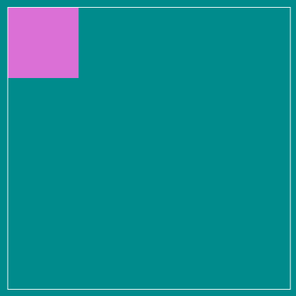
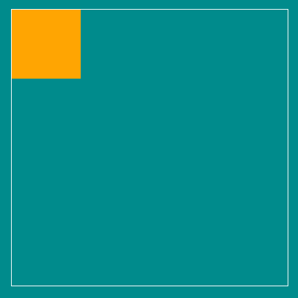
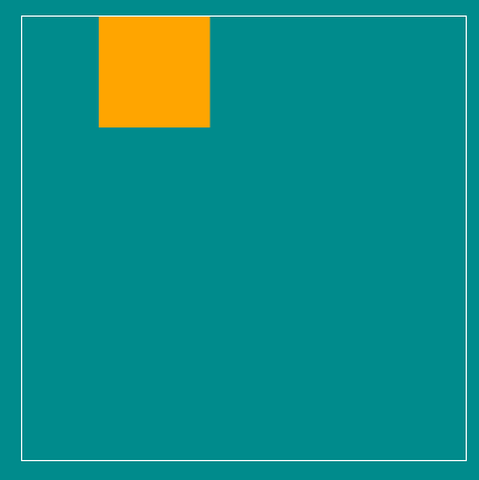
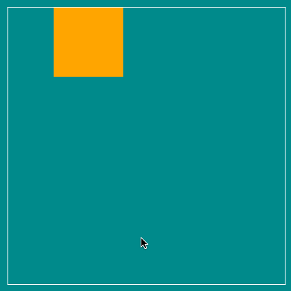
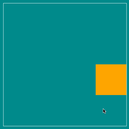
1.4 案例 移动的小方块
<main>
  <div class="box"></div>
</main>
<style>
    main {


        margin-top: 150px;
        width: 400px;
        height: 400px;
        border: 1px solid #ffffff;
    }
    .box {


        width: 100px;
        height: 100px;
        background-color: orange;
        animation-name: hj;
        animation-duration: 4s;
    }
    @keyframes hj {


        25% {


            transform: translateX(300px);
        }
        50% {


            transform: translate(300px, 300px);
        }
        75% {


            transform: translateY(300px);
        }
    }
</style>

1.5 同时声明关键帧规则
当我们的关键帧中存在相同的样式时,是可以提取共同样式的,如下
@keyframes hj {


    25% {


        transform: translateX(300px);
        background-color: green;
        border-radius: 50%;
    }
    50% {


        transform: translate(300px, 300px);
        background-color: orange;
        border-radius: 0;
    }
    75% {


        transform: translateY(300px);
        background-color: green;
        border-radius: 50%;
    }
}
可以改为如下代码,动画效果一致
@keyframes hj {


    25% {


        transform: translateX(300px);
    }
    50% {


        transform: translate(300px, 300px);
        background-color: orange;
        border-radius: 0;
    }
    75% {


        transform: translateY(300px);
    }
    25%, 75% {


        background-color: green;
        border-radius: 50%;
    }
}
1.6 多个动画使用与时间配置
- 一个元素可以设置多个动画,只需用 “,” 隔开;
- 每个动画完成花费的时间
- 如果动画数量与时间配置的个数一致,则动画与完成时间一一对应;
- 如果动画数多于完成时间数,则从第一个完成时间循环使用;
- 1.6.1如下,此时 .box 设置了两个动画,两个动画的完成时间都是 5s
.box {


    width: 100px;
    height: 100px;
    background-color: orange;
    animation-name: myTranslate, myBackgroundColor;
    animation-duration: 5s;
}
@keyframes myTranslate {


    25% {


        transform: translateX(300px);
    }
    50% {


        transform: translate(300px, 300px);
    }
    75% {


        transform: translateY(300px);
    }
}
@keyframes myBackgroundColor {


    25% {


        background-color: red;
    }
    50% {


        background-color: aquamarine;
    }
    75% {


        background-color: blue;
    }
}

- 1.6.2 如下,此时 .box 设置了三个动画,myBackgroundColor 的完成时间都是 5s,myTranslate 的完成时间都是 4s,myBorderRadius 的完成时间都是 5s
.box {


    width: 100px;
    height: 100px;
    background-color: orange;
    animation-name: myTranslate, myBackgroundColor, myBorderRadius;
    animation-duration: 5s, 4s;
}
@keyframes myTranslate {


    25% {


        transform: translateX(300px);
    }
    50% {


        transform: translate(300px, 300px);
    }
    75% {


        transform: translateY(300px);
    }
}
@keyframes myBackgroundColor {


    25% {


        background-color: red;
    }
    50% {


        background-color: aquamarine;
    }
    75% {


        background-color: blue;
    }
}
@keyframes myBorderRadius {


    25% {


        border-radius: 50%;
    }
    50% {


        border-radius: 20%;
    }
    75% {


        border-radius: 50%;
    }
    90% {


        border-radius: 30%;
    }
}

1.7 属性重叠对动画的影响
规则
在动画执行的同一时间,谁后出现,谁的权重就高。
换言之,重叠的多个动画属性,会交替出现各自样式;
1.7.1 样式重叠,时间覆盖
在下面代码中,myBackgroundColor 与 myBorderRadius 在动画的前两秒内重叠 background-color 属性,并且 myBorderRadius 在后,因此 myBorderRadius 的权重高。又因为 myBorderRadius 的完成时间是 4s,因此 myBorderRadius 在 前 50% 时间即 2s 内 展现为 black => green;两秒过后,myBackgroundColor的完成时间已过,因此不会再出现 myBackgroundColor 的动画效果。
.box {


    width: 100px;
    height: 100px;
    background-color: orange;
    animation-name: myTranslate, myBackgroundColor, myBorderRadius;
    animation-duration: 4s, 2s;
}
@keyframes myTranslate {


    25% {


        transform: translateX(300px);
    }
    50% {


        transform: translate(300px, 300px);
    }
    75% {


        transform: translateY(300px);
    }
}
@keyframes myBackgroundColor {


    25% {


        background-color: red;
    }
    50% {


        background-color: aquamarine;
    }
    75% {


        background-color: blue;
    }
}
@keyframes myBorderRadius {


    25% {


        border-radius: 50%;
        background-color: black;
    }
    50% {


        border-radius: 20%;
        background-color: green;
    }
    75% {


        border-radius: 50%;
    }
}

1.7.2 样式重叠,时间不覆盖,动画之间交叉执行
在上面的基础上,将 .box 中 myBackgroundColor 的完成时间修改为 4s,这样在 myBorderRadius 的前 50%(2s)动画执行完成后,会展现出 myBackgroundColor 的后 2s 动画(blue),效果图如下
.box {


    width: 100px;
    height: 100px;
    background-color: orange;
    animation-name: myTranslate, myBackgroundColor, myBorderRadius;
    animation-duration: 4s, 4s;
}

1.8. 动画属性中间值
1.8.1 100px => 200px 有中间值
有动画过渡状态
<div class="box"></div>
<style>
  .box {


    width: 100px;
    height: 100px;
    background-color: orange;
    margin: 100px auto;
    animation-name: amplification;
    animation-duration: 2s;
  }

  @keyframes amplification {


    100% {


      width: 200px;
      height: 200px;
    }
  }
</style>

1.8.2 auto => 200px 无中间值
无动画过渡状态,直接呈现结果;
.box {


    width: auto;
    height: auto;
    background-color: orange;
    margin: 100px auto;
    animation-name: amplification;
    animation-duration: 2s;
}

@keyframes amplification {


    100% {


        width: 200px;
        height: 200px;
    }
}

再比如 border: solid; => border: dashed; 也是没有中间值的

二、 animation-iteration-count 控制动画执行次数
默认animation-iteration-count: 1
animation-iteration-count: 2; 动画播放 2 次
animation-iteration-count: infinite; 动画播放无数次(循环播放)
<main>
		<div class="box"></div>
</main>
<style>
    main {


        margin-top: 150px;
        width: 400px;
        height: 400px;
        border: 1px solid #ffffff;
    }
    .box {


        width: 100px;
        height: 100px;
        background-color: orange;
        animation-name: myTranslate;
        animation-duration: 4s;
        animation-iteration-count: infinite;
    }
    @keyframes myTranslate {


        25% {


            transform: translateX(300px);
        }
        50% {


            transform: translate(300px, 300px);
        }
        75% {


            transform: translateY(300px);
        }
    }
</style>
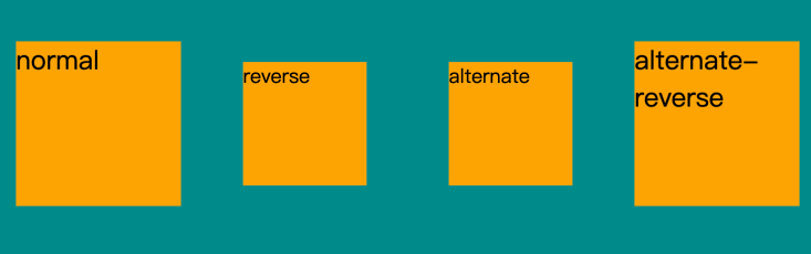
三、 animation-direction 动画运动方向
animation-direction 属性是用来定义是否应该轮流反向播放动画的
CSS 语法
animation-direction: normal|reverse|alternate|alternate-reverse|initial|inherit;
属性值
| 值 | 描述 | 测试 |
|---|---|---|
| normal | 默认值。动画按正常播放。 | 测试 » |
| reverse | 动画反向播放。 | 测试 » |
| alternate | 动画在奇数次(1、3、5…)正向播放,在偶数次(2、4、6…)反向播放。 | 测试 » |
| alternate-reverse | 动画在奇数次(1、3、5…)反向播放,在偶数次(2、4、6…)正向播放。 | 测试 » |
| initial | 设置该属性为它的默认值。请参阅 initial。 | |
| inherit | 从父元素继承该属性。请参阅 inherit。 |
<div class="box-normal"> normal </div>
<div class="box-reverse"> reverse </div>
<div class="box-alternate"> alternate </div>
<div class="box-alternate-reverse"> alternate-reverse </div>
<style>
    .box-normal {


        width: 100px;
        height: 100px;
        background-color: orange;
        margin: 100px auto;
        animation-name: amplification;
        animation-duration: 2s;
        animation-delay: 1s;
        animation-iteration-count: infinite;
        animation-direction: normal;
    }
    .box-reverse {


        width: 100px;
        height: 100px;
        background-color: orange;
        margin: 100px auto;
        animation-name: amplification;
        animation-duration: 2s;
        animation-delay: 1s;
        animation-iteration-count: infinite;
        animation-direction: reverse;
    }
    .box-alternate {


        width: 100px;
        height: 100px;
        background-color: orange;
        margin: 100px auto;
        animation-name: amplification;
        animation-duration: 2s;
        animation-delay: 1s;
        animation-iteration-count: infinite;
        animation-direction: alternate;
    }
    .box-alternate-reverse {


        width: 100px;
        height: 100px;
        background-color: orange;
        margin: 100px auto;
        animation-name: amplification;
        animation-duration: 2s;
        animation-delay: 1s;
        animation-iteration-count: infinite;
        animation-direction: alternate-reverse;
    }

    @keyframes amplification {


        100% {


            transform: scale(1.5);
        }
    }
</style>
案例:弹跳小球体验动画轮换衔接
<div class="ball"></div>
<div class="shadow"></div>
<style>
  .ball {


      width: 60px;
      height: 60px;
      background-image: radial-gradient(circle at center, orange, #f65409);
      border-radius: 50%;
      animation-name: ball;
      animation-duration: 1s;
      animation-direction: alternate-reverse;
      animation-iteration-count: infinite;
  }
  .shadow {


      position: absolute;
      transform: translateY(35px);
      width: 30px;
      height: 20px;
      background-color: rgba(0, 0, 0, 0.3);
      border-radius: 50%;
      z-index: -1;
      filter: blur(3px);
      animation-name: shadow;
      animation-duration: 1s;
      animation-direction: alternate-reverse;
      animation-iteration-count: infinite;
  }

  @keyframes ball {


      100% {


          transform: translateY(-200px);
      }
  }

  @keyframes shadow {


      100% {


          width: 40px;
      }
  }
</style>

四、 animation-delay 动画延迟属性
设置动画在启动前的延迟间隔
<div class="box"></div>
<style>
  .box {


      width: 100px;
      height: 100px;
      background-color: orange;
      animation-name: scale;
      animation-duration: 2s;
      animation-delay: 2s;
      animation-iteration-count: infinite;
  }

  @keyframes scale {


      100% {


          transform: scale(1.5);
      }
  }
</style>

五、animation-timing-function 动画速度曲线
语法
animation-timing-function: value;
animation-timing-function 使用的数学函数,称为三次贝塞尔曲线,速度曲线。使用此函数,您可以使用您自己的值,或使用预先定义的值之一:
| 值 | 描述 | 测试 |
|---|---|---|
| linear | 动画从头到尾的速度是相同的。 | 测试 |
| ease | 默认。动画以低速开始,然后加快,在结束前变慢。 | 测试 |
| ease-in | 动画以低速开始。 | 测试 |
| ease-out | 动画以低速结束。 | 测试 |
| ease-in-out | 动画以低速开始和结束。 | 测试 |
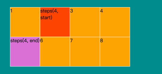
| steps(int,start|end) | 指定了时间函数中的间隔数量(步长)。有两个参数,第一个参数指定函数的间隔数,该参数是一个正整数(大于 0)。 第二个参数是可选的,表示动画是从时间段的开头连续还是末尾连续。含义分别如下:start:表示直接开始。end:默认值,表示戛然而止。 | |
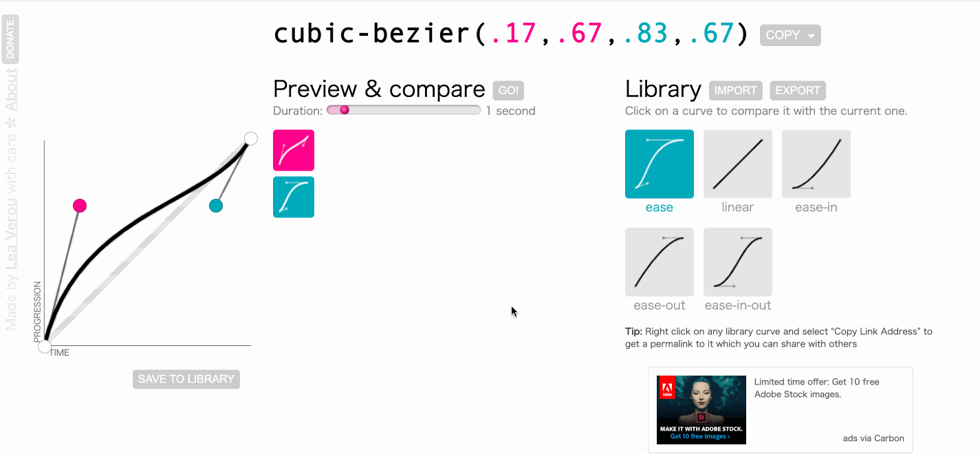
| cubic-bezier(n,n,n,n) | 在 cubic-bezier 函数中自己的值。可能的值是从 0 到 1 的数值。 |
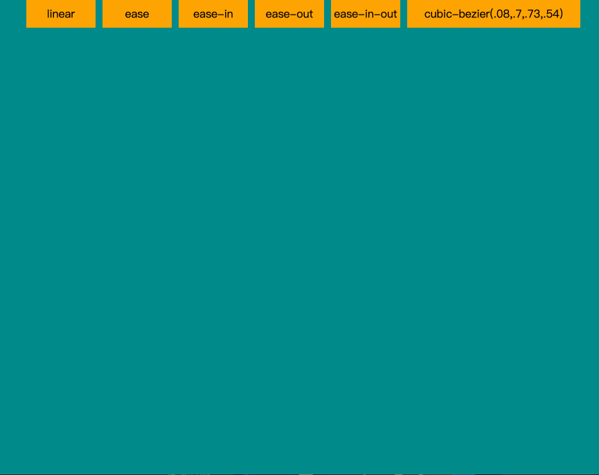
5.1 示例,完整体验时间曲线效果
<ul class="timing-box">
  <li>linear</li>
  <li>ease</li>
  <li>ease-in</li>
  <li>ease-out</li>
  <li>ease-in-out</li>
  <li>cubic-bezier(.08,.7,.73,.54)</li>
</ul>
<style>
  .timing-box {


      list-style: none;
      display: flex;
      justify-content: space-between;
      text-align: center;
  }
  .timing-box li {


      background-color: orange;
      width: 100px;
      height: 40px;
      line-height: 40px;
      margin-right: 10px;
      animation-name: move;
      animation-duration: 4s;
      animation-iteration-count: infinite;
      animation-delay: 1s;
  }

  li:nth-child(1) {


      animation-timing-function: linear;
  }
  li:nth-child(2) {


      animation-timing-function: ease;
  }
  li:nth-child(3) {


      animation-timing-function: ease-in;
  }
  li:nth-child(4) {


      animation-timing-function: ease-out;
  }
  li:nth-child(5) {


      animation-timing-function: ease-in-out;
  }
  li:nth-child(6) {


      white-space: nowrap;
      width: 250px;
      animation-timing-function: cubic-bezier(.08,.7,.73,.54);
  }

  @keyframes move {


      100% {


          transform: translateY(100vh);
      }
  }
</style>
5.2 示例,步进动画
<ul class="steps-box">
  <li>1</li>
  <li>2</li>
  <li>3</li>
  ...
  <li>8</li>
</ul>
<style>
  .steps-box {


      margin-top: 100px;
      list-style: none;
      display: flex;
      flex-wrap: wrap;
      width: 400px;
      height: 200px;
      background-color: orange;
  }
  .steps-box li {


      position: relative;
      width: 100px;
      height: 100px;
      border-right: 1px solid #ffffff;
      border-top: 1px solid #ffffff;
      box-sizing: border-box;
  }
  .steps-box li:nth-child(1), .steps-box li:nth-child(5) {


      border-left: 1px solid #ffffff;
  }
  .steps-box li:nth-child(n + 5) {


      border-bottom: 1px solid #ffffff;
  }
  .steps-box li:nth-child(1):before,
  .steps-box li:nth-child(5):before {


      content: "";
      width: 98px;
      height: 98px;
      position: absolute;
      z-index: 2;
      box-sizing: border-box;
      animation-name: move;
      animation-duration: 3s;
      animation-iteration-count: infinite;
  }

  .steps-box li:nth-child(1):before {


      content: "steps(4, start)";
      background-color: orangered;
      top: 0;
      animation-timing-function: steps(4, start);
  }
  .steps-box li:nth-child(5):before {


      content: "steps(4, end)";
      background-color: orchid;
      bottom: 0;
      animation-timing-function: steps(4, end);
  }

  @keyframes move {


      100% {


          transform: translateX(400px);
      }
  }
</style>
六、animation-play-state 动画播放状态属性
语法
animation-play-state: paused|running;
| 值 | 描述 | 测试 |
|---|---|---|
| paused | 指定暂停动画 | 测试 » |
| running | 指定正在运行的动画 | 测试 » |
6.1 示例,暂停
<main>
  <div class="box"></div>
</main>
<style>
    main {


        margin-top: 150px;
        width: 400px;
        height: 400px;
        border: 1px solid #ffffff;
    }
    .box {


        width: 100px;
        height: 100px;
        background-color: orange;
        animation-name: myTranslate;
        animation-duration: 4s;
        animation-iteration-count: infinite;
    }

    .box:hover {


        animation-play-state: paused;
    }

    @keyframes myTranslate {


        25% {


            transform: translateX(300px);
        }
        50% {


            transform: translate(300px, 300px);
        }
        75% {


            transform: translateY(300px);
        }
    }
</style>
6.2 示例,播放
<main>
  <div class="box"></div>
</main>
<style>
    main {


        margin-top: 150px;
        width: 400px;
        height: 400px;
        border: 1px solid #ffffff;
    }
    .box {


        width: 100px;
        height: 100px;
        background-color: orange;
        animation-name: myTranslate;
        animation-duration: 4s;
        animation-iteration-count: infinite;
        animation-play-state: paused;
    }

    .box:hover {


        animation-play-state: running;
    }

    @keyframes myTranslate {


        25% {


            transform: translateX(300px);
        }
        50% {


            transform: translate(300px, 300px);
        }
        75% {


            transform: translateY(300px);
        }
    }
</style>
七、animation-fill-mode 动画填充模式属性
animation-fill-mode 属性规定当动画不播放时(当动画完成时,或当动画有一个延迟未开始时),要应用到元素的播放样式。
CSS 语法
animation-fill-mode: none|forwards|backwards|both|initial|inherit;
属性值
| 值 | 描述 |
|---|---|
| none | 默认值。动画在动画执行之前和之后不会应用任何样式到目标元素。 |
| forwards | 在动画结束后(由 animation-iteration-count 决定),动画将应用该属性值。 |
| backwards | 动画将应用在 animation-delay 定义期间启动动画的第一次迭代的关键帧中定义的属性值。这些都是 from 关键帧中的值(当 animation-direction 为 “normal” 或 “alternate” 时)或 to 关键帧中的值(当 animation-direction 为 “reverse” 或 “alternate-reverse” 时)。 |
| both | 动画遵循 forwards 和 backwards 的规则。也就是说,动画会在两个方向上扩展动画属性。 |
| initial | 设置该属性为它的默认值。请参阅 initial。 |
| inherit | 从父元素继承该属性。请参阅 inherit。 |
7.1 示例,停留在动画最后一帧
<main>
  <div class="box"></div>
</main>
<style>
    main {


        margin-top: 150px;
        width: 400px;
        height: 400px;
        border: 1px solid #ffffff;
    }
    .box {


        width: 100px;
        height: 100px;
        background-color: orange;
        animation-name: hj;
        animation-duration: 4s;
        animation-fill-mode: forwards;
    }

    @keyframes hj {


        25% {


            transform: translateX(300px);
        }
        50% {


            transform: translate(300px, 300px);
            background-color: orange;
            border-radius: 0;
        }
        75% {


            transform: translateY(300px);
        }
        100% {


            transform: translate(0, 0);
            background-color: orchid;
        }
        25%, 75% {


            background-color: green;
            border-radius: 50%;
        }
    }
</style>