Shape
基本属性(corners、gradient、padding、size、solid、stroke)
1 corners圆角
<corners
android:radius="dimension" //全部的圆角半径
android:topLeftRadius="dimension" //左上角的圆角半径
android:topRightRadius="dimension" //右上角的圆角半径
android:bottomLeftRadius="dimension" //左下角的圆角半径
android:bottomRightRadius="dimension" /> //右下角的圆角半径
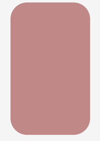
Corners标签是用来字义圆角的,其中radius与其它四个并不能共同使用。
代码:
<?xml version="1.0" encoding="utf-8"?>
<shape xmlns:android="http://schemas.android.com/apk/res/android" >
 <corners android:radius="20dip"/>
 <solid android:color="#ffff00"/>
</shape>
如图:
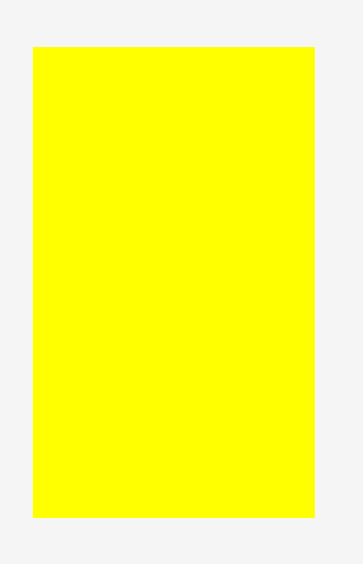
2 solid 填充色
<solid
android:color="color" />
代码:
<?xml version="1.0" encoding="utf-8"?>
<shape xmlns:android="http://schemas.android.com/apk/res/android" >
 <solid android:color="#ffff00"/>
</shape>
如图:
3 Shape的属性(rectangle、oval、line、ring)
android:shape=["rectangle" | "oval" | "line" | "ring"]
shape的形状,默认为矩形,可以设置为矩形(rectangle)、椭圆形(oval)、线性形状(line)、环形(ring)
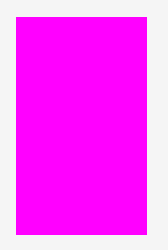
3.1 rectangle (矩形)
这就是上一节我们使用的形状,当我们不指定shape属性时,默认就是矩形的。
<?xml version="1.0" encoding="utf-8"?>
<shape xmlns:android="http://schemas.android.com/apk/res/android"
 android:shape="rectangle">
 <solid android:color="#ff00ff"/>
</shape>
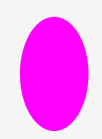
3.2 oval(椭圆)
<?xml version="1.0" encoding="utf-8"?>
<shape xmlns:android="http://schemas.android.com/apk/res/android"
 android:shape="oval">
 <solid android:color="#ff00ff"/>
</shape>
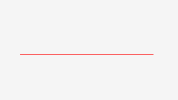
3.3 line(线形)
<?xml version="1.0" encoding="utf-8"?>
<shape xmlns:android="http://schemas.android.com/apk/res/android"
 android:shape="line">
 <stroke android:width="2dp"
 android:color="#ff00"/>
</shape>
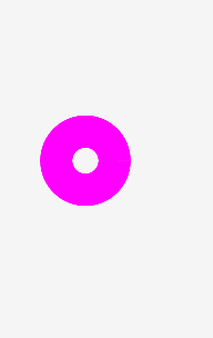
3.4 ring(环形)
它特有的属性:
android:innerRadius 尺寸,内环的半径。
android:thickness 尺寸,环的厚度
android:innerRadiusRatio 浮点型,以环的宽度比率来表示内环的半径,
android:useLevel boolean值,如果当做是LevelListDrawable使用时值为true,否则为false.
<?xml version="1.0" encoding="utf-8"?>
<shape xmlns:android="http://schemas.android.com/apk/res/android"
 android:shape="ring"
 android:innerRadius="20dp"
 android:thickness="50dp"
 android:useLevel="false">
 <solid android:color="#ff00ff"/>
</shape>
4 size和padding
<size
android:width="dimension"
android:height="dimension" />
<padding
android:left="dimension"
android:top="dimension"
android:right="dimension"
android:bottom="dimension" />
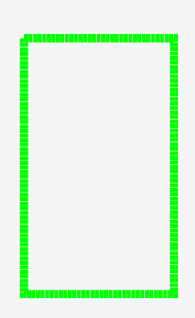
5 stroke
这是描边属性,可以定义描边的宽度,颜色,虚实线等
<stroke
android:width="dimension" //描边的宽度
android:color="color" //描边的颜色
// 以下两个属性设置虚线
android:dashWidth="dimension" //虚线的宽度,值为0时是实线
android:dashGap="dimension" /> //虚线的间隔
<?xml version="1.0" encoding="utf-8"?>
<shape xmlns:android="http://schemas.android.com/apk/res/android" >
 <stroke
 android:width="20dp"
 android:color="#00ff00"
 android:dashWidth="10dp"
 android:dashGap="1dp" />
</shape>
6 gradient 渐变色
<gradient
android:type=["linear" | "radial" | "sweep"] //共有3中渐变类型,线性渐变(默认)/放射渐变/扫描式渐变
android:angle="integer" //渐变角度,必须为45的倍数,0为从左到右,90为从上到下
android:centerX="float" //渐变中心X的相当位置,范围为0~1
android:centerY="float" //渐变中心Y的相当位置,范围为0~1
android:startColor="color" //渐变开始点的颜色
android:centerColor="color" //渐变中间点的颜色,在开始与结束点之间
android:endColor="color" //渐变结束点的颜色
android:gradientRadius="float" //渐变的半径,只有当渐变类型为radial时才能使用
android:useLevel=["true" | "false"] /> //使用LevelListDrawable时就要设置为true。设为false时才有渐变效果
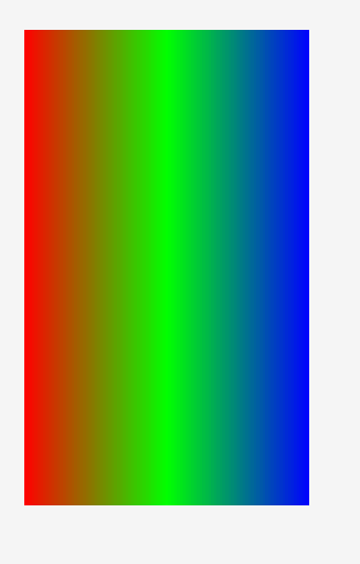
首先有三种渐变类型,分别是:linear(线性渐变)、radial(放射性渐变)、sweep(扫描式渐变)
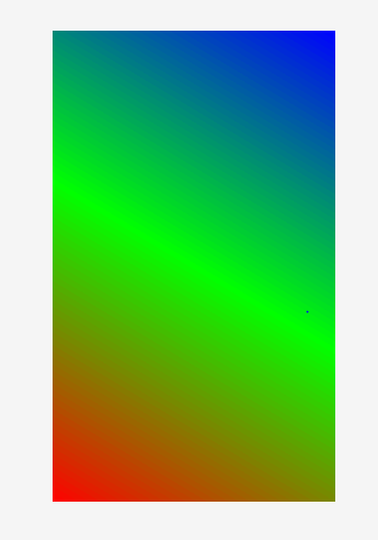
6.1 Lineae线形渐变
<?xml version="1.0" encoding="utf-8"?>
<shape xmlns:android="http://schemas.android.com/apk/res/android" >
<gradient
android:type="linear"
android:startColor="#ff0000"
android:centerColor="#00ff00"
android:endColor="#0000ff"/>
</shape>
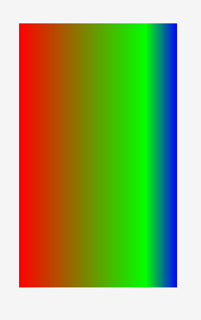
android:angle属性(仅对线性渐变有效)
<?xml version="1.0" encoding="utf-8"?>
<shape xmlns:android="http://schemas.android.com/apk/res/android" >
 <gradient
 android:type="linear"
 android:startColor="#ff0000"
 android:centerColor="#00ff00"
 android:endColor="#0000ff"
 android:angle="45"/>
</shape>
android:centerX与android:centerY
centerX、centerY两个属性用于设置渐变的中心点位置,类型为分数或小数,不接受Dimension。默认值是0.5,有效值是0.0~1.0,超出该范围后会看不出渐变效果。centerX、centerY的取值其实是宽和高的百分比;不难理解,下面看代码:
<?xml version="1.0" encoding="utf-8"?>
<shape xmlns:android="http://schemas.android.com/apk/res/android" >
 <gradient
 android:type="linear"
 android:startColor="#ff0000"
 android:centerColor="#00ff00"
 android:endColor="#0000ff"
 android:centerX="0.5"
 android:centerY="0.8"/>
</shape>
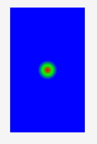
6.2 radial 放射性渐变
<?xml version="1.0" encoding="utf-8"?>
<shape xmlns:android="http://schemas.android.com/apk/res/android" >
 <gradient
 android:type="radial"
 android:startColor="#ff0000"
 android:centerColor="#00ff00"
 android:endColor="#0000ff"
 android:gradientRadius="100"/>
</shape>
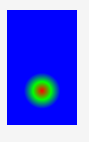
android:centerX与android:centerY
<?xml version="1.0" encoding="utf-8"?>
<shape xmlns:android="http://schemas.android.com/apk/res/android" >
 <gradient
 android:type="radial"
 android:startColor="#ff0000"
 android:centerColor="#00ff00"
 android:endColor="#0000ff"
 android:gradientRadius= "200"
 android:centerX="0.5"
 android:centerY="0.7"/>
</shape>
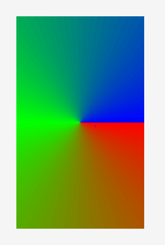
6.3 sweep扫描式渐变
<?xml version="1.0" encoding="utf-8"?>
<shape xmlns:android="http://schemas.android.com/apk/res/android" >
 <gradient
 android:type="sweep"
 android:startColor="#ff0000"
 android:centerColor="#00ff00"
 android:endColor="#0000ff"/>
</shape>
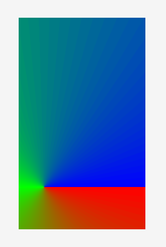
android:centerX与android:centerY
<?xml version="1.0" encoding="utf-8"?>
<shape xmlns:android="http://schemas.android.com/apk/res/android" >
 <gradient
 android:type="sweep"
 android:startColor="#ff0000"
 android:centerColor="#00ff00"
 android:endColor="#0000ff"
 android:centerX="0.2"
 android:centerY="0.8"/>
</shape>
Selector
android:drawable 放一个drawable资源
android:state_pressed 是否按下,如一个按钮触摸或者点击。
android:state_focused 是否取得焦点,比如用户选择了一个文本框。
android:state_hovered 光标是否悬停,通常与focused state相同,它是4.0的新特性
android:state_selected 被选中,它与focus state并不完全一样,如一个list view 被选中的时候,它里面的各个子组件可能通过方向键,被选中了。
android:state_checkable 组件是否能被check。如:RadioButton是可以被check的。
android:state_checked 被checked了,如:一个RadioButton可以被check了。
android:state_enabled 能够接受触摸或者点击事件
android:state_activated 被激活
android:state_window_focused 应用程序是否在前台,当有通知栏被拉下来或者一个对话框弹出的时候应用程序就不在前台了
代码:
<?xml version="1.0" encoding="utf-8"?>
<selector xmlns:android="http://schemas.android.com/apk/res/android">
<item android:drawable="@color/colorAccent" android:state_pressed="true"/>
<item android:drawable="@color/colorAccent" android:state_checked="true"/>
<item android:drawable="@color/colorAccent" android:state_selected="true"/>
 <item android:drawable="@color/colorPrimary"/>
</selector>