版权声明:本文为博主原创文章,未经博主允许不得转载。 https://blog.csdn.net/Common_it/article/details/80434643
TextInputLayout继承LinearLayout,是一个容器,只可以包裹一个子控件,类似ScrollView,用TextInputLayout包裹的EditText会有很多的特效,接下来我们看看效果
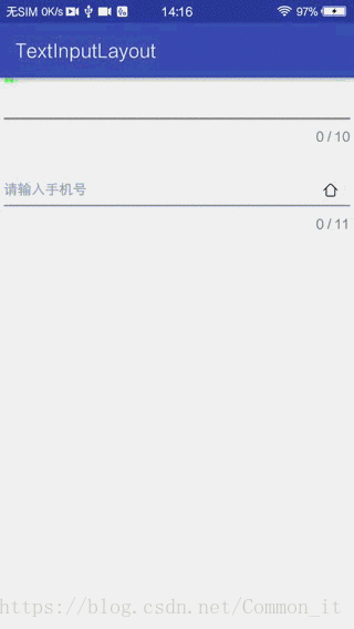
效果
layout
只要用TextInputLayout包裹EditText就OK
    <android.support.design.widget.TextInputLayout
        android:id="@+id/tl_input"
        android:layout_width="match_parent"
        android:layout_height="wrap_content"
        app:counterEnabled="true"
        app:counterMaxLength="11"
        app:counterOverflowTextAppearance="@style/CountTextError"
        app:counterTextAppearance="@style/CountTextNormal"
        app:errorTextAppearance="@style/CountTextError"
        app:hintAnimationEnabled="true"
        app:hintEnabled="true"
        app:hintTextAppearance="@style/HintText"
        app:passwordToggleDrawable="@drawable/select_home"
        app:passwordToggleEnabled="true"
        app:passwordToggleTint="@color/colorNormal"
        app:passwordToggleTintMode="multiply">

        <EditText
            android:id="@+id/et_input"
            android:layout_width="match_parent"
            android:layout_height="wrap_content"
            android:hint="请输入手机号"
            android:inputType="textPassword"
            android:textColorHint="#999999"
            android:textSize="14sp" />
    </android.support.design.widget.TextInputLayout>
Sytle
    <style name="HintText">
        <item name="android:textSize">12sp</item>
        <item name="android:textColor">#666666</item>
    </style>

    <style name="CountTextNormal">
        <item name="android:textColor">#666666</item>
    </style>

    <style name="CountTextError">
        <item name="android:textColor">#FF0000</item>
    </style>
自定义属性说明
| 自定义属性 | 说明 | 参数 |
|---|---|---|
| counterEnabled | 是否开始输入统计功能 | Boolean值 默认值:false |
| counterMaxLength | 设置最大输入长度 | Integer值 默认值:-1(无限制) |
| counterTextAppearance | 设置统计文字的样式 | 样式文件 |
| counterOverflowTextAppearance | 设置超出输入最大长度后的样式 | 样式文件 |
| errorEnabled | 是否开启错误提示 | Boolean值 默认值:false |
| errorTextAppearance | 错误提示文字样式 | 样式文件 |
| hintEnabled | 是否开启提示功能 | Boolean值 默认值:true |
| hintAnimationEnabled | 是否开启提示动画功能 | Boolean值 默认值:true |
| hintTextAppearance | 提示功能的样式 | 样式文件 |
| passwordToggleEnabled | 是否开启密码切换功能 | Boolean值 默认值:false |
| passwordToggleDrawable | 设置密码切换图片 | Drawable资源 |
| passwordToggleTint | 给密码切换图片着色 | Color资源 |
| passwordToggleTintMode | 设置图片着色模式 | 默认:src_in |
注意
- 使用
passwordToggleEnabled功能是在包裹的EditText中需要设置inputType属性; - 想修改EditText下边线的颜色可以修改color文件中
colorAccent的颜色值; errorEnabled功能如果打开了就会一直显示,需要在适当的时候设置为false,所以这个功能适合在java文件中使用,根据逻辑来展示;