版权声明:本文为博主原创文章,未经博主允许不得转载。 https://blog.csdn.net/arcers/article/details/79187006
1 附加包
如果尚未安装,可以直接通过install.packages('packagename')从cran下载
library(ggplot2)
library(ggridges)  # 绘制山脊图
library(dplyr)  # 数据处理
library(reshape) # 数据处理
library(viridis)  # 调色板
2 绘图
(1)对iris数据集绘制山脊图
windowsFonts('yh' = '微软雅黑')

ggplot(iris) +
  geom_density_ridges_gradient(
    aes(x = Sepal.Length, y = Species, fill = ..x..,height = ..density..),
    scale = 1, rel_min_height = 0.01) +
  theme_ridges(font_size = 13, grid = TRUE) +
  theme(
    text = element_text(family = 'yh'),
    legend.position = 'right'
  ) +
  scale_y_discrete(name = '', expand = c(0.01, 0)) +
  scale_x_continuous(name = '', expand = c(0.01, 0)) +
scale_fill_viridis(name = "", option = "C") 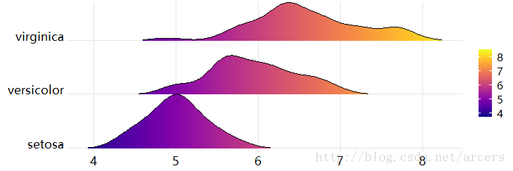
(2)对diamonds数据集绘制山脊图
windowsFonts('yh' = '微软雅黑')

ggplot(diamonds) +
  geom_density_ridges_gradient(
    aes(x = price, y = clarity, fill = ..x..,height = ..density..),
    scale = 3, rel_min_height = 0.01) +
  theme_ridges(font_size = 13, grid = TRUE) +
  theme(
    text = element_text(family = 'yh'),
    legend.position = 'right'
  ) +
  scale_y_discrete(name = '', expand = c(0.01, 0)) +
  scale_x_continuous(name = '', expand = c(0.01, 0)) +
scale_fill_viridis(name = "", option = "C", alpha = .1) 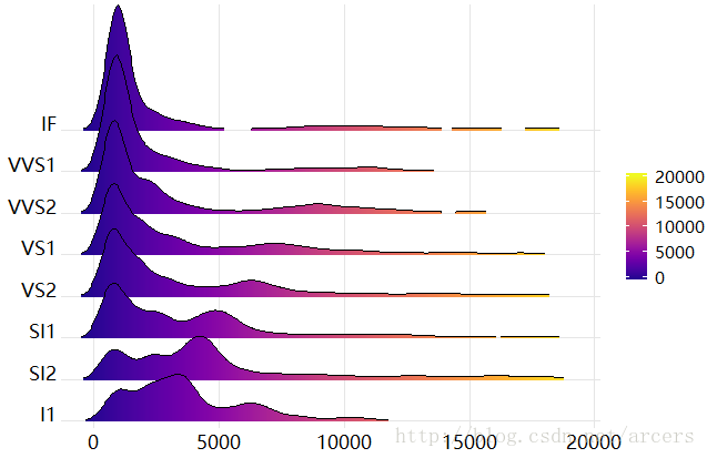
3 总结
山脊图生动展示了不同类别数据在同一因素的不同水平下的分布差异,个人感觉在纵轴方向上如果出现重叠是不太容易看清细节的,而在横轴方向更能体现分布的位置差异性。