山脊图也叫也叫峰峦图、山峦图,主要是通过展示一个相同的X轴数据,可以是时间序列、基因数据等,对应不同的Y轴数据,清晰的展示不同数据见变量的关系。今天我们通过R语言来演示山脊图。需要使用到ggridges包,需要提前安装好。 我们先导入R包和数据
library(ggplot2)
library(ggridges)
library(foreign)
bc <- read.spss("E:/r/test/tree_car.sav",
                use.value.labels=F, to.data.frame=T)
head(bc,6)
##    car age gender inccat ed marital
## 1 37.2  45      m      4  3       1
## 2 19.8  42      m      2  3       0
## 3 11.8  28      m      1  4       0
## 4 21.3  31      f      2  4       1
## 5 68.9  42      f      4  3       0
## 6 34.1  35      m      3  3       0
这是一个汽车销售数据(公众号回复:汽车销售,可以获得该数据),我们来看下数据,car就是汽车售价,age是年龄,gender是性别,inccat是收入,这里分成4个等级,ed是教育程度,这里分为5个等级,marital表示是否结婚.我们处理一下数据,把分类变量转换成因子,然后加上一个标签。
bc$ed<-factor(bc$ed,levels=c(1:5),labels=c("小学","初中","高中","大学","博士"))
bc$inccat<-factor(bc$inccat,levels=c(1:4),labels=c("低收入","中低收入","中等收入","富裕"))
bc$gender<-ifelse(bc$gender=="m",1,0)
bc$gender<-factor(bc$gender,levels = c(0,1),labels=c("女性","男性"))
bc$marital<-factor(bc$marital,levels = c(0,1),labels=c("未婚","已婚"))
head(bc,6)
##    car age gender   inccat   ed marital
## 1 37.2  45   男性     富裕 高中    已婚
## 2 19.8  42   男性 中低收入 高中    未婚
## 3 11.8  28   男性   低收入 大学    未婚
## 4 21.3  31   女性 中低收入 大学    已婚
## 5 68.9  42   女性     富裕 高中    未婚
## 6 34.1  35   男性 中等收入 高中    未婚
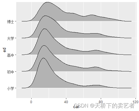
接下来开始绘图,ggridges包绘制山峦图有两个主要的函数,geom_density_ridges函数主要是用于分类的演示,geom_density_ridges_gradient用于渐变性的演示,主要是通过绘制密度函数图来表示。我们先来演示一下geom_density_ridges函数。 假设我们想了解不同教育阶段人群的购车价格分布,这里X就是汽车售价car,Y就是学历ed。我们先来画一个基础图形
ggplot(bc, aes(x = car, y = ed)) +
  geom_density_ridges()
## Picking joint bandwidth of 5.11
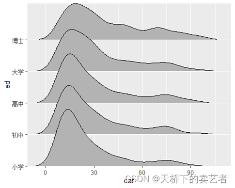
在geom_density_ridges()函数中,我们设置rel_min_height=0.005可以删除尾部区域线条,scale控制山峰高度,gradient_lwd为设置坡度。
ggplot(bc, aes(x = car, y = ed)) +
  geom_density_ridges(scale = 2, rel_min_height = 0.01,gradient_lwd = 1.)
## Warning in geom_density_ridges(scale = 2, rel_min_height = 0.01, gradient_lwd =
## 1): Ignoring unknown parameters: `gradient_lwd`
## Picking joint bandwidth of 5.11

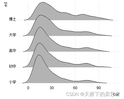
我们可以看到山峰明显增高了,尾部区域线条没有了。scale_x_continuous和scale_y_discrete函数可以控制图像和坐标轴的距离
ggplot(bc, aes(x = car, y = ed)) +
  geom_density_ridges(rel_min_height = 0.01)+
  scale_x_continuous(expand = c(0, 0)) +   #用于控制离坐标轴的距离
  scale_y_discrete(expand = c(0,0))  #用于控制离坐标轴的距离
## Picking joint bandwidth of 5.11
theme_ridges()函数用于控制背景,山脊图的主题设置,默认是14,grid = TRUE为有网格线
ggplot(bc, aes(x = car, y = ed)) +
  geom_density_ridges(rel_min_height = 0.005)+
  scale_y_discrete(expand = c(0.01, 0)) +
  scale_x_continuous(expand = c(0.01, 0))+
  theme_ridges(font_size = 13, grid = TRUE)
## Picking joint bandwidth of 5.11
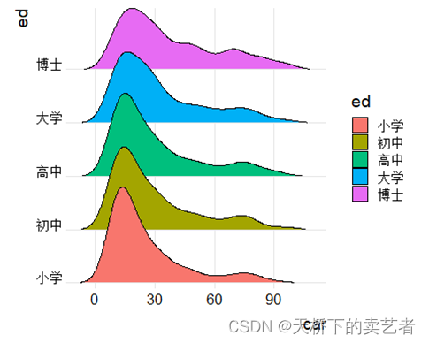
根据分类添加颜色,fill = ed
ggplot(bc, aes(x = car, y = ed,fill = ed)) +
  geom_density_ridges(rel_min_height = 0.005)+
  scale_y_discrete(expand = c(0.01, 0)) +
  scale_x_continuous(expand = c(0.01, 0))+
  theme_ridges()+ theme()
## Picking joint bandwidth of 5.11
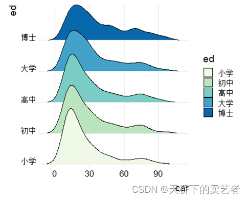
使用scale_fill_brewer(palette = 4),可以使用ggplot定制主体颜色,有多个主题
ggplot(bc, aes(x = car, y = ed,fill = ed)) +
  geom_density_ridges(rel_min_height = 0.005)+
  scale_y_discrete(expand = c(0.01, 0)) +
  scale_x_continuous(expand = c(0.01, 0))+
  theme_ridges()+ theme()+
  scale_fill_brewer(palette = 4)
## Picking joint bandwidth of 5.11
添加标题和副标题
ggplot(bc, aes(x = car, y = ed,fill = ed)) +
  geom_density_ridges(rel_min_height = 0.005)+
  scale_y_discrete(expand = c(0.01, 0)) +
  scale_x_continuous(expand = c(0.01, 0))+
  theme_ridges()+ theme()+
  scale_fill_brewer(palette = 4)+
    labs(
    title = '学历和购车价格关系',
    subtitle = '不同学历和购车价格关系'
  )
## Picking joint bandwidth of 5.11

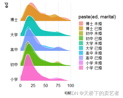
假设我们想进一步知道结婚和没有结婚的不同教育购车区别
ggplot(bc, aes(x = car, y = ed,fill = paste(ed, marital))) +
  geom_density_ridges(alpha = .7, color = "white", from = 0, to = 100)+
  scale_y_discrete(expand = c(0.01, 0)) +
  scale_x_continuous(expand = c(0.01, 0))+
  theme_ridges()+ theme()
## Picking joint bandwidth of 5.83
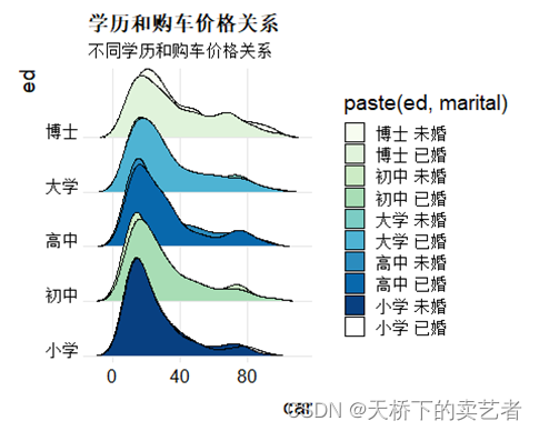
也可以切换其他主题
ggplot(bc, aes(x = car, y = ed,fill = paste(ed, marital))) +
  geom_density_ridges(rel_min_height = 0.005)+
  scale_y_discrete(expand = c(0.01, 0)) +
  scale_x_continuous(expand = c(0.01, 0))+
  theme_ridges()+ theme()+
  scale_fill_brewer(palette = 4)+
  scale_fill_brewer(palette = 4)+
    labs(
    title = '学历和购车价格关系',
    subtitle = '不同学历和购车价格关系'
  )
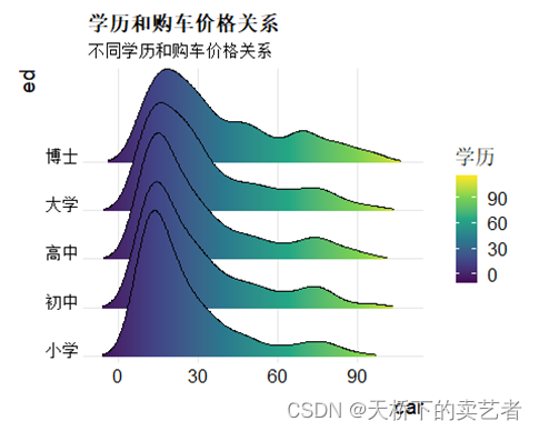
接下来我们介绍一下geom_density_ridges_gradient函数,主要是渐变的效果,大部分参数相同,这里要选个fill = stat(x)进行转换。
为不同类型的学历机型渐变颜色, scale_fill_viridis_c函数 #name =为名字映射,alpha透明度,option = #“C”,不同颜色美学,A-H,direction,设置颜色在比例中的顺序,默认是1
ggplot(bc, aes(x = car, y = ed, fill = after_stat(x))) +
  geom_density_ridges_gradient(scale = 3, rel_min_height = 0.01, gradient_lwd = 1.) +
  scale_x_continuous(expand = c(0, 0)) +
  scale_y_discrete(expand = expand_scale(mult = c(0.01, 0.25))) +
  scale_fill_viridis_c(name = "学历", option = "C") +
  labs(
    title = '学历和购车价格关系',
    subtitle = '不同学历和购车价格关系'
  )
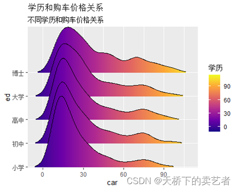
这样就产生了一个渐变风格的山脊图,接下来option这里可以产生不同颜色美学,A-H,direction,设置颜色在比例中的顺序,默认是1,我们换一个看看
ggplot(bc, aes(x = car, y = ed, fill = after_stat(x))) +
  geom_density_ridges_gradient(scale = 3, rel_min_height = 0.01, gradient_lwd = 1.) +
  scale_x_continuous(expand = c(0, 0)) +
  scale_y_discrete(expand = expand_scale(mult = c(0.01, 0.25))) +
  scale_fill_viridis_c(name = "学历", option = "D") +
  labs(
    title = '学历和购车价格关系',
    subtitle = '不同学历和购车价格关系')+
theme_ridges()+ theme()
## Picking joint bandwidth of 5.11