版权声明:JiahaoZhang原创文章,转载请注明出处 https://blog.csdn.net/GrootBaby/article/details/88953413
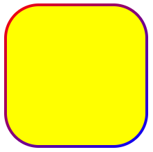
CSS 中 border 用了border-image,border-radius圆角设置就会失效,所以可以通过伪元素::before或者::after,使用背景线性渐变模拟实现。
.border-radius-linear-gradient {
    width: 200px;
    height: 200px;
    position: relative;
    border: 4px solid transparent;
    background-color: transparent;
    border-radius: 50px;
    background-clip: padding-box;
}
.border-radius-linear-gradient::after {
    content: "";
    display: block;
    position: absolute;
    top: -4px;
    right: -4px;
    bottom: -4px;
    left: -4px;
    border-top-right-radius: 50px;
    border-radius: 50px;
    background: linear-gradient(135deg, red, blue);
    z-index: -1;
}
.border-radius-linear-gradient-content {
    width: 200px;
    height: 200px;
    background-color: yellow;
    border-radius: 46px;
}
<div class="border-radius-linear-gradient">
<div class="border-radius-linear-gradient-content"></div>
</div>效果如下图: