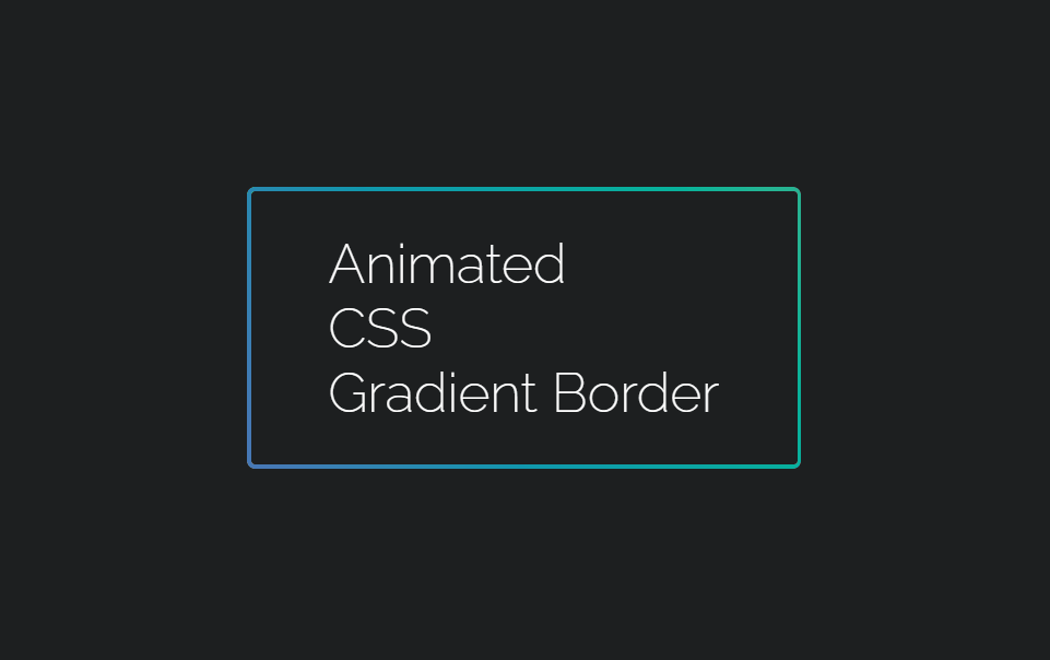
1、实现效果
2、实现代码
<!DOCTYPE html>
<html lang="en">

<head>
  <meta charset="UTF-8">
  <meta name="viewport" content="width=device-width, initial-scale=1.0">
  <title>Document</title>
  <style>
    @import url('https://fonts.googleapis.com/css?family=Raleway:200');

    html,
    body {


      height: 100%;
    }

    body {


      display: flex;
      justify-content: center;
      align-items: center;
      height: 100%;
      background: #1D1F20;
    }

    #box {


      display: flex;
      justify-content: center;
      align-items: center;
      width: 400px;
      height: 200px;
      color: #fff;
      font-size: 2.5rem;
    }

    .gradient-border {


      --borderWidth: 3px;
      background: #1D1F20;
      position: relative;
      border-radius: var(--borderWidth);
    }

    .gradient-border:after {


      content: '';
      position: absolute;
      top: calc(-1 * var(--borderWidth));
      left: calc(-1 * var(--borderWidth));
      height: calc(100% + var(--borderWidth) * 2);
      width: calc(100% + var(--borderWidth) * 2);
      background: linear-gradient(60deg, #f79533, #f37055, #ef4e7b, #a166ab, #5073b8, #1098ad, #07b39b, #6fba82);
      border-radius: calc(2 * var(--borderWidth));
      z-index: -1;
      animation: animatedgradient 3s ease alternate infinite;
      background-size: 300% 300%;
    }

    @keyframes animatedgradient {


      0% {


        background-position: 0% 50%;
      }

      50% {


        background-position: 100% 50%;
      }

      100% {


        background-position: 0% 50%;
      }
    }
  </style>
</head>

<body>
  <div class="gradient-border" id="box">
    Animated <br>CSS <br>Gradient Border
  </div>
</body>

</html>