有个师弟毕业论文需要画3D图,指导老师让他用matlab画,他就让我帮忙,我不会matlab,但是想到Python里面有个matplotlib包内置了matlab的画图功能,因此就答应了,当作画图的练手
给出一个Excel文件,里面是3个sheet,分别是三种药:吉非替尼,吉西他滨,紫杉醇的结果,要求是用三个sheet做三个三维图
X轴AUC,Y轴癌症类型,Z轴IC50
临床上IC50较难预测,任务是要根据癌症类型、AUC预测IC50
AUC是小于1的小数,癌症类型有五种:大细胞癌,腺癌,鳞状细胞癌,良性肿瘤和未指定,然后IC50是波动比较大的小数,从0-20都有
首先需要读入数据,这里用pandas包读取Excel
# coding=utf-8
import pandas as pd
df = []
for i in range(3): # 读取三个sheet
    dd = pd.read_excel(r"D:\1.xlsx", header=0, sheet_name=i)
    dd = dd[dd.type != "未指定"] # 删除不需要的数据
    dd = dd[dd.type != "良性肿瘤"] # 删除不需要的数据
    dd = dd.sort_values(by="AUC") # 排序后画图会好看点
    class_mapping = {label: idx for idx, label in enumerate(set(dd['type']))} # 将癌症类型映射为0,1,2数字,方便画图
    dd['type'] = dd['type'].map(class_mapping)
    dd = dd.reset_index() # 排序并且映射完后index变化需要reset
    df.append(dd)
首先读取EXCEL数据,然后删除不需要的未指定和良性肿瘤类型
接下来是排序,因为画图是根据一个个点顺序连接的,所以最好有序才能看出规律
然后是将离散数据转为连续数据,这里并没有用很高级的编码(比如One-hot),只是简单的将其转化为0,1,2
{'腺癌': 0, '鳞状细胞癌': 1, '大细胞癌': 2}
接下来是开始画图,这里用的是 Axes3D
# coding=utf-8
from matplotlib import pyplot as plt
import numpy as np
from mpl_toolkits.mplot3d import Axes3D
%matplotlib notebook


def creatdata(data):
    return data['AUC'], data['type'], data['IC50']


X, Y, Z = creatdata(df[0])
X, Z = np.meshgrid(X, Z)
Y, _ = np.meshgrid(Y, Y)
fig = plt.figure()
ax = Axes3D(fig)
ax.plot_surface(X, Y, Z, cmap='rainbow')
ax.set_yticks([0, 1, 2, ])
ax.set_zticks([0, 10, 15])
ax.set_yticklabels(['腺癌', '鳞状细胞癌', '大细胞癌'], rotation=30, fontsize=8) #将图表上的类别0,1,2呈现为中文类型
ax.set_xlabel('AUC')
ax.set_ylabel('癌症类型', labelpad=20)#labelpad用来设置坐标轴标题离坐标轴的距离
ax.set_zlabel('IC50', labelpad=20)
plt.title(u"吉非替尼", fontsize=20)
plt.rcParams['font.sans-serif'] = ['SimHei']  # 用来正常显示中文
plt.show()
画图的重点是
ax.plot_surface(X, Y, Z, cmap='rainbow')
这里X, Y, Z都要求是二维的,所以需要用np.meshgrid将其一维转化为二维
meshgrid的作用看下列例子
import numpy as np

a = [1, 2, 3]
b = [5, 6, 7, 8]
c, d = np.meshgrid(a, b)
print("c:") # a扩展为3行4列(a的行 b的列)
print(c)
print("d:") # b扩展为4行3列(a的行 b的列)
print(d)
结果
c:
[[1 2 3]
 [1 2 3]
 [1 2 3]
 [1 2 3]]
d:
[[5 5 5]
 [6 6 6]
 [7 7 7]
 [8 8 8]]
还有就是,如果要让呈现的图表可以用鼠标拖拽,需要加上
%matplotlib notebook
以及显示中文
plt.rcParams['font.sans-serif'] = ['SimHei'] # 用来正常显示中文
由于Y轴是离散数据,所以画出来的图有点奇怪
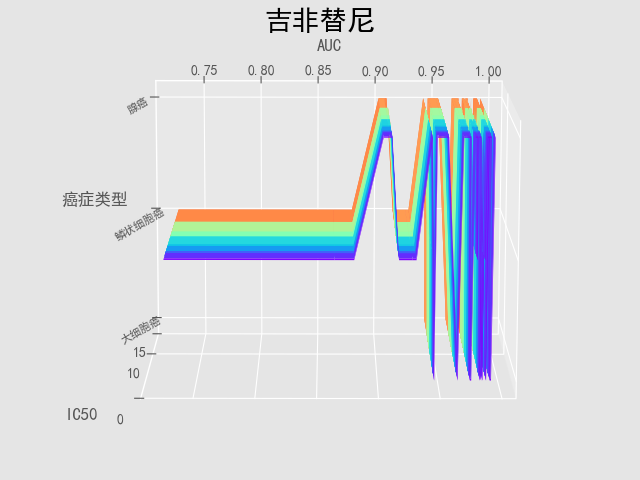
之前曾经试过三维拟合,但是效果不是很好,所以就放弃了,做成现在这样
结果不是很好,只是记录一下自己近期的工作