本节内容转自阿里天池技术论坛。详细网址如下:https://tianchi.aliyun.com/learn/liveDetail.html?spm=5176.11510288.4851103.4.2706b7bd7jjU4d&classroomId=261 ,但是再好的博客,不如到权威官方文档学习来的实在!博客从形式上教会人例化参数,传入实参。而更深层次的学习,查看官方文档更有用,这样可以深入到源码,查看到任何自己感兴趣的源码内容,更好的理论联系实际。在实战中学习应用是掌握一门编码语言,并激发编码兴趣的有效途径。matplotlib官网为: https://matplotlib.org/ ;另外Python3画图方面,个人感觉最好用的还是 Seaborn,其官网为: 官网:http://seaborn.pydata.org/examples/index.html, 其中gallery或者Examples里面都有非常好的例子,sklearn中也有部分非常好的例子,sklearn的API,Tutorial,User Guide都是非常好的参考!
目录
Matplotlib数据可视化画图
- 基础绘图
- 图表的基本元素
- 图表样式
- 图表注解
- 子图绘制
5.1 figure对象
5.2 建子图后填充图表
5.3 使用subplots子图数组填充图标
5.4 多系列图绘制 - 基本图表绘制
6.1 Series 与 DataFrame 绘图
6.2 柱状图
6.3 面积图
6.4 填图
6.5 饼图
6.6 直方图
6.7 散点图
6.7 箱型图 - seaborn的热图
- 密度图
主要内容
1.基础绘图
#!ls -l datalab/1742/*
import numpy as np
import pandas as pd
import matplotlib.pyplot as plt
# 图表窗口1 → plt.show()
#1. 基础绘图
plt.plot(np.random.rand(10))

2. 图表的基本元素
#2. 图表的基本元素
"""
    图名
    x轴标签
    y轴标签
    图例
    x轴边界
    y轴边界
    x刻度
    y刻度
    x刻度标签
    y刻度标签
注意:范围只限定图表的长度,刻度则是决定显示的标尺
      (观察下图就可以得出二者之间的关系)
"""
df = pd.DataFrame(np.random.rand(10,2),columns=['A','B'])
fig = df.plot(figsize=(8,4))  # figsize:创建图表窗口,设置窗口大小
plt.title('TITLETITLETITLE')  # 图名
plt.xlabel('X轴')  # x轴标签
plt.ylabel('Y轴') # y轴标签
plt.legend(loc = 'upper right') # 显示图例,loc表示位置
plt.xlim([0,12])  # x轴边界
plt.ylim([0,1.5])  # y轴边界
plt.xticks(range(10))  # 设置x刻度
plt.yticks([0,0.2,0.4,0.6,0.8,1.0,1.2])  # 设置y刻度
fig.set_xticklabels("%.1f" %i for i in range(10))  # x轴刻度标签
fig.set_yticklabels("%.2f" %i for i in [0,0.2,0.4,0.6,0.8,1.0,1.2])  # y轴刻度标签
# 这里x轴范围是0-12,但刻度只是0-9,刻度标签使得其显示1位小数

3. 图表样式
"""
    linestyle
    color
    marker
    style (linestyle、marker、color)
    alpha
    colormap
    grid
学习一个库:官网是永远的权威和参考出处
color参考:https://matplotlib.org/gallery/color/named_colors.html#sphx-glr-gallery-color-named-colors-py
"""
#  独立设置
s = pd.Series(np.random.randn(100).cumsum())
s.plot(linestyle = '--',
       marker = '.',
       color="r",
      grid=True)

# 直接用风格样式设置
# 透明度与颜色版
# s.plot(style="--.",alpha = 0.8,colormap = 'Reds_r')
df = pd.DataFrame(np.random.randn(100, 4),columns=list('ABCD')).cumsum()
df.plot(style = '--.',alpha = 0.8,colormap = 'summer_r')

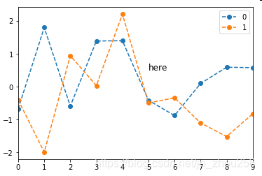
4. 图表注解
df = pd.DataFrame(np.random.randn(10,2))
df.plot(style = '--o')
plt.text(5,0.5,'here',fontsize=12)
5. 子图绘制
#plt.figure(num=None, figsize=None, dpi=None, facecolor=None, edgecolor=None, frameon=True, FigureClass=<class 'matplotlib.figure.Figure'>, **kwargs)
#plt.subplots(nrows=1, ncols=1, sharex=False, sharey=False, squeeze=True, subplot_kw=None, gridspec_kw=None, **fig_kw)[source]

#5.1 figure对(不同框)
fig1 = plt.figure(num=1,figsize=(8,6))
plt.plot(np.random.rand(50).cumsum(),'k--')
fig2 = plt.figure(num=2,figsize=(8,6))
plt.plot(50-np.random.rand(50).cumsum(),'k--')
#np.cumsum()的理解
zhou=np.random.randint(0,50,10) #array()类型
shou=np.cumsum(zhou)
zhou1=np.random.randint(0,50,10).cumsum()

#5.2 建子图后填充图表
# 先建立子图 然后填充图表
fig = plt.figure(figsize=(10,6),facecolor = 'gray')

ax1 = fig.add_subplot(2,2,1)
plt.plot(np.random.rand(50).cumsum(),'k--')
plt.plot(np.random.randn(50).cumsum(),'b--')

ax2 = fig.add_subplot(2,2,2)
ax2.hist(np.random.rand(50),alpha=0.5)

ax4 = fig.add_subplot(2,2,4)
df2 = pd.DataFrame(np.random.rand(10, 4), columns=['a', 'b', 'c', 'd'])
ax4.plot(df2,alpha=0.5,linestyle='--',marker='.')

#5.3 使用subplots子图数组填充图标
# 创建一个新的figure,并返回一个subplot对象的numpy数组 → plt.subplot
fig,axes = plt.subplots(2,3,figsize=(10,4))
ts = pd.Series(np.random.randn(1000).cumsum())
print(axes, axes.shape, type(axes))
# 生成图表对象的数组
ax1 = axes[0,1]
ax1.plot(ts)
## plt.subplots 参数调整
fig,axes = plt.subplots(2,2,sharex=True,sharey=True)
# sharex,sharey:是否共享x,y刻度
for i in range(2):
    for j in range(2):
        axes[i,j].hist(np.random.randn(500),color='b',alpha=0.5)
# wspace,hspace:用于控制宽度和高度的百分比,比如subplot之间的间距
plt.subplots_adjust(wspace=0,hspace=0)


#5.4 多系列图绘制
#plt.plot():
#subplots,是否分别绘制系列(子图)
#layout:绘制子图矩阵,按顺序填充
df = pd.DataFrame(np.random.randn(1000, 4), index=ts.index, columns=list('ABCD'))
df = df.cumsum()
df.plot(style = '--.',alpha = 0.4,grid = True,figsize = (20,8),
       subplots = True,
       layout = (1,4),
       sharex = False)
plt.subplots_adjust(wspace=0,hspace=0.2)


6. 基本图表绘制
#6.1 Series 与 DataFrame 绘图
"""
plt.plot(kind='line', ax=None, figsize=None, use_index=True, title=None, grid=None, legend=False,
style=None, logx=False, logy=False, loglog=False, xticks=None, yticks=None, xlim=None, ylim=None,
rot=None, fontsize=None, colormap=None, table=False, yerr=None, xerr=None, label=None, secondary_y=False, **kwds)
参数含义:
    series的index为横坐标
    value为纵坐标
    kind → line,bar,barh...(折线图,柱状图,柱状图-横...)
    label → 图例标签,Dataframe格式以列名为label
    style → 风格字符串,这里包括了linestyle(-),marker(.),color(g)
    color → 颜色,有color指定时候,以color颜色为准
    alpha → 透明度,0-1
    use_index → 将索引用为刻度标签,默认为True
    rot → 旋转刻度标签,0-360
    grid → 显示网格,一般直接用plt.grid
    xlim,ylim → x,y轴界限
    xticks,yticks → x,y轴刻度值
    figsize → 图像大小
    title → 图名
    legend → 是否显示图例,一般直接用plt.legend()
"""
#添加中文支持
from matplotlib.font_manager import FontProperties
#就在我自己的C盘的这个目录下面
font = FontProperties(fname=r"c:\windows\fonts\SimSun.ttc", size=14)
ts = pd.Series(np.random.randn(1000), index=pd.date_range('1/1/2000', periods=1000)) # pandas 时间序列
ts = ts.cumsum()
ts.plot(kind='line',
       label = "what",
       style = '--.',
       color = 'g',
       alpha = 0.4,
       use_index = True,
       rot = 45,
       grid = True,
       ylim = [-50,50],
       yticks = list(range(-50,50,10)),
       figsize = (8,4),
       title = 'wenqing',
       legend = True)
plt.title(u'文青', fontproperties=font)
# 对网格项进行更加细致的设置
#plt.grid(True, linestyle = "--",color = "gray", linewidth = "0.5",axis = 'x')  # 网格
plt.legend()

# subplots → 是否将各个列绘制到不同图表,默认False
df = pd.DataFrame(np.random.randn(1000, 4), index=ts.index, columns=list('ABCD')).cumsum()
df.plot(kind='line',
       style = '--.',
       alpha = 0.4,
       use_index = True,
       rot = 45,
       grid = True,
       figsize = (8,4),
       title = 'test',
       legend = True,
       subplots = False,
       colormap = 'Greens')

#6.2 柱状图
#plt.plot(kind='bar/barh')
# 创建一个新的figure,并返回一个subplot对象的numpy数组
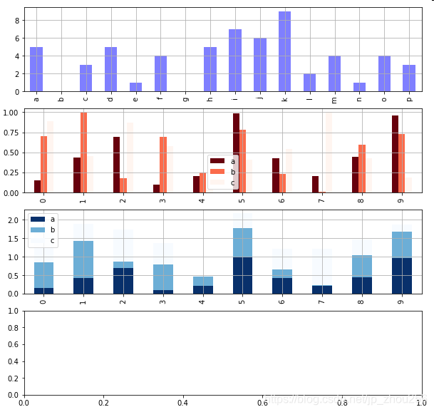
fig,axes = plt.subplots(4,1,figsize = (10,10))
s = pd.Series(np.random.randint(0,10,16),index = list('abcdefghijklmnop'))
df = pd.DataFrame(np.random.rand(10,3), columns=['a','b','c'])
# 单系列柱状图方法一:plt.plot(kind='bar/barh')
s.plot(kind='bar',color = 'b',grid = True,alpha = 0.5,ax = axes[0]) # ax参数 → 选择第几个子图
# 多系列柱状图
df = pd.DataFrame(np.random.rand(10,3), columns=['a','b','c'])
df.plot(kind='bar',ax = axes[1],grid = True,colormap='Reds_r')
# 多系列堆叠图
# stacked → 堆叠
df.plot(kind='bar',ax = axes[2],grid = True,colormap='Blues_r',stacked=True)
"""
plt.bar()
    x,y参数:x,y值
    width:宽度比例
    facecolor柱状图里填充的颜色、edgecolor是边框的颜色
    left-每个柱x轴左边界,bottom-每个柱y轴下边界 → bottom扩展即可化为甘特图 Gantt Chart
    align:决定整个bar图分布,默认left表示默认从左边界开始绘制,center会将图绘制在中间位置
    xerr/yerr :x/y方向error bar
"""
plt.figure(figsize=(10,4))
x = np.arange(10)
y1 = np.random.rand(10)
y2 = -np.random.rand(10)
plt.bar(x,y1,width = 1,facecolor = 'yellowgreen',edgecolor = 'white',yerr = y1*0.1)
plt.bar(x,y2,width = 1,facecolor = 'lightskyblue',edgecolor = 'white',yerr = y2*0.1)
for i,j in zip(x,y1):
    plt.text(i-0.2,j-0.15,'%.2f' % j, color = 'k')
for i,j in zip(x,y2):
    plt.text(i-0.2,j+0.05,'%.2f' % -j, color = 'k')
# 给图添加text
# zip() 函数用于将可迭代的对象作为参数,将对象中对应的元素打包成一个个元组,然后返回由这些元组组成的列表。

#6.3 面积图
"""
stacked:是否堆叠,默认情况下,区域图被堆叠
为了产生堆积面积图,每列必须是正值或全部负值!
当数据有NaN时候,自动填充0,图标签需要清洗掉缺失值
"""
fig,axes = plt.subplots(2,1,figsize = (8,6))
df1 = pd.DataFrame(np.random.rand(10, 4), columns=['a', 'b', 'c', 'd'])
df2 = pd.DataFrame(np.random.randn(10, 4), columns=['a', 'b', 'c', 'd'])
df1.plot.area(colormap = 'Greens_r',alpha = 0.5,ax = axes[0])
df2.plot.area(stacked=False,colormap = 'Set2',alpha = 0.5,ax = axes[1])

#6.4 填图
fig,axes = plt.subplots(2,1,figsize = (8,6))
x = np.linspace(0, 1, 500)
y1 = np.sin(4 * np.pi * x) * np.exp(-5 * x)
y2 = -np.sin(4 * np.pi * x) * np.exp(-5 * x)
axes[0].fill(x, y1, 'r',alpha=0.5,label='y1')
axes[0].fill(x, y2, 'g',alpha=0.5,label='y2')
# 对函数与坐标轴之间的区域进行填充,使用fill函数
# 也可写成:plt.fill(x, y1, 'r',x, y2, 'g',alpha=0.5)
x = np.linspace(0, 5 * np.pi, 1000)
y1 = np.sin(x)
y2 = np.sin(2 * x)
axes[1].fill_between(x, y1, y2, color ='b',alpha=0.5,label='area')
# 填充两个函数之间的区域,使用fill_between函数
for i in range(2):
    axes[i].legend()
    axes[i].grid()
# 添加图例、格网

#6.5 饼图
"""
plt.pie(x, explode=None, labels=None, colors=None, autopct=None, pctdistance=0.6, shadow=False, labeldistance=1.1, startangle=None, radius=None, counterclock=True, wedgeprops=None, textprops=None, center=(0, 0), frame=False, hold=None, data=None)
参数含义:
    第一个参数:数据
    explode:指定每部分的偏移量
    labels:标签
    colors:颜色
    autopct:饼图上的数据标签显示方式
    pctdistance:每个饼切片的中心和通过autopct生成的文本开始之间的比例
    labeldistance:被画饼标记的直径,默认值:1.1
    shadow:阴影
    startangle:开始角度
    radius:半径
    frame:图框
    counterclock:指定指针方向,顺时针或者逆时针
"""
s = pd.Series(3 * np.random.rand(4), index=['a', 'b', 'c', 'd'], name='series')
plt.axis('equal')  # 保证长宽相等
plt.pie(s,
       explode = [0.1,0,0,0],
       labels = s.index,
       colors=['r', 'g', 'b', 'c'],
       autopct='%.2f%%',
       pctdistance=0.6,
       labeldistance = 1.2,
       shadow = True,
       startangle=0,
       radius=1.5,
       frame=False)

#6.6 直方图
"""
plt.hist(x, bins=10, range=None, normed=False, weights=None, cumulative=False, bottom=None,
histtype='bar', align='mid', orientation='vertical',rwidth=None, log=False, color=None, label=None,
stacked=False, hold=None, data=None, **kwargs)

    bin:箱子的宽度
    normed 标准化
    histtype 风格,bar,barstacked,step,stepfilled
    orientation 水平还是垂直{‘horizontal’, ‘vertical’}
    align : {‘left’, ‘mid’, ‘right’}, optional(对齐方式)
    stacked:是否堆叠
"""
# 直方图
s = pd.Series(np.random.randn(1000))
s.hist(bins = 20,
       histtype = 'bar',
       align = 'mid',
       orientation = 'vertical',
       alpha=0.5,
       normed =True)
# 密度图
s.plot(kind='kde',style='k--')

# 堆叠直方图
plt.figure(num=1)
df = pd.DataFrame({'a': np.random.randn(1000) + 1, 'b': np.random.randn(1000),
                    'c': np.random.randn(1000) - 1, 'd': np.random.randn(1000)-2},
                   columns=['a', 'b', 'c','d'])
df.plot.hist(stacked=True,
             bins=20,
             colormap='Greens_r',
             alpha=0.5,
             grid=True)
# 使用DataFrame.plot.hist()和Series.plot.hist()方法绘制
df.hist(bins=50)
# 生成多个直方图


#6.7 散点图
"""
plt.scatter(x, y, s=20, c=None, marker='o', cmap=None, norm=None, vmin=None, vmax=None, alpha=None, linewidths=None,
verts=None, edgecolors=None, hold=None, data=None, **kwargs)

参数含义:
    s:散点的大小
    c:散点的颜色
    vmin,vmax:亮度设置,标量
    cmap:colormap
"""
plt.figure(figsize=(8,6))
x = np.random.randn(1000)
y = np.random.randn(1000)
plt.scatter(x,y,marker='.',
           s = np.random.randn(1000)*100,
           cmap = 'Reds_r',
           c = y,
           alpha = 0.8,)
plt.grid()


# pd.scatter_matrix()散点矩阵
# pd.scatter_matrix(frame, alpha=0.5, figsize=None, ax=None,
# grid=False, diagonal='hist', marker='.', density_kwds=None, hist_kwds=None, range_padding=0.05, **kwds)
# diagonal:({‘hist’, ‘kde’}),必须且只能在{‘hist’, ‘kde’}中选择1个 → 每个指标的频率图
# range_padding:(float, 可选),图像在x轴、y轴原点附近的留白(padding),该值越大,留白距离越大,图像远离坐标原点

df = pd.DataFrame(np.random.randn(100,4),columns = ['a','b','c','d'])
pd.scatter_matrix(df,figsize=(10,6),
                 marker = 'o',
                 diagonal='kde',
                 alpha = 0.5,
                 range_padding=0.5)


#6.7 箱型图
'''
箱型图:又称为盒须图、盒式图、盒状图或箱线图,是一种用作显示一组数据分散情况资料的统计图
包含一组数据的:最大值、最小值、中位数、上四分位数(Q1)、下四分位数(Q3)、异常值
① 中位数 → 一组数据平均分成两份,中间的数
② 下四分位数Q1 → 是将序列平均分成四份,计算(n+1)/4与(n-1)/4两种,一般使用(n+1)/4
③ 上四分位数Q3 → 是将序列平均分成四份,计算(1+n)/4*3=6.75
④ 内限 → T形的盒须就是内限,最大值区间Q3+1.5IQR,最小值区间Q1-1.5IQR (IQR=Q3-Q1)
⑤ 外限 → T形的盒须就是内限,最大值区间Q3+3IQR,最小值区间Q1-3IQR (IQR=Q3-Q1)
⑥ 异常值 → 内限之外 - 中度异常,外限之外 - 极度异常
plt.plot.box(),plt.boxplot()
'''
# plt.plot.box()绘制
fig,axes = plt.subplots(2,1,figsize=(10,6))
df = pd.DataFrame(np.random.rand(10, 5), columns=['A', 'B', 'C', 'D', 'E'])
color = dict(boxes='DarkGreen', whiskers='DarkOrange', medians='DarkBlue', caps='Gray')
# 箱型图着色
# boxes → 箱线
# whiskers → 分位数与error bar横线之间竖线的颜色
# medians → 中位数线颜色
# caps → error bar横线颜色
df.plot.box(ylim=[0,1.2],
grid = True,
color = color,
ax = axes[0])
df.plot.box(vert=False,
positions=[1, 4, 5, 6, 8],
ax = axes[1],
grid = True,
color = color)
# vert:是否垂直,默认True
# position:箱型图占位
df = pd.DataFrame(np.random.rand(10, 5), columns=['A', 'B', 'C', 'D', 'E'])
plt.figure(figsize=(10,4))
# 创建图表、数据
f = df.boxplot(sym = 'o', # 异常点形状,参考marker
vert = True, # 是否垂直
whis = 1.5, # IQR,默认1.5,也可以设置区间比如[5,95],代表强制上下边缘为数据95%和5%位置
patch_artist = True, # 上下四分位框内是否填充,True为填充
meanline = False,showmeans=True, # 是否有均值线及其形状
showbox = True, # 是否显示箱线
showcaps = True, # 是否显示边缘线
showfliers = True, # 是否显示异常值
notch = False, # 中间箱体是否缺口
return_type='dict' # 返回类型为字典
)
plt.title('boxplot')
for box in f['boxes']:
box.set( color='b', linewidth=1) # 箱体边框颜色
box.set( facecolor = 'b' ,alpha=0.5) # 箱体内部填充颜色
for whisker in f['whiskers']:
whisker.set(color='k', linewidth=0.5,linestyle='-')
for cap in f['caps']:
cap.set(color='gray', linewidth=2)
for median in f['medians']:
median.set(color='DarkBlue', linewidth=2)
for flier in f['fliers']:
flier.set(marker='o', color='y', alpha=0.5)
# boxes, 箱线
# medians, 中位值的横线,
# whiskers, 从box到error bar之间的竖线.
# fliers, 异常值
# caps, error bar横线
# means, 均值的横线,
# plt.boxplot()绘制
# 分组汇总
df = pd.DataFrame(np.random.rand(10,2), columns=['Col1', 'Col2'] )
df['X'] = pd.Series(['A','A','A','A','A','B','B','B','B','B'])
df['Y'] = pd.Series(['A','B','A','B','A','B','A','B','A','B'])
df.boxplot(by = 'X')
df.boxplot(column=['Col1','Col2'], by=['X','Y'])
# columns:按照数据的列分子图
# by:按照列分组做箱型图


汇总代码
# -*- coding: utf-8 -*-
"""Matplotlib数据可视化画图"""
#!ls -l datalab/1742/*
import numpy as np
import pandas as pd
import matplotlib.pyplot as plt
# 图表窗口1 → plt.show()
#1. 基础绘图
plt.plot(np.random.rand(10))
#2. 图表的基本元素
"""
图名
x轴标签
y轴标签
图例
x轴边界
y轴边界
x刻度
y刻度
x刻度标签
y刻度标签
注意:范围只限定图表的长度,刻度则是决定显示的标尺
(观察下图就可以得出二者之间的关系)
"""
df = pd.DataFrame(np.random.rand(10,2),columns=['A','B'])
fig = df.plot(figsize=(8,4)) # figsize:创建图表窗口,设置窗口大小
plt.title('TITLETITLETITLE') # 图名
plt.xlabel('X轴') # x轴标签
plt.ylabel('Y轴') # y轴标签
plt.legend(loc = 'upper right') # 显示图例,loc表示位置
plt.xlim([0,12]) # x轴边界
plt.ylim([0,1.5]) # y轴边界
plt.xticks(range(10)) # 设置x刻度
plt.yticks([0,0.2,0.4,0.6,0.8,1.0,1.2]) # 设置y刻度
fig.set_xticklabels("%.1f" %i for i in range(10)) # x轴刻度标签
fig.set_yticklabels("%.2f" %i for i in [0,0.2,0.4,0.6,0.8,1.0,1.2]) # y轴刻度标签
# 这里x轴范围是0-12,但刻度只是0-9,刻度标签使得其显示1位小数
#3. 图表样式
"""
linestyle
color
marker
style (linestyle、marker、color)
alpha
colormap
grid
学习一个库:官网是永远的权威和参考出处
color参考:https://matplotlib.org/gallery/color/named_colors.html#sphx-glr-gallery-color-named-colors-py
"""
# 独立设置
s = pd.Series(np.random.randn(100).cumsum())
s.plot(linestyle = '--',
marker = '.',
color="r",
grid=True)
# 直接用风格样式设置
# 透明度与颜色版
# s.plot(style="--.",alpha = 0.8,colormap = 'Reds_r')
df = pd.DataFrame(np.random.randn(100, 4),columns=list('ABCD')).cumsum()
df.plot(style = '--.',alpha = 0.8,colormap = 'summer_r')
#4. 图表注解
df = pd.DataFrame(np.random.randn(10,2))
df.plot(style = '--o')
plt.text(5,0.5,'here',fontsize=12)
#5. 子图绘制
#plt.figure(num=None, figsize=None, dpi=None, facecolor=None, edgecolor=None, frameon=True, FigureClass=<class 'matplotlib.figure.Figure'>, **kwargs)
#plt.subplots(nrows=1, ncols=1, sharex=False, sharey=False, squeeze=True, subplot_kw=None, gridspec_kw=None, **fig_kw)[source]
#5.1 figure对(不同框)
fig1 = plt.figure(num=1,figsize=(8,6))
plt.plot(np.random.rand(50).cumsum(),'k--')
fig2 = plt.figure(num=2,figsize=(8,6))
plt.plot(50-np.random.rand(50).cumsum(),'k--')
#np.cumsum()的理解
zhou=np.random.randint(0,50,10) #array()类型
shou=np.cumsum(zhou)
zhou1=np.random.randint(0,50,10).cumsum()
#5.2 建子图后填充图表
# 先建立子图 然后填充图表
fig = plt.figure(figsize=(10,6),facecolor = 'gray')
ax1 = fig.add_subplot(2,2,1)
plt.plot(np.random.rand(50).cumsum(),'k--')
plt.plot(np.random.randn(50).cumsum(),'b--')
ax2 = fig.add_subplot(2,2,2)
ax2.hist(np.random.rand(50),alpha=0.5)
ax4 = fig.add_subplot(2,2,4)
df2 = pd.DataFrame(np.random.rand(10, 4), columns=['a', 'b', 'c', 'd'])
ax4.plot(df2,alpha=0.5,linestyle='--',marker='.')
#5.3 使用subplots子图数组填充图标
# 创建一个新的figure,并返回一个subplot对象的numpy数组 → plt.subplot
fig,axes = plt.subplots(2,3,figsize=(10,4))
ts = pd.Series(np.random.randn(1000).cumsum())
print(axes, axes.shape, type(axes))
# 生成图表对象的数组
ax1 = axes[0,1]
ax1.plot(ts)
## plt.subplots 参数调整
fig,axes = plt.subplots(2,2,sharex=True,sharey=True)
# sharex,sharey:是否共享x,y刻度
for i in range(2):
for j in range(2):
axes[i,j].hist(np.random.randn(500),color='b',alpha=0.5)
# wspace,hspace:用于控制宽度和高度的百分比,比如subplot之间的间距
plt.subplots_adjust(wspace=0,hspace=0)
#5.4 多系列图绘制
#plt.plot():
#subplots,是否分别绘制系列(子图)
#layout:绘制子图矩阵,按顺序填充
df = pd.DataFrame(np.random.randn(1000, 4), index=ts.index, columns=list('ABCD'))
df = df.cumsum()
df.plot(style = '--.',alpha = 0.4,grid = True,figsize = (20,8),
subplots = True,
layout = (1,4),
sharex = False)
plt.subplots_adjust(wspace=0,hspace=0.2)
#6. 基本图表绘制
#6.1 Series 与 DataFrame 绘图
"""
plt.plot(kind='line', ax=None, figsize=None, use_index=True, title=None, grid=None, legend=False,
style=None, logx=False, logy=False, loglog=False, xticks=None, yticks=None, xlim=None, ylim=None,
rot=None, fontsize=None, colormap=None, table=False, yerr=None, xerr=None, label=None, secondary_y=False, **kwds)
参数含义:
series的index为横坐标
value为纵坐标
kind → line,bar,barh...(折线图,柱状图,柱状图-横...)
label → 图例标签,Dataframe格式以列名为label
style → 风格字符串,这里包括了linestyle(-),marker(.),color(g)
color → 颜色,有color指定时候,以color颜色为准
alpha → 透明度,0-1
use_index → 将索引用为刻度标签,默认为True
rot → 旋转刻度标签,0-360
grid → 显示网格,一般直接用plt.grid
xlim,ylim → x,y轴界限
xticks,yticks → x,y轴刻度值
figsize → 图像大小
title → 图名
legend → 是否显示图例,一般直接用plt.legend()
"""
#添加中文支持
from matplotlib.font_manager import FontProperties
#就在我自己的C盘的这个目录下面
font = FontProperties(fname=r"c:\windows\fonts\SimSun.ttc", size=14)
ts = pd.Series(np.random.randn(1000), index=pd.date_range('1/1/2000', periods=1000)) # pandas 时间序列
ts = ts.cumsum()
ts.plot(kind='line',
label = "what",
style = '--.',
color = 'g',
alpha = 0.4,
use_index = True,
rot = 45,
grid = True,
ylim = [-50,50],
yticks = list(range(-50,50,10)),
figsize = (8,4),
title = 'wenqing',
legend = True)
plt.title(u'文青', fontproperties=font)
# 对网格项进行更加细致的设置
#plt.grid(True, linestyle = "--",color = "gray", linewidth = "0.5",axis = 'x') # 网格
plt.legend()
# subplots → 是否将各个列绘制到不同图表,默认False
df = pd.DataFrame(np.random.randn(1000, 4), index=ts.index, columns=list('ABCD')).cumsum()
df.plot(kind='line',
style = '--.',
alpha = 0.4,
use_index = True,
rot = 45,
grid = True,
figsize = (8,4),
title = 'test',
legend = True,
subplots = False,
colormap = 'Greens')
#6.2 柱状图
#plt.plot(kind='bar/barh')
# 创建一个新的figure,并返回一个subplot对象的numpy数组
fig,axes = plt.subplots(4,1,figsize = (10,10))
s = pd.Series(np.random.randint(0,10,16),index = list('abcdefghijklmnop'))
df = pd.DataFrame(np.random.rand(10,3), columns=['a','b','c'])
# 单系列柱状图方法一:plt.plot(kind='bar/barh')
s.plot(kind='bar',color = 'b',grid = True,alpha = 0.5,ax = axes[0]) # ax参数 → 选择第几个子图
# 多系列柱状图
df = pd.DataFrame(np.random.rand(10,3), columns=['a','b','c'])
df.plot(kind='bar',ax = axes[1],grid = True,colormap='Reds_r')
# 多系列堆叠图
# stacked → 堆叠
df.plot(kind='bar',ax = axes[2],grid = True,colormap='Blues_r',stacked=True)
"""
plt.bar()
x,y参数:x,y值
width:宽度比例
facecolor柱状图里填充的颜色、edgecolor是边框的颜色
left-每个柱x轴左边界,bottom-每个柱y轴下边界 → bottom扩展即可化为甘特图 Gantt Chart
align:决定整个bar图分布,默认left表示默认从左边界开始绘制,center会将图绘制在中间位置
xerr/yerr :x/y方向error bar
"""
plt.figure(figsize=(10,4))
x = np.arange(10)
y1 = np.random.rand(10)
y2 = -np.random.rand(10)
plt.bar(x,y1,width = 1,facecolor = 'yellowgreen',edgecolor = 'white',yerr = y1*0.1)
plt.bar(x,y2,width = 1,facecolor = 'lightskyblue',edgecolor = 'white',yerr = y2*0.1)
for i,j in zip(x,y1):
plt.text(i-0.2,j-0.15,'%.2f' % j, color = 'k')
for i,j in zip(x,y2):
plt.text(i-0.2,j+0.05,'%.2f' % -j, color = 'k')
# 给图添加text
# zip() 函数用于将可迭代的对象作为参数,将对象中对应的元素打包成一个个元组,然后返回由这些元组组成的列表。
#6.3 面积图
"""
stacked:是否堆叠,默认情况下,区域图被堆叠
为了产生堆积面积图,每列必须是正值或全部负值!
当数据有NaN时候,自动填充0,图标签需要清洗掉缺失值
"""
fig,axes = plt.subplots(2,1,figsize = (8,6))
df1 = pd.DataFrame(np.random.rand(10, 4), columns=['a', 'b', 'c', 'd'])
df2 = pd.DataFrame(np.random.randn(10, 4), columns=['a', 'b', 'c', 'd'])
df1.plot.area(colormap = 'Greens_r',alpha = 0.5,ax = axes[0])
df2.plot.area(stacked=False,colormap = 'Set2',alpha = 0.5,ax = axes[1])
#6.4 填图
fig,axes = plt.subplots(2,1,figsize = (8,6))
x = np.linspace(0, 1, 500)
y1 = np.sin(4 * np.pi * x) * np.exp(-5 * x)
y2 = -np.sin(4 * np.pi * x) * np.exp(-5 * x)
axes[0].fill(x, y1, 'r',alpha=0.5,label='y1')
axes[0].fill(x, y2, 'g',alpha=0.5,label='y2')
# 对函数与坐标轴之间的区域进行填充,使用fill函数
# 也可写成:plt.fill(x, y1, 'r',x, y2, 'g',alpha=0.5)
x = np.linspace(0, 5 * np.pi, 1000)
y1 = np.sin(x)
y2 = np.sin(2 * x)
axes[1].fill_between(x, y1, y2, color ='b',alpha=0.5,label='area')
# 填充两个函数之间的区域,使用fill_between函数
for i in range(2):
axes[i].legend()
axes[i].grid()
# 添加图例、格网
#6.5 饼图
"""
plt.pie(x, explode=None, labels=None, colors=None, autopct=None, pctdistance=0.6, shadow=False, labeldistance=1.1, startangle=None, radius=None, counterclock=True, wedgeprops=None, textprops=None, center=(0, 0), frame=False, hold=None, data=None)
参数含义:
第一个参数:数据
explode:指定每部分的偏移量
labels:标签
colors:颜色
autopct:饼图上的数据标签显示方式
pctdistance:每个饼切片的中心和通过autopct生成的文本开始之间的比例
labeldistance:被画饼标记的直径,默认值:1.1
shadow:阴影
startangle:开始角度
radius:半径
frame:图框
counterclock:指定指针方向,顺时针或者逆时针
"""
s = pd.Series(3 * np.random.rand(4), index=['a', 'b', 'c', 'd'], name='series')
plt.axis('equal') # 保证长宽相等
plt.pie(s,
explode = [0.1,0,0,0],
labels = s.index,
colors=['r', 'g', 'b', 'c'],
autopct='%.2f%%',
pctdistance=0.6,
labeldistance = 1.2,
shadow = True,
startangle=0,
radius=1.5,
frame=False)
#6.6 直方图
"""
plt.hist(x, bins=10, range=None, normed=False, weights=None, cumulative=False, bottom=None,
histtype='bar', align='mid', orientation='vertical',rwidth=None, log=False, color=None, label=None,
stacked=False, hold=None, data=None, **kwargs)
bin:箱子的宽度
normed 标准化
histtype 风格,bar,barstacked,step,stepfilled
orientation 水平还是垂直{‘horizontal’, ‘vertical’}
align : {‘left’, ‘mid’, ‘right’}, optional(对齐方式)
stacked:是否堆叠
"""
# 直方图
s = pd.Series(np.random.randn(1000))
s.hist(bins = 20,
histtype = 'bar',
align = 'mid',
orientation = 'vertical',
alpha=0.5,
normed =True)
# 密度图
s.plot(kind='kde',style='k--')
# 堆叠直方图
plt.figure(num=1)
df = pd.DataFrame({'a': np.random.randn(1000) + 1, 'b': np.random.randn(1000),
'c': np.random.randn(1000) - 1, 'd': np.random.randn(1000)-2},
columns=['a', 'b', 'c','d'])
df.plot.hist(stacked=True,
bins=20,
colormap='Greens_r',
alpha=0.5,
grid=True)
# 使用DataFrame.plot.hist()和Series.plot.hist()方法绘制
df.hist(bins=50)
# 生成多个直方图
#6.7 散点图
"""
plt.scatter(x, y, s=20, c=None, marker='o', cmap=None, norm=None, vmin=None, vmax=None, alpha=None, linewidths=None,
verts=None, edgecolors=None, hold=None, data=None, **kwargs)
参数含义:
s:散点的大小
c:散点的颜色
vmin,vmax:亮度设置,标量
cmap:colormap
"""
plt.figure(figsize=(8,6))
x = np.random.randn(1000)
y = np.random.randn(1000)
plt.scatter(x,y,marker='.',
s = np.random.randn(1000)*100,
cmap = 'Reds_r',
c = y,
alpha = 0.8,)
plt.grid()
# pd.scatter_matrix()散点矩阵
# pd.scatter_matrix(frame, alpha=0.5, figsize=None, ax=None,
# grid=False, diagonal='hist', marker='.', density_kwds=None, hist_kwds=None, range_padding=0.05, **kwds)
# diagonal:({‘hist’, ‘kde’}),必须且只能在{‘hist’, ‘kde’}中选择1个 → 每个指标的频率图
# range_padding:(float, 可选),图像在x轴、y轴原点附近的留白(padding),该值越大,留白距离越大,图像远离坐标原点
df = pd.DataFrame(np.random.randn(100,4),columns = ['a','b','c','d'])
pd.scatter_matrix(df,figsize=(10,6),
marker = 'o',
diagonal='kde',
alpha = 0.5,
range_padding=0.5)
#6.7 箱型图
'''
箱型图:又称为盒须图、盒式图、盒状图或箱线图,是一种用作显示一组数据分散情况资料的统计图
包含一组数据的:最大值、最小值、中位数、上四分位数(Q1)、下四分位数(Q3)、异常值
① 中位数 → 一组数据平均分成两份,中间的数
② 下四分位数Q1 → 是将序列平均分成四份,计算(n+1)/4与(n-1)/4两种,一般使用(n+1)/4
③ 上四分位数Q3 → 是将序列平均分成四份,计算(1+n)/4*3=6.75
④ 内限 → T形的盒须就是内限,最大值区间Q3+1.5IQR,最小值区间Q1-1.5IQR (IQR=Q3-Q1)
⑤ 外限 → T形的盒须就是内限,最大值区间Q3+3IQR,最小值区间Q1-3IQR (IQR=Q3-Q1)
⑥ 异常值 → 内限之外 - 中度异常,外限之外 - 极度异常
plt.plot.box(),plt.boxplot()
'''
# plt.plot.box()绘制
fig,axes = plt.subplots(2,1,figsize=(10,6))
df = pd.DataFrame(np.random.rand(10, 5), columns=['A', 'B', 'C', 'D', 'E'])
color = dict(boxes='DarkGreen', whiskers='DarkOrange', medians='DarkBlue', caps='Gray')
# 箱型图着色
# boxes → 箱线
# whiskers → 分位数与error bar横线之间竖线的颜色
# medians → 中位数线颜色
# caps → error bar横线颜色
df.plot.box(ylim=[0,1.2],
grid = True,
color = color,
ax = axes[0])
df.plot.box(vert=False,
positions=[1, 4, 5, 6, 8],
ax = axes[1],
grid = True,
color = color)
# vert:是否垂直,默认True
# position:箱型图占位
df = pd.DataFrame(np.random.rand(10, 5), columns=['A', 'B', 'C', 'D', 'E'])
plt.figure(figsize=(10,4))
# 创建图表、数据
f = df.boxplot(sym = 'o', # 异常点形状,参考marker
vert = True, # 是否垂直
whis = 1.5, # IQR,默认1.5,也可以设置区间比如[5,95],代表强制上下边缘为数据95%和5%位置
patch_artist = True, # 上下四分位框内是否填充,True为填充
meanline = False,showmeans=True, # 是否有均值线及其形状
showbox = True, # 是否显示箱线
showcaps = True, # 是否显示边缘线
showfliers = True, # 是否显示异常值
notch = False, # 中间箱体是否缺口
return_type='dict' # 返回类型为字典
)
plt.title('boxplot')
for box in f['boxes']:
box.set( color='b', linewidth=1) # 箱体边框颜色
box.set( facecolor = 'b' ,alpha=0.5) # 箱体内部填充颜色
for whisker in f['whiskers']:
whisker.set(color='k', linewidth=0.5,linestyle='-')
for cap in f['caps']:
cap.set(color='gray', linewidth=2)
for median in f['medians']:
median.set(color='DarkBlue', linewidth=2)
for flier in f['fliers']:
flier.set(marker='o', color='y', alpha=0.5)
# boxes, 箱线
# medians, 中位值的横线,
# whiskers, 从box到error bar之间的竖线.
# fliers, 异常值
# caps, error bar横线
# means, 均值的横线,
# plt.boxplot()绘制
# 分组汇总
df = pd.DataFrame(np.random.rand(10,2), columns=['Col1', 'Col2'] )
df['X'] = pd.Series(['A','A','A','A','A','B','B','B','B','B'])
df['Y'] = pd.Series(['A','B','A','B','A','B','A','B','A','B'])
df.boxplot(by = 'X')
df.boxplot(column=['Col1','Col2'], by=['X','Y'])
# columns:按照数据的列分子图
# by:按照列分组做箱型图
7.seaborn的热图
# 热图 - heatmap()
# 简单示例
import seaborn as sns
df = pd.DataFrame(np.random.rand(10,15))
# 创建数据 - 10*12图表
sns.heatmap(df,    # 加载数据
            vmin=0, vmax=1   # 设置图例最大最小值
            )

#1.热图
# heatmap()
# 参数设置
flights = sns.load_dataset("flights")
flights = flights.pivot("month", "year", "passengers")
#print(flights.head())
# 加载数据
sns.heatmap(flights,
            annot = True,      # 是否显示数值
            fmt = 'd',         # 格式化字符串
            linewidths = 0.2,  # 格子边线宽度
            #center = 100,      # 调色盘的色彩中心值,若没有指定,则以cmap为主
            #cmap = 'Reds',     # 设置调色盘
            cbar = True,       # 是否显示图例色带
            #cbar_kws={"orientation": "horizontal"},   # 是否横向显示图例色带
            #square = True,     # 是否正方形显示图表
           )

#  heatmap()
#2.绘制半边热图
sns.set(style="white")
# 设置风格
rs = np.random.RandomState(33)
d = pd.DataFrame(rs.normal(size=(100, 26)))
corr = d.corr()   # 求解相关性矩阵表格
# 创建数据
mask = np.zeros_like(corr, dtype=np.bool)
mask[np.triu_indices_from(mask)] = True
# 设置一个“上三角形”蒙版
cmap = sns.diverging_palette(220, 10, as_cmap=True)
# 设置调色盘
sns.heatmap(corr, mask=mask, cmap=cmap, vmax=.3, center=0,
            square=True, linewidths=0.2)


#生成半边热图
attend = sns.load_dataset("attention")
print(attend.head())
# 加载数据
g = sns.FacetGrid(attend, col="subject", col_wrap=5,   # 设置每行的图表数量
                  size=1.5)  ##取定subject列,看第五列score的走势,可以用于产看两个变量的相关性走势
g.map(plt.plot, "solutions", "score",
      marker="o",color = 'gray',linewidth = 2)
# 绘制图表矩阵
g.set(xlim = (0,4),
      ylim = (0,10),
      xticks = [0,1,2,3,4],
      yticks = [0,2,4,6,8,10]
      )
# 设置x,y轴刻度


#3.时间线图
# tsplot()
# 参数设置
attend = sns.load_dataset("attention")
columns=attend.columns.tolist()
print(attend.head())
print('数据量为:%i条' % len(attend))
print('timepoint为0.0时的数据量为:%i条' % len(attend[attend['solutions'] == 0]))
print('timepoint共有%i个唯一值' % len(attend['solutions'].value_counts()))
#print(gammas['timepoint'].value_counts())  # 查看唯一值具体信息
# 导入数据
sns.tsplot(time="solutions",     # 时间数据,x轴
           value="score",  # y轴value
           unit="subject",       #
           condition="attention",      # 分类
           data=attend)


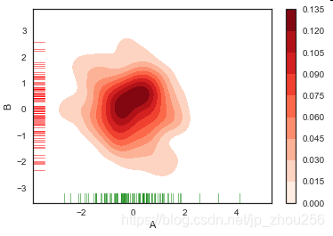
8.密度图
rs = np.random.RandomState(2) # 设定随机数种子
df = pd.DataFrame(rs.randn(100,2),
columns = ['A','B'])
sns.kdeplot(df['A'],df['B'],
cbar = True, # 是否显示颜色图例
shade = True, # 是否填充
cmap = 'Reds', # 设置调色盘
shade_lowest=False, # 最外围颜色是否显示
n_levels = 10 # 曲线个数(如果非常多,则会越平滑)
)
# 两个维度数据生成曲线密度图,以颜色作为密度衰减显示
sns.rugplot(df['A'], color="g", axis='x',alpha = 0.5)
sns.rugplot(df['B'], color="r", axis='y',alpha = 0.5)
# 注意设置x,y轴
# 密度图 - kdeplot()
# 两个样本数据密度分布图
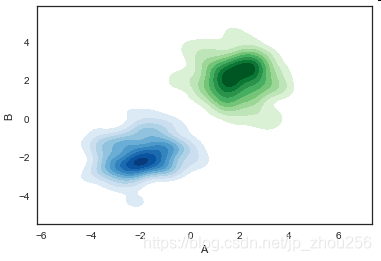
# 多个密度图
rs1 = np.random.RandomState(2)
rs2 = np.random.RandomState(5)
df1 = pd.DataFrame(rs1.randn(100,2)+2,columns = ['A','B'])
df2 = pd.DataFrame(rs2.randn(100,2)-2,columns = ['A','B'])
# 创建数据
sns.kdeplot(df1['A'],df1['B'],cmap = 'Greens',
shade = True,shade_lowest=False)
sns.kdeplot(df2['A'],df2['B'],cmap = 'Blues',
shade = True,shade_lowest=False)
# 创建图表
#sns.rugplot(df2['A']+df1['A'], color="g", axis='x',alpha = 0.5)
#sns.rugplot(df2['B']+df1['B'], color="r", axis='y',alpha = 0.5)
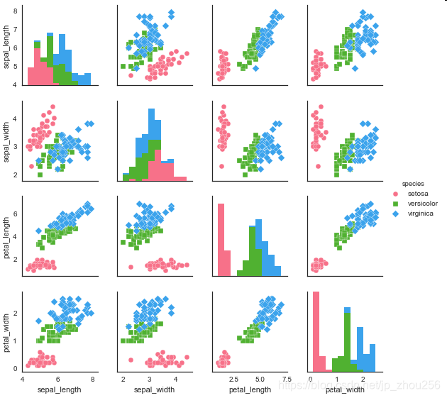
# 矩阵散点图 - pairplot()
sns.set_style("white")
# 设置风格
iris = sns.load_dataset("iris")
print(iris.head())
# 读取数据
sns.pairplot(iris,
kind = 'scatter', # 散点图/回归分布图 {‘scatter’, ‘reg’}
diag_kind="hist", # 直方图/密度图 {‘hist’, ‘kde’}
hue="species", # 按照某一字段进行分类
palette="husl", # 设置调色板
markers=["o", "s", "D"], # 设置不同系列的点样式(这里根据参考分类个数)
size = 2, # 图表大小
)