12. 分类模型评估
12.1 混淆矩阵(with codes)
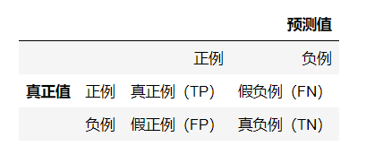
混淆矩阵,是用来表示误差,衡量模型分类效果的一种形式。该矩阵是一个方阵,矩阵的数值用来表示分类器预测的结果,包括真正例(True Positive),假正例(False Positive),真负例(True Negtive),假负例(False Negtive)。
import numpy as np
from sklearn.datasets import make_classification
from sklearn.linear_model import LogisticRegression
from sklearn.model_selection import train_test_split
# 混淆矩阵,可以获取评估结果。
from sklearn.metrics import confusion_matrix
import matplotlib as mpl
import matplotlib.pyplot as plt

mpl.rcParams["font.family"] = "SimHei"
mpl.rcParams["axes.unicode_minus"] = False

X, y = make_classification(n_samples=200, n_features=2, n_informative=2, n_redundant=0,
        n_classes=2, random_state=0)
X_train, X_test, y_train, y_test = train_test_split(X, y, test_size=0.25, random_state=0)
lr = LogisticRegression(penalty="l2", C=2)
lr.fit(X_train, y_train)
train_predict = lr.predict(X_train)
test_predict = lr.predict(X_test)
# 输出混淆矩阵的值。labels指定预测的标签,前面的为正例,后面的为负例。
print(confusion_matrix(y_true=y_test, y_pred=test_predict, labels=[1, 0]))
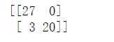
# matrix就是二维ndarray数组类型。
matrix = confusion_matrix(y_true=y_test, y_pred=test_predict, labels=[1, 0])
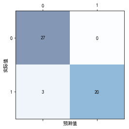
# 混淆矩阵图。
plt.matshow(matrix, cmap=plt.cm.Blues, alpha=0.5)
# 依次遍历矩阵的行与列。
for i in range(matrix.shape[0]):
for j in range(matrix.shape[1]):
# va:指定垂直对齐方式。
# ha:指定水平对齐方式。
plt.text(x=j, y=i, s=matrix[i, j], va='center', ha='center')
plt.xlabel('预测值')
plt.ylabel('实际值')
plt.show()
12.2 评估指标(with codes)
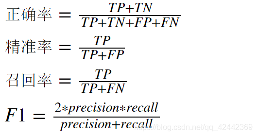
从混淆矩阵中,我们可以提取如下的评估指标:
- 正确率(accuracy)
- 精准率(precision)
- 召回率(recall)
- F1(调和平均值)
各指标的定义如下:
# accuracy_score 获取正确率
# precision_score 获取精准率
# recall_score 获取召回率
# f1_score 获取精准率与召回率的调和平均值
from sklearn.metrics import accuracy_score, precision_score, recall_score, f1_score
# 返回一个字符串(str)类型,内容就是分类的报告,包括正例与负例的精准率,召回率与调和平均值。
from sklearn.metrics import classification_report
train_accuracy = np.sum(y_train == train_predict) / y_train.shape[0]
test_accuracy = np.sum(y_test == test_predict) / y_test.shape[0]
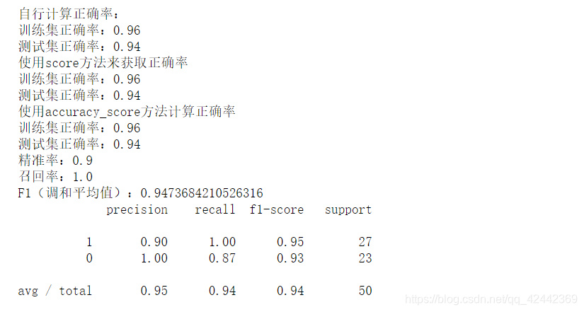
print("自行计算正确率:")
print(f"训练集正确率:{train_accuracy}")
print(f"测试集正确率:{test_accuracy}")
# 分类模型也提供了score方法,获取的就是正确率(accuracy_score)。
# 但是,注意:score方法与accuracy_score方法参数的内容不同。
print("使用score方法来获取正确率")
print(f"训练集正确率:{lr.score(X_train, y_train)}")
print(f"测试集正确率:{lr.score(X_test, y_test)}")
print("使用accuracy_score方法计算正确率")
print(f"训练集正确率:{accuracy_score(y_train, train_predict)}")
print(f"测试集正确率:{accuracy_score(y_test, test_predict)}")
print(f"精准率:{precision_score(y_test, test_predict)}")
print(f"召回率:{recall_score(y_test, test_predict)}")
print(f"F1(调和平均值):{f1_score(y_test, test_predict)}")
print(classification_report(y_true=y_test, y_pred=test_predict, labels=[1, 0]))
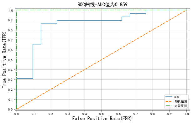
12.3 ROC曲线(with codes)
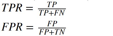
ROC曲线(Receiver Operating Characteristic——受试者工作特征曲线),使用图形来描述二分类系统的性能表现。图形的纵轴为真正例率(TPR——True Positive Rate),横轴为假正例率(FPR——False Positive Rate)。其中,真正例率与假正例率定义为:
ROC曲线通过真正例率(TPR)与假正例率(FPR)两项指标,可以用来评估分类模型的性能,从而进行分类模型的选择。真正例率与假正例率可以通过移动分类模型的阈值而进行计算。随着概率阈值发生改变,真正例率与假负例率也会随之发生改变。当取不同阈值时会得到不同的混淆矩阵,对应于ROC曲线上的一个点。那么ROC曲线就反映了FPR与TPR之间权衡的情况,通俗地来说,即在TPR随着FPR递增的情况下,谁增长得更快,快多少的问题。TPR增长得越快,曲线越往上凸,模型的分类性能就越好。
ROC曲线如果为对角线,则可以理解为随机猜测。如果在对角线以下,则其性能比随机猜测还要差。如果ROC曲线真正例率为1,假正例率为0,即曲线为x=0与y=1构成的折线,则此时的分类器是最完美的。
12.4 AUC(ROC曲线下的面积)
AUC(Area Under the Curve)是指ROC曲线下的面积,使用AUC值作为评价标准是因为很多时候ROC曲线并不能清晰的说明哪个分类器的效果更好,而AUC作为数值可以直观的评价分类器的好坏,值越大越好。
在sklearn库中,可以使用metrics包中的auc方法进行求解。
import numpy as np
# roc_curve 返回fpr,tpr与相关的阈值变化,通过这些数据,我们就可以
# 绘制roc曲线。
# auc 返回auc面积(在roc曲线下的面积)。
# roc_auc_score 返回roc_auc的评分,该值与auc返回的值是相同的(将auc的面积作为评分标准)。
from sklearn.metrics import roc_curve, auc, roc_auc_score
# 可以看做目标样本的标签值(分类值)。
y = np.array([0, 0, 1, 1])
# 定义每个样本的评分值(该评分值可以看做是sigmoid返回的概率值)。我们就是使用该分值来判定
# 样本是正例还是负例。
scores = np.array([0.2, 0.4, 0.35, 0.8])
# y_true:真实的样本分类。
# y_score:样本的评分值。使用该评分值与阈值进行比较,进而得出预测结果。
# pos_label:指定正例的标签。
# 返回值:
# fpr: 假正例率
# tpr:真正例率
# thresholds:阈值,由大到小。
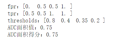
fpr, tpr, thresholds = roc_curve(y, scores, pos_label=1)
print(f"fpr:{fpr}")
print(f"tpr:{tpr}")
print(f"thresholds:{thresholds}")
# auc方法,计算roc曲线下的面积。最大值为1。
# 方法需要两个参数:fpr与tpr。
print(f"AUC面积值:{auc(fpr, tpr)}")
# 还可以使用roc_auc_score方法来计算auc的面积。
print(f"AUC面积得分:{roc_auc_score(y_true=y, y_score=scores)}")
# 注意:尽管roc_curve与roc_auc_score都能够计算auc面积值,但是,二者需要的参数内容
# 是不同的。这点就类似于分类当中的accuracy_score与lr.score。或者类似于回归当中的
# r2_socre与lr.score。
import numpy as np
from sklearn.datasets import make_classification
from sklearn.linear_model import LogisticRegression
from sklearn.model_selection import train_test_split
from sklearn.metrics import roc_curve, auc
import matplotlib as mpl
import matplotlib.pyplot as plt

mpl.rcParams["font.family"] = "SimHei"
mpl.rcParams["axes.unicode_minus"] = False

# flip_y 随机改变样本类别的概率,相当于是为数据集增加噪声。
X, y = make_classification(n_samples=200, n_features=10, n_classes=2, random_state=0, flip_y=0.3)
X_train, X_test, y_train, y_test = train_test_split(X, y, test_size=0.25, random_state=0)
lr = LogisticRegression(penalty="l2", C=2)
lr.fit(X_train, y_train)
y_hat = lr.predict(X_test)
# 通过sigmoid返回的概率值作为我们得分的依据,用于在roc_curve当中,判定样本的类别。
score = lr.predict_proba(X_test)
# score[:, 1] 因为1是正例,我们需要传递的是类别1的概率。
fpr, tpr, thresholds = roc_curve(y_true=y_test, y_score=score[:, 1], pos_label=1)

plt.figure(figsize=(10, 6))
# 绘制ROC曲线。
plt.plot(fpr, tpr, label="ROC")
# 绘制(0, 0)与(1, 1)两个点的连线,该曲线(直线)为随机猜测的效果。
plt.plot([0,1], [0,1], lw=2, ls="--", label="随机猜测")
# 绘制(0, 0), (0, 1), (1, 1)三点的连线(两条线),这两条线构成完美的roc曲线(auc的值为1)。
plt.plot([0, 0, 1], [0, 1, 1], lw=2, ls="-.", label="完美预测")
plt.xlim(-0.01, 1.02)
plt.ylim(-0.01, 1.02)
plt.xticks(np.arange(0, 1.1, 0.1))
plt.yticks(np.arange(0, 1.1, 0.1))
plt.xlabel('False Positive Rate(FPR)', fontsize=16)
plt.ylabel('True Positive Rate(TPR)', fontsize=16)
plt.grid()
plt.title(f"ROC曲线-AUC值为{auc(fpr, tpr):.3f}", fontsize=16)
plt.legend()
plt.show()
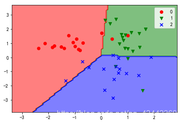
13. 使用逻辑回归进行多分类(with codes)
逻辑回归也可以进行多分类任务。
from sklearn.datasets import make_classification
from sklearn.linear_model import LogisticRegression
from sklearn.model_selection import train_test_split
# n_clusters_per_class 每个类别生成的簇的数量。
X, y = make_classification(n_samples=200, n_features=2, n_informative=2, n_redundant=0,
n_classes=3, random_state=0, n_clusters_per_class=1)
X_train, X_test, y_train, y_test = train_test_split(X, y, test_size=0.25, random_state=0)
# lr = LogisticRegression()
# lr = LogisticRegression(multi_class="ovr")
# 多分类任务可以使用"ovr"(一对其他)与multinomial(多项式)来进行处理。
# 如果使用多项式进行处理,则solver(解决方案)不能使用默认的liblinear。
lr = LogisticRegression(multi_class="multinomial", solver="lbfgs")
lr.fit(X_train, y_train)
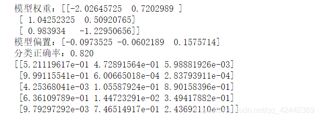
# 在多分类时,默认使用的方式为ovr,通过多个二分类的组合,实现多分类的任务。
# 在多分类情况下,模型的权重与偏置分为n组(内部为维护n个二分类的模型),其中n为分类的数量。
print(f"模型权重:{lr.coef_}")
print(f"模型偏置:{lr.intercept_}")
y_hat = lr.predict(X_test)
print(f"分类正确率:{lr.score(X_test, y_test):.3f}")
print(lr.predict_proba(X_test[:5]))
import numpy as np
import matplotlib as mpl
import matplotlib.pyplot as plt
from matplotlib.colors import ListedColormap

mpl.rcParams["font.family"] = "SimHei"
mpl.rcParams["axes.unicode_minus"] = False


cmap = ListedColormap(["r", "g", "b"])
marker = ["o", "v", "x"]

x1_min, x2_min = np.min(X_test, axis=0)
x1_max, x2_max = np.max(X_test, axis=0)
x1 = np.linspace(x1_min - 1, x1_max + 1, 100)
x2 = np.linspace(x2_min - 1, x2_max + 1, 100)
X1, X2 = np.meshgrid(x1, x2)
Z = lr.predict(np.array([X1.ravel(), X2.ravel()]).T).reshape(X1.shape)
plt.contourf(X1, X2, Z, cmap=cmap, alpha=0.5)
for i, class_ in enumerate(np.unique(y_test)):
    plt.scatter(x=X_test[y_test == class_, 0], y=X_test[y_test == class_, 1],
            c=cmap(i), label=class_, marker=marker[i])
plt.legend()
plt.show()