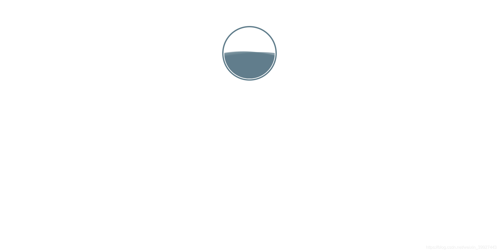
通过在制定overflow:hidden的元素上添加非常大圆形,而且圆形设置圆角,并不断滚动,数量多了就可以显示出水波效果
<!DOCTYPE html>
<html>
<head>
<style>
@keyframes roll {
    form {
        transform: rotate(0deg);
    }
    to {
        transform: rotate(360deg);
    }
}
.shuiqiu {
    width: 200px;
    height: 200px;
    border-radius: 50%;
    border: 5px solid #607d8b;
    margin: 100px auto;
    position: relative;
    overflow: hidden;
}
.shuiqiucontent {
    width: calc(100% - 6px);
    height: calc(100% - 6px);
    position: relative;
    overflow: hidden;
    margin: 3px;
    border-radius: 50%;
}
.shui {
    position: absolute;
    width: 1000px;
    height: 1000px;
    top: 100px;
    left: 50%;
    margin-left: -500px;
}
.shuiqiu:hover .shui1 {
    animation: roll 5s linear infinite;
}
.shuiqiu:hover .shui2 {
    animation: roll 7s linear infinite;
}
.shuiqiu:hover .shui3 {
    animation: roll 6s linear infinite;
}
.shuiqiu:hover .shui4 {
    animation: roll 10s linear infinite;
}
.shuiqiu:hover .shui5 {
    animation: roll 8s linear infinite;
}
.shuiqiu:hover .shui6 {
    animation: roll 9.5s linear infinite;
}
.shui1 {
    border-radius: 45%;
    background: #607d8bbe;
    animation: roll 10s linear infinite;
}
.shui2 {
    border-radius: 46%;
    background: #607d8b9a;
    animation: roll 14s linear infinite;
}
.shui3 {
    border-radius: 47%;
    background: #607d8bab;
    animation: roll 12s linear infinite;
}
.shui4 {
    border-radius: 48%;
    background: #607d8b44;
    animation: roll 20s linear infinite;
}
.shui5 {
    border-radius: 49%;
    background: #607d8b9f;
    animation: roll 16s linear infinite;
}
.shui6 {
    border-radius: 50%;
    background: #607d8b38;
    animation: roll 19s linear infinite;
}
</style>
</head>
<body>

<div class="shuiqiu">
    <div class="shuiqiucontent">
        <div class="shui shui1"></div>
        <div class="shui shui2"></div>
        <div class="shui shui3"></div>
        <div class="shui shui4"></div>
        <div class="shui shui5"></div>
        <div class="shui shui6"></div>
    </div>
</div>

</body>
</html>