如果对3D转换不熟悉可以参考:CSS – CSS3中3D转换相关属性讲解(translate3d,rotate3d,perspective,transform-style)
如果对动画不熟悉可以参考:CSS – CSS3基础动画讲解
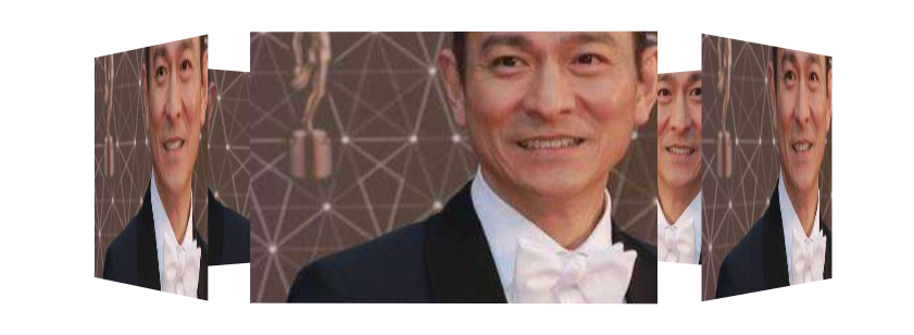
旋转木马图片相册
<!DOCTYPE html>
<html lang="en">
    <head>
        <meta charset="UTF-8" />
        <meta http-equiv="X-UA-Compatible" content="IE=edge" />
        <meta name="viewport" content="width=device-width, initial-scale=1.0" />
        <title>Document</title>
        <style>
            body {


                perspective: 1500px;
            }
            @keyframes rotate {


                0% {


                    transform: rotateY(0deg);
                }
                100% {


                    transform: rotateY(360deg);
                }
            }
            section {


                position: relative;
                width: 300px;
                height: 200px;
                margin: 100px auto;
                transform-style: preserve-3d;
                animation: rotate 10s infinite linear;
            }

            div {


                position: absolute;
                top: 0;
                left: 0;
                width: 100%;
                height: 100%;
                background: url(images/img.jpg) no-repeat center center;
            }
            section div:nth-child(1) {


                transform: translateZ(300px);
            }
            section div:nth-child(2) {


                transform: rotateY(60deg) translateZ(300px);
            }
            section div:nth-child(3) {


                transform: rotateY(120deg) translateZ(300px);
            }
            section div:nth-child(4) {


                transform: rotateY(180deg) translateZ(300px);
            }
            section div:nth-child(5) {


                transform: rotateY(240deg) translateZ(300px);
            }
            section div:nth-child(6) {


                transform: rotateY(300deg) translateZ(300px);
            }
        </style>
    </head>
    <body>
        <section>
            <div></div>
            <div></div>
            <div></div>
            <div></div>
            <div></div>
            <div></div>
        </section>
    </body>
</html>